How to Plot Two Dotted Lines and Set Markers Using Matplotlib
How to plot two dotted lines and set markers using Matplotlib is an essential skill for data visualization in Python. Matplotlib is a powerful library that allows you to create a wide variety of plots, including dotted lines with custom markers. In this comprehensive guide, we’ll explore various techniques and options for plotting dotted lines and setting markers using Matplotlib. We’ll cover everything from basic dotted line plots to more advanced customization options, providing you with the knowledge and tools to create stunning visualizations.
Understanding the Basics of Plotting Dotted Lines and Setting Markers
Before we dive into the specifics of how to plot two dotted lines and set markers using Matplotlib, let’s start with the fundamentals. Matplotlib provides several ways to create dotted lines and add markers to your plots. The most common method is to use the plot() function with appropriate parameters.
Here’s a simple example of how to plot two dotted lines and set markers using Matplotlib:
import matplotlib.pyplot as plt
import numpy as np

x = np.linspace(0, 10, 100)
y1 = np.sin(x)
y2 = np.cos(x)

plt.plot(x, y1, linestyle=':', marker='o', label='Line 1 - how2matplotlib.com')
plt.plot(x, y2, linestyle=':', marker='s', label='Line 2 - how2matplotlib.com')
plt.legend()
plt.title('How to Plot Two Dotted Lines and Set Markers Using Matplotlib')
plt.xlabel('X-axis')
plt.ylabel('Y-axis')
plt.show()
Output:
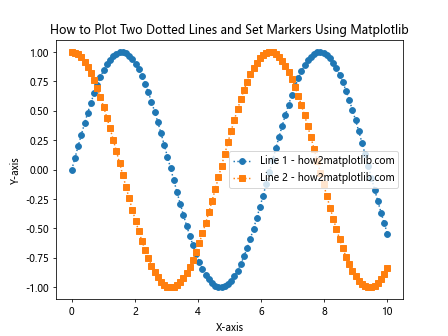
In this example, we create two dotted lines using the linestyle=':' parameter and set different markers for each line using the marker parameter. The 'o' marker creates circular points, while the 's' marker creates square points.
Customizing Dotted Lines in Matplotlib
When learning how to plot two dotted lines and set markers using Matplotlib, it’s important to understand the various customization options available. Matplotlib offers several ways to modify the appearance of dotted lines, including line style, color, and width.
Here’s an example demonstrating how to customize dotted lines:
import matplotlib.pyplot as plt
import numpy as np

x = np.linspace(0, 10, 50)
y1 = x**2
y2 = x**3

plt.plot(x, y1, linestyle=':', color='red', linewidth=2, label='Dotted Line 1 - how2matplotlib.com')
plt.plot(x, y2, linestyle='-.', color='blue', linewidth=1.5, label='Dash-dot Line 2 - how2matplotlib.com')
plt.legend()
plt.title('How to Plot Two Dotted Lines with Custom Styles Using Matplotlib')
plt.xlabel('X-axis')
plt.ylabel('Y-axis')
plt.show()
Output:
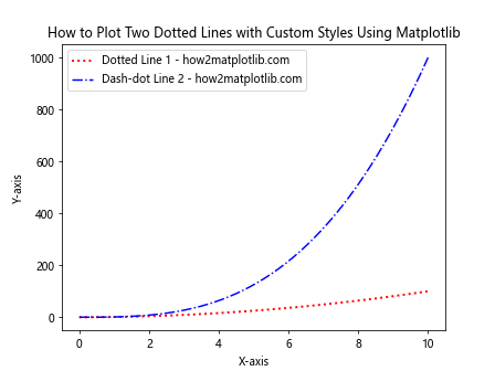
In this example, we use different line styles (':' for dotted and '-.' for dash-dot), colors, and line widths to create visually distinct lines.
Setting and Customizing Markers in Matplotlib
Markers are an essential part of how to plot two dotted lines and set markers using Matplotlib. They help highlight specific data points and make your plots more informative. Matplotlib provides a wide range of marker styles and customization options.
Here’s an example showcasing various marker styles:
import matplotlib.pyplot as plt
import numpy as np

x = np.linspace(0, 5, 10)
y = x**2

marker_styles = ['o', 's', '^', 'D', 'v', '<', '>', 'p', '*', 'H']

for i, marker in enumerate(marker_styles):
    plt.plot(x, y + i*5, linestyle=':', marker=marker, label=f'Marker {marker} - how2matplotlib.com')

plt.legend(bbox_to_anchor=(1.05, 1), loc='upper left')
plt.title('How to Plot Dotted Lines with Various Markers Using Matplotlib')
plt.xlabel('X-axis')
plt.ylabel('Y-axis')
plt.tight_layout()
plt.show()
Output:
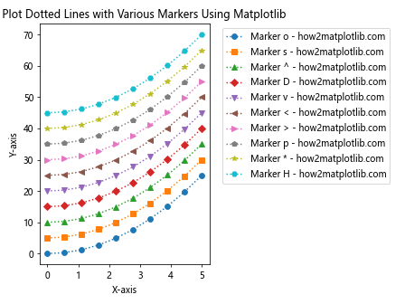
This example demonstrates ten different marker styles applied to dotted lines, showcasing the variety of options available when learning how to plot two dotted lines and set markers using Matplotlib.
Combining Dotted Lines and Markers for Effective Visualization
When mastering how to plot two dotted lines and set markers using Matplotlib, it’s crucial to understand how to combine these elements effectively. By carefully choosing line styles, colors, and markers, you can create visually appealing and informative plots.
Here’s an example that combines dotted lines with custom markers and colors:
import matplotlib.pyplot as plt
import numpy as np

x = np.linspace(0, 10, 20)
y1 = np.sin(x)
y2 = np.cos(x)

plt.plot(x, y1, linestyle=':', color='purple', marker='o', markersize=8, markerfacecolor='yellow', markeredgecolor='purple', label='Sin - how2matplotlib.com')
plt.plot(x, y2, linestyle=':', color='green', marker='s', markersize=8, markerfacecolor='orange', markeredgecolor='green', label='Cos - how2matplotlib.com')
plt.legend()
plt.title('How to Plot Two Dotted Lines with Custom Markers Using Matplotlib')
plt.xlabel('X-axis')
plt.ylabel('Y-axis')
plt.grid(True, linestyle='--', alpha=0.7)
plt.show()
Output:
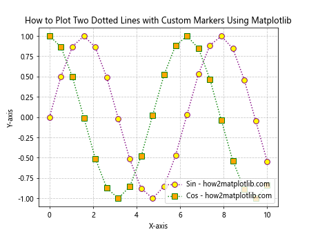
In this example, we use dotted lines with different colors and custom markers. The markers are further customized with different face and edge colors, creating a visually striking plot.
Advanced Techniques for Plotting Dotted Lines and Markers
As you become more proficient in how to plot two dotted lines and set markers using Matplotlib, you may want to explore more advanced techniques. These can include creating custom dash patterns, using marker symbols from mathematical fonts, or even animating your plots.
Here’s an example of how to create custom dash patterns for your dotted lines:
import matplotlib.pyplot as plt
import numpy as np

x = np.linspace(0, 10, 100)
y1 = np.sin(x)
y2 = np.cos(x)

plt.plot(x, y1, linestyle=(0, (1, 1)), marker='o', markersize=4, label='Custom Dotted 1 - how2matplotlib.com')
plt.plot(x, y2, linestyle=(0, (5, 2, 1, 2)), marker='s', markersize=4, label='Custom Dotted 2 - how2matplotlib.com')
plt.legend()
plt.title('How to Plot Two Custom Dotted Lines and Set Markers Using Matplotlib')
plt.xlabel('X-axis')
plt.ylabel('Y-axis')
plt.show()
Output:
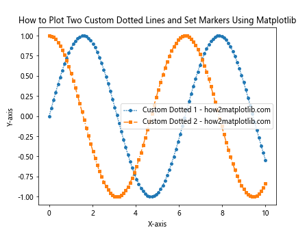
In this example, we use custom dash patterns defined by tuples. The first line uses a simple dot pattern, while the second line uses a more complex dash-dot-dot pattern.
Plotting Dotted Lines and Markers in Different Plot Types
Understanding how to plot two dotted lines and set markers using Matplotlib extends beyond simple line plots. You can apply these techniques to various plot types, such as scatter plots, bar charts, and polar plots.
Here’s an example of how to create a scatter plot with dotted lines connecting the points:
import matplotlib.pyplot as plt
import numpy as np

x = np.linspace(0, 10, 20)
y1 = np.sin(x) + np.random.normal(0, 0.1, 20)
y2 = np.cos(x) + np.random.normal(0, 0.1, 20)

plt.scatter(x, y1, color='red', marker='o', label='Data 1 - how2matplotlib.com')
plt.scatter(x, y2, color='blue', marker='s', label='Data 2 - how2matplotlib.com')
plt.plot(x, y1, linestyle=':', color='red', alpha=0.5)
plt.plot(x, y2, linestyle=':', color='blue', alpha=0.5)
plt.legend()
plt.title('How to Plot Scatter Points with Dotted Lines Using Matplotlib')
plt.xlabel('X-axis')
plt.ylabel('Y-axis')
plt.show()
Output:
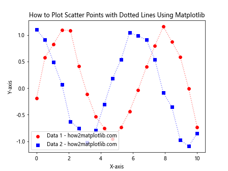
This example demonstrates how to combine scatter points with dotted lines, creating a hybrid visualization that shows both individual data points and the overall trend.
Handling Multiple Datasets with Dotted Lines and Markers
When working with multiple datasets, knowing how to plot two dotted lines and set markers using Matplotlib becomes even more important. You’ll need to carefully choose colors, line styles, and markers to distinguish between different datasets.
Here’s an example of plotting multiple datasets with dotted lines and markers:
import matplotlib.pyplot as plt
import numpy as np

x = np.linspace(0, 10, 50)
y1 = np.sin(x)
y2 = np.cos(x)
y3 = np.tan(x)
y4 = x**2

plt.plot(x, y1, linestyle=':', marker='o', markersize=4, label='Sin - how2matplotlib.com')
plt.plot(x, y2, linestyle=':', marker='s', markersize=4, label='Cos - how2matplotlib.com')
plt.plot(x, y3, linestyle=':', marker='^', markersize=4, label='Tan - how2matplotlib.com')
plt.plot(x, y4, linestyle=':', marker='D', markersize=4, label='X^2 - how2matplotlib.com')
plt.legend()
plt.title('How to Plot Multiple Dotted Lines and Set Markers Using Matplotlib')
plt.xlabel('X-axis')
plt.ylabel('Y-axis')
plt.ylim(-5, 5)  # Limit y-axis for better visibility
plt.show()
Output:
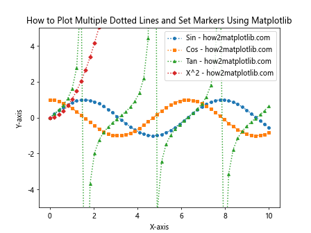
This example shows how to plot four different datasets using dotted lines and distinct markers, making it easy to differentiate between them.
Customizing Marker Sizes and Colors
When learning how to plot two dotted lines and set markers using Matplotlib, it’s important to understand how to customize marker sizes and colors. This can help emphasize certain data points or create visually appealing plots.
Here’s an example demonstrating how to vary marker sizes and colors:
import matplotlib.pyplot as plt
import numpy as np

x = np.linspace(0, 10, 20)
y1 = np.sin(x)
y2 = np.cos(x)

sizes1 = np.linspace(20, 200, 20)
sizes2 = np.linspace(200, 20, 20)
colors1 = plt.cm.viridis(np.linspace(0, 1, 20))
colors2 = plt.cm.plasma(np.linspace(0, 1, 20))

plt.scatter(x, y1, s=sizes1, c=colors1, marker='o', label='Variable Size/Color 1 - how2matplotlib.com')
plt.scatter(x, y2, s=sizes2, c=colors2, marker='s', label='Variable Size/Color 2 - how2matplotlib.com')
plt.plot(x, y1, linestyle=':', color='gray', alpha=0.5)
plt.plot(x, y2, linestyle=':', color='gray', alpha=0.5)
plt.legend()
plt.title('How to Plot Dotted Lines with Variable Marker Sizes and Colors Using Matplotlib')
plt.xlabel('X-axis')
plt.ylabel('Y-axis')
plt.colorbar(label='Color Scale')
plt.show()
Output:
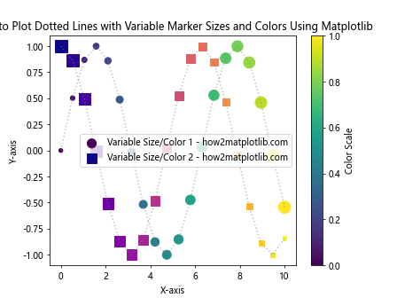
In this example, we use varying marker sizes and colors to represent additional dimensions of data, while still maintaining dotted lines to show the overall trend.
Creating Subplots with Dotted Lines and Markers
As you become more proficient in how to plot two dotted lines and set markers using Matplotlib, you may want to create more complex visualizations using subplots. This allows you to compare multiple plots side by side or create dashboard-like layouts.
Here’s an example of creating subplots with dotted lines and markers:
import matplotlib.pyplot as plt
import numpy as np

x = np.linspace(0, 10, 50)
y1 = np.sin(x)
y2 = np.cos(x)

fig, (ax1, ax2) = plt.subplots(1, 2, figsize=(12, 5))

ax1.plot(x, y1, linestyle=':', marker='o', markersize=4, label='Sin - how2matplotlib.com')
ax1.set_title('Sine Wave')
ax1.set_xlabel('X-axis')
ax1.set_ylabel('Y-axis')
ax1.legend()

ax2.plot(x, y2, linestyle=':', marker='s', markersize=4, label='Cos - how2matplotlib.com')
ax2.set_title('Cosine Wave')
ax2.set_xlabel('X-axis')
ax2.set_ylabel('Y-axis')
ax2.legend()

plt.suptitle('How to Plot Dotted Lines and Set Markers in Subplots Using Matplotlib')
plt.tight_layout()
plt.show()
Output:
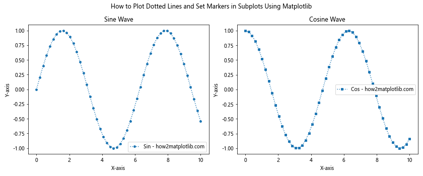
This example demonstrates how to create two subplots, each with its own dotted line and markers, allowing for easy comparison between different datasets.
Adding Error Bars to Dotted Line Plots
When working with experimental data, it’s often necessary to include error bars in your plots. Understanding how to plot two dotted lines and set markers using Matplotlib includes knowing how to add error bars to your visualizations.
Here’s an example of how to add error bars to a dotted line plot:
import matplotlib.pyplot as plt
import numpy as np

x = np.linspace(0, 10, 10)
y1 = np.sin(x) + np.random.normal(0, 0.1, 10)
y2 = np.cos(x) + np.random.normal(0, 0.1, 10)
yerr1 = np.random.uniform(0.1, 0.2, 10)
yerr2 = np.random.uniform(0.1, 0.2, 10)

plt.errorbar(x, y1, yerr=yerr1, fmt=':', marker='o', capsize=5, label='Data 1 - how2matplotlib.com')
plt.errorbar(x, y2, yerr=yerr2, fmt=':', marker='s', capsize=5, label='Data 2 - how2matplotlib.com')
plt.legend()
plt.title('How to Plot Dotted Lines with Error Bars and Markers Using Matplotlib')
plt.xlabel('X-axis')
plt.ylabel('Y-axis')
plt.show()
Output:
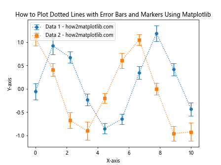
In this example, we use the errorbar() function to create dotted lines with markers and error bars, providing a more complete representation of the data and its uncertainty.
Creating Filled Regions Between Dotted Lines
Another useful technique when learning how to plot two dotted lines and set markers using Matplotlib is creating filled regions between the lines. This can be particularly helpful when visualizing confidence intervals or comparing two datasets.
Here’s an example of how to create filled regions between dotted lines:
import matplotlib.pyplot as plt
import numpy as np

x = np.linspace(0, 10, 100)
y1 = np.sin(x) + 0.5
y2 = np.sin(x) - 0.5

plt.plot(x, y1, linestyle=':', marker='o', markersize=4, markevery=10, label='Upper Bound - how2matplotlib.com')
plt.plot(x, y2, linestyle=':', marker='s', markersize=4, markevery=10, label='Lower Bound - how2matplotlib.com')
plt.fill_between(x, y1, y2, alpha=0.2, label='Filled Region - how2matplotlib.com')
plt.legend()
plt.title('How to Plot Two Dotted Lines with Filled Region Using Matplotlib')
plt.xlabel('X-axis')
plt.ylabel('Y-axis')
plt.show()
Output:
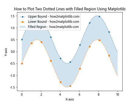
This example demonstrates how to create two dotted lines with markers and fill the region between them, which can be useful for visualizing ranges or confidence intervals.
Animating Dotted Lines and Markers
For more dynamic visualizations, you can animate your dotted lines and markers. This technique can be particularly useful when demonstrating how data changes over time or when creating interactive presentations.
Here’s an example of how to create a simple animation of dotted lines and markers:
import matplotlib.pyplot as plt
import matplotlib.animation as animation
import numpy as np

fig, ax = plt.subplots()

x = np.linspace(0, 2*np.pi, 100)
line, = ax.plot(x, np.sin(x), linestyle=':', marker='o', markersize=4, markevery=10)

def animate(i):
    line.set_ydata(np.sin(x + i/10))
    return line,

ani = animation.FuncAnimation(fig, animate, frames=100, interval=50, blit=True)
plt.title('How to Animate Dotted Lines and Markers Using Matplotlib')
plt.xlabel('X-axis')
plt.ylabel('Y-axis')
plt.show()
Output:
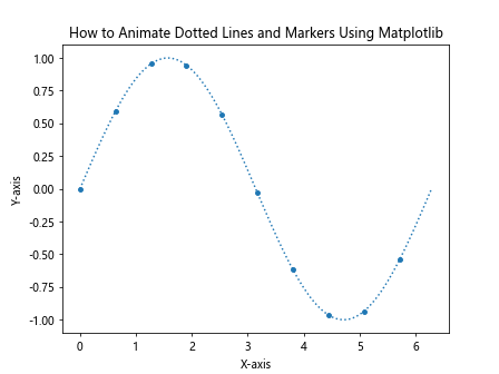
This example creates an animation of a sine wave with a dotted line and markers, demonstrating how to bring your visualizations to life.
Combining Dotted Lines with Other Plot Types
When mastering how to plot two dotted lines and set markers using Matplotlib, it’s valuable to know how to combine these elements with other plot types. This can lead to more informative and visually appealing visualizations.
Here’s an example that combines a bar plot with dotted lines and markers:
import matplotlib.pyplot as plt
import numpy as np

categories = ['A', 'B', 'C', 'D', 'E']
values1 = [3, 7, 2, 9, 4]
values2 = [5, 2, 8, 3, 7]

x = np.arange(len(categories))
width = 0.35

fig, ax = plt.subplots()

ax.bar(x - width/2, values1, width, label='Data 1 - how2matplotlib.com')
ax.bar(x + width/2, values2, width, label='Data 2 - how2matplotlib.com')

ax.plot(x, values1, linestyle=':', marker='o', color='red', label='Trend 1 - how2matplotlib.com')
ax.plot(x, values2, linestyle=':', marker='s', color='blue', label='Trend 2 - how2matplotlib.com')

ax.set_xlabel('Categories')
ax.set_ylabel('Values')
ax.set_title('How to Combine Bar Plots with Dotted Lines and Markers Using Matplotlib')
ax.set_xticks(x)
ax.set_xticklabels(categories)
ax.legend()

plt.tight_layout()
plt.show()
Output:
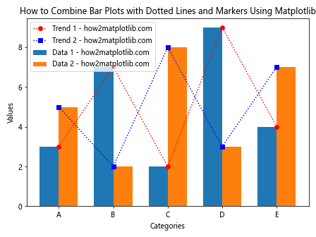
This example shows how to overlay dotted lines and markers on a bar plot, providing both discrete values and trend information in a single visualization.
Using Dotted Lines and Markers in 3D Plots
Extending your knowledge of how to plot two dotted lines and set markers using Matplotlib to three-dimensional plots can open up new possibilities for data visualization. Matplotlib’s 3D plotting capabilities allow you to create complex visualizations with dotted lines and markers in 3D space.
Here’s an example of how to create a 3D plot with dotted lines and markers:
import matplotlib.pyplot as plt
from mpl_toolkits.mplot3d import Axes3D
import numpy as np

fig = plt.figure()
ax = fig.add_subplot(111, projection='3d')

t = np.linspace(0, 10, 100)
x = np.sin(t)
y = np.cos(t)
z = t

ax.plot(x, y, z, linestyle=':', marker='o', markersize=4, markevery=10, label='3D Curve - how2matplotlib.com')
ax.legend()

ax.set_xlabel('X-axis')
ax.set_ylabel('Y-axis')
ax.set_zlabel('Z-axis')
ax.set_title('How to Plot 3D Dotted Lines and Set Markers Using Matplotlib')

plt.show()
Output:
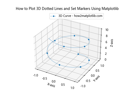
This example demonstrates how to create a 3D spiral using dotted lines and markers, showcasing the versatility of Matplotlib in creating complex visualizations.
Customizing Marker Styles with Path Effects
For even more advanced customization of markers when learning how to plot two dotted lines and set markers using Matplotlib, you can use path effects. Path effects allow you to add outlines, shadows, or other visual enhancements to your markers.
Here’s an example of how to use path effects to customize markers:
import matplotlib.pyplot as plt
import matplotlib.patheffects as pe
import numpy as np

x = np.linspace(0, 10, 20)
y1 = np.sin(x)
y2 = np.cos(x)

plt.plot(x, y1, linestyle=':', marker='o', markersize=12, markerfacecolor='yellow', markeredgecolor='red',
         path_effects=[pe.withStroke(linewidth=3, foreground='black')],
         label='Line 1 - how2matplotlib.com')
plt.plot(x, y2, linestyle=':', marker='s', markersize=12, markerfacecolor='lightblue', markeredgecolor='blue',
         path_effects=[pe.withStroke(linewidth=3, foreground='black')],
         label='Line 2 - how2matplotlib.com')

plt.legend()
plt.title('How to Plot Dotted Lines with Custom Marker Styles Using Path Effects in Matplotlib')
plt.xlabel('X-axis')
plt.ylabel('Y-axis')
plt.show()
Output:
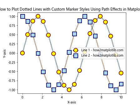
This example shows how to add a black outline to markers using path effects, creating a more visually striking appearance for your plot.
Creating Custom Markers
While Matplotlib provides a wide range of built-in marker styles, you may sometimes need to create custom markers for specific visualization needs. Understanding how to plot two dotted lines and set markers using Matplotlib includes knowing how to define and use custom markers.
Here’s an example of how to create and use a custom marker:
import matplotlib.pyplot as plt
import numpy as np

x = np.linspace(0, 10, 20)
y1 = np.sin(x)
y2 = np.cos(x)

custom_marker = plt.matplotlib.markers.MarkerStyle(marker='$\heartsuit$')

plt.plot(x, y1, linestyle=':', marker=custom_marker, markersize=15, label='Custom Marker 1 - how2matplotlib.com')
plt.plot(x, y2, linestyle=':', marker='$\clubsuit$', markersize=15, label='Custom Marker 2 - how2matplotlib.com')

plt.legend()
plt.title('How to Plot Dotted Lines with Custom Markers Using Matplotlib')
plt.xlabel('X-axis')
plt.ylabel('Y-axis')
plt.show()
Output:
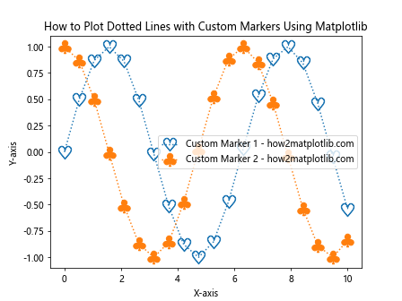
This example demonstrates how to create a custom heart-shaped marker and use a built-in club-shaped marker, showing the flexibility of Matplotlib in marker customization.
Conclusion
In this comprehensive guide, we’ve explored various aspects of how to plot two dotted lines and set markers using Matplotlib. We’ve covered everything from basic line plots to advanced techniques like custom markers, 3D plotting, and animations. By mastering these techniques, you’ll be able to create informative and visually appealing data visualizations that effectively communicate your insights.