How to Set Plot Background Color in Matplotlib
How to Set Plot Background Color in Matplotlib is an essential skill for data visualization enthusiasts and professionals alike. Matplotlib, a powerful plotting library for Python, offers various ways to customize the appearance of your plots, including setting the background color. In this comprehensive guide, we’ll explore different methods and techniques to set plot background color in Matplotlib, providing you with the knowledge and tools to create visually appealing and informative plots.
Understanding the Importance of Background Color in Matplotlib Plots
Before diving into the specifics of how to set plot background color in Matplotlib, it’s crucial to understand why background color matters in data visualization. The background color of a plot can significantly impact the overall aesthetics and readability of your visualizations. A well-chosen background color can:
- Enhance contrast and improve readability
- Set the mood or tone of the visualization
- Highlight specific data points or trends
- Complement your overall design scheme
- Make your plots more accessible to viewers with visual impairments
When learning how to set plot background color in Matplotlib, keep these factors in mind to create effective and visually appealing plots.
Basic Techniques for Setting Plot Background Color in Matplotlib
Let’s start with some basic techniques for setting plot background color in Matplotlib. These methods are straightforward and can be easily implemented in your plotting code.
Using set_facecolor() to Set Plot Background Color
One of the simplest ways to set plot background color in Matplotlib is by using the set_facecolor() method. This method allows you to change the background color of the entire figure or specific axes.
Here’s an example of how to set plot background color in Matplotlib using set_facecolor():
import matplotlib.pyplot as plt

# Create a figure and axis
fig, ax = plt.subplots()

# Set the background color of the entire figure
fig.patch.set_facecolor('#F0F0F0')  # Light gray

# Set the background color of the axis
ax.set_facecolor('#E0E0E0')  # Slightly darker gray

# Plot some data
x = [1, 2, 3, 4, 5]
y = [2, 4, 6, 8, 10]
ax.plot(x, y, label='Data from how2matplotlib.com')

# Add labels and title
ax.set_xlabel('X-axis')
ax.set_ylabel('Y-axis')
ax.set_title('How to Set Plot Background Color in Matplotlib')

# Add legend
ax.legend()

# Display the plot
plt.show()
Output:
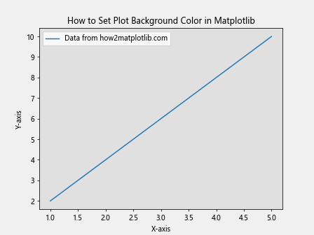
In this example, we use fig.patch.set_facecolor() to set the background color of the entire figure to a light gray (#F0F0F0). We then use ax.set_facecolor() to set the background color of the axis to a slightly darker gray (#E0E0E0). This creates a subtle contrast between the figure and axis backgrounds.
Using rcParams to Set Default Plot Background Color
If you want to set a default background color for all your Matplotlib plots, you can use the rcParams dictionary. This approach is particularly useful when you’re working on a project with a consistent color scheme.
Here’s an example of how to set plot background color in Matplotlib using rcParams:
import matplotlib.pyplot as plt

# Set the default background color for all plots
plt.rcParams['figure.facecolor'] = '#F5F5F5'  # Light gray
plt.rcParams['axes.facecolor'] = '#FFFFFF'  # White

# Create a figure and axis
fig, ax = plt.subplots()

# Plot some data
x = [1, 2, 3, 4, 5]
y = [2, 4, 6, 8, 10]
ax.plot(x, y, label='Data from how2matplotlib.com')

# Add labels and title
ax.set_xlabel('X-axis')
ax.set_ylabel('Y-axis')
ax.set_title('How to Set Plot Background Color in Matplotlib')

# Add legend
ax.legend()

# Display the plot
plt.show()
Output:
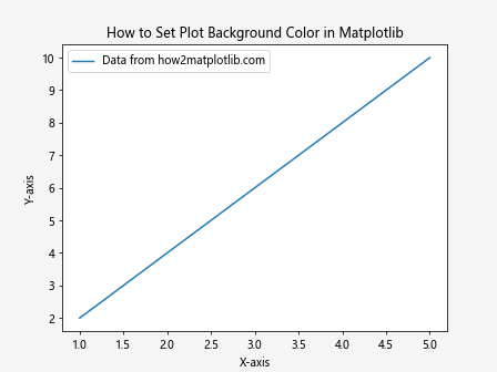
In this example, we use plt.rcParams to set the default background color for all figures to a light gray (#F5F5F5) and the default background color for all axes to white (#FFFFFF). This configuration will apply to all subsequent plots in your script or notebook.
Advanced Techniques for Setting Plot Background Color in Matplotlib
Now that we’ve covered the basics of how to set plot background color in Matplotlib, let’s explore some more advanced techniques that allow for greater customization and control over your plot’s appearance.
Using Gradients as Plot Background Color
One way to add visual interest to your plots is by using gradients as the background color. Matplotlib provides the LinearGradient and RadialGradient classes for creating gradient backgrounds.
Here’s an example of how to set plot background color in Matplotlib using a linear gradient:
import matplotlib.pyplot as plt
import numpy as np
from matplotlib.colors import LinearSegmentedColormap

# Create a figure and axis
fig, ax = plt.subplots()

# Create a custom colormap for the gradient
colors = ['#FF9999', '#FFCC99', '#FFFF99', '#CCFFCC']
n_bins = 100
cmap = LinearSegmentedColormap.from_list('custom_cmap', colors, N=n_bins)

# Create the gradient
X, Y = np.meshgrid(np.linspace(0, 1, 100), np.linspace(0, 1, 100))
C = Y  # Use Y values for the gradient

# Set the background color using the gradient
ax.imshow(C, cmap=cmap, aspect='auto', extent=[0, 1, 0, 1], zorder=-1)

# Plot some data
x = np.linspace(0, 1, 50)
y = np.sin(2 * np.pi * x)
ax.plot(x, y, color='blue', label='Data from how2matplotlib.com')

# Add labels and title
ax.set_xlabel('X-axis')
ax.set_ylabel('Y-axis')
ax.set_title('How to Set Plot Background Color in Matplotlib: Gradient Example')

# Add legend
ax.legend()

# Display the plot
plt.show()
Output:
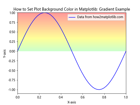
In this example, we create a custom colormap using LinearSegmentedColormap.from_list() and use it to create a gradient background. The gradient is applied using ax.imshow() with a low zorder value to ensure it appears behind the plotted data.
Customizing Plot Background Color for Different Plot Types
Different types of plots may require different approaches when it comes to setting background color. Let’s explore how to set plot background color in Matplotlib for various common plot types.
Setting Background Color for Scatter Plots
Scatter plots are widely used to visualize the relationship between two variables. Here’s how to set plot background color in Matplotlib for a scatter plot:
import matplotlib.pyplot as plt
import numpy as np

# Create a figure and axis
fig, ax = plt.subplots()

# Set the background color
ax.set_facecolor('#F0F8FF')  # Light blue

# Generate random data
np.random.seed(42)
x = np.random.rand(50)
y = np.random.rand(50)

# Create a scatter plot
scatter = ax.scatter(x, y, c=y, cmap='viridis', s=100, alpha=0.7)

# Add a colorbar
plt.colorbar(scatter)

# Add labels and title
ax.set_xlabel('X-axis')
ax.set_ylabel('Y-axis')
ax.set_title('How to Set Plot Background Color in Matplotlib: Scatter Plot')

# Add a text annotation
ax.text(0.5, 0.95, 'Data from how2matplotlib.com', transform=ax.transAxes, ha='center')

# Display the plot
plt.show()
Output:
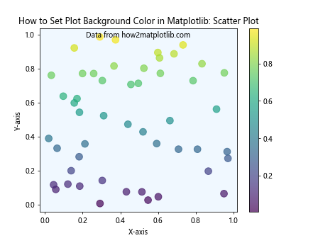
In this example, we set a light blue background color for the scatter plot using ax.set_facecolor(). The scatter points are colored using a colormap, which contrasts nicely with the background.
Setting Background Color for Bar Charts
Bar charts are excellent for comparing categorical data. Here’s how to set plot background color in Matplotlib for a bar chart:
import matplotlib.pyplot as plt
import numpy as np

# Create a figure and axis
fig, ax = plt.subplots()

# Set the background color
fig.patch.set_facecolor('#FFF5E6')  # Light orange
ax.set_facecolor('#FFFFFF')  # White

# Create data for the bar chart
categories = ['A', 'B', 'C', 'D', 'E']
values = [23, 45, 56, 78, 32]

# Create the bar chart
bars = ax.bar(categories, values, color='skyblue', edgecolor='navy')

# Add value labels on top of each bar
for bar in bars:
    height = bar.get_height()
    ax.text(bar.get_x() + bar.get_width()/2., height,
            f'{height}',
            ha='center', va='bottom')

# Add labels and title
ax.set_xlabel('Categories')
ax.set_ylabel('Values')
ax.set_title('How to Set Plot Background Color in Matplotlib: Bar Chart')

# Add a text annotation
ax.text(0.5, -0.1, 'Data from how2matplotlib.com', transform=ax.transAxes, ha='center')

# Display the plot
plt.show()
Output:
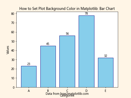
In this example, we set a light orange background color for the figure and a white background for the axis. This creates a subtle frame effect around the bar chart.
Setting Background Color for Pie Charts
Pie charts are useful for showing the composition of a whole. Here’s how to set plot background color in Matplotlib for a pie chart:
import matplotlib.pyplot as plt

# Create a figure and axis
fig, ax = plt.subplots()

# Set the background color
fig.patch.set_facecolor('#E6F3FF')  # Light blue

# Data for the pie chart
sizes = [35, 30, 20, 15]
labels = ['A', 'B', 'C', 'D']
colors = ['#FF9999', '#66B2FF', '#99FF99', '#FFCC99']

# Create the pie chart
wedges, texts, autotexts = ax.pie(sizes, labels=labels, colors=colors, autopct='%1.1f%%', startangle=90)

# Enhance the appearance of the text
for text in texts + autotexts:
    text.set_color('black')
    text.set_fontweight('bold')

# Add a title
ax.set_title('How to Set Plot Background Color in Matplotlib: Pie Chart')

# Add a text annotation
ax.text(0.5, -0.1, 'Data from how2matplotlib.com', transform=ax.transAxes, ha='center')

# Ensure the pie chart is circular
ax.axis('equal')

# Display the plot
plt.show()
Output:
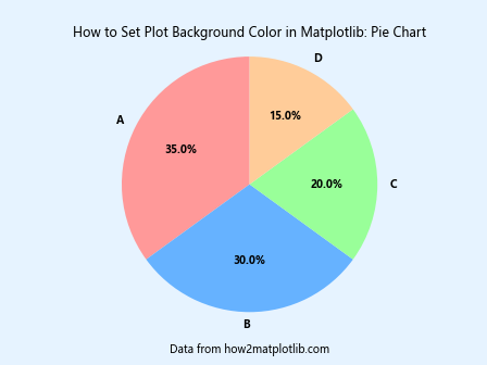
In this example, we set a light blue background color for the figure. The pie chart itself doesn’t have a background, but the figure background color complements the pie slices nicely.
Best Practices for Setting Plot Background Color in Matplotlib
When learning how to set plot background color in Matplotlib, it’s important to keep some best practices in mind to ensure your visualizations are effective and professional-looking.
- Consider contrast: Choose a background color that provides sufficient contrast with your data and text elements. High contrast improves readability and accessibility.
Be consistent: If you’re creating multiple plots for a single project or presentation, use a consistent color scheme, including background colors.
Use color psychology: Different colors can evoke different emotions and associations. Choose background colors that align with the message or tone of your data visualization.
Avoid overpowering colors: The background color should complement your data, not overpower it. Soft, muted colors often work well as backgrounds.
Test for colorblindness: Ensure your color choices, including background colors, are accessible to individuals with color vision deficiencies.
Consider the context: Think about where your plot will be displayed (e.g., digital screens, print, presentations) and choose colors accordingly.
Use gradients and textures sparingly: While they can add visual interest, overuse can distract from the data.
Maintain professionalism: For business or academic presentations, stick to more conservative color choices unless the context allows for more creative options.
Advanced Customization Techniques for Plot Background Color in Matplotlib
As you become more proficient in how to set plot background color in Matplotlib, you may want to explore more advanced customization techniques. Let’s look at some examples.