How to Set Axis Ranges in Matplotlib
How to Set Axis Ranges in Matplotlib is an essential skill for anyone working with data visualization in Python. Matplotlib is a powerful library that allows you to create a wide variety of plots and charts, and setting the axis ranges is crucial for presenting your data effectively. In this comprehensive guide, we’ll explore various methods and techniques for setting axis ranges in Matplotlib, providing you with the knowledge and tools to create visually appealing and informative plots.
Understanding Axis Ranges in Matplotlib
Before diving into the specifics of how to set axis ranges in Matplotlib, it’s important to understand what axis ranges are and why they matter. Axis ranges define the extent of your plot along the x and y axes. By setting appropriate ranges, you can focus on specific areas of interest in your data, zoom in or out to show more or less detail, and ensure that all relevant data points are visible within the plot area.
Matplotlib provides several ways to set axis ranges, including:
- Using the
set_xlim()andset_ylim()methods - Using the
axis()method - Using the
xlim()andylim()functions - Adjusting ranges automatically based on data
Let’s explore each of these methods in detail and see how to set axis ranges in Matplotlib effectively.
Setting Axis Ranges with set_xlim() and set_ylim()
One of the most straightforward ways to set axis ranges in Matplotlib is by using the set_xlim() and set_ylim() methods. These methods allow you to specify the minimum and maximum values for the x and y axes, respectively.
Here’s a simple example of how to set axis ranges using these methods:
import matplotlib.pyplot as plt
import numpy as np

# Generate some sample data
x = np.linspace(0, 10, 100)
y = np.sin(x)

# Create the plot
plt.figure(figsize=(8, 6))
plt.plot(x, y, label='sin(x)')

# Set axis ranges
plt.gca().set_xlim(0, 8)
plt.gca().set_ylim(-1.2, 1.2)

# Add labels and title
plt.xlabel('X-axis (how2matplotlib.com)')
plt.ylabel('Y-axis (how2matplotlib.com)')
plt.title('How to Set Axis Ranges in Matplotlib')
plt.legend()

# Show the plot
plt.show()
Output:
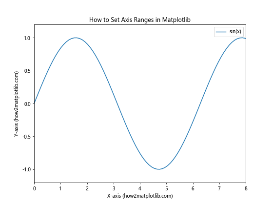
In this example, we use set_xlim(0, 8) to set the x-axis range from 0 to 8, and set_ylim(-1.2, 1.2) to set the y-axis range from -1.2 to 1.2. The gca() function is used to get the current axes instance.
You can also use these methods to reverse the axis direction by specifying a larger value for the minimum and a smaller value for the maximum:
import matplotlib.pyplot as plt
import numpy as np

# Generate some sample data
x = np.linspace(0, 10, 100)
y = np.cos(x)

# Create the plot
plt.figure(figsize=(8, 6))
plt.plot(x, y, label='cos(x)')

# Set reversed axis ranges
plt.gca().set_xlim(10, 0)
plt.gca().set_ylim(1, -1)

# Add labels and title
plt.xlabel('Reversed X-axis (how2matplotlib.com)')
plt.ylabel('Reversed Y-axis (how2matplotlib.com)')
plt.title('How to Set Reversed Axis Ranges in Matplotlib')
plt.legend()

# Show the plot
plt.show()
Output:
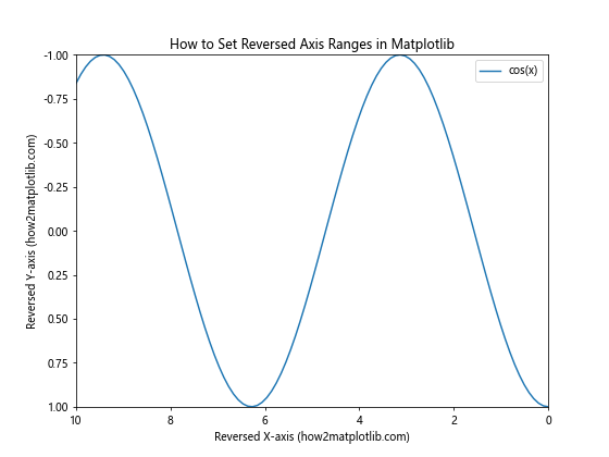
In this example, we set the x-axis range from 10 to 0 and the y-axis range from 1 to -1, effectively reversing both axes.
Using the axis() Method to Set Axis Ranges
Another way to set axis ranges in Matplotlib is by using the axis() method. This method allows you to set both x and y axis ranges in a single function call.
Here’s an example of how to use the axis() method:
import matplotlib.pyplot as plt
import numpy as np

# Generate some sample data
x = np.linspace(0, 10, 100)
y = np.exp(x)

# Create the plot
plt.figure(figsize=(8, 6))
plt.plot(x, y, label='exp(x)')

# Set axis ranges using axis() method
plt.axis([0, 5, 0, 150])

# Add labels and title
plt.xlabel('X-axis (how2matplotlib.com)')
plt.ylabel('Y-axis (how2matplotlib.com)')
plt.title('How to Set Axis Ranges in Matplotlib using axis() Method')
plt.legend()

# Show the plot
plt.show()
Output:
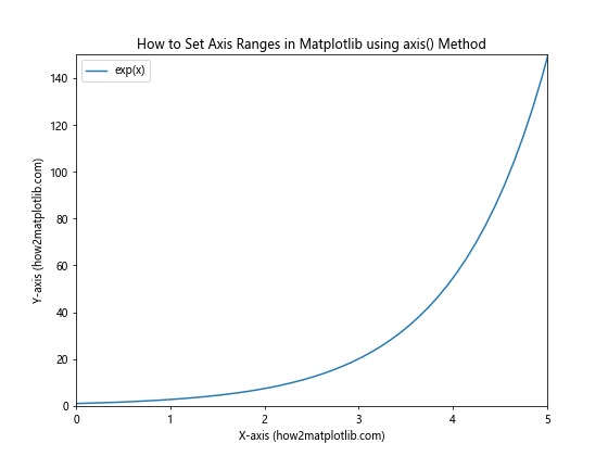
In this example, we use plt.axis([0, 5, 0, 150]) to set the x-axis range from 0 to 5 and the y-axis range from 0 to 150. The axis() method takes a list of four values: [xmin, xmax, ymin, ymax].
You can also use the axis() method with string arguments to set specific aspects of the plot:
import matplotlib.pyplot as plt
import numpy as np

# Generate some sample data
x = np.linspace(0, 10, 100)
y = np.log(x + 1)

# Create the plot
plt.figure(figsize=(8, 6))
plt.plot(x, y, label='log(x+1)')

# Set axis ranges and properties using axis() method
plt.axis([0, 8, 0, 2.5])
plt.axis('equal')

# Add labels and title
plt.xlabel('X-axis (how2matplotlib.com)')
plt.ylabel('Y-axis (how2matplotlib.com)')
plt.title('How to Set Axis Ranges and Properties in Matplotlib')
plt.legend()

# Show the plot
plt.show()
Output:
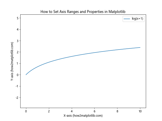
In this example, we first set the axis ranges using plt.axis([0, 8, 0, 2.5]), and then use plt.axis('equal') to ensure that the aspect ratio of the plot is 1:1, meaning that the units on both axes have the same scale.
Setting Axis Ranges with xlim() and ylim() Functions
Matplotlib also provides the xlim() and ylim() functions, which offer a more concise way to set axis ranges. These functions can be used to either get or set the current axis limits.
Here’s an example of how to use xlim() and ylim() to set axis ranges:
import matplotlib.pyplot as plt
import numpy as np

# Generate some sample data
x = np.linspace(0, 10, 100)
y = x**2

# Create the plot
plt.figure(figsize=(8, 6))
plt.plot(x, y, label='x^2')

# Set axis ranges using xlim() and ylim()
plt.xlim(0, 8)
plt.ylim(0, 50)

# Add labels and title
plt.xlabel('X-axis (how2matplotlib.com)')
plt.ylabel('Y-axis (how2matplotlib.com)')
plt.title('How to Set Axis Ranges in Matplotlib using xlim() and ylim()')
plt.legend()

# Show the plot
plt.show()
Output:
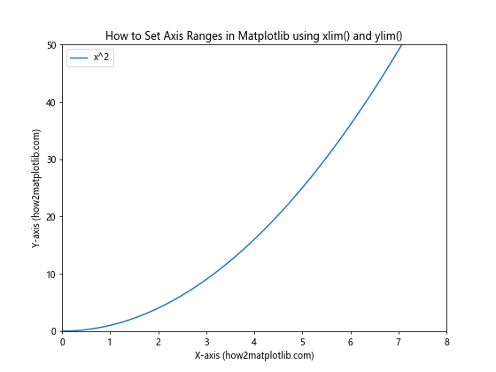
In this example, we use plt.xlim(0, 8) to set the x-axis range from 0 to 8, and plt.ylim(0, 50) to set the y-axis range from 0 to 50.
You can also use these functions to get the current axis limits:
import matplotlib.pyplot as plt
import numpy as np

# Generate some sample data
x = np.linspace(0, 10, 100)
y = np.sqrt(x)

# Create the plot
plt.figure(figsize=(8, 6))
plt.plot(x, y, label='sqrt(x)')

# Set initial axis ranges
plt.xlim(0, 8)
plt.ylim(0, 3)

# Get current axis limits
x_min, x_max = plt.xlim()
y_min, y_max = plt.ylim()

# Print current limits
print(f"X-axis limits: {x_min} to {x_max}")
print(f"Y-axis limits: {y_min} to {y_max}")

# Add labels and title
plt.xlabel('X-axis (how2matplotlib.com)')
plt.ylabel('Y-axis (how2matplotlib.com)')
plt.title('How to Get Axis Ranges in Matplotlib')
plt.legend()

# Show the plot
plt.show()
Output:
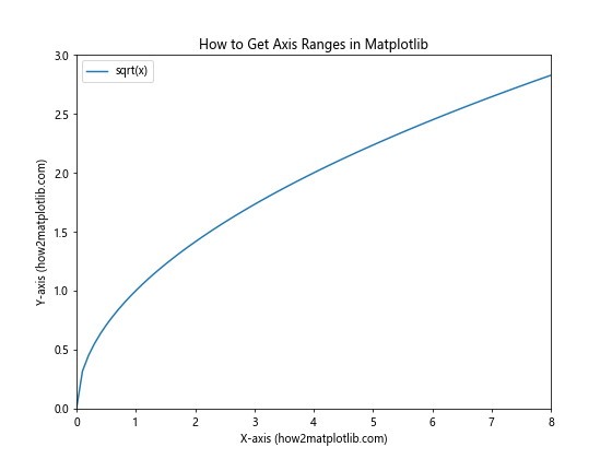
In this example, we first set the axis ranges using xlim() and ylim(), and then retrieve the current limits using the same functions without arguments. This can be useful when you need to know the current axis ranges for further calculations or adjustments.
Adjusting Axis Ranges Automatically Based on Data
Sometimes, you may want to set axis ranges automatically based on your data. Matplotlib provides several ways to achieve this, including the autoscale() function and the margins() function.
Here’s an example of how to use autoscale() to adjust axis ranges:
import matplotlib.pyplot as plt
import numpy as np

# Generate some sample data
x = np.linspace(0, 10, 100)
y = np.tan(x)

# Create the plot
plt.figure(figsize=(8, 6))
plt.plot(x, y, label='tan(x)')

# Autoscale the y-axis
plt.autoscale(axis='y')

# Set x-axis limits manually
plt.xlim(0, 5)

# Add labels and title
plt.xlabel('X-axis (how2matplotlib.com)')
plt.ylabel('Y-axis (how2matplotlib.com)')
plt.title('How to Set Axis Ranges Automatically in Matplotlib')
plt.legend()

# Show the plot
plt.show()
Output:
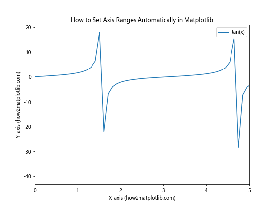
In this example, we use plt.autoscale(axis='y') to automatically adjust the y-axis range based on the data, while manually setting the x-axis range using plt.xlim(0, 5).
You can also use the margins() function to add padding around your data:
import matplotlib.pyplot as plt
import numpy as np

# Generate some sample data
x = np.linspace(0, 10, 100)
y = np.sin(x) * np.exp(-0.1 * x)

# Create the plot
plt.figure(figsize=(8, 6))
plt.plot(x, y, label='sin(x) * exp(-0.1x)')

# Add margins to the plot
plt.margins(x=0.1, y=0.2)

# Add labels and title
plt.xlabel('X-axis (how2matplotlib.com)')
plt.ylabel('Y-axis (how2matplotlib.com)')
plt.title('How to Add Margins to Axis Ranges in Matplotlib')
plt.legend()

# Show the plot
plt.show()
Output:
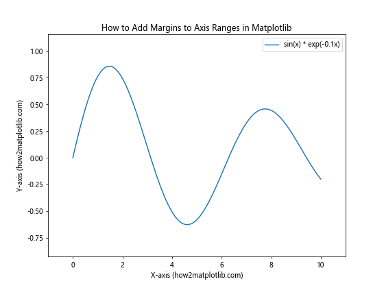
In this example, we use plt.margins(x=0.1, y=0.2) to add 10% padding to the x-axis and 20% padding to the y-axis. This can help prevent data points from being plotted too close to the edges of the plot.
Setting Axis Ranges for Subplots
When working with multiple subplots, you may want to set axis ranges for each subplot individually. Matplotlib allows you to do this using the set_xlim() and set_ylim() methods on each subplot’s axes object.
Here’s an example of how to set axis ranges for subplots:
import matplotlib.pyplot as plt
import numpy as np

# Generate some sample data
x = np.linspace(0, 10, 100)
y1 = np.sin(x)
y2 = np.cos(x)

# Create subplots
fig, (ax1, ax2) = plt.subplots(2, 1, figsize=(8, 10))

# Plot data on the first subplot
ax1.plot(x, y1, label='sin(x)')
ax1.set_xlim(0, 8)
ax1.set_ylim(-1.2, 1.2)
ax1.set_xlabel('X-axis (how2matplotlib.com)')
ax1.set_ylabel('Y-axis (how2matplotlib.com)')
ax1.set_title('Subplot 1: sin(x)')
ax1.legend()

# Plot data on the second subplot
ax2.plot(x, y2, label='cos(x)')
ax2.set_xlim(2, 10)
ax2.set_ylim(-1.5, 1.5)
ax2.set_xlabel('X-axis (how2matplotlib.com)')
ax2.set_ylabel('Y-axis (how2matplotlib.com)')
ax2.set_title('Subplot 2: cos(x)')
ax2.legend()

# Adjust layout and show the plot
plt.tight_layout()
plt.show()
Output:
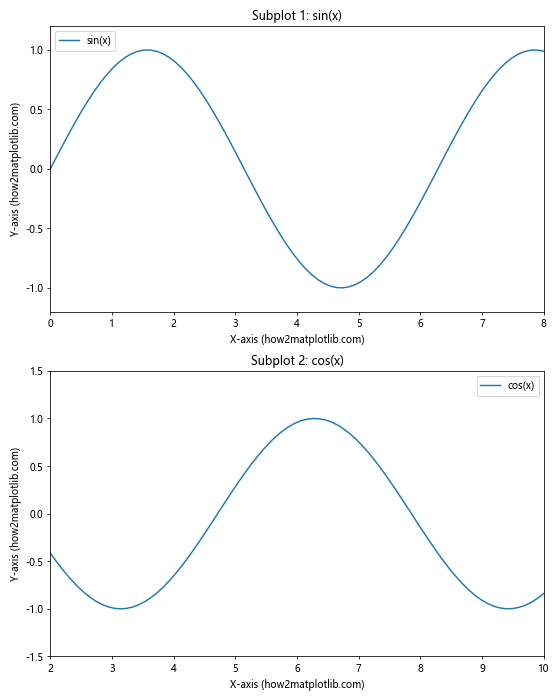
In this example, we create two subplots and set different axis ranges for each using the set_xlim() and set_ylim() methods on the individual axes objects (ax1 and ax2).
Setting Logarithmic Axis Scales
In some cases, you may need to plot data with a large range of values. In such situations, using a logarithmic scale can be helpful. Matplotlib allows you to set logarithmic scales for both x and y axes.
Here’s an example of how to set logarithmic axis scales:
import matplotlib.pyplot as plt
import numpy as np

# Generate some sample data
x = np.logspace(0, 5, 100)
y = x**2

# Create the plot
plt.figure(figsize=(8, 6))
plt.loglog(x, y, label='x^2')

# Set axis ranges
plt.xlim(1, 1e5)
plt.ylim(1, 1e10)

# Add labels and title
plt.xlabel('X-axis (log scale) (how2matplotlib.com)')
plt.ylabel('Y-axis (log scale) (how2matplotlib.com)')
plt.title('How to Set Logarithmic Axis Scales in Matplotlib')
plt.legend()

# Show the plot
plt.show()
Output:
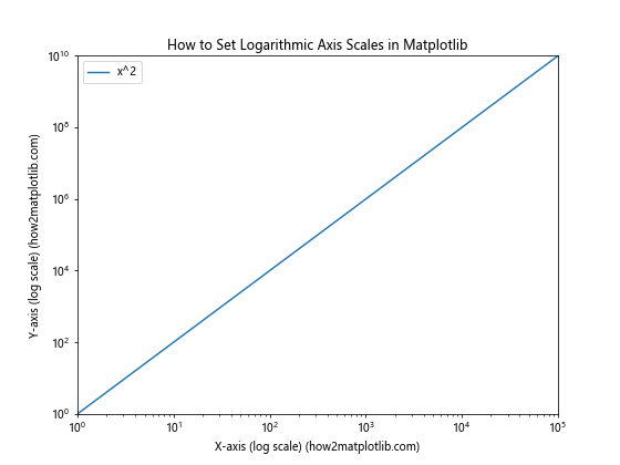
In this example, we use plt.loglog() to create a plot with logarithmic scales on both axes. We then set the axis ranges using plt.xlim() and plt.ylim(), specifying the ranges in the original (non-logarithmic) scale.
You can also set a logarithmic scale for just one axis using plt.semilogx() or plt.semilogy():
import matplotlib.pyplot as plt
import numpy as np

# Generate some sample data
x = np.linspace(1, 1000, 100)
y = np.log(x)

# Create the plot
plt.figure(figsize=(8, 6))
plt.semilogx(x, y, label='log(x)')

# Set axis ranges
plt.xlim(1, 1000)
plt.ylim(0, 8)

# Add labels and title
plt.xlabel('X-axis (log scale) (how2matplotlib.com)')
plt.ylabel('Y-axis (linear scale) (how2matplotlib.com)')
plt.title('How to Set Semi-Logarithmic Axis Scales in Matplotlib')
plt.legend()

# Show the plot
plt.show()
Output:
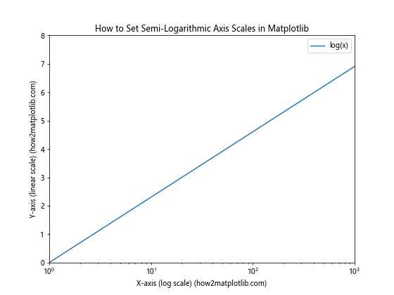
In this example, we use plt.semilogx() to create a plot with a logarithmic x-axis and a linear y-axis.
Setting Axis Ranges for Different Plot Types
The methods for setting axis ranges in Matplotlib can be applied to various types of plots, including scatter plots, bar plots, and histograms. Let’s look at some examples of how to set axis ranges for different plot types.
Bar Plots
Here’s an example of how to set axis ranges for a bar plot:
import matplotlib.pyplot as plt
import numpy as np

# Generate some sample data
categories = ['A', 'B', 'C', 'D', 'E']
values = np.random.randint(1, 10, 5)

# Create the bar plot
plt.figure(figsize=(8, 6))
plt.bar(categories, values)

# Set axis ranges
plt.ylim(0, 12)

# Add labels and title
plt.xlabel('Categories (how2matplotlib.com)')
plt.ylabel('Values (how2matplotlib.com)')
plt.title('How to Set Axis Ranges for Bar Plots in Matplotlib')

# Show the plot
plt.show()
Output:

In this example, we create a bar plot using plt.bar() and set the y-axis range using plt.ylim(). Note that for bar plots, you typically only need to set the y-axis range, as the x-axis is categorical.
Histograms
Here’s an example of how to set axis ranges for a histogram:
import matplotlib.pyplot as plt
import numpy as np

# Generate some sample data
data = np.random.normal(0, 1, 1000)

# Create the histogram
plt.figure(figsize=(8, 6))
plt.hist(data, bins=30, edgecolor='black')

# Set axis ranges
plt.xlim(-4, 4)
plt.ylim(0, 150)

# Add labels and title
plt.xlabel('Values (how2matplotlib.com)')
plt.ylabel('Frequency (how2matplotlib.com)')
plt.title('How to Set Axis Ranges for Histograms in Matplotlib')

# Show the plot
plt.show()
Output:
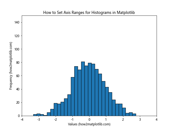
In this example, we create a histogram using plt.hist() and set both x and y-axis ranges using plt.xlim() and plt.ylim().
Advanced Techniques for Setting Axis Ranges
Now that we’ve covered the basics of how to set axis ranges in Matplotlib, let’s explore some more advanced techniques that can help you create even more customized and informative plots.
Using Scientific Notation for Axis Labels
When dealing with very large or very small numbers, it can be helpful to use scientific notation for axis labels. Matplotlib provides a way to do this using the ScalarFormatter class:
import matplotlib.pyplot as plt
import numpy as np
from matplotlib.ticker import ScalarFormatter

# Generate some sample data
x = np.linspace(1e-7, 1e-5, 100)
y = x**2

# Create the plot
plt.figure(figsize=(8, 6))
plt.plot(x, y, label='x^2')

# Set axis ranges
plt.xlim(1e-7, 1e-5)
plt.ylim(1e-14, 1e-10)

# Use scientific notation for axis labels
plt.gca().xaxis.set_major_formatter(ScalarFormatter(useMathText=True))
plt.gca().yaxis.set_major_formatter(ScalarFormatter(useMathText=True))

# Add labels and title
plt.xlabel('X-axis (how2matplotlib.com)')
plt.ylabel('Y-axis (how2matplotlib.com)')
plt.title('How to Use Scientific Notation for Axis Labels in Matplotlib')
plt.legend()

# Show the plot
plt.show()
Output:
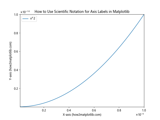
In this example, we use the ScalarFormatter class with useMathText=True to display axis labels in scientific notation.
Setting Different Scales for Left and Right Y-axes
Sometimes, you may want to plot two different datasets with different scales on the same graph. Matplotlib allows you to create a secondary y-axis with a different scale:
import matplotlib.pyplot as plt
import numpy as np

# Generate some sample data
x = np.linspace(0, 10, 100)
y1 = np.sin(x)
y2 = np.exp(x)

# Create the plot
fig, ax1 = plt.subplots(figsize=(8, 6))

# Plot the first dataset
color = 'tab:blue'
ax1.set_xlabel('X-axis (how2matplotlib.com)')
ax1.set_ylabel('sin(x) (how2matplotlib.com)', color=color)
ax1.plot(x, y1, color=color, label='sin(x)')
ax1.tick_params(axis='y', labelcolor=color)
ax1.set_ylim(-1.5, 1.5)

# Create a secondary y-axis
ax2 = ax1.twinx()
color = 'tab:orange'
ax2.set_ylabel('exp(x) (how2matplotlib.com)', color=color)
ax2.plot(x, y2, color=color, label='exp(x)')
ax2.tick_params(axis='y', labelcolor=color)
ax2.set_ylim(0, 25000)

# Add title and legend
plt.title('How to Set Different Scales for Left and Right Y-axes in Matplotlib')
fig.legend(loc='upper left', bbox_to_anchor=(0.1, 0.9))

# Show the plot
plt.show()
Output:
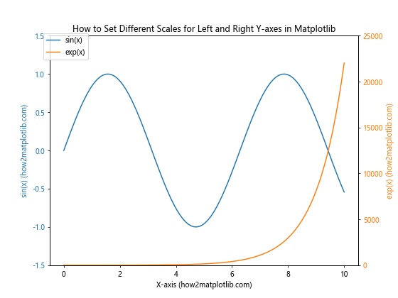
In this example, we create two y-axes with different scales using the twinx() method. This allows us to plot two datasets with vastly different ranges on the same graph.
Setting Axis Ranges with Date/Time Data
When working with time series data, you may need to set axis ranges using date and time values. Matplotlib provides support for date/time data through the matplotlib.dates module:
import matplotlib.pyplot as plt
import numpy as np
import matplotlib.dates as mdates
from datetime import datetime, timedelta

# Generate some sample data
start_date = datetime(2023, 1, 1)
dates = [start_date + timedelta(days=i) for i in range(100)]
values = np.cumsum(np.random.randn(100))

# Create the plot
plt.figure(figsize=(10, 6))
plt.plot(dates, values, label='Time series data')

# Set axis ranges
plt.xlim(datetime(2023, 2, 1), datetime(2023, 4, 1))
plt.ylim(-10, 10)

# Format x-axis ticks as dates
plt.gca().xaxis.set_major_formatter(mdates.DateFormatter('%Y-%m-%d'))
plt.gca().xaxis.set_major_locator(mdates.WeekdayLocator(byweekday=mdates.MO))
plt.gcf().autofmt_xdate()  # Rotate and align the tick labels

# Add labels and title
plt.xlabel('Date (how2matplotlib.com)')
plt.ylabel('Value (how2matplotlib.com)')
plt.title('How to Set Axis Ranges with Date/Time Data in Matplotlib')
plt.legend()

# Show the plot
plt.show()
Output:
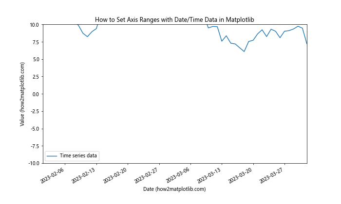
In this example, we use datetime objects to set the x-axis range and format the x-axis ticks as dates using matplotlib.dates.DateFormatter and matplotlib.dates.WeekdayLocator.
Best Practices for Setting Axis Ranges
When setting axis ranges in Matplotlib, it’s important to follow some best practices to ensure your plots are clear, informative, and visually appealing. Here are some tips on how to set axis ranges effectively:
- Choose appropriate ranges: Select axis ranges that encompass all your data points while minimizing empty space. This helps to maximize the use of the plot area and focus on the relevant data.
Consider the context: Think about the purpose of your plot and the message you want to convey. Sometimes, zooming in on a specific range can highlight important details, while other times, showing the full range provides a better overview.
Use consistent scales: When comparing multiple plots, try to use consistent axis ranges and scales to make comparisons easier and more meaningful.
Add padding: Include some padding around your data points to prevent them from being cut off at the edges of the plot. The
margins()function can be helpful for this.Use logarithmic scales when appropriate: For data that spans several orders of magnitude, consider using logarithmic scales to better visualize the relationships between data points.
Label axes clearly: Always include clear and informative labels for your axes, including units when applicable.
Consider the aspect ratio: For some types of plots (e.g., scatter plots of geographic data), maintaining a specific aspect ratio may be important. Use the
aspectparameter or theaxis('equal')method when necessary.Be mindful of zero: In many cases, including zero on the y-axis can provide important context. However, there are situations where starting from zero may not be necessary or may even be misleading.
Use scientific notation for very large or small numbers: When dealing with very large or small numbers, consider using scientific notation to make the axis labels more readable.
Test different ranges: Experiment with different axis ranges to find the most effective way to present your data. Sometimes, small adjustments can significantly improve the clarity of your plot.
Troubleshooting Common Issues
When learning how to set axis ranges in Matplotlib, you may encounter some common issues. Here are a few problems you might face and how to solve them: