How to Put the Y-Axis in Logarithmic Scale with Matplotlib
How to put the y-axis in logarithmic scale with Matplotlib is an essential skill for data visualization enthusiasts and professionals alike. Matplotlib, a powerful plotting library for Python, offers various ways to customize your plots, including the ability to set the y-axis to a logarithmic scale. This article will delve deep into the intricacies of using logarithmic scales in Matplotlib, providing you with a thorough understanding of the concept and its implementation.
Understanding Logarithmic Scales in Matplotlib
Before we dive into how to put the y-axis in logarithmic scale with Matplotlib, it’s crucial to understand what logarithmic scales are and why they’re useful. Logarithmic scales are particularly helpful when dealing with data that spans several orders of magnitude. They allow you to visualize and compare values that might otherwise be difficult to represent on a linear scale.
In Matplotlib, you can easily switch between linear and logarithmic scales for both the x and y axes. This article will focus primarily on how to put the y-axis in logarithmic scale with Matplotlib, but many of the concepts can be applied to the x-axis as well.
Let’s start with a simple example of how to put the y-axis in logarithmic scale with Matplotlib:
import matplotlib.pyplot as plt
import numpy as np

x = np.linspace(0, 10, 100)
y = np.exp(x)

plt.figure(figsize=(10, 6))
plt.plot(x, y, label='Exponential Growth')
plt.yscale('log')
plt.xlabel('X-axis')
plt.ylabel('Y-axis (log scale)')
plt.title('How to put the y-axis in logarithmic scale with Matplotlib - how2matplotlib.com')
plt.legend()
plt.grid(True)
plt.show()
Output:
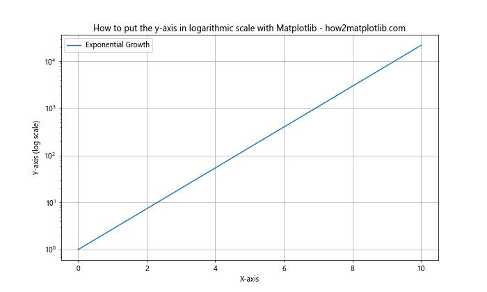
In this example, we’ve created a simple exponential function and plotted it using Matplotlib. The key line for setting the y-axis to a logarithmic scale is plt.yscale('log'). This single line transforms the y-axis from a linear scale to a logarithmic one.
Methods to Put the Y-Axis in Logarithmic Scale with Matplotlib
There are several methods you can use to put the y-axis in logarithmic scale with Matplotlib. Let’s explore each of these methods in detail.
Using plt.yscale()
The most straightforward method to put the y-axis in logarithmic scale with Matplotlib is by using the plt.yscale() function. This function allows you to set the scale of the y-axis to various types, including logarithmic.
Here’s an example of how to use plt.yscale():
import matplotlib.pyplot as plt
import numpy as np

x = np.linspace(1, 100, 100)
y = x**2

plt.figure(figsize=(10, 6))
plt.plot(x, y, label='Quadratic Function')
plt.yscale('log')
plt.xlabel('X-axis')
plt.ylabel('Y-axis (log scale)')
plt.title('How to put the y-axis in logarithmic scale with Matplotlib - how2matplotlib.com')
plt.legend()
plt.grid(True)
plt.show()
Output:
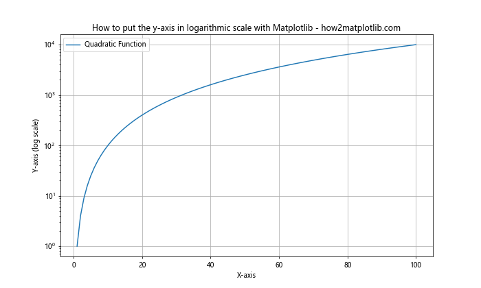
In this example, we’ve plotted a quadratic function and set the y-axis to a logarithmic scale using plt.yscale('log'). This method is simple and effective for most use cases.
Using ax.set_yscale()
Another method to put the y-axis in logarithmic scale with Matplotlib is by using the set_yscale() method of the Axes object. This method is particularly useful when you’re working with subplots or when you need more control over individual axes.
Here’s an example of how to use ax.set_yscale():
import matplotlib.pyplot as plt
import numpy as np

x = np.linspace(1, 100, 100)
y1 = x**2
y2 = x**3

fig, (ax1, ax2) = plt.subplots(1, 2, figsize=(15, 6))

ax1.plot(x, y1, label='Quadratic')
ax1.set_yscale('log')
ax1.set_title('Quadratic Function (Log Scale)')
ax1.set_xlabel('X-axis')
ax1.set_ylabel('Y-axis (log scale)')
ax1.legend()
ax1.grid(True)

ax2.plot(x, y2, label='Cubic')
ax2.set_yscale('log')
ax2.set_title('Cubic Function (Log Scale)')
ax2.set_xlabel('X-axis')
ax2.set_ylabel('Y-axis (log scale)')
ax2.legend()
ax2.grid(True)

plt.suptitle('How to put the y-axis in logarithmic scale with Matplotlib - how2matplotlib.com')
plt.tight_layout()
plt.show()
Output:
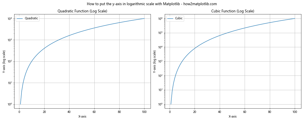
In this example, we’ve created two subplots, each with a different function plotted. We’ve used ax.set_yscale('log') to set the y-axis of each subplot to a logarithmic scale independently.
Using semilogx(), semilogy(), and loglog()
Matplotlib provides specialized functions for creating plots with logarithmic scales. These functions are semilogx(), semilogy(), and loglog(). The semilogy() function is particularly relevant when you want to put the y-axis in logarithmic scale with Matplotlib.
Here’s an example using semilogy():
import matplotlib.pyplot as plt
import numpy as np

x = np.linspace(0, 5, 100)
y = np.exp(x)

plt.figure(figsize=(10, 6))
plt.semilogy(x, y, label='Exponential Growth')
plt.xlabel('X-axis')
plt.ylabel('Y-axis (log scale)')
plt.title('How to put the y-axis in logarithmic scale with Matplotlib - how2matplotlib.com')
plt.legend()
plt.grid(True)
plt.show()
Output:
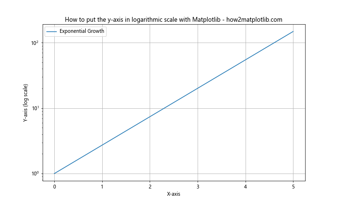
In this example, we’ve used plt.semilogy() to create a plot with a linear x-axis and a logarithmic y-axis. This function combines the plotting and scale-setting steps into one, making it a convenient option for many use cases.
Customizing Logarithmic Scales in Matplotlib
Now that we’ve covered the basics of how to put the y-axis in logarithmic scale with Matplotlib, let’s explore some ways to customize these logarithmic scales.
Setting the Base of the Logarithm
By default, Matplotlib uses base 10 for logarithmic scales. However, you can change this to any base you prefer. Here’s an example of how to set the base to 2:
import matplotlib.pyplot as plt
import numpy as np

x = np.linspace(1, 16, 100)
y = 2**x

plt.figure(figsize=(10, 6))
plt.plot(x, y)
plt.yscale('log', base=2)
plt.xlabel('X-axis')
plt.ylabel('Y-axis (log2 scale)')
plt.title('How to put the y-axis in logarithmic scale with Matplotlib - how2matplotlib.com')
plt.grid(True)
plt.show()
Output:
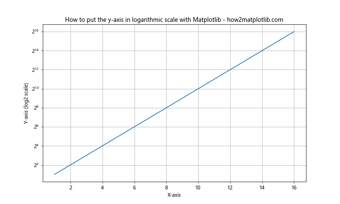
In this example, we’ve set the base of the logarithm to 2 using plt.yscale('log', base=2). This can be particularly useful when working with data that naturally fits a base-2 scale, such as computer memory sizes.
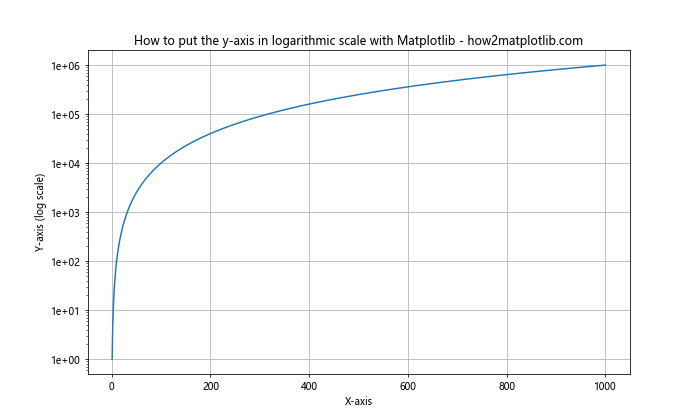
Customizing Tick Locations
When you put the y-axis in logarithmic scale with Matplotlib, you might want to customize the locations of the tick marks. You can do this using the LogLocator class from Matplotlib.
Here’s an example:
import matplotlib.pyplot as plt
from matplotlib.ticker import LogLocator
import numpy as np

x = np.linspace(1, 1000, 1000)
y = x**2

plt.figure(figsize=(10, 6))
plt.plot(x, y)
plt.yscale('log')
plt.gca().yaxis.set_major_locator(LogLocator(base=10, numticks=10))
plt.xlabel('X-axis')
plt.ylabel('Y-axis (log scale)')
plt.title('How to put the y-axis in logarithmic scale with Matplotlib - how2matplotlib.com')
plt.grid(True)
plt.show()
Output:

In this example, we’ve used LogLocator to set the major tick locations on the y-axis. We’ve specified that we want base-10 ticks and approximately 10 tick marks.
Customizing Tick Labels
In addition to customizing tick locations, you might want to format the tick labels when you put the y-axis in logarithmic scale with Matplotlib. You can do this using the FuncFormatter class.
Here’s an example:
import matplotlib.pyplot as plt
from matplotlib.ticker import FuncFormatter
import numpy as np

def format_func(value, tick_number):
    return f'{value:.0e}'

x = np.linspace(1, 1000, 1000)
y = x**2

plt.figure(figsize=(10, 6))
plt.plot(x, y)
plt.yscale('log')
plt.gca().yaxis.set_major_formatter(FuncFormatter(format_func))
plt.xlabel('X-axis')
plt.ylabel('Y-axis (log scale)')
plt.title('How to put the y-axis in logarithmic scale with Matplotlib - how2matplotlib.com')
plt.grid(True)
plt.show()
Output:
In this example, we’ve defined a custom formatting function that displays the tick labels in scientific notation. We then apply this formatter to the y-axis using set_major_formatter().
Handling Special Cases When Using Logarithmic Scales
When you put the y-axis in logarithmic scale with Matplotlib, you need to be aware of some special cases that can arise.
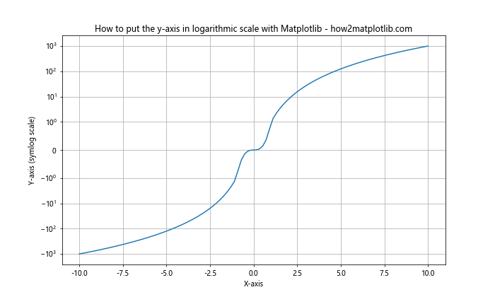
Dealing with Zero and Negative Values
Logarithmic scales can’t handle zero or negative values. If your data includes these, you’ll need to handle them specially. One approach is to use a symlog scale, which behaves linearly around zero and logarithmically for larger values.
Here’s an example:
import matplotlib.pyplot as plt
import numpy as np

x = np.linspace(-10, 10, 100)
y = x**3

plt.figure(figsize=(10, 6))
plt.plot(x, y)
plt.yscale('symlog', linthresh=0.1)
plt.xlabel('X-axis')
plt.ylabel('Y-axis (symlog scale)')
plt.title('How to put the y-axis in logarithmic scale with Matplotlib - how2matplotlib.com')
plt.grid(True)
plt.show()
Output:
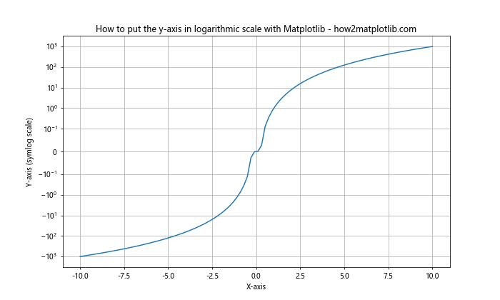
In this example, we’ve used plt.yscale('symlog', linthresh=0.1) to create a symlog scale. The linthresh parameter determines the range around zero where the scale behaves linearly.
Using LogNorm for Color Mapping
When creating heatmaps or scatter plots with color mapping, you might want to use a logarithmic scale for the colors. You can do this using LogNorm.
Here’s an example:
import matplotlib.pyplot as plt
from matplotlib.colors import LogNorm
import numpy as np

x = np.linspace(0, 5, 100)
y = np.linspace(0, 5, 100)
X, Y = np.meshgrid(x, y)
Z = np.exp(X) * np.exp(Y)

plt.figure(figsize=(10, 8))
plt.pcolormesh(X, Y, Z, norm=LogNorm())
plt.colorbar(label='Z-value (log scale)')
plt.xlabel('X-axis')
plt.ylabel('Y-axis')
plt.title('How to put the y-axis in logarithmic scale with Matplotlib - how2matplotlib.com')
plt.show()
Output:
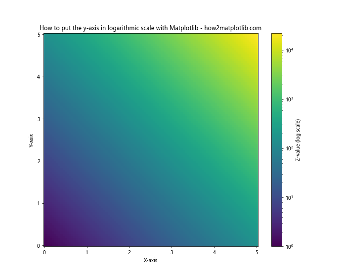
In this example, we’ve created a 2D heatmap where the color scale is logarithmic. This is achieved by passing norm=LogNorm() to the pcolormesh() function.
Combining Logarithmic Scales with Other Matplotlib Features
When you put the y-axis in logarithmic scale with Matplotlib, you can still use many of Matplotlib’s other features to enhance your plots.
Adding a Secondary Y-Axis
You can add a secondary y-axis with a different scale to your plot. This can be useful for comparing data with different magnitudes.
Here’s an example:
import matplotlib.pyplot as plt
import numpy as np

x = np.linspace(0, 10, 100)
y1 = np.exp(x)
y2 = x**2

fig, ax1 = plt.subplots(figsize=(10, 6))

color = 'tab:blue'
ax1.set_xlabel('X-axis')
ax1.set_ylabel('Y1 (log scale)', color=color)
ax1.semilogy(x, y1, color=color)
ax1.tick_params(axis='y', labelcolor=color)

ax2 = ax1.twinx()
color = 'tab:orange'
ax2.set_ylabel('Y2 (linear scale)', color=color)
ax2.plot(x, y2, color=color)
ax2.tick_params(axis='y', labelcolor=color)

plt.title('How to put the y-axis in logarithmic scale with Matplotlib - how2matplotlib.com')
plt.show()
Output:
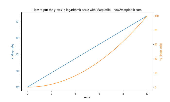
In this example, we’ve created a plot with two y-axes: one logarithmic (left) and one linear (right). This allows us to compare an exponential function with a quadratic function on the same plot.
Using Logarithmic Scales with Bar Plots
You can also use logarithmic scales with bar plots. This can be particularly useful when dealing with data that spans several orders of magnitude.
Here’s an example:
import matplotlib.pyplot as plt
import numpy as np

categories = ['A', 'B', 'C', 'D', 'E']
values = [10, 100, 1000, 10000, 100000]

plt.figure(figsize=(10, 6))
plt.bar(categories, values)
plt.yscale('log')
plt.xlabel('Categories')
plt.ylabel('Values (log scale)')
plt.title('How to put the y-axis in logarithmic scale with Matplotlib - how2matplotlib.com')
plt.show()
Output:
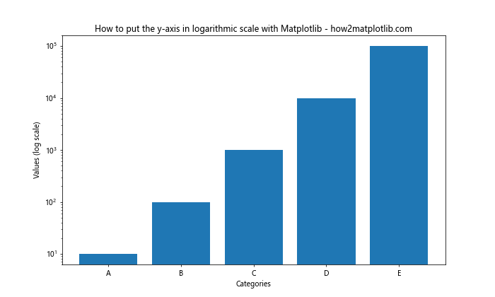
In this example, we’ve created a bar plot with a logarithmic y-axis. This allows us to clearly see the differences between values that span several orders of magnitude.
Best Practices When Using Logarithmic Scales
When you put the y-axis in logarithmic scale with Matplotlib, there are several best practices to keep in mind:
- Always clearly label your axes, indicating that a logarithmic scale is being used.
- Consider using a symlog scale if your data includes zero or negative values.
- Be aware that logarithmic scales can sometimes be misleading. Make sure your audience understands how to interpret them.
- Use appropriate tick locations and labels to make your plot easy to read.
- Consider using different bases (e.g., base 2 or base e) if they’re more appropriate for your data.
Here’s an example that incorporates some of these best practices:
import matplotlib.pyplot as plt
import numpy as np

x = np.linspace(1, 1000, 1000)
y = x**2

plt.figure(figsize=(10, 6))
plt.plot(x, y)
plt.xscale('log')
plt.yscale('log')
plt.xlabel('X-axis (log scale)')
plt.ylabel('Y-axis (log scale)')
plt.title('How to put the y-axis in logarithmic scale with Matplotlib - how2matplotlib.com')
plt.grid(True, which="both", ls="-", alpha=0.2)
plt.text(0.05, 0.95, 'Note: Both axes use logarithmic scales',
         transform=plt.gca().transAxes, fontsize=10, verticalalignment='top')
plt.show()
Output:
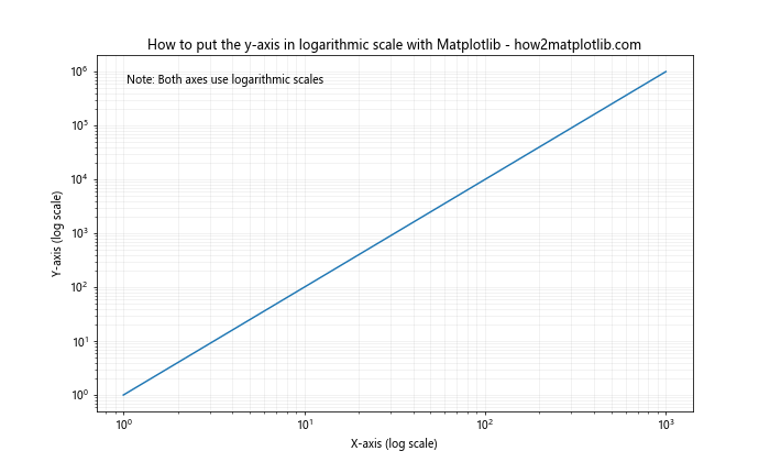
In this example, we’ve clearly labeled both axes as using logarithmic scales, added a grid to help with readability, and included a note about the use of logarithmic scales.
Troubleshooting Common Issues
When learning how to put the y-axis in logarithmic scale with Matplotlib, you might encounter some common issues. Let’s address a few of these:
Issue 1: ValueError: Data has no positive values, and therefore can not be log-scaled
This error occurs when you try to use a logarithmic scale with data that contains zero or negative values. To resolve this, you can either filter out non-positive values or use a symlog scale.
Here’s an example of how to handle this:
import matplotlib.pyplot as plt
import numpy as np

x = np.linspace(-10, 10, 100)
y = x**3

plt.figure(figsize=(10, 6))
plt.plot(x, y)
plt.yscale('symlog', linthresh=1)
plt.xlabel('X-axis')
plt.ylabel('Y-axis (symlog scale)')
plt.title('How to put the y-axis in logarithmic scale with Matplotlib - how2matplotlib.com')
plt.grid(True)
plt.show()
Output:
In this example, we’ve used a symlog scale to handle the negative values in our data.
Issue 2: Tick labels are overlapping
When you put the y-axis in logarithmic scale with Matplotlib, you might find that the tick labels overlap, especially if your data spans many orders of magnitude. You can resolve this by customizing the tick locations and labels.
Here’s an example:
import matplotlib.pyplot as plt
from matplotlib.ticker import LogLocator, FuncFormatter
import numpy as np

def format_func(value, tick_number):
    return f'{value:.0e}'

x = np.linspace(1, 1e6, 1000)
y = x**2

plt.figure(figsize=(10, 6))
plt.plot(x, y)
plt.yscale('log')
plt.gca().yaxis.set_major_locator(LogLocator(base=10, numticks=5))
plt.gca().yaxis.set_major_formatter(FuncFormatter(format_func))
plt.xlabel('X-axis')
plt.ylabel('Y-axis (log scale)')
plt.title('How to put the y-axis in logarithmic scale with Matplotlib - how2matplotlib.com')
plt.grid(True)
plt.show()
Output:
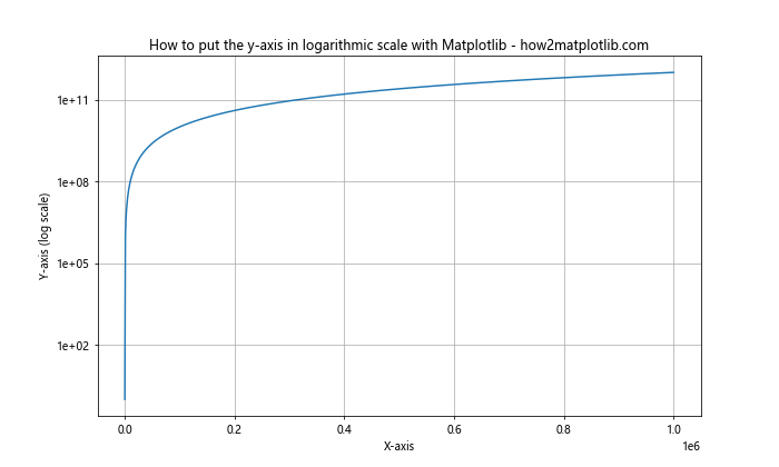
In this example, we’ve reduced the number of tick marks and formatted the labels to use scientific notation, which helps prevent overlapping.
Advanced Techniques for Logarithmic Scales in Matplotlib
As you become more comfortable with how to put the y-axis in logarithmic scale with Matplotlib, you might want to explore some more advanced techniques.
Creating Broken Axis Plots
When your data spans a very large range, you might want to create a broken axis plot. This involves creating two subplots with different scales and making them appear as if they’re part of the same plot.
Here’s an example of how to create a broken axis plot with a logarithmic scale:
import matplotlib.pyplot as plt
import numpy as np

x = np.linspace(0, 100, 1000)
y = np.exp(x/10)

fig, (ax1, ax2) = plt.subplots(2, 1, sharex=True, figsize=(10, 8))
fig.subplots_adjust(hspace=0.05)

ax1.plot(x, y)
ax1.set_ylim(1e20, 1e40)
ax1.set_yscale('log')

ax2.plot(x, y)
ax2.set_ylim(0, 1e5)
ax2.set_yscale('log')

ax1.spines['bottom'].set_visible(False)
ax2.spines['top'].set_visible(False)
ax1.xaxis.tick_top()
ax1.tick_params(labeltop=False)
ax2.xaxis.tick_bottom()

d = .015
kwargs = dict(transform=ax1.transAxes, color='k', clip_on=False)
ax1.plot((-d, +d), (-d, +d), **kwargs)
ax1.plot((1-d, 1+d), (-d, +d), **kwargs)

kwargs.update(transform=ax2.transAxes)
ax2.plot((-d, +d), (1-d, 1+d), **kwargs)
ax2.plot((1-d, 1+d), (1-d, 1+d), **kwargs)

plt.xlabel('X-axis')
fig.text(0.04, 0.5, 'Y-axis (log scale)', va='center', rotation='vertical')
plt.suptitle('How to put the y-axis in logarithmic scale with Matplotlib - how2matplotlib.com')
plt.show()
Output:
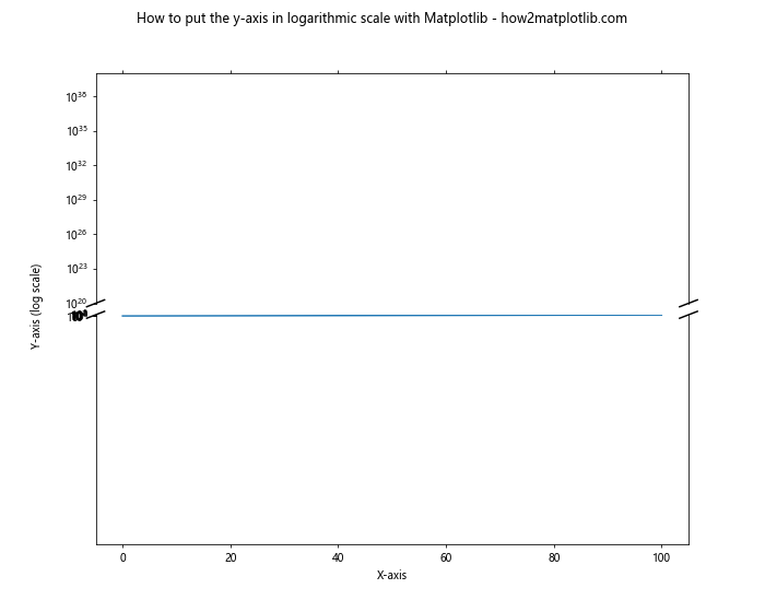
In this example, we’ve created two subplots with different y-axis ranges, both using logarithmic scales. We’ve then added diagonal lines to indicate that the axis is broken.
Conclusion
Learning how to put the y-axis in logarithmic scale with Matplotlib is an essential skill for data visualization. It allows you to effectively display data that spans several orders of magnitude, reveal patterns that might be hidden in linear scales, and create more informative and visually appealing plots.
Throughout this article, we’ve covered various methods to put the y-axis in logarithmic scale with Matplotlib, including using plt.yscale(), ax.set_yscale(), and specialized functions like semilogy(). We’ve also explored how to customize these logarithmic scales, handle special cases, combine logarithmic scales with other Matplotlib features, and troubleshoot common issues.
Remember, the key to effective data visualization is not just knowing how to create a plot, but understanding when and why to use different techniques. Logarithmic scales are powerful tools, but they should be used judiciously and always with clear labeling to ensure your audience can correctly interpret your visualizations.