Matplotlib Color: A Comprehensive Guide to Customizing Your Plots
Matplotlib Color is a crucial aspect of data visualization that can significantly enhance the clarity and impact of your plots. This comprehensive guide will explore the various ways to use color effectively in Matplotlib, from basic color specifications to advanced color mapping techniques. By mastering Matplotlib Color, you’ll be able to create visually appealing and informative plots that effectively communicate your data insights.
Matplotlib Color Recommended Articles
- Matplotlib color scales
- Matplotlib Color Palettes
- Matplotlib color names
- Matplotlib Color List
- Matplotlib Color Gradient
- Matplotlib Color by Column
- Matplotlib Color Based on Value
- Matplotlib Colors
- Matplotlib Line Colors
- How to Change Bar Color in Matplotlib
- Matplotlib Bar Colors
- Histogram Color with Matplotlib
- Blue Color in Matplotlib
- Matplotlib Histogram Color
Understanding Matplotlib Color Basics
Matplotlib Color provides a wide range of options for specifying colors in your plots. The most common methods include using color names, RGB values, and hexadecimal codes. Let’s explore these basic color specifications with some examples.
Using Color Names
Matplotlib supports a variety of predefined color names that you can use to specify colors in your plots. Here’s a simple example:
import matplotlib.pyplot as plt

plt.figure(figsize=(8, 6))
plt.plot([1, 2, 3, 4], [1, 4, 2, 3], color='red', label='Red Line')
plt.plot([1, 2, 3, 4], [2, 3, 4, 1], color='blue', label='Blue Line')
plt.title('Matplotlib Color Example - how2matplotlib.com')
plt.xlabel('X-axis')
plt.ylabel('Y-axis')
plt.legend()
plt.show()
Output:
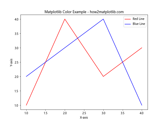
In this example, we create two line plots using the color names ‘red’ and ‘blue’. Matplotlib Color recognizes a wide range of color names, making it easy to specify colors without needing to remember specific color codes.
Using RGB Values
For more precise color control, you can use RGB (Red, Green, Blue) values to specify colors in Matplotlib. RGB values range from 0 to 1 for each color component. Here’s an example:
import matplotlib.pyplot as plt

plt.figure(figsize=(8, 6))
plt.plot([1, 2, 3, 4], [1, 4, 2, 3], color=(0.8, 0.2, 0.1), label='Custom Red')
plt.plot([1, 2, 3, 4], [2, 3, 4, 1], color=(0.1, 0.5, 0.9), label='Custom Blue')
plt.title('Matplotlib Color with RGB Values - how2matplotlib.com')
plt.xlabel('X-axis')
plt.ylabel('Y-axis')
plt.legend()
plt.show()
Output:
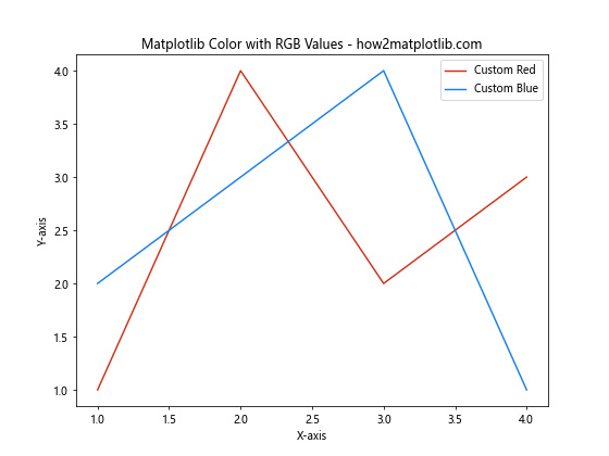
In this example, we use RGB tuples to specify custom shades of red and blue. The RGB values allow for fine-tuned color selection, giving you more control over the exact hues in your plots.
Using Hexadecimal Codes
Hexadecimal color codes are another popular method for specifying colors in Matplotlib. These codes consist of six characters representing the RGB values in hexadecimal format. Here’s an example:
import matplotlib.pyplot as plt

plt.figure(figsize=(8, 6))
plt.plot([1, 2, 3, 4], [1, 4, 2, 3], color='#FF5733', label='Custom Orange')
plt.plot([1, 2, 3, 4], [2, 3, 4, 1], color='#33FF57', label='Custom Green')
plt.title('Matplotlib Color with Hex Codes - how2matplotlib.com')
plt.xlabel('X-axis')
plt.ylabel('Y-axis')
plt.legend()
plt.show()
Output:
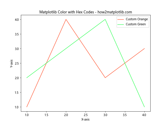
In this example, we use hexadecimal color codes to specify custom orange and green colors. Hexadecimal codes are widely used in web design and offer a convenient way to specify exact colors in Matplotlib.
Exploring Matplotlib Color Maps
Matplotlib Color maps are powerful tools for visualizing data distributions and relationships. Color maps allow you to map numerical values to a range of colors, creating visually appealing and informative plots. Let’s explore some examples of using color maps in Matplotlib.
Using Built-in Color Maps
Matplotlib provides a wide range of built-in color maps that you can use for various visualization purposes. Here’s an example using the ‘viridis’ color map:
import matplotlib.pyplot as plt
import numpy as np

x = np.linspace(0, 10, 100)
y = np.sin(x)
plt.figure(figsize=(10, 6))
plt.scatter(x, y, c=y, cmap='viridis')
plt.colorbar(label='Sin(x)')
plt.title('Matplotlib Color Map Example - how2matplotlib.com')
plt.xlabel('X-axis')
plt.ylabel('Y-axis')
plt.show()
Output:
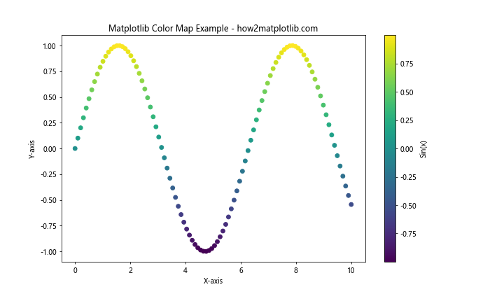
In this example, we create a scatter plot where the color of each point is determined by its y-value. The ‘viridis’ color map is used to map the y-values to colors, creating a visually appealing representation of the sine wave.
Creating Custom Color Maps
While Matplotlib offers many built-in color maps, you can also create custom color maps to suit your specific needs. Here’s an example of creating a custom color map:
import matplotlib.pyplot as plt
import matplotlib.colors as mcolors
import numpy as np

# Create a custom color map
colors = ['#FF0000', '#00FF00', '#0000FF']
n_bins = 100
cmap = mcolors.LinearSegmentedColormap.from_list('custom_cmap', colors, N=n_bins)

# Generate data
x = np.linspace(0, 10, 100)
y = np.cos(x)

plt.figure(figsize=(10, 6))
plt.scatter(x, y, c=y, cmap=cmap)
plt.colorbar(label='Cos(x)')
plt.title('Custom Matplotlib Color Map - how2matplotlib.com')
plt.xlabel('X-axis')
plt.ylabel('Y-axis')
plt.show()
Output:
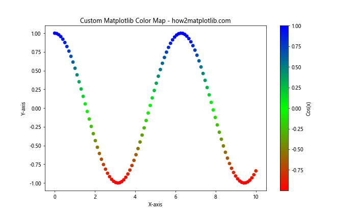
In this example, we create a custom color map using three colors: red, green, and blue. The custom color map is then applied to a scatter plot of the cosine function, demonstrating how you can create unique color schemes for your visualizations.
Applying Matplotlib Color to Different Plot Types
Matplotlib Color can be applied to various types of plots to enhance their visual appeal and convey information more effectively. Let’s explore how to use color in different plot types.
Bar Plots with Color
Bar plots are excellent for comparing categorical data. Using color effectively in bar plots can help distinguish between different categories. Here’s an example:
import matplotlib.pyplot as plt
import numpy as np

categories = ['A', 'B', 'C', 'D', 'E']
values = np.random.rand(5) * 10

plt.figure(figsize=(10, 6))
bars = plt.bar(categories, values, color=['#FF9999', '#66B2FF', '#99FF99', '#FFCC99', '#FF99CC'])

for bar in bars:
    height = bar.get_height()
    plt.text(bar.get_x() + bar.get_width()/2., height,
             f'{height:.2f}',
             ha='center', va='bottom')

plt.title('Colored Bar Plot - how2matplotlib.com')
plt.xlabel('Categories')
plt.ylabel('Values')
plt.show()
Output:
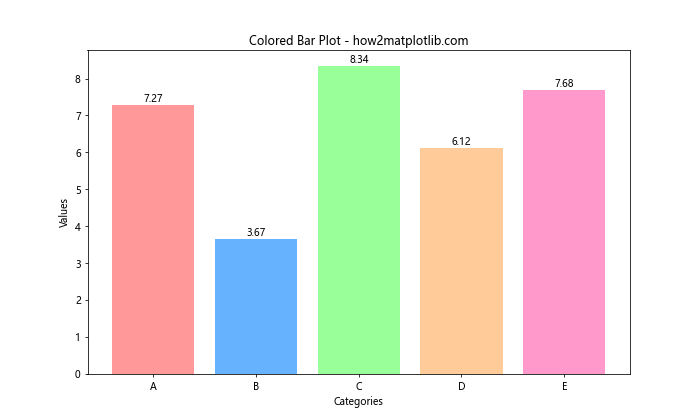
In this example, we create a bar plot with different colors for each category. We also add text labels to display the value of each bar, enhancing the information conveyed by the plot.
Pie Charts with Color
Pie charts are useful for showing the composition of a whole. Color plays a crucial role in distinguishing between different segments. Here’s an example:
import matplotlib.pyplot as plt

sizes = [30, 25, 20, 15, 10]
labels = ['A', 'B', 'C', 'D', 'E']
colors = ['#FF9999', '#66B2FF', '#99FF99', '#FFCC99', '#FF99CC']
explode = (0.1, 0, 0, 0, 0)  # explode the first slice

plt.figure(figsize=(10, 8))
plt.pie(sizes, explode=explode, labels=labels, colors=colors, autopct='%1.1f%%', startangle=90)
plt.axis('equal')  # Equal aspect ratio ensures that pie is drawn as a circle
plt.title('Colored Pie Chart - how2matplotlib.com')
plt.show()
Output:
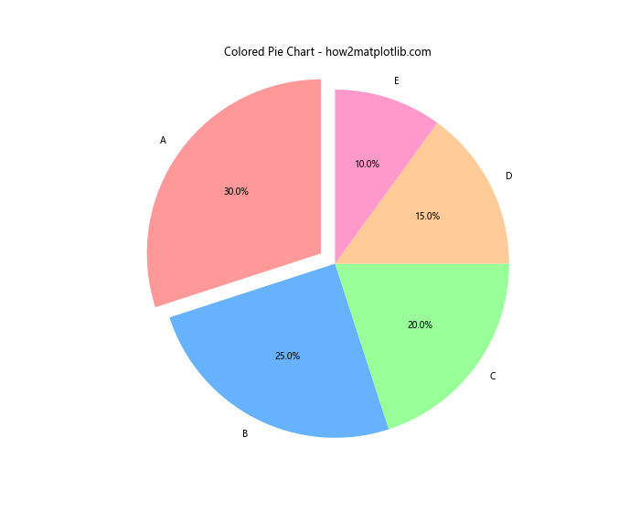
In this example, we create a pie chart with different colors for each segment. The explode parameter is used to emphasize the first slice by separating it slightly from the rest of the pie.
Heatmaps with Color
Heatmaps are excellent for visualizing 2D data distributions. Color is essential in heatmaps to represent the intensity or magnitude of values. Here’s an example:
import matplotlib.pyplot as plt
import numpy as np

data = np.random.rand(10, 10)
plt.figure(figsize=(10, 8))
heatmap = plt.imshow(data, cmap='YlOrRd')
plt.colorbar(heatmap)

plt.title('Heatmap with Matplotlib Color - how2matplotlib.com')
plt.xlabel('X-axis')
plt.ylabel('Y-axis')
plt.show()
Output:
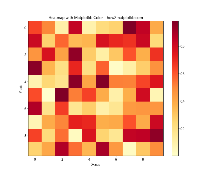
In this example, we create a heatmap using random data and the ‘YlOrRd’ (Yellow-Orange-Red) color map. The colorbar provides a reference for interpreting the color values in the heatmap.
Advanced Matplotlib Color Techniques
As you become more comfortable with basic Matplotlib Color usage, you can explore advanced techniques to create even more sophisticated and informative visualizations. Let’s dive into some advanced color techniques.
Color Normalization
Color normalization allows you to map your data to colors in a more controlled way. This is particularly useful when dealing with data that has outliers or when you want to emphasize certain ranges of values. Here’s an example:
import matplotlib.pyplot as plt
import matplotlib.colors as colors
import numpy as np

# Generate sample data
np.random.seed(42)
data = np.random.normal(loc=0, scale=1, size=(20, 20))

# Create a custom normalization
vmin, vmax = -2, 2
norm = colors.Normalize(vmin=vmin, vmax=vmax)

plt.figure(figsize=(10, 8))
heatmap = plt.imshow(data, cmap='coolwarm', norm=norm)
plt.colorbar(heatmap, label='Value')

plt.title('Heatmap with Color Normalization - how2matplotlib.com')
plt.xlabel('X-axis')
plt.ylabel('Y-axis')
plt.show()
Output:
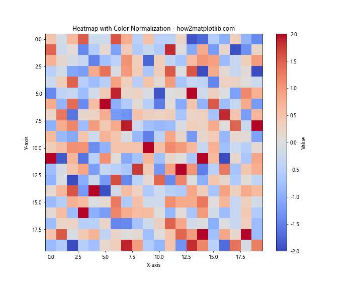
In this example, we use color normalization to map our data to a specific range (-2 to 2) in the ‘coolwarm’ color map. This technique ensures that the color scaling remains consistent even if the data contains outliers.
Discrete Color Maps
While continuous color maps are common, discrete color maps can be useful for categorical data or when you want to emphasize distinct levels in your data. Here’s an example of creating and using a discrete color map:
import matplotlib.pyplot as plt
import matplotlib.colors as colors
import numpy as np

# Create a discrete color map
n_bins = 5
cmap = plt.get_cmap('viridis', n_bins)
bounds = np.linspace(0, 1, n_bins + 1)
norm = colors.BoundaryNorm(bounds, cmap.N)

# Generate sample data
data = np.random.rand(10, 10)

plt.figure(figsize=(10, 8))
heatmap = plt.imshow(data, cmap=cmap, norm=norm)
plt.colorbar(heatmap, ticks=bounds[:-1] + 0.5 / n_bins, label='Value')

plt.title('Discrete Color Map - how2matplotlib.com')
plt.xlabel('X-axis')
plt.ylabel('Y-axis')
plt.show()
Output:
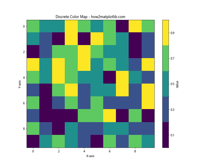
In this example, we create a discrete color map with 5 bins using the ‘viridis’ color scheme. This approach is useful when you want to categorize your data into distinct levels represented by different colors.
Alpha Blending
Alpha blending allows you to control the transparency of colors in your plots. This technique is particularly useful when overlaying multiple datasets or when you want to emphasize certain parts of your visualization. Here’s an example:
import matplotlib.pyplot as plt
import numpy as np

x = np.linspace(0, 10, 100)
y1 = np.sin(x)
y2 = np.cos(x)

plt.figure(figsize=(10, 6))
plt.plot(x, y1, color='red', alpha=0.7, label='Sin(x)')
plt.plot(x, y2, color='blue', alpha=0.7, label='Cos(x)')
plt.fill_between(x, y1, y2, color='purple', alpha=0.3)

plt.title('Alpha Blending in Matplotlib Color - how2matplotlib.com')
plt.xlabel('X-axis')
plt.ylabel('Y-axis')
plt.legend()
plt.grid(True, alpha=0.3)
plt.show()
Output:
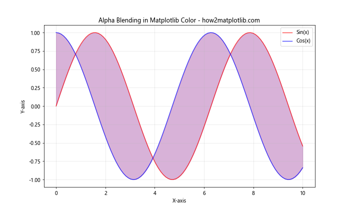
In this example, we use alpha blending to create semi-transparent lines and a filled area between two curves. The alpha parameter controls the opacity of each element, allowing for better visualization of overlapping areas.
Matplotlib Color in 3D Plots
Matplotlib Color can also be applied to 3D plots, adding an extra dimension of information to your visualizations. Let’s explore how to use color effectively in 3D plots.
3D Surface Plots with Color
3D surface plots are excellent for visualizing functions of two variables. Color can be used to represent the height or another dimension of the data. Here’s an example:
import matplotlib.pyplot as plt
import numpy as np
from mpl_toolkits.mplot3d import Axes3D

fig = plt.figure(figsize=(12, 8))
ax = fig.add_subplot(111, projection='3d')

x = np.linspace(-5, 5, 100)
y = np.linspace(-5, 5, 100)
X, Y = np.meshgrid(x, y)
Z = np.sin(np.sqrt(X**2 + Y**2))

surface = ax.plot_surface(X, Y, Z, cmap='viridis', edgecolor='none')
fig.colorbar(surface, ax=ax, shrink=0.5, aspect=5, label='Z value')

ax.set_title('3D Surface Plot with Matplotlib Color - how2matplotlib.com')
ax.set_xlabel('X-axis')
ax.set_ylabel('Y-axis')
ax.set_zlabel('Z-axis')

plt.show()
Output:
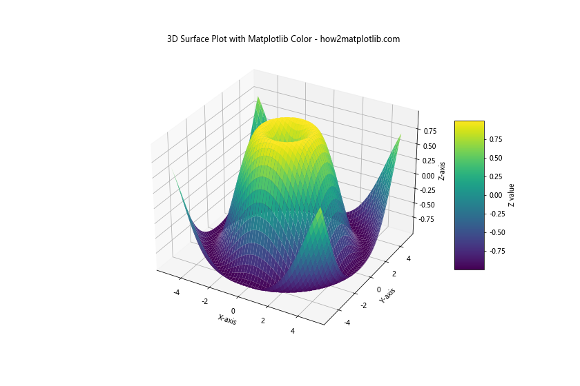
In this example, we create a 3D surface plot of a two-variable function. The ‘viridis’ color map is used to represent the Z-values, providing an additional dimension of information through color.
3D Scatter Plots with Color
3D scatter plots can benefit from color to represent an additional dimension of data. Here’s an example:
import matplotlib.pyplot as plt
import numpy as np
from mpl_toolkits.mplot3d import Axes3D

fig = plt.figure(figsize=(12, 8))
ax = fig.add_subplot(111, projection='3d')

n = 100
x = np.random.rand(n)
y = np.random.rand(n)
z = np.random.rand(n)
c = np.random.rand(n)

scatter = ax.scatter(x, y, z, c=c, cmap='plasma')
fig.colorbar(scatter, ax=ax, shrink=0.5, aspect=5, label='Color Value')

ax.set_title('3D Scatter Plot with Matplotlib Color - how2matplotlib.com')
ax.set_xlabel('X-axis')
ax.set_ylabel('Y-axis')
ax.set_zlabel('Z-axis')

plt.show()
Output:
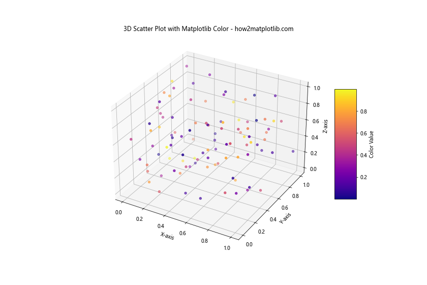
In this example, we create a 3D scatter plot where the color of each point represents a fourth dimension of data. This technique allows you to visualize four-dimensional data in a three-dimensional space.
Customizing Matplotlib Color Cycles
Matplotlib uses a default color cycle for plotting multiple datasets. However, you can customize this color cycle to suit your needs or to maintain consistency with your project’s color scheme.
Setting a Custom Color Cycle
Here’s an example of how to set a custom color cycle:
import matplotlib.pyplot as plt
import numpy as np

# Define a custom color cycle
custom_colors = ['#FF9999', '#66B2FF', '#99FF99', '#FFCC99', '#FF99CC']
plt.rcParams['axes.prop_cycle'] = plt.cycler(color=custom_colors)

# Generate sample data
x = np.linspace(0, 10, 100)
y1 = np.sin(x)
y2 = np.cos(x)
y3 = np.tan(x)
y4 = x**2
y5 = x**3

plt.figure(figsize=(12, 8))
plt.plot(x, y1, label='Sin(x)')
plt.plot(x, y2, label='Cos(x)')
plt.plot(x, y3, label='Tan(x)')
plt.plot(x, y4, label='x^2')
plt.plot(x, y5, label='x^3')

plt.title('Custom Color Cycle in Matplotlib - how2matplotlib.com')
plt.xlabel('X-axis')
plt.ylabel('Y-axis')
plt.legend()
plt.grid(True, alpha=0.3)
plt.show()
Output:
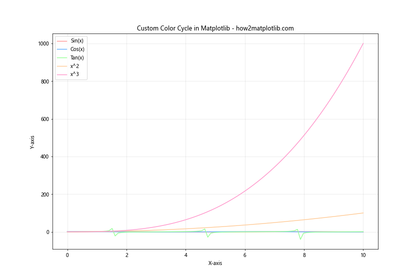
In this example, we define a custom color cycle using a list of hexadecimal color codes. By setting plt.rcParams['axes.prop_cycle'], we ensure that these colors are used cyclically for each new line plot. This approach is particularly useful when creating multiple plots with consistent color schemes.
Matplotlib Color and Accessibility
When using Matplotlib Color, it’s important to consider accessibility to ensure that your visualizations are easily interpretable by all users, including those with color vision deficiencies. Here are some techniques to improve the accessibility of your plots.
Using Colorblind-Friendly Color Maps
Matplotlib provides several color maps that are designed to be perceptually uniform and accessible to individuals with color vision deficiencies. Here’s an example using the ‘viridis’ color map, which is known for its accessibility:
import matplotlib.pyplot as plt
import numpy as np

# Generate sample data
x = np.linspace(0, 10, 100)
y = np.sin(x)

plt.figure(figsize=(12, 8))
scatter = plt.scatter(x, y, c=y, cmap='viridis')
plt.colorbar(scatter, label='Sin(x)')

plt.title('Colorblind-Friendly Plot using Viridis - how2matplotlib.com')
plt.xlabel('X-axis')
plt.ylabel('Y-axis')
plt.show()
Output:
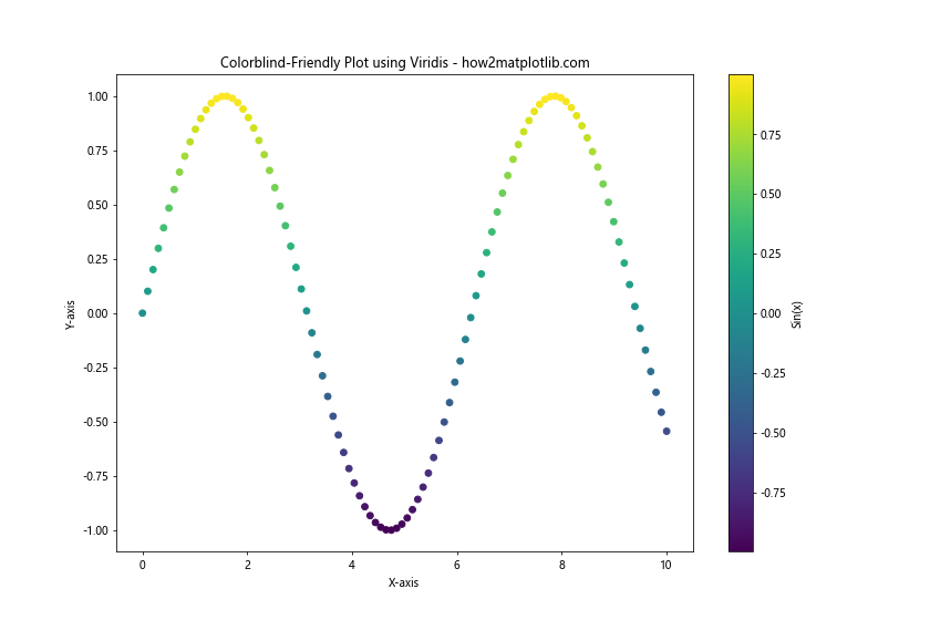
The ‘viridis’ color map used in this example is designed to be perceptually uniform and accessible to individuals with various forms of color vision deficiency.
Combining Color with Other Visual Cues
To further improve accessibility, it’s often helpful to combine color with other visual cues such as markers, line styles, or patterns. Here’s an example:
import matplotlib.pyplot as plt
import numpy as np

x = np.linspace(0, 10, 100)
y1 = np.sin(x)
y2 = np.cos(x)

plt.figure(figsize=(12, 8))
plt.plot(x, y1, color='blue', linestyle='-', marker='o', markevery=10, label='Sin(x)')
plt.plot(x, y2, color='red', linestyle='--', marker='s', markevery=10, label='Cos(x)')

plt.title('Combining Color with Other Visual Cues - how2matplotlib.com')
plt.xlabel('X-axis')
plt.ylabel('Y-axis')
plt.legend()
plt.grid(True, alpha=0.3)
plt.show()
Output:
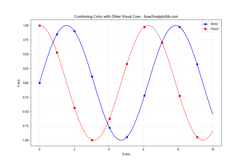
In this example, we use different colors, line styles, and markers to distinguish between the two plotted functions. This combination of visual cues makes the plot more accessible and easier to interpret for all users.
Advanced Matplotlib Color Techniques for Data Analysis
Matplotlib Color can be a powerful tool for data analysis, helping to reveal patterns and relationships in complex datasets. Let’s explore some advanced techniques for using color in data analysis.
Bivariate Color Maps
Bivariate color maps allow you to visualize the relationship between two variables using color. Here’s an example:
import matplotlib.pyplot as plt
import numpy as np

# Generate sample data
x = np.random.randn(1000)
y = x + np.random.randn(1000) * 0.5

# Create a bivariate color map
h, xedges, yedges = np.histogram2d(x, y, bins=20)
extent = [xedges[0], xedges[-1], yedges[0], yedges[-1]]

plt.figure(figsize=(12, 8))
plt.imshow(h.T, extent=extent, origin='lower', cmap='viridis')
plt.colorbar(label='Frequency')

plt.title('Bivariate Color Map - how2matplotlib.com')
plt.xlabel('X-axis')
plt.ylabel('Y-axis')
plt.show()
Output:
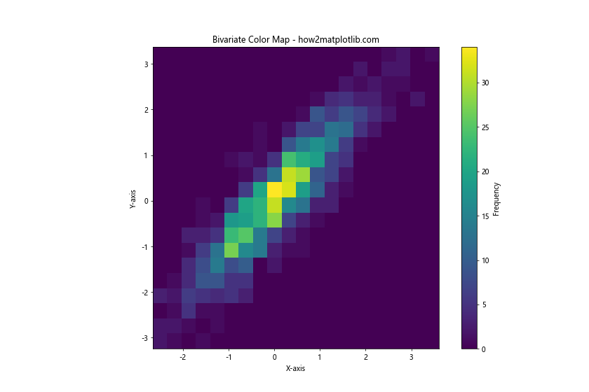
In this example, we create a bivariate color map to visualize the relationship between two variables. The color intensity represents the frequency of data points in each bin, allowing us to see patterns in the joint distribution of the variables.
Color-Coded Clustering
Color can be used effectively to visualize the results of clustering algorithms. Here’s an example using K-means clustering:
import matplotlib.pyplot as plt
import numpy as np
from sklearn.cluster import KMeans

# Generate sample data
np.random.seed(42)
X = np.random.randn(300, 2)
X[:100] += [2, 2]
X[100:200] += [-2, -2]

# Perform K-means clustering
kmeans = KMeans(n_clusters=3)
kmeans.fit(X)
y_kmeans = kmeans.predict(X)

plt.figure(figsize=(12, 8))
scatter = plt.scatter(X[:, 0], X[:, 1], c=y_kmeans, cmap='viridis')
centers = kmeans.cluster_centers_
plt.scatter(centers[:, 0], centers[:, 1], c='red', s=200, alpha=0.75, marker='X')
plt.colorbar(scatter, label='Cluster')

plt.title('Color-Coded Clustering Results - how2matplotlib.com')
plt.xlabel('X-axis')
plt.ylabel('Y-axis')
plt.show()
Output:
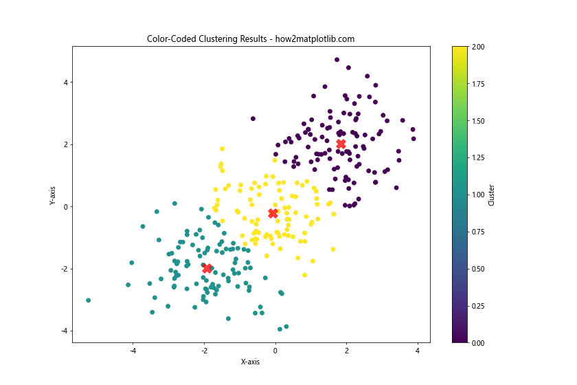
In this example, we use color to visualize the results of K-means clustering. Each cluster is assigned a different color, making it easy to identify the groupings in the data.
Matplotlib Color Conclusion
Matplotlib Color is a powerful tool for enhancing data visualizations and conveying complex information effectively. From basic color specifications to advanced techniques like custom color maps, normalization, and accessibility considerations, mastering Matplotlib Color can significantly improve the quality and impact of your data visualizations.
By exploring the various aspects of Matplotlib Color covered in this guide, you’ll be well-equipped to create visually appealing and informative plots that effectively communicate your data insights. Remember to consider the context of your data, your audience, and the message you want to convey when choosing colors for your visualizations.
As you continue to work with Matplotlib Color, experiment with different techniques and color schemes to find what works best for your specific data and visualization needs. With practice and creativity, you’ll be able to leverage the full potential of Matplotlib Color to create stunning and informative data visualizations.