matplotlib color names
Matplotlib is a popular plotting library in Python that provides a wide variety of customization options for visualizing data. One of the customization options in Matplotlib is the ability to specify colors using predefined color names. In this article, we will explore the different color names available in Matplotlib and how to use them in your plots.
Getting Started
To use color names in Matplotlib, you can simply pass the name of the color as a string to the color parameter in the plotting functions. Matplotlib supports a wide range of color names, including common colors such as "red", "blue", and "green", as well as more exotic names like "turquoise" and "orchid".
Here is an example of how to create a plot using a predefined color name:
import matplotlib.pyplot as plt

x = [1, 2, 3, 4, 5]
y = [10, 20, 15, 25, 30]

plt.plot(x, y, color='blue')
plt.show()
Output:

This code snippet creates a simple line plot with the color set to "blue".
List of Available Color Names
Matplotlib provides a predefined list of color names that you can use in your plots. Here is a list of some common color names available in Matplotlib:
"blue""red""green""black""purple""orange""yellow""cyan""magenta""brown"
You can also use CSS-like color names in Matplotlib, such as "darkorange", "skyblue", and "lightcoral". These color names provide more options for customizing the colors in your plots.
Using Color Names in Plots
Let’s explore how to use color names in different types of plots in Matplotlib.
Line Plot
You can specify the color of a line plot using a color name. Here is an example:
import matplotlib.pyplot as plt

x = [1, 2, 3, 4, 5]
y = [10, 20, 15, 25, 30]

plt.plot(x, y, color='green')
plt.show()
Output:

Scatter Plot
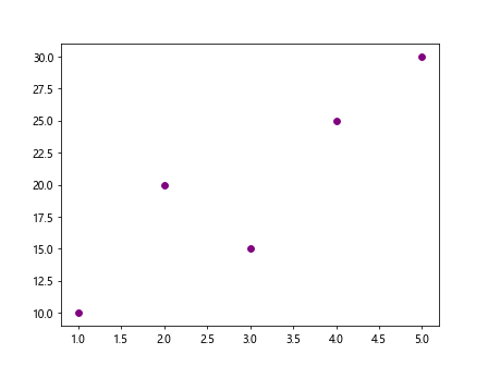
In a scatter plot, you can set the color of the markers using a color name. Here is an example:
import matplotlib.pyplot as plt

x = [1, 2, 3, 4, 5]
y = [10, 20, 15, 25, 30]

plt.scatter(x, y, color='purple')
plt.show()
Output:
Bar Plot
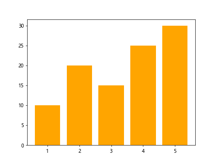
For a bar plot, you can specify the color of the bars using a color name. Here is an example:
import matplotlib.pyplot as plt

x = [1, 2, 3, 4, 5]
y = [10, 20, 15, 25, 30]

plt.bar(x, y, color='orange')
plt.show()
Output:
Pie Chart
In a pie chart, you can set the colors of the wedges using color names. Here is an example:
import matplotlib.pyplot as plt

sizes = [15, 30, 45, 10]
labels = ['A', 'B', 'C', 'D']

plt.pie(sizes, labels=labels, colors=['blue', 'red', 'green', 'purple'])
plt.show()
Output:

Customizing Colors
In addition to using predefined color names, you can also specify colors using RGB values or hex color codes in Matplotlib. This gives you more control over the exact shade of color you want to use in your plots.
RGB Values
You can specify colors using RGB values in Matplotlib by passing a tuple with three values representing the red, green, and blue components. Here is an example:
import matplotlib.pyplot as plt

x = [1, 2, 3, 4, 5]
y = [10, 20, 15, 25, 30]

plt.plot(x, y, color=(0.3, 0.5, 0.7))
plt.show()
Output:

Hex Color Codes
Similarly, you can use hex color codes to specify colors in Matplotlib. Hex color codes are a way of representing colors using a hexadecimal notation. Here is an example:
import matplotlib.pyplot as plt

x = [1, 2, 3, 4, 5]
y = [10, 20, 15, 25, 30]

plt.plot(x, y, color='#ff0000')
plt.show()
Output:

Using RGB values or hex color codes allows you to create more custom colors in your plots and match specific color schemes or branding requirements.
Conclusion
In this article, we have explored how to use predefined color names in Matplotlib to customize the colors in your plots. By using color names, you can quickly set the color of different elements in your plots without having to specify RGB values or hex color codes. Experiment with different color names to find the perfect color scheme for your data visualizations.