Histogram Color with Matplotlib
Histograms are a great way to visualize the distribution of data. Matplotlib is a popular plotting library for Python that allows you to create various types of plots, including histograms. In this article, we will explore how to customize the color of histograms in Matplotlib.
Simple Histogram with Default Color
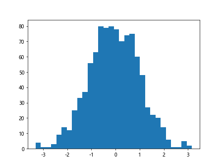
Let’s start by creating a simple histogram using Matplotlib with the default color.
import matplotlib.pyplot as plt
import numpy as np

data = np.random.randn(1000)
plt.hist(data, bins=30)
plt.show()
Output:
Customizing Histogram Color
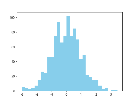
You can customize the color of the histogram by specifying the color parameter in the hist function. Here’s an example:
import matplotlib.pyplot as plt
import numpy as np

data = np.random.randn(1000)

plt.hist(data, bins=30, color='skyblue')
plt.show()
Output:
Customizing Edge Color
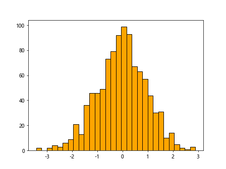
You can also customize the edge color of the bars in the histogram by specifying the edgecolor parameter. Here’s an example:
import matplotlib.pyplot as plt
import numpy as np

data = np.random.randn(1000)

plt.hist(data, bins=30, color='orange', edgecolor='black')
plt.show()
Output:
Adding Transparency
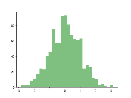
If you want to add transparency to the bars in the histogram, you can specify the alpha parameter. Here’s an example:
import matplotlib.pyplot as plt
import numpy as np

data = np.random.randn(1000)

plt.hist(data, bins=30, color='green', alpha=0.5)
plt.show()
Output:
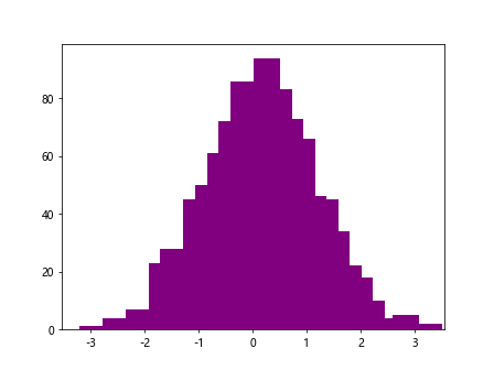
Setting Bar Width
You can adjust the width of the bars in the histogram using the width parameter. Here’s an example:
import matplotlib.pyplot as plt
import numpy as np

data = np.random.randn(1000)

plt.hist(data, bins=30, color='purple', width=0.5)
plt.show()
Output:
Using Colormap
Matplotlib provides a variety of colormaps that you can use to color the bars in the histogram. Here’s an example using the cividis colormap:
import matplotlib.pyplot as plt
import numpy as np

data = np.random.randn(1000)

plt.hist(data, bins=30, cmap='cividis')
plt.show()
Setting Colormap Range
You can adjust the range of the colormap using the vmin and vmax parameters. Here’s an example:
import matplotlib.pyplot as plt
import numpy as np

data = np.random.randn(1000)

plt.hist(data, bins=30, cmap='plasma', vmin=-2, vmax=2)
plt.show()
Reversing Colormap
If you want to reverse the order of the colors in the colormap, you can use the rstride parameter. Here’s an example:
import matplotlib.pyplot as plt
import numpy as np

data = np.random.randn(1000)

plt.hist(data, bins=30, cmap='viridis', rstride=-1)
plt.show()
Adding Colorbar
You can add a colorbar to the histogram to show the mapping of colors to values. Here’s an example:
import matplotlib.pyplot as plt
import numpy as np

data = np.random.randn(1000)

plt.hist(data, bins=30, cmap='magma')
plt.colorbar()
plt.show()
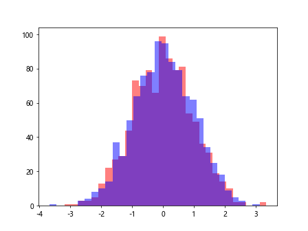
Adding Multiple Histograms with Different Colors
You can plot multiple histograms with different colors on the same plot using the alpha parameter. Here’s an example:
import matplotlib.pyplot as plt
import numpy as np

data = np.random.randn(1000)

data1 = np.random.randn(1000)
data2 = np.random.randn(1000)
plt.hist(data1, bins=30, color='red', alpha=0.5)
plt.hist(data2, bins=30, color='blue', alpha=0.5)
plt.show()
Output:
Conclusion
In this article, we explored various ways to customize the color of histograms in Matplotlib. From specifying the color and edge color to using colormaps and adding transparency, there are many options available to make your histograms visually appealing. Experiment with these examples and see how you can create stunning visualizations with Matplotlib.