How to Change Bar Color in Matplotlib
Matplotlib is a popular Python library used for creating visualizations, including bar charts. By default, Matplotlib assigns a different color to each bar in a bar chart. However, you may want to customize the colors of the bars to make your visualizations more aesthetically pleasing or to convey certain information more effectively. In this article, we will explore how to change the bar color in Matplotlib.
1. Changing Bar Colors Using the color Parameter
One simple way to change the colors of bars in a bar chart in Matplotlib is by specifying the color parameter when creating the bar chart. This parameter allows you to pass a list of colors that will be applied to each bar in the chart. Here is an example of how you can create a bar chart with custom colors:
import matplotlib.pyplot as plt

# Data
x = ['A', 'B', 'C', 'D']
y = [10, 20, 15, 25]
colors = ['blue', 'green', 'red', 'purple']

# Create bar chart with custom colors
plt.bar(x, y, color=colors)
plt.show()
Output:
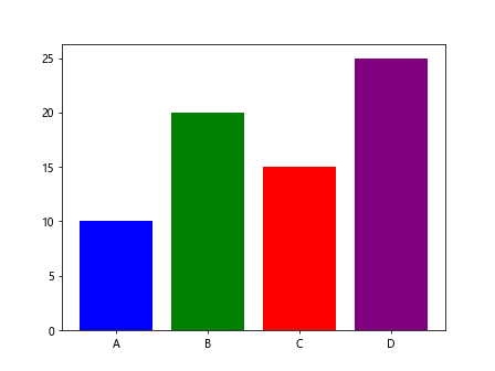
In the code snippet above, we define a list of colors (colors) that corresponds to each bar in the chart. By passing this list to the color parameter in the plt.bar() function, we can customize the colors of the bars in the chart.
2. Changing Bar Colors Using Colormaps
Matplotlib provides colormaps that can be used to assign a range of colors to the bars in a bar chart based on their values. This can be particularly useful when you want to visualize the distribution of a variable or show trends in the data. You can use the cmap parameter to specify a colormap that will be applied to the bars. Here is an example:
import matplotlib.pyplot as plt

# Data
x = ['A', 'B', 'C', 'D']
y = [10, 20, 15, 25]

# Create bar chart with colormap
plt.bar(x, y, cmap='viridis')
plt.show()
In the code snippet above, we use the cmap parameter with the value 'viridis' to apply the Viridis colormap to the bars in the chart. Matplotlib provides a variety of colormaps that you can choose from to customize the colors of the bars in your visualization.
3. Changing Bar Colors Conditionally
Sometimes you may want to change the colors of the bars in a bar chart based on certain conditions or thresholds in the data. This can help emphasize important values or highlight specific patterns in the data. You can achieve this by using conditional statements to assign different colors to each bar. Here is an example:
import matplotlib.pyplot as plt

# Data
x = ['A', 'B', 'C', 'D']
y = [10, 20, 15, 25]
colors = ['red' if value > 15 else 'blue' for value in y]

# Create bar chart with conditional colors
plt.bar(x, y, color=colors)
plt.show()
Output:
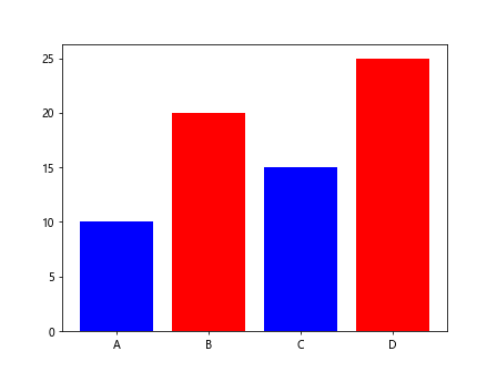
In the code snippet above, we use a list comprehension to create a list of colors based on a condition (i.e., if the value in y is greater than 15, the color is set to ‘red’; otherwise, it is set to ‘blue’). This allows you to customize the colors of the bars in the chart based on the data values.
4. Assigning Different Colors to Positive and Negative Bars
In some cases, you may want to differentiate between positive and negative values in a bar chart by assigning different colors to the bars. This can be achieved by using conditional statements to check the sign of the data values and assigning colors accordingly. Here is an example:
import matplotlib.pyplot as plt

# Data
x = ['A', 'B', 'C', 'D']
y = [10, -20, 15, -25]
colors = ['red' if value < 0 else 'blue' for value in y]

# Create bar chart with positive and negative colors
plt.bar(x, y, color=colors)
plt.show()
Output:
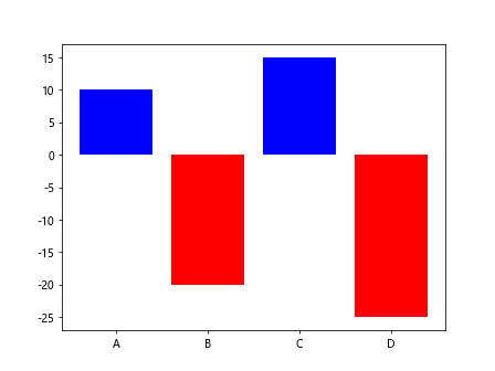
In the code snippet above, we check if the value in y is less than 0, and if so, we assign the color 'red' to the bar; otherwise, we assign the color 'blue'. This allows you to visually distinguish between positive and negative values in the bar chart.
5. Using Hexadecimal Color Codes
If you want to specify custom colors for the bars in a bar chart using hexadecimal color codes, you can do so by passing the color codes as strings to the color parameter. This gives you more control over the colors used in your visualizations. Here is an example:
import matplotlib.pyplot as plt

# Data
x = ['A', 'B', 'C', 'D']
y = [10, 20, 15, 25]
colors = ['#FF5733', '#33FF57', '#3366FF', '#FF3366']

# Create bar chart with custom hex color codes
plt.bar(x, y, color=colors)
plt.show()
Output:
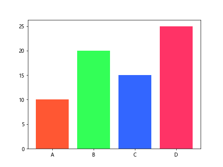
In the code snippet above, we define a list of hexadecimal color codes (colors) that correspond to each bar in the chart. By passing these color codes to the color parameter in the plt.bar() function, we can customize the colors of the bars in the chart using the specified hexadecimal values.
6. Using RGBA Color Values
Another way to specify custom colors for the bars in a bar chart is by using RGBA (Red, Green, Blue, Alpha) color values. RGBA values allow you to control the transparency of the colors used in the visualization. You can pass the RGBA values as tuples to the color parameter. Here is an example:
import matplotlib.pyplot as plt

# Data
x = ['A', 'B', 'C', 'D']
y = [10, 20, 15, 25]
colors = [(1, 0, 0, 0.5), (0, 1, 0, 0.5), (0, 0, 1, 0.5), (1, 1, 0, 0.5)]

# Create bar chart with custom RGBA color values
plt.bar(x, y, color=colors)
plt.show()
Output:
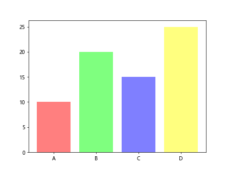
In the code snippet above, we define a list of RGBA color values (colors) as tuples, where each tuple consists of the Red, Green, Blue, and Alpha values. The alpha value controls the transparency of the colors, allowing you to create visually appealing bar charts with varying levels of transparency.
7. Using Seaborn Color Palette
Seaborn is a data visualization library based on Matplotlib that provides additional functionality for creating visually appealing plots. Seaborn includes built-in color palettes that you can use to customize the colors of the bars in a bar chart. Here is an example:
import matplotlib.pyplot as plt
import seaborn as sns

# Data
x = ['A', 'B', 'C', 'D']
y = [10, 20, 15, 25]

# Set Seaborn color palette
sns.set_palette('husl')

# Create bar chart with Seaborn color palette
plt.bar(x, y)
plt.show()
Output:
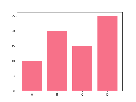
In the code snippet above, we use the sns.set_palette() function from Seaborn to set the color palette to 'husl', which stands for Hue, Saturation, and Lightness. This allows you to apply a predefined color palette to the bars in the bar chart, giving your visualization a more polished and professional look.
8. Creating a Colorbar for Bar Colors
If you want to add a colorbar to your bar chart to provide a visual representation of the color mapping used for the bars, you can do so by using the ScalarMappable and colorbar functions from the Matplotlib library. This can be especially useful when using colormaps to assign colors to the bars based on their values. Here is an example:
import matplotlib.pyplot as plt
import numpy as np
import matplotlib.cm as cm

# Data
x = ['A', 'B', 'C', 'D']
y = [10, 20, 15, 25]

# Create bar chart with colormap
bars = plt.bar(x, y, color=cm.viridis(np.linspace(0, 1, len(x))))

# Create colorbar
mappable = cm.ScalarMappable(cmap=cm.viridis)
mappable.set_array([])
cbar = plt.colorbar(mappable)
cbar.set_label('Color Mapping')

plt.show()
In the code snippet above, we use the cm.viridis() colormap from Matplotlib to assign colors to the bars in the bar chart based on their values. We then create a colorbar using the ScalarMappable and colorbar functions to display the color mapping used for the bars in the chart.
9. Changing Bar Color Based on Data Range
If you want to customize the colors of the bars in a bar chart based on a specific data range or threshold, you can do so by creating a custom colormap using the ListedColormap class from the Matplotlib library. This allows you to define a range of colors that will be applied to the bars based on their values. Here is an example:
import matplotlib.pyplot as plt
import numpy as np
import matplotlib.colors as mcolors

# Data
x = ['A', 'B', 'C', 'D']
y = [10, 20, 15, 25]

# Define custom color range
colors = ['red', 'yellow', 'green']
boundaries = [10, 15, 20, 25]
cmap = mcolors.ListedColormap(colors)

# Create bar chart with custom color range
plt.bar(x, y, cmap=cmap, norm=mcolors.BoundaryNorm(boundaries, len(colors)-1))
plt.colorbar(plt.cm.ScalarMappable(cmap=cmap))
plt.show()
In the code snippet above, we define a custom color range (colors) and boundaries based on the data values. We then create a custom colormap using the ListedColormap class and apply it to the bars in the bar chart. This allows you to assign colors to the bars based on specific data ranges or thresholds.
10. Changing Bar Edge Colors
In addition to changing the fill colors of the bars in a bar chart, you may also want to customize the edge colors of the bars to make them stand out or blend in with the background. You can achieve this by setting the edgecolor parameter when creating the bar chart. Here is an example:
import matplotlib.pyplot as plt

# Data
x = ['A', 'B', 'C', 'D']
y = [10, 20, 15, 25]

# Create bar chart with custom edge color
plt.bar(x, y, edgecolor='black')
plt.show()
Output:
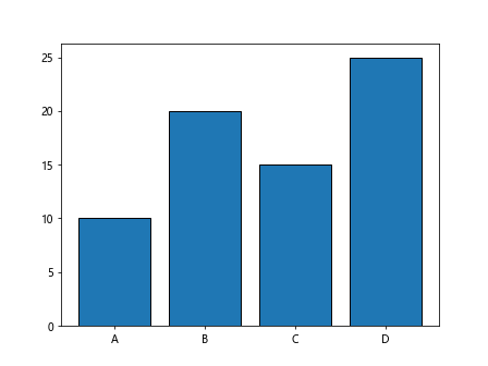
In the code snippet above, we set the edgecolor parameter to 'black' when creating the bar chart. This adds a black border to each bar in the chart, making them more visually distinct from the background and enhancing the overall appearance of the visualization.
Conclusion
In this article, we have explored various methods for changing the bar colors in Matplotlib bar charts. By using different techniques such as specifying custom colors, using colormaps, applying conditional color changes, and utilizing Seaborn color palettes, you can create visually appealing and informative bar charts that effectively convey your data. Experiment with these methods and customize the colors of your bar charts to create engaging and impactful visualizations.