Pyplot Errorbar
In data visualization, error bars are used to indicate the variability in the data. They are often added to plots to show the uncertainty or accuracy of the data points. In this article, we will explore how to create error bars in plots using the pyplot.errorbar function in Matplotlib.
Basic Errorbar Plot
Let’s start by creating a simple error bar plot using random data. The errorbar function takes the x and y coordinates of the data points, as well as the x and y error bars.
import matplotlib.pyplot as plt
import numpy as np

x = np.linspace(0, 10, 10)
y = np.sin(x)
yerr = 0.1 + 0.2 * np.sqrt(x)

plt.errorbar(x, y, yerr=yerr)
plt.show()
Output:
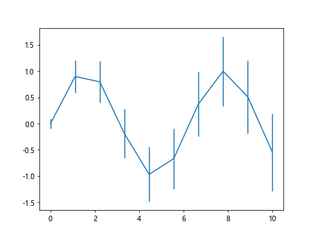
In this example, we generate random data for the x values, y values (sine function), and y error bars. The errorbar function plots the data points with error bars on the y-axis according to the specified error.
Customizing Errorbar Plot
You can customize the error bar plot by changing the color, linewidth, markers, and error bar style. Here is an example:
import matplotlib.pyplot as plt
import numpy as np

x = np.arange(10)
y = np.power(x, 2)
yerr = np.sqrt(x)

plt.errorbar(x, y, yerr=yerr, color='green', linestyle='--',
             marker='o', markersize=8, capsize=3, elinewidth=2)
plt.show()
Output:
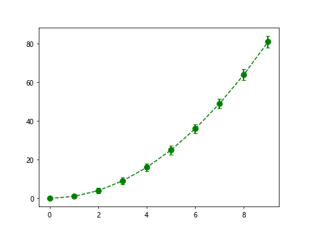
In this code snippet, we change the color to green, linestyle to dashed, marker to circle, markersize to 8, capsize to 3, and linewidth of the error bar to 2.
Multiple Errorbar Plots
You can also plot multiple error bars on the same plot for better comparison. Here is an example:
import matplotlib.pyplot as plt
import numpy as np

x = np.linspace(0, 10, 20)
y1 = np.sin(x)
y2 = np.cos(x)
yerr1 = 0.1 + 0.2 * np.sqrt(x)
yerr2 = 0.2 + 0.1 * np.sqrt(x)

plt.errorbar(x, y1, yerr=yerr1, label='sin(x)')
plt.errorbar(x, y2, yerr=yerr2, label='cos(x)', color='red', linestyle='dashed')
plt.legend()
plt.show()
Output:
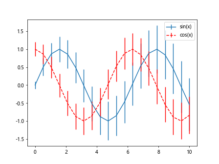
In this code snippet, we plot the sine and cosine functions with their respective error bars on the same plot and add a legend for better understanding.
Bar Plot with Errorbars
You can also add error bars to bar plots in Matplotlib. Here is an example:
import matplotlib.pyplot as plt
import numpy as np

x = np.arange(5)
y = np.random.rand(5)
yerr = 0.1 + 0.2 * np.sqrt(x)

plt.bar(x, y, yerr=yerr, capsize=5)
plt.show()
Output:
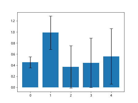
In this code snippet, we create a bar plot with random data and add error bars to each bar according to the specified error.
Horizontal Error Bars
By default, error bars are vertical, but you can also plot horizontal error bars. Here is an example:
import matplotlib.pyplot as plt
import numpy as np

x = np.arange(5)
y = np.random.rand(5)
xerr = 0.1 + 0.2 * np.sqrt(x)

plt.errorbar(x, y, xerr=xerr, fmt='o', ecolor='red')
plt.show()
Output:
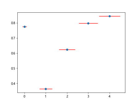
In this code snippet, we create a plot with horizontal error bars by specifying the xerr parameter instead of yerr.
Adding Annotations to Error Bars
You can add annotations to error bars to provide additional information. Here is an example:
import matplotlib.pyplot as plt
import numpy as np

x = np.arange(5)
y = np.random.rand(5)
yerr = 0.1 + 0.2 * np.sqrt(x)

plt.errorbar(x, y, yerr=yerr, fmt='o', ecolor='purple', elinewidth=2)

for i, txt in enumerate(y):
    plt.annotate(f'{y[i]:.2f}', (x[i], y[i]), textcoords='offset points', xytext=(0,10), ha='center', color='blue')

plt.show()
Output:
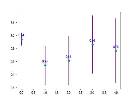
In this code snippet, we add annotations to each data point on the plot with the value of y to provide more context.
Log Scale Errorbar Plot
You can also create error bar plots with a logarithmic scale. Here is an example:
import matplotlib.pyplot as plt
import numpy as np

x = np.linspace(0, 10, 20)
y = np.power(10, x)
yerr = 0.1 + 0.2 * np.sqrt(x)

plt.errorbar(x, y, yerr=yerr)
plt.yscale('log')
plt.show()
Output:
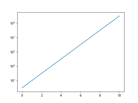
In this code snippet, we generate data points with a logarithmic scale for the y-axis, and the error bars are also plotted on the logarithmic scale.
Polar Errorbar Plot
You can create error bar plots in a polar coordinate system. Here is an example:
import matplotlib.pyplot as plt
import numpy as np

theta = np.linspace(0, 2*np.pi, 20)
r = np.abs(np.sin(2*theta))
theta_err = np.random.uniform(0.1, 0.2, 20)

plt.errorbar(theta, r, xerr=theta_err, fmt='o', ecolor='magenta')
plt.polar(theta, r)
plt.show()
In this code snippet, we generate polar data points, plot the error bars with a unique marker color, and create a polar plot using the polar function.
Subplots with Errorbars
You can create subplots with error bars to visualize multiple datasets side by side. Here is an example:
import matplotlib.pyplot as plt
import numpy as np

x = np.arange(10)
y = np.sin(x)
yerr = 0.1 + 0.2 * np.sqrt(x)

fig, axs = plt.subplots(2)
axs[0].errorbar(x, y, yerr=yerr, label='Dataset 1')
axs[1].errorbar(x, y**2, yerr=yerr/2, label='Dataset 2', color='red')
plt.tight_layout()
plt.show()
Output:
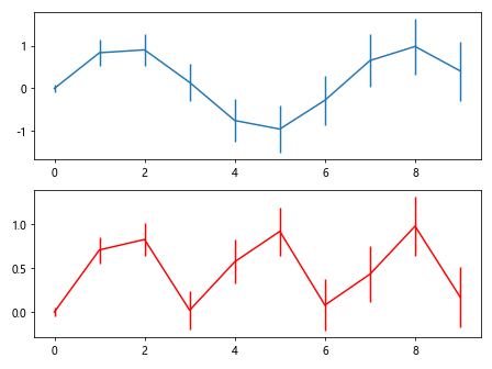
In this code snippet, we create two subplots to display two datasets with error bars and labels for each subplot.
Grouped Errorbars
You can also create grouped error bars for grouped bar plots. Here is an example:
import matplotlib.pyplot as plt
import numpy as np

labels = ['A', 'B', 'C', 'D']
x = np.arange(len(labels))
y1 = np.random.rand(len(labels))
y2 = np.random.rand(len(labels))
yerr1 = 0.1 + 0.2 * np.sqrt(x)
yerr2 = 0.1 + 0.1 * np.sqrt(x)

width = 0.35
plt.bar(x - width/2, y1, width, yerr=yerr1, label='Group 1')
plt.bar(x + width/2, y2, width, yerr=yerr2, label='Group 2', color='red')
plt.xticks(x, labels)
plt.legend()
plt.show()
Output:
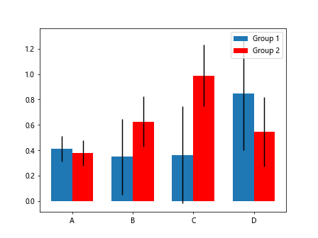
In this code snippet, we create grouped bar plots with error bars for each group to compare two datasets more effectively.
Real-world Example: Errorbar Plot of Temperature Data
Let’s analyze a real-world example where we have a dataset containing temperature values and their corresponding error bars. We will plot the temperature data with error bars to visualize the temperature variability.
import pandas as pd
import matplotlib.pyplot as plt
import numpy as np

# Create a sample temperature dataset with error bars
data = {
    'Temperature': [20, 22, 23, 25, 21],
    'Error': [1, 2, 1.5, 1.8, 1.2]
}

df = pd.DataFrame(data)
x = np.arange(len(df))

plt.errorbar(x, df['Temperature'], yerr=df['Error'], fmt='o', ecolor='green')
plt.xticks(x, ['Day 1', 'Day 2', 'Day 3', 'Day 4', 'Day 5'])
plt.ylabel('Temperature (°C)')
plt.title('Temperature Variation')
plt.show()
Output:
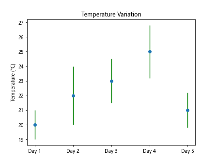
In this example, we create a sample temperature dataset with error bars and plot the temperature values with their corresponding error bars to visualize the temperature variation over five days.
Pyplot Errorbar Conclusion
In this article, we have explored how to create errorbars in plots using the pyplot.errorbar function in Matplotlib. We have covered various aspects of error bar plots, including basic error bar plots, customizing error bar plots, multiple error bar plots, bar plots with error bars, horizontal error bars, annotations, log scale error bar plots, polar error bar plots, subplots with error bars, grouped error bars, and a real-world example.
By understanding how to use error bars effectively in data visualization, you can communicate the uncertainty or variability in your data more clearly. Whether you are plotting experimental results, analyzing statistical data, or presenting research findings, error bars play a crucial role in conveying the reliability of your data.
Experiment with different styles, colors, and marker types to create error bar plots that effectively communicate the variability in your data. Combine error bars with other visualization techniques to create insightful and informative plots that help viewers understand the data better.