Colormap
Colormap is an essential component in data visualization, especially in fields like data analysis, image processing, and computer graphics. It is used to represent data values with different colors based on a specific color mapping scheme. In this article, we will explore various aspects of colormaps, including types of colormaps, how to create custom colormaps, and how to apply them in data visualization using Python’s Matplotlib library.
Types of Colormaps
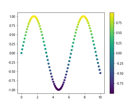
Sequential Colormaps
Sequential colormaps are used when data values increase or decrease continuously. They are suitable for representing ordered data such as temperature, elevation, or time series data.
Example code:
import matplotlib.pyplot as plt
import numpy as np

x = np.linspace(0, 10, 100)
y = np.sin(x)

plt.figure()
plt.scatter(x, y, c=y, cmap='viridis')
plt.colorbar()
plt.show()
Output:
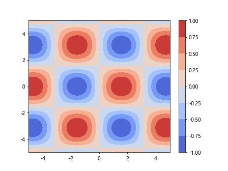
Diverging Colormaps
Diverging colormaps are used to highlight the midpoint of a dataset. They are suitable for visualizing data that has a clear central value, such as the difference between two values.
Example code:
import matplotlib.pyplot as plt
import numpy as np

x = np.linspace(-5, 5, 100)
y = np.linspace(-5, 5, 100)
X, Y = np.meshgrid(x, y)
Z = np.sin(X) * np.cos(Y)

plt.figure()
plt.contourf(X, Y, Z, cmap='coolwarm')
plt.colorbar()
plt.show()
Output:
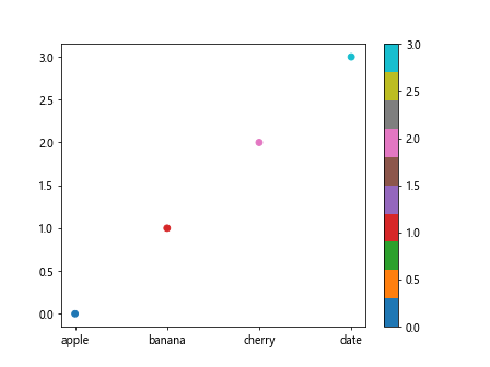
Qualitative Colormaps
Qualitative colormaps are used for categorical data where distinctions between values are more important than the ordering.
Example code:
import matplotlib.pyplot as plt
import numpy as np

categories = ['apple', 'banana', 'cherry', 'date']
values = np.arange(len(categories))

plt.figure()
plt.scatter(values, values, c=values, cmap='tab10')
plt.xticks(values, categories)
plt.colorbar()
plt.show()
Output:
Creating Custom Colormaps
Matplotlib allows users to create custom colormaps by defining the colors and boundaries for different values.
Example code:
import matplotlib.colors as mcolors
import numpy as np

colors = ['#FF0000', '#00FF00', '#0000FF']
bounds = [0, 0.5, 1]
cmap = mcolors.ListedColormap(colors)
norm = mcolors.BoundaryNorm(bounds, cmap.N)

x = np.linspace(0, 1, 100)
y = np.cos(4 * np.pi * x)

plt.figure()
plt.scatter(x, y, c=y, cmap=cmap, norm=norm)
plt.colorbar()
plt.show()
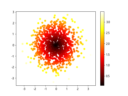
Applying Colormaps in Data Visualization
Colormaps can be easily applied in various types of data visualizations using Matplotlib, such as scatter plots, contour plots, and images.
Scatter Plot
Example code:
import matplotlib.pyplot as plt
import numpy as np

x = np.random.randn(1000)
y = np.random.randn(1000)

plt.figure()
plt.scatter(x, y, c=np.sqrt(x**2 + y**2), cmap='hot')
plt.colorbar()
plt.show()
Output:
Contour Plot
Example code:
import matplotlib.pyplot as plt
import numpy as np

x = np.linspace(-5, 5, 100)
y = np.linspace(-5, 5, 100)
X, Y = np.meshgrid(x, y)
Z = np.sin(X) * np.cos(Y)

plt.figure()
plt.contourf(X, Y, Z, cmap='spring')
plt.colorbar()
plt.show()
Output:
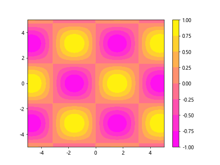
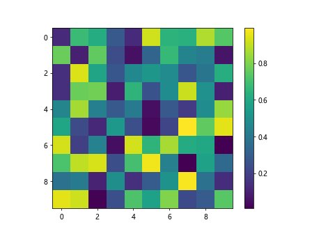
Image Plot
Example code:
import matplotlib.pyplot as plt
import numpy as np

data = np.random.random((10, 10))

plt.figure()
plt.imshow(data, cmap='viridis')
plt.colorbar()
plt.show()
Output:
In conclusion, colormaps play a crucial role in data visualization by helping to represent data values effectively. Understanding the types of colormaps available, creating custom colormaps, and applying them in data visualization can greatly enhance the readability and interpretation of data visualizations. Matplotlib provides a wide range of colormaps to choose from, along with the flexibility to create custom colormaps to suit specific visualization needs. Whether it is a scatter plot, contour plot, or image plot, colormaps can make a significant impact on the visual representation of data.