Heatmap in Matplotlib
Heatmaps are a type of data visualization that uses color coding to represent values in a matrix. They are commonly used to display correlations, distributions, and patterns within large datasets. In this article, we will delve into how to create heatmaps using Matplotlib, a popular plotting library in Python.
Installing Matplotlib
Before getting started with creating heatmaps, you will need to install Matplotlib if you haven’t already. You can install it using pip by running the following command:
pip install matplotlib
Once you have Matplotlib installed, you can start creating heatmaps for your data.
Creating a Basic Heatmap
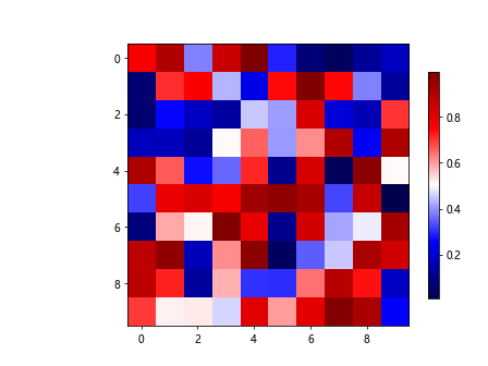
To create a basic heatmap in Matplotlib, you can use the imshow function along with a color map to represent the data. Let’s start by generating some random data and plotting it as a heatmap.
import numpy as np
import matplotlib.pyplot as plt

# Generate random data
data = np.random.rand(10, 10)

# Create a basic heatmap
plt.imshow(data, cmap='viridis')
plt.colorbar()
plt.show()
Output:
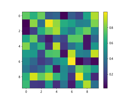
In this example, we generate a 10×10 matrix of random numbers and display it as a heatmap using the ‘viridis’ color map. The colorbar function adds a color legend to the plot to show the mapping of colors to values.
Customizing Heatmap Colors
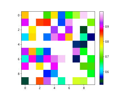
You can customize the colors of the heatmap by using different color maps or by setting custom color thresholds. Let’s create a heatmap with custom colors based on the values in our data.
import numpy as np
import matplotlib.pyplot as plt

# Generate random data
data = np.random.rand(10, 10)

# Create a custom heatmap with specified colors
plt.imshow(data, cmap='RdYlBu', vmin=0, vmax=1)
plt.colorbar()
plt.show()
Output:
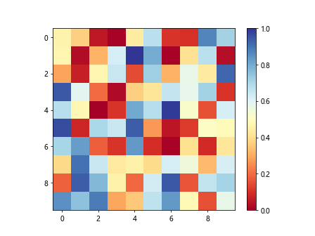
In this example, we are using the ‘RdYlBu’ color map and setting the minimum and maximum values for the color scale to 0 and 1, respectively.
Adding Annotations to Heatmap
Annotations can be added to the heatmap to provide additional context or information about the data points. Let’s add annotations to the heatmap using the text function.
import numpy as np
import matplotlib.pyplot as plt

# Generate random data
data = np.random.rand(10, 10)

# Add annotations to the heatmap
plt.imshow(data, cmap='coolwarm')
for i in range(10):
    for j in range(10):
        plt.text(j, i, f'{data[i, j]:.2f}', ha='center', va='center', color='black')
plt.colorbar()
plt.show()
Output:
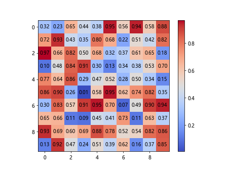
In this example, we iterate over each data point in the matrix and display the value as an annotation at the center of the corresponding cell in the heatmap.
Changing the Aspect Ratio of Heatmap
You can adjust the aspect ratio of the heatmap to better represent the data by using the aspect parameter in Matplotlib. Let’s create a heatmap with a square aspect ratio.
import numpy as np
import matplotlib.pyplot as plt

# Generate random data
data = np.random.rand(10, 10)

# Change the aspect ratio of the heatmap
plt.imshow(data, cmap='plasma', aspect='equal')
plt.colorbar()
plt.show()
Output:
By setting the aspect parameter to ‘equal’, the aspect ratio of the heatmap will be enforced to be square.
Displaying Categorical Data in a Heatmap
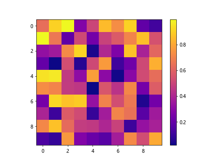
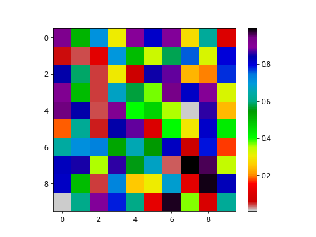
Heatmaps can also be used to display categorical data by mapping categories to colors. Let’s create a heatmap for categorical data using different colors for different categories.
import numpy as np
import matplotlib.pyplot as plt

# Generate random data
data = np.random.rand(10, 10)

# Display categorical data in a heatmap
categories = ['A', 'B', 'C', 'D', 'E']
data = np.random.randint(0, len(categories), (10, 10))

plt.imshow(data, cmap='tab10', vmin=0, vmax=len(categories)-1)
plt.colorbar()
plt.show()
Output:
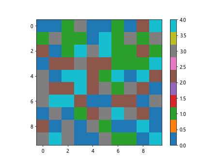
In this example, we generate random categorical data represented as integers and use the ‘tab10’ color map to assign colors to each category.
Adding a Title and Labels to Heatmap
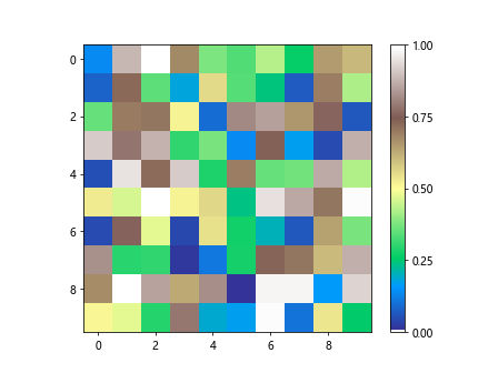
Titles and labels can be added to the heatmap to provide context and information about the data being displayed. Let’s add a title and axis labels to the heatmap.
import numpy as np
import matplotlib.pyplot as plt

# Generate random data
data = np.random.rand(10, 10)

# Add title and labels to the heatmap
plt.imshow(data, cmap='Set3')
plt.colorbar()
plt.title('Categorical Data Heatmap')
plt.xlabel('X-axis')
plt.ylabel('Y-axis')
plt.show()
Output:
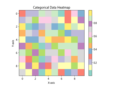
By using the title function to set a title for the heatmap and xlabel and ylabel functions to label the axes, we provide additional information to the viewer.
Saving Heatmap as Image
You can save the generated heatmap as an image file for sharing or further analysis. Let’s save the heatmap as a PNG image.
import numpy as np
import matplotlib.pyplot as plt

# Generate random data
data = np.random.rand(10, 10)

# Save heatmap as image
plt.imshow(data, cmap='Paired')
plt.colorbar()
plt.savefig('heatmap.png')
By calling the savefig function with the desired file name and format, we can save the heatmap as a PNG image in the current directory.
Creating Subplots with Heatmaps
Subplots can be used to display multiple heatmaps in a single figure, allowing for easy comparison and analysis of different datasets. Let’s create subplots with two heatmaps side by side.
import numpy as np
import matplotlib.pyplot as plt

# Generate random data
data = np.random.rand(10, 10)

# Create subplots with heatmaps
fig, axs = plt.subplots(1, 2, figsize=(12, 6))

axs[0].imshow(np.random.rand(10, 10), cmap='BuPu')
axs[0].set_title('Heatmap 1')

axs[1].imshow(np.random.rand(10, 10), cmap='YlGn')
axs[1].set_title('Heatmap 2')

plt.tight_layout()
plt.show()
Output:
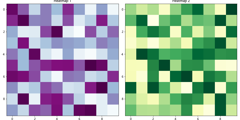
In this example, we use subplots to create a figure with two subplots, each displaying a random heatmap with a different color map.
Adding Gridlines to Heatmap
Gridlines can be added to the heatmap to visually separate the data points and improve readability. Let’s add gridlines to the heatmap using the grid function.
import numpy as np
import matplotlib.pyplot as plt

# Generate random data
data = np.random.rand(10, 10)

# Add gridlines to the heatmap
plt.imshow(data, cmap='jet')
plt.colorbar()
plt.grid(visible=True, color='white', linestyle='--')
plt.show()
Output:
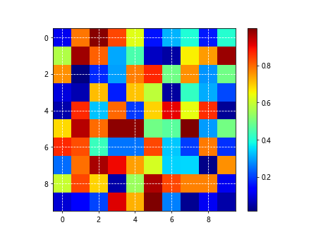
By setting the visible parameter of the grid function to True, we display gridlines on the heatmap with a specified color and linestyle.
Masking Data in Heatmap
You can mask specific data points in the heatmap to highlight or exclude certain values. Let’s mask data points in the heatmap based on a threshold value.
import numpy as np
import matplotlib.pyplot as plt

# Generate random data
data = np.random.rand(10, 10)

# Mask data in the heatmap based on a threshold
thresh = 0.5
masked_data = np.ma.masked_where(data < thresh, data)

plt.imshow(masked_data, cmap='gist_ncar')
plt.colorbar()
plt.show()
Output:
In this example, we use the masked_where function from NumPy to mask data points below a specified threshold in the heatmap.
Resizing Heatmap Colorbar
The colorbar in the heatmap can be resized to better fit the plot and improve visibility. Let's resize the colorbar of the heatmap.
import numpy as np
import matplotlib.pyplot as plt

# Generate random data
data = np.random.rand(10, 10)

# Resize the heatmap colorbar
img = plt.imshow(data, cmap='seismic')
cbar = plt.colorbar(img, fraction=0.03)
plt.show()
Output:
By setting the fraction parameter of the colorbar function, we can control the size of the colorbar relative to the plot.
Reversing Color Map in Heatmap
You can reverse the color map in the heatmap to change the direction of color progression. Let's reverse the color map in the heatmap.
import numpy as np
import matplotlib.pyplot as plt

# Generate random data
data = np.random.rand(10, 10)

# Reverse the color map in the heatmap
plt.imshow(data, cmap='nipy_spectral_r')
plt.colorbar()
plt.show()
Output:
By appending '_r' to the color map name, we reverse the color map when displaying the heatmap.
Heatmap with Logarithmic Scale
Using a logarithmic scale in the heatmap can help visualize data with a wide range of values. Let's create a heatmap with a logarithmic color scale.
import numpy as np
import matplotlib.pyplot as plt

# Display data in the heatmap with logarithmic scale
data = np.random.rand(10, 10) * 100
plt.imshow(data, cmap='twilight', norm=matplotlib.colors.LogNorm(vmin=1, vmax=100))
plt.colorbar()
plt.show()
In this example, we use the LogNorm normalization to display the data in the heatmap with a logarithmic scale ranging from 1 to 100.
Adjusting Colorbar Ticks in Heatmap
You can customize the colorbar ticks in the heatmap to show specific values or intervals. Let's adjust the colorbar ticks in the heatmap.
import numpy as np
import matplotlib.pyplot as plt

# Generate random data
data = np.random.rand(10, 10)

# Adjust colorbar ticks in the heatmap
plt.imshow(data, cmap='terrain')
cbar = plt.colorbar()
cbar.set_ticks([0, 0.25, 0.5, 0.75, 1])
plt.show()
Output:
By using the set_ticks function on the colorbar object, we can set custom tick positions for the colorbar in the heatmap.
Heatmap with Annotations and Color Legend
Annotations can be combined with a color legend to provide comprehensive information about the heatmap. Let's create a heatmap with annotations and a color legend.
import numpy as np
import matplotlib.pyplot as plt

# Generate random data
data = np.random.rand(10, 10)

# Create a heatmap with annotations and color legend
plt.imshow(data, cmap='winter')
for i in range(10):
    for j in range(10):
        plt.text(j, i, f'{data[i, j]:.2f}', ha='center', va='center', color='black')

cbar = plt.colorbar()
cbar.set_label('Values')
plt.show()
Output:
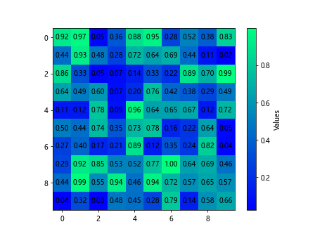
In this example, we add annotations to the heatmap to display the data values and add a color legend to indicate the mapping of colors to values.
Heatmap with Different Masked Regions
You can create a heatmap with different masked regions to emphasize specific areas of interest in the data. Let's create a heatmap with multiple masked regions.
import numpy as np
import matplotlib.pyplot as plt

# Generate random data
data = np.random.rand(10, 10)

# Create a heatmap with different masked regions
masked_data1 = np.ma.masked_where((data < 0.3) | (data > 0.7), data)
masked_data2 = np.ma.masked_where((data >= 0.3) & (data <= 0.6), data)

plt.imshow(masked_data1, cmap='hot')
plt.imshow(masked_data2, cmap='Blues', alpha=0.5)
plt.colorbar()
plt.show()
Output:
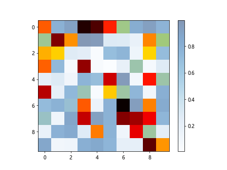
In this example, we create two masked regions in the heatmap based on different threshold values to highlight specific areas in the data.
Heatmap with Row and Column Dendrograms
Dendrograms can be added to the heatmap to show hierarchical clustering of rows and columns in the data. Let's create a heatmap with row and column dendrograms.
import scipy.cluster.hierarchy as sch
import numpy as np
import matplotlib.pyplot as plt

# Generate random data
data = np.random.rand(10, 10)

# Perform hierarchical clustering
row_dendrogram = sch.dendrogram(sch.linkage(data, method='ward'), no_plot=True)
col_dendrogram = sch.dendrogram(sch.linkage(data.T, method='ward'), no_plot=True)

# Create heatmap with row and column dendrograms
plt.imshow(data[row_dendrogram['leaves'], :][:, col_dendrogram['leaves']], cmap='magma')
plt.colorbar()
plt.show()
In this example, we use hierarchical clustering to generate row and column dendrograms and display them alongside the heatmap.
Heatmap in Matplotlib Conclusion
In this article, we explored various aspects of creating heatmaps in Matplotlib. We covered the basics of generating heatmaps, customizing colors, adding annotations, changing aspect ratios, displaying categorical data, and many more advanced techniques. By following the provided examples and code snippets, you can create visually appealing and informative heatmaps for your data visualization needs. Harness the power of heatmaps in Matplotlib to gain insights and uncover patterns in your datasets.