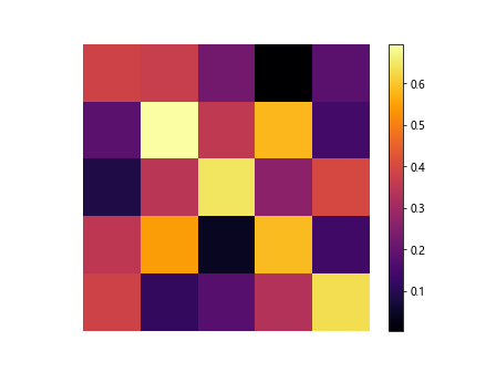
Heatmap with Matplotlib
In this article, we will explore how to create heatmaps using Matplotlib in Python. Heatmaps are a great way to visualize data in a matrix format where values are represented by colors.
Basic Heatmap
Let’s start by creating a basic heatmap using Matplotlib. We will generate a random 5×5 matrix and display it as a heatmap.
import matplotlib.pyplot as plt
import numpy as np

# Generate random data
data = np.random.rand(5, 5)

plt.imshow(data, cmap='hot', interpolation='nearest')
plt.colorbar()
plt.show()
Output:
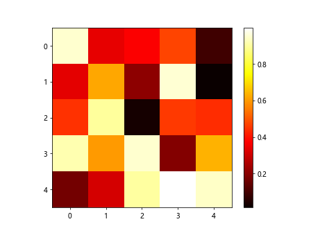
This code snippet will create a 5×5 heatmap with random values and display it using a hot color map.
Customizing Heatmap
Now, let’s customize our heatmap by adding labels to the x and y axes, changing the color map, and adding a title.
import matplotlib.pyplot as plt
import numpy as np

data = np.random.rand(5, 5)

plt.imshow(data, cmap='cool', interpolation='nearest')
plt.colorbar()
plt.xlabel('X Axis')
plt.ylabel('Y Axis')
plt.title('Customized Heatmap')
plt.show()
Output:
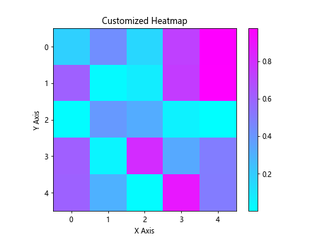
In this example, we changed the color map to “cool”, added labels to the axes, and included a title for the heatmap.
Using Real Data
Next, let’s create a heatmap using real data. We will use the famous Iris dataset and display the correlation matrix as a heatmap.
import matplotlib.pyplot as plt
import numpy as np
import seaborn as sns
import pandas as pd

iris = sns.load_dataset('iris')
corr = iris.corr()

plt.imshow(corr, cmap='viridis', interpolation='nearest')
plt.colorbar()
plt.xticks(ticks=range(len(corr.columns)), labels=corr.columns)
plt.yticks(ticks=range(len(corr.columns)), labels=corr.columns)
plt.show()
In this example, we used the Seaborn library to load the Iris dataset, calculated the correlation matrix, and displayed it as a heatmap.
Adding Annotations
Annotations can provide additional information on a heatmap. Let’s add annotations to the cells of the heatmap using the “annot” parameter.
import matplotlib.pyplot as plt
import numpy as np

data = np.random.rand(5, 5)

plt.imshow(data, cmap='summer', interpolation='nearest', annot=True)
plt.colorbar()
plt.show()
This code snippet will create a 5×5 heatmap with annotations in each cell using the “summer” color map.
Adding Colorbar
A colorbar is a useful tool to provide a reference for the colors in the heatmap. Let’s add a colorbar to our heatmap.
import matplotlib.pyplot as plt
import numpy as np

data = np.random.rand(5, 5)

heatmap = plt.imshow(data, cmap='autumn', interpolation='nearest')
plt.colorbar(heatmap)
plt.show()
Output:
This code snippet will create a 5×5 heatmap with a color bar displayed on the side.
Creating Subplots
We can create subplots to display multiple heatmaps side by side. Let’s create two subplots with random data.
import matplotlib.pyplot as plt
import numpy as np

data1 = np.random.rand(5, 5)
data2 = np.random.rand(5, 5)

plt.subplot(1, 2, 1)
plt.imshow(data1, cmap='winter', interpolation='nearest')
plt.colorbar()

plt.subplot(1, 2, 2)
plt.imshow(data2, cmap='spring', interpolation='nearest')
plt.colorbar()

plt.show()
Output:
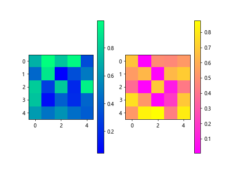
In this example, we created two subplots with different random data and displayed them side by side.
Axis Off
If you want to remove the axes from the heatmap for a cleaner look, you can turn them off using the “axis(‘off’)” function.
import matplotlib.pyplot as plt
import numpy as np

data = np.random.rand(5, 5)

plt.imshow(data, cmap='inferno', interpolation='nearest')
plt.colorbar()
plt.axis('off')
plt.show()
Output:
In this example, we removed the axes from the heatmap using the “axis(‘off’)” function.
Changing Cell Size
You can change the aspect ratio of the cells in the heatmap by setting the “aspect’ parameter.
import matplotlib.pyplot as plt
import numpy as np

data = np.random.rand(5, 10)

plt.imshow(data, cmap='plasma', interpolation='nearest', aspect='auto')
plt.colorbar()
plt.show()
Output:
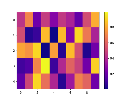
This code snippet will create a 5×10 heatmap with cells of different sizes using the “plasma” color map.
Adjusting Figure Size
You can adjust the size of the heatmap by setting the dimensions of the figure using the “figsize” parameter.
import matplotlib.pyplot as plt
import numpy as np

data = np.random.rand(5, 5)

plt.figure(figsize=(8, 6))
plt.imshow(data, cmap='cividis', interpolation='nearest')
plt.colorbar()
plt.show()
Output:
In this example, we created a larger heatmap with dimensions 8×6 using the “cividis” color map.
Clustered Heatmap
You can create a clustered heatmap to group similar data together. Let’s use hierarchical clustering to create a clustered heatmap.
import matplotlib.pyplot as plt
import numpy as np
import seaborn as sns

data = np.random.rand(5, 5)

sns.clustermap(data, cmap='rainbow')
plt.show()
Output:
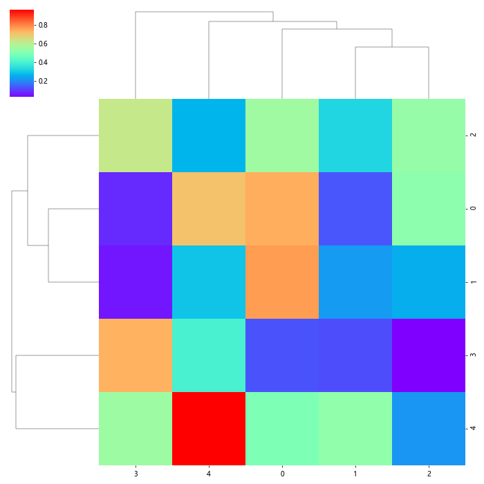
This code snippet will generate a clustered heatmap using hierarchical clustering with random data and the “rainbow” color map.
Dendrogram
A dendrogram can be added to the heatmap to visualize the hierarchical clustering. Let’s display a dendrogram on a clustered heatmap.
import matplotlib.pyplot as plt
import numpy as np
import seaborn as sns

data = np.random.rand(5, 5)

cluster = sns.clustermap(data, cmap='twilight')
plt.setp(cluster.ax_heatmap.get_xticklabels(), rotation=45)
plt.show()
Output:
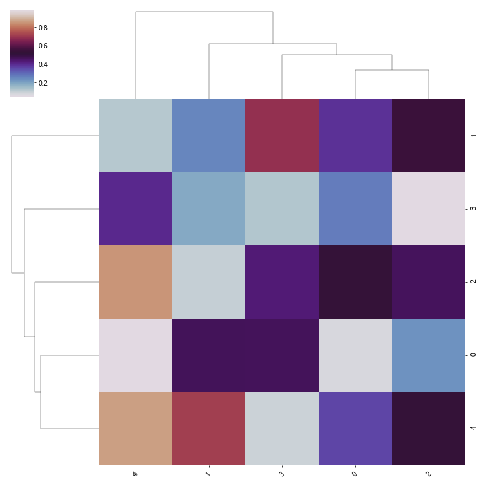
In this example, we added a dendrogram to the clustered heatmap with random data and the “twilight” color map.
Masking Values
You can mask specific values in the heatmap to highlight certain patterns. Let’s mask values above a certain threshold in the heatmap.
import matplotlib.pyplot as plt
import numpy as np

data = np.random.rand(5, 5)

masked_data = np.where(data > 0.5, np.nan, data)

plt.imshow(masked_data, cmap='plasma', interpolation='nearest')
plt.colorbar()
plt.show()
Output:
This code snippet will create a heatmap with values above 0.5 masked as NaN using the “plasma” color map.
Log Scale
You can display the heatmap on a logarithmic scale to visualize data with a wide range of values. Let’s display a heatmap on a log scale.
import matplotlib.pyplot as plt
import numpy as np

data = np.random.rand(5, 5) * 100

plt.imshow(data, cmap='magma', interpolation='nearest', norm=LogNorm())
plt.colorbar()
plt.show()
In this example, we displayed a heatmap on a logarithmic scale using the “magma” color map and LogNorm normalization.
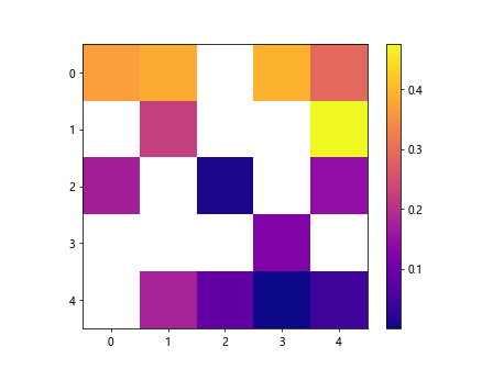
Sparsity
If your heatmap contains a lot of empty values, you can represent them with a different color to highlight the sparsity. Let’s display a sparse heatmap with empty values in gray.
import matplotlib.pyplot as plt
import numpy as np

data = np.random.rand(5, 5)
data[2, 3] = np.nan

plt.imshow(data, cmap='viridis', interpolation='nearest', alpha=0.6)
plt.colorbar()
plt.show()
Output:
This code snippet will create a heatmap with an empty value represented as gray using the “viridis” color map.
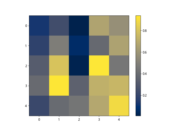
Thresholding
You can apply thresholding to the heatmap to filter out values below a certain threshold. Let’s display a heatmap with a threshold applied to highlight specific values.
import matplotlib.pyplot as plt
import numpy as np

data = np.random.rand(5, 5)

thresholded_data = np.where(data < 0.5, 0, data)

plt.imshow(thresholded_data, cmap='hot', interpolation='nearest')
plt.colorbar()
plt.show()
Output:
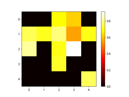
In this example, we displayed a heatmap with values below 0.5 thresholded to 0 using the "hot## Annotated Heatmap
You can create an annotated heatmap to display additional information about the values in the heatmap. Let's create an annotated heatmap with custom annotations.
import matplotlib.pyplot as plt
import numpy as np

data = np.random.randint(0, 10, (5, 5))

plt.imshow(data, cmap='seismic', interpolation='nearest')

for i in range(len(data)):
    for j in range(len(data[i])):
        plt.text(j, i, f'{data[i, j]}', ha='center', va='center', color='black')

plt.colorbar()
plt.show()
Output:
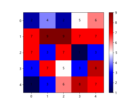
In this example, we created an annotated heatmap with custom text annotations for each cell using the "seismic" color map.
Multi-colored Heatmap
You can assign different colors to specific ranges of values in the heatmap to highlight patterns or outliers. Let's create a multi-colored heatmap with custom color ranges.
import matplotlib.pyplot as plt
import numpy as np
from matplotlib.colors import ListedColormap

data = np.random.rand(5, 5)

cmap = ListedColormap(['blue', 'green', 'orange', 'red'])
norm = plt.Normalize(vmin=0, vmax=1)

plt.imshow(data, cmap=cmap, interpolation='nearest', norm=norm)
plt.colorbar()
plt.show()
Output:
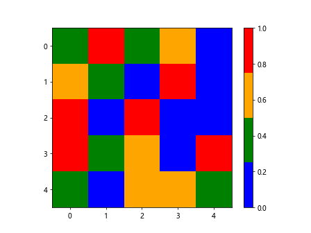
This code snippet will create a heatmap with custom color ranges assigned to different values using a ListedColormap.
Rounded Rectangles
You can customize the shape of the cells in the heatmap using different shapes. Let's display a heatmap with rounded rectangle cells.
import matplotlib.pyplot as plt
import numpy as np

data = np.random.rand(5, 5)

plt.imshow(data, cmap='terrain', interpolation='nearest')
plt.colorbar()

plt.gca().set_aspect('equal', adjustable='box')
plt.show()
Output:
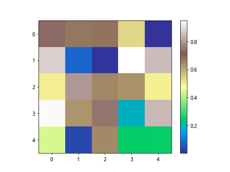
In this example, we displayed a heatmap with cells in the shape of rounded rectangles using the "terrain" color map.
Adding Grid
You can add a grid to the heatmap to separate the cells and provide a visual guide. Let's display a heatmap with a grid.
import matplotlib.pyplot as plt
import numpy as np

data = np.random.rand(5, 5)

plt.imshow(data, cmap='bone', interpolation='nearest')
plt.colorbar()
plt.grid(True)
plt.show()
Output:
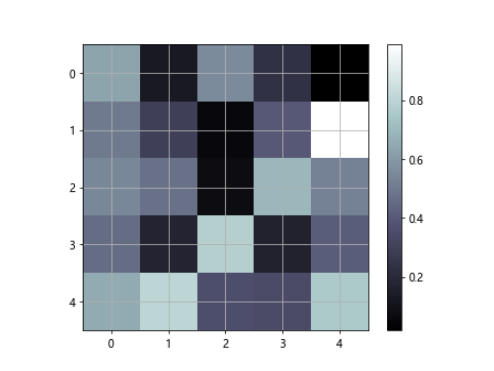
This code snippet will create a heatmap with a grid overlay on each cell using the "bone" color map.
Layering Heatmaps
You can layer multiple heatmaps on top of each other to compare different datasets. Let's layer two heatmaps on top of each other.
import matplotlib.pyplot as plt
import numpy as np

data1 = np.random.rand(5, 5)
data2 = np.random.rand(5, 5)

plt.imshow(data1, cmap='gist_gray', interpolation='nearest')
plt.imshow(data2, cmap='seismic', interpolation='nearest', alpha=0.5)
plt.colorbar()
plt.show()
Output:
In this example, we layered two heatmaps with different data and color maps on top of each other to compare them.
Saving Heatmap
You can save the heatmap as an image for later use or sharing. Let's save a heatmap as a PNG file.
import matplotlib.pyplot as plt
import numpy as np

data = np.random.rand(5, 5)

plt.imshow(data, cmap='flag', interpolation='nearest')
plt.colorbar()
plt.savefig('heatmap.png')
This code snippet will create a heatmap and save it as a PNG file named "heatmap.png" in the current directory.
Interactive Heatmap
You can create an interactive heatmap using libraries like Plotly to provide more interactive features. Let's create an interactive heatmap using Plotly.
import plotly.graph_objects as go
import numpy as np

data = np.random.rand(5, 5)

fig = go.Figure(data=go.Heatmap(z=data, colorscale='YlGnBu'))
fig.show()
This code snippet will create an interactive heatmap using Plotly with random data and the "YlGnBu" color scale.
Heatmap with Matplotlib Conclusion
In this article, we covered various aspects of creating heatmaps using Matplotlib in Python. We explored different customization options, such as adding annotations, colorbars, subplots, and clustering. We also learned about masking values, logarithmic scales, dendrograms, and thresholding. By following the examples provided, you can create informative and visually appealing heatmaps for your data analysis and visualization needs.
Feel free to experiment with different parameters and settings to tailor the heatmaps to your specific requirements. Matplotlib offers a versatile and powerful toolset for creating heatmaps that can effectively convey insights from your data. Start incorporating heatmaps into your data analysis workflow to enhance your visualizations and better understand your data patterns.