Matplotlib Axis Label
Introduction
Matplotlib is a widely used Python library for creating static, animated, and interactive visualizations in Python. One important aspect of creating visualizations is labeling the axes properly. In this article, we will go over different ways to label the axes in Matplotlib plots.
Basic Axis Labeling
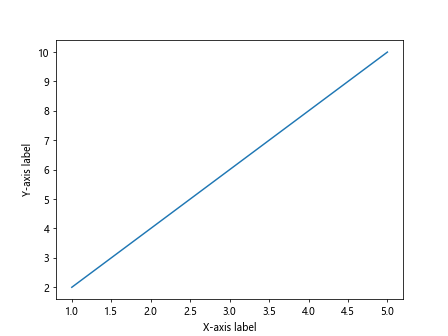
The simplest way to label the axes in a Matplotlib plot is by using the xlabel() and ylabel() methods of the pyplot module. Let’s first create a basic plot and then label the axes.
import matplotlib.pyplot as plt

# Create some data
x = [1, 2, 3, 4, 5]
y = [2, 4, 6, 8, 10]

# Plot the data
plt.plot(x, y)

# Add labels
plt.xlabel('X-axis label')
plt.ylabel('Y-axis label')

plt.show()
Output:

In the above code snippet, we first create some data points and plot them using plt.plot(). Then, we use plt.xlabel() and plt.ylabel() to add labels to the x-axis and y-axis, respectively.
Customizing Axis Labels
You can customize the axis labels in Matplotlib by changing the font size, font weight, font family, color, and rotation angle. Let’s see how to customize the axis labels using the following example.
import matplotlib.pyplot as plt

# Create some data
x = [1, 2, 3, 4, 5]
y = [2, 4, 6, 8, 10]

# Plot the data
plt.plot(x, y)

# Customize labels
plt.xlabel('X-axis label', fontsize=14, fontweight='bold', fontfamily='serif', color='blue', rotation=45)
plt.ylabel('Y-axis label', fontsize=14, fontweight='bold', fontfamily='sans-serif', color='green', rotation=45)

plt.show()
Output:
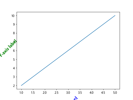
In this example, we have customized the x-axis label by changing the font size to 14, font weight to bold, font family to serif, color to blue, and rotation angle to 45 degrees. Similarly, we have customized the y-axis label with different font properties.
Unicode and LaTeX in Axis Labels
Matplotlib supports Unicode characters and LaTeX formatting in axis labels. This enables you to use special characters and mathematical notation in your labels. Let’s create a plot with Unicode and LaTeX formatted axis labels.
import matplotlib.pyplot as plt

# Create some data
x = [1, 2, 3, 4, 5]
y = [2, 4, 6, 8, 10]

# Plot the data
plt.plot(x, y)

# Unicode and LaTeX labels
plt.xlabel('Temperature (°C)')
plt.ylabel(r'$\alpha \beta \gamma$')

plt.show()
Output:
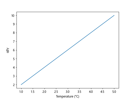
In the example above, we have used the Unicode character for degrees (°) in the x-axis label. For the y-axis label, we have used LaTeX formatting to display Greek letters alpha, beta, and gamma.
Multiple Axes and Labels
Sometimes you may need to create plots with multiple axes and labels. Matplotlib provides the ability to create subplots and label each axis independently. Let’s see how to create a plot with multiple axes and labels.
import matplotlib.pyplot as plt

# Create some data
x = [1, 2, 3, 4, 5]
y1 = [2, 4, 6, 8, 10]
y2 = [1, 3, 5, 7, 9]

# Create subplots
fig, ax1 = plt.subplots()
ax2 = ax1.twinx()

# Plot the data on different axes
ax1.plot(x, y1, 'g-')
ax2.plot(x, y2, 'b-')

# Add labels to each axis
ax1.set_xlabel('X-axis label', color='green')
ax1.set_ylabel('Y1-axis label', color='green')
ax2.set_ylabel('Y2-axis label', color='blue')

plt.show()
Output:
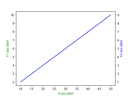
In the code snippet above, we create a plot with two y-axes sharing the same x-axis. We use ax1.twinx() to create a second y-axis that shares the same x-axis as the first y-axis. Then, we label each axis independently using set_xlabel() and set_ylabel() methods.
Axis Label Alignment and Positioning
You can align and position axis labels in Matplotlib using the set_xlabel() and set_ylabel() methods with additional parameters like labelpad, labelcolor, and horizontalalignment. Let’s see how to align and position axis labels in a plot.
import matplotlib.pyplot as plt

# Create some data
x = [1, 2, 3, 4, 5]
y = [2, 4, 6, 8, 10]

# Plot the data
plt.plot(x, y)

# Position and align labels
plt.xlabel('X-axis label', labelpad=10, color='red', horizontalalignment='right')
plt.ylabel('Y-axis label', labelpad=10, color='blue', horizontalalignment='right')

plt.show()
Output:
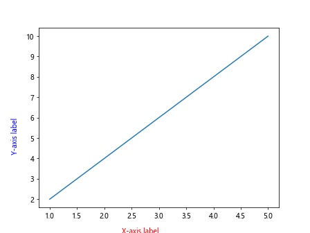
In the code snippet above, we have positioned and aligned the x-axis label to the right with additional padding of 10 points and set the label color to red. The y-axis label is also positioned and aligned to the right with a label color of blue and padding of 10 points.
Rotate Axis Labels
You can rotate the axis labels in Matplotlib to improve readability when dealing with long text labels. By rotating the labels, you can prevent overlap and make the plot easier to understand. Let’s see how to rotate axis labels in a plot.
import matplotlib.pyplot as plt

# Create some data
x = [1, 2, 3, 4, 5]
y = [2, 4, 6, 8, 10]

# Plot the data
plt.plot(x, y)

# Rotate labels
plt.xlabel('This is a long X-axis label', rotation=45)
plt.ylabel('This is a long Y-axis label', rotation=45)

plt.show()
Output:
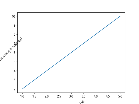
In the code snippet above, we have rotated both the x-axis and y-axis labels by 45 degrees to make the labels easier to read. This can be particularly useful when dealing with long axis labels.
Axis Label Font Properties
You can customize the font properties of axis labels, such as font size, font weight, font family, and font style, in Matplotlib. Let’s see how to change the font properties of axis labels in a plot.
import matplotlib.pyplot as plt

# Create some data
x = [1, 2, 3, 4, 5]
y = [2, 4, 6, 8, 10]

# Plot the data
plt.plot(x, y)

# Font properties
plt.xlabel('X-axis label', fontsize=14, fontweight='bold', fontfamily='serif', style='italic')
plt.ylabel('Y-axis label', fontsize=14, fontweight='bold', fontfamily='sans-serif', style='normal')

plt.show()
Output:
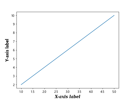
In the example above, we have customized the font properties of both the x-axis and y-axis labels by changing the font size to 14, font weight to bold, font family to serif for the x-axis label, and sans-serif for the y-axis label. We have also changed the font style to italic for the x-axis label and normal for the y-axis label.
Axis Label Color
You can change the color of axis labels in Matplotlib to match the color scheme of your plot or to highlight important information. Let’s see how to change the color of axis labels in a plot.
import matplotlib.pyplot as plt

# Create some data
x = [1, 2, 3, 4, 5]
y = [2, 4, 6, 8, 10]

# Plot the data
plt.plot(x, y)

# Change label color
plt.xlabel('X-axis label', color='purple')
plt.ylabel('Y-axis label', color='orange')

plt.show()
Output:
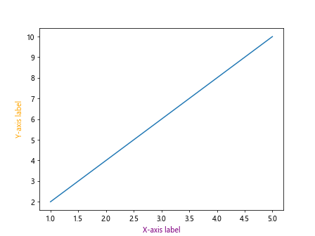
In the code snippet above, we have changed the color of the x-axis label to purple and the y-axis label to orange. You can customize the color of the axis labels to suit your plot’s color scheme or design preferences.
Axis Label Background Color
You can change the background color of axis labels in Matplotlib to create a more visually appealing plot. Let’s see how to change the background color of axis labels in a plot.
import matplotlib.pyplot as plt

# Create some data
x = [1, 2, 3, 4, 5]
y = [2, 4, 6, 8, 10]

# Plot the data
plt.plot(x, y)

# Change label background color
plt.xlabel('X-axis label', backgroundcolor='lightblue')
plt.ylabel('Y-axis label', backgroundcolor='lightgreen')

plt.show()
Output:
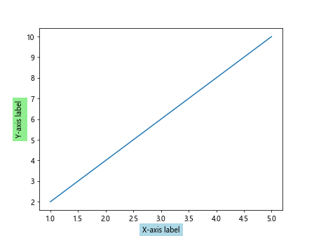
In the example above, we have changed the background color of the x-axis label to light blue and the y-axis label to light green. This can help improve the readability of the labels and make them stand out against the plot background.
Axis Label Rotation
You can rotate the axis labels in Matplotlib to adjust the orientation of the text on the axis. Rotating the labels can prevent overlap and improve readability, especially when dealing with long text labels. Let’s see how to rotate axis labels in a plot.
import matplotlib.pyplot as plt

# Create some data
x = [1, 2, 3, 4, 5]
y = [2, 4, 6, 8, 10]

# Plot the data
plt.plot(x, y)

# Rotate labels
plt.xticks(rotation=45)
plt.yticks(rotation=90)

plt.show()
Output:
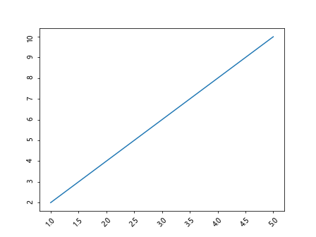
In the code snippet above, we have rotated both the x-axis and y-axis tick labels by 45 and 90 degrees, respectively. This can help improve the readability of the labels and prevent overlap, especially when plotting multiple data points.
Axis Label Position
You can adjust the position of axis labels in Matplotlib to improve the layout of the plot and prevent overlap with other elements. By changing the position of the labels, you can optimize the plot for readability and aesthetics. Let’s see how to adjust the position of axis labels in a plot.
import matplotlib.pyplot as plt

# Create some data
x = [1, 2, 3, 4, 5]
y = [2, 4, 6, 8, 10]

# Plot the data
plt.plot(x, y)

# Adjust label position
plt.xlabel('X-axis label', position=(0.5, 0.1))
plt.ylabel('Y-axis label', position=(0.1, 0.5))

plt.show()
Output:
In the example above, we have adjusted the position of the x-axis label to be at 50% along the x-axis and 10% along the y-axis. Similarly, we have adjusted the position of the y-axis label to be at 10% along the x-axis and 50% along the y-axis. This allows you to customize the position of the labels based on your plot’s layout.
Axis Label Visibility
You can control the visibility of axis labels in Matplotlib to show or hide the labels based on your plot requirements. This can be useful when you have a cluttered plot with multiple elements, and you want to focus on specific data points. Let’s see how to control the visibility of axis labels in a plot.
import matplotlib.pyplot as plt

# Create some data
x = [1, 2, 3, 4, 5]
y = [2, 4, 6, 8, 10]

# Plot the data
plt.plot(x, y)

# Hide labels
plt.xlabel('X-axis label', visible=False)
plt.ylabel('Y-axis label', visible=False)

plt.show()
Output:

In the code snippet above, we have used the visible=False parameter to hide both the x-axis and y-axis labels. This can be useful when you want to focus on the data points and reduce clutter in the plot.
Axis Label Grid
You can customize the axis labels grid in Matplotlib to display grid lines, change their style, color, and transparency. Grid lines can help guide the viewer’s eyes across the plot and make it easier to interpret the data. Let’s see how to customize the axis label grid in a plot.
import matplotlib.pyplot as plt

# Create some data
x = [1, 2, 3, 4, 5]
y = [2, 4, 6, 8, 10]

# Plot the data
plt.plot(x, y)

# Customize grid
plt.grid(True, linestyle='--', color='gray', alpha=0.5)

plt.show()
Output:
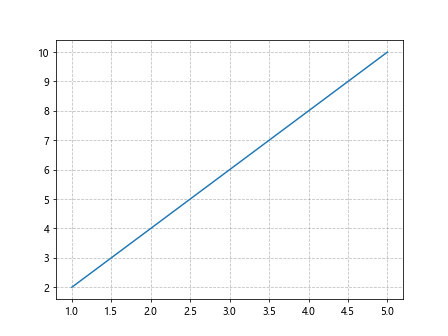
In the example above, we have enabled the grid lines using plt.grid(True) and customized the grid style to dotted lines, color to gray, and transparency to 50%. This can make the grid lines less intrusive while still providing guidance for the viewer.
Matplotlib Axis Label Conclusion
In this article, we have explored various ways to label the axes in Matplotlib plots, including basic labeling, customizing labels, using Unicode and LaTeX, handling multiple axes, aligning and positioning labels, rotating labels, changing font properties, modifying label color, adjusting label background color, rotating axis ticks, positioning labels, controlling label visibility, customizing the grid, and more. By mastering these techniques, you can create visually appealing and informative plots with properly labeled axes in Matplotlib.