Adding Colorbars in Matplotlib
Matplotlib is a popular Python library used for creating static, animated, and interactive visualizations in Python. One of the common elements in visualizations is the colorbar, which provides a visual indication of the mapping between colors and data values in a plot. In this article, we will explore how to add colorbars to different types of plots using Matplotlib.
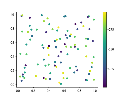
1. Basic Colorbar
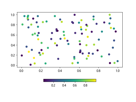
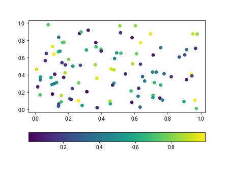
To create a basic colorbar in Matplotlib, you can use the colorbar function provided by the library. Let’s create a simple scatter plot and add a colorbar to it:
import matplotlib.pyplot as plt
import numpy as np

x = np.random.rand(100)
y = np.random.rand(100)
colors = np.random.rand(100)

plt.scatter(x, y, c=colors, cmap='viridis')
plt.colorbar()
plt.show()
Output:
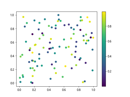
In this example, we generate random data points and colors for a scatter plot. We then use the plt.colorbar() function to add a colorbar to the plot.
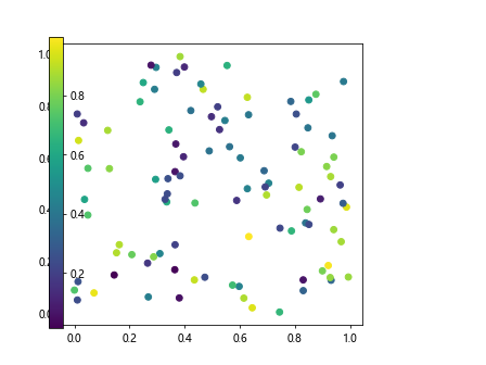
2. Customizing Colorbars
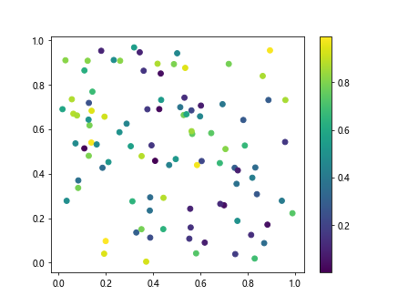
You can customize the appearance of the colorbar by adjusting various parameters. Let’s create a plot with a larger font size for the colorbar labels and a different orientation:
import matplotlib.pyplot as plt
import numpy as np

x = np.random.rand(100)
y = np.random.rand(100)
colors = np.random.rand(100)

plt.scatter(x, y, c=colors, cmap='viridis')
cbar = plt.colorbar()
cbar.ax.tick_params(labelsize=12)
cbar.ax.invert_yaxis()
plt.show()
Output:
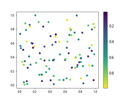
In this example, we use the cbar.ax.tick_params(labelsize=12) to set the font size of the colorbar labels and cbar.ax.invert_yaxis() to change the orientation of the colorbar.
3. Adding Colorbars to Contour Plots
Colorbars are commonly used in contour plots to indicate the mapping between contour levels and colors. Let’s create a contour plot and add a colorbar to it:
import matplotlib.pyplot as plt
import numpy as np

x = np.linspace(-2*np.pi, 2*np.pi, 100)
y = np.linspace(-2*np.pi, 2*np.pi, 100)
X, Y = np.meshgrid(x, y)
Z = np.sin(X) * np.cos(Y)

plt.contourf(X, Y, Z, cmap='coolwarm')
plt.colorbar()
plt.show()
Output:
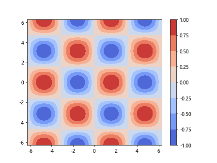
In this example, we create a contour plot of a 2D function and add a colorbar using the plt.colorbar() function.
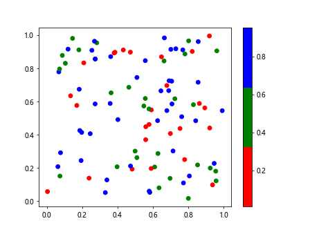
4. Discrete Colorbars
Sometimes it is more appropriate to use discrete colors rather than a continuous colormap. You can achieve this by specifying the number of discrete color levels in the colorbar. Let’s create a scatter plot with a discrete colorbar:
import matplotlib.pyplot as plt
import numpy as np

x = np.random.rand(100)
y = np.random.rand(100)
colors = np.random.randint(0, 4, 100)

plt.scatter(x, y, c=colors, cmap='viridis')
plt.colorbar(ticks=[0, 1, 2, 3])
plt.show()
Output:
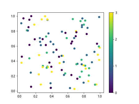
In this example, we generate random data points and assign them to different discrete color levels. We then specify the ticks for the colorbar using the ticks parameter in the plt.colorbar() function.
5. Logarithmic Colorbars
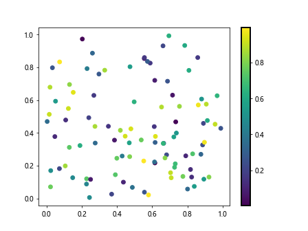
In some cases, it is useful to use a logarithmic scale for the colorbar. Let’s create a scatter plot with a logarithmic colorbar:
import matplotlib.pyplot as plt
import numpy as np

x = np.random.rand(100)
y = np.random.rand(100)
colors = np.random.rand(100)

plt.scatter(x, y, c=colors, cmap='viridis', norm=matplotlib.colors.LogNorm())
plt.colorbar()
plt.show()
In this example, we use the norm parameter in the plt.scatter() function to specify a logarithmic scale for the colorbar.
6. Custom Colorbars
You can create custom colorbars in Matplotlib by defining a custom colormap. Let’s create a scatter plot with a custom colormap and colorbar:
import matplotlib.pyplot as plt
import numpy as np
import matplotlib.colors

x = np.random.rand(100)
y = np.random.rand(100)
colors = np.random.rand(100)

cmap = matplotlib.colors.ListedColormap(['red', 'green', 'blue'])
plt.scatter(x, y, c=colors, cmap=cmap)
plt.colorbar()
plt.show()
Output:
In this example, we define a custom colormap using the ListedColormap class and pass it to the cmap parameter in the plt.scatter() function.
7. Colorbar Placement
You can customize the placement of the colorbar within a plot by specifying the location and size. Let’s create a scatter plot with a colorbar placed at the bottom of the plot:
import matplotlib.pyplot as plt
import numpy as np

x = np.random.rand(100)
y = np.random.rand(100)
colors = np.random.rand(100)

plt.scatter(x, y, c=colors, cmap='viridis')
plt.colorbar(location='bottom', shrink=0.5)
plt.show()
Output:
In this example, we use the location and shrink parameters in the plt.colorbar() function to place the colorbar at the bottom of the plot and adjust its size.
8. Colorbar Labels
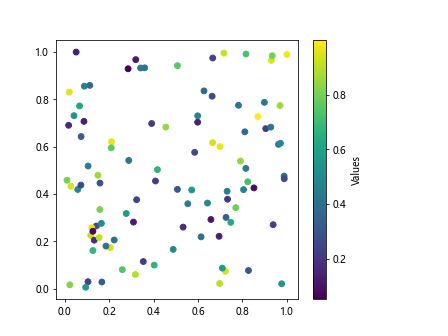
You can add labels to the colorbar to provide information about the data values represented by the colors. Let’s create a scatter plot with a labeled colorbar:
import matplotlib.pyplot as plt
import numpy as np

x = np.random.rand(100)
y = np.random.rand(100)
colors = np.random.rand(100)

plt.scatter(x, y, c=colors, cmap='viridis')
cbar = plt.colorbar()
cbar.set_label('Values')
plt.show()
Output:
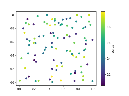
In this example, we use the cbar.set_label() function to add a label to the colorbar indicating the data values represented by the colors.
9. Colorbar Format
You can customize the format of the colorbar by setting the format of the tick labels. Let’s create a scatter plot with a formatted colorbar displaying integers:
import matplotlib.pyplot as plt
import numpy as np

x = np.random.rand(100)
y = np.random.rand(100)
colors = np.random.rand(100)

plt.scatter(x, y, c=colors, cmap='viridis')
cbar = plt.colorbar(format='%d')
plt.show()
Output:
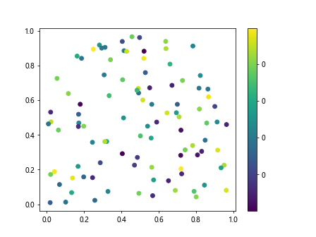
In this example, we use the format parameter in the plt.colorbar() function to specify the format of the tick labels in the colorbar.
10. Colorbar Range
You can set the range of values displayed in the colorbar by specifying the minimum and maximum values. Let’s create a scatter plot with a colorbar displaying a specific range of values:
import matplotlib.pyplot as plt
import numpy as np

x = np.random.rand(100)
y = np.random.rand(100)
colors = np.random.rand(100)

plt.scatter(x, y, c=colors, cmap='viridis')
plt.colorbar(vmin=0, vmax=1)
plt.show()
In this example, we use the vmin and vmax parameters in the plt.colorbar() function to set the range of values displayed in the colorbar.
11. Colorbar Orientation
You can change the orientation of the colorbar by rotating it vertically or horizontally. Let’s create a scatter plot with a horizontally oriented colorbar:
import matplotlib.pyplot as plt
import numpy as np

x = np.random.rand(100)
y = np.random.rand(100)
colors = np.random.rand(100)

plt.scatter(x, y, c=colors, cmap='viridis')
plt.colorbar(orientation='horizontal')
plt.show()
Output:
In this example, we use the orientation parameter in the plt.colorbar() function to change the orientation of the colorbar to horizontal.
12. Colorbar Transparency
You can adjust the transparency of the colorbar in Matplotlib plots. Let’s create a scatter plot with a semi-transparent colorbar:
import matplotlib.pyplot as plt
import numpy as np

x = np.random.rand(100)
y = np.random.rand(100)
colors = np.random.rand(100)

plt.scatter(x, y, c=colors, cmap='viridis')
cbar = plt.colorbar()
cbar.set_alpha(0.5)
plt.show()
Output:
In this example, we use the cbar.set_alpha() function to adjust the transparency of the colorbar.
13. Colorbar Borders
You can add borders to the colorbar in Matplotlib plots for better visualization. Let’s create a scatter plot with a colorbar that has borders:
import matplotlib.pyplot as plt
import numpy as np

x = np.random.rand(100)
y = np.random.rand(100)
colors = np.random.rand(100)

plt.scatter(x, y, c=colors, cmap='viridis')
cbar = plt.colorbar()
cbar.outline.set_linewidth(2)
cbar.outline.set_edgecolor('black')
plt.show()
Output:
In this example, we use the cbar.outline.set_linewidth() and cbar.outline.set_edgecolor() functions to add borders to the colorbar with a specified width and color.
14. Colorbar Spacing
You can adjust the spacing between the plot and colorbar in Matplotlib plots. Let’s create a scatter plot with a colorbar that has increased spacing:
import matplotlib.pyplot as plt
import numpy as np

x = np.random.rand(100)
y = np.random.rand(100)
colors = np.random.rand(100)

plt.scatter(x, y, c=colors, cmap='viridis')
cbar = plt.colorbar()
cbar.set_label('Values')
plt.subplots_adjust(right=0.8)
plt.show()
Output:
In this example, we use the plt.subplots_adjust() function to adjust the spacing between the plot and the colorbar by changing the right margin.
15. Colorbar Title
You can add a title to the colorbar in Matplotlib plots for better interpretation. Let’s create a scatter plot with a colorbar that has a title:
import matplotlib.pyplot as plt
import numpy as np

x = np.random.rand(100)
y = np.random.rand(100)
colors = np.random.rand(100)

plt.scatter(x, y, c=colors, cmap='viridis')
cbar = plt.colorbar()
cbar.set_label('Values')
cbar.set_label('Colorbar Title', size=12)
plt.show()
Output:
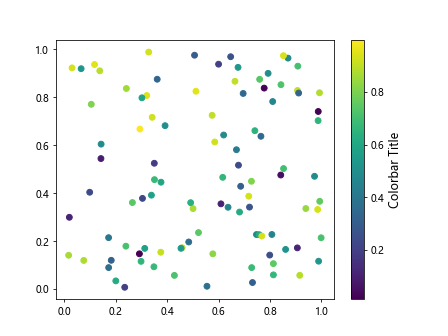
In this example, we use the cbar.set_label() function with a specified title and font size to add a title to the colorbar.
16. Multiple Colorbars
You can add multiple colorbars to a single plot in Matplotlib for visualizing multiple data sets with different color mappings. Let’s create a plot with two scatter plots and two colorbars:
import matplotlib.pyplot as plt
import numpy as np

x1 = np.random.rand(100)
y1 = np.random.rand(100)
colors1 = np.random.rand(100)

x2 = np.random.rand(100)
y2 = np.random.rand(100)
colors2 = np.random.rand(100)

plt.scatter(x1, y1, c=colors1, cmap='viridis')
plt.colorbar()
plt.scatter(x2, y2, c=colors2, cmap='plasma')
plt.colorbar()
plt.show()
Output:
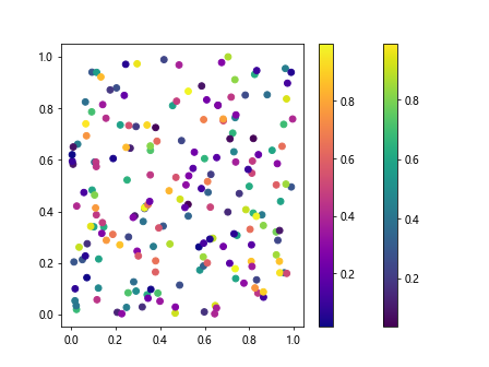
In this example, we create two scatter plots with different color mappings and add a colorbar to each plot.
17. Discrete Colorbar Labels
You can define custom labels for discrete color levels in the colorbar in Matplotlib plots. Let’s create a scatter plot with custom labels for discrete color levels:
import matplotlib.pyplot as plt
import numpy as np

x = np.random.rand(100)
y = np.random.rand(100)
colors = np.random.randint(0, 4, 100)
labels = ['Low', 'Medium', 'High']

plt.scatter(x, y, c=colors, cmap='viridis')
plt.colorbar(ticks=[0, 1, 2, 3], labels=labels)
plt.show()
In this example, we use the labels parameter in the plt.colorbar() function to specify custom labels for discrete color levels.
18. Colorbar Tick Locations
You can set the locations of the tick marks in the colorbar to highlight specific data values. Let’s create a scatter plot with custom tick locations in the colorbar:
import matplotlib.pyplot as plt
import numpy as np

x = np.random.rand(100)
y = np.random.rand(100)
colors = np.random.rand(100)

plt.scatter(x, y, c=colors, cmap='viridis')
plt.colorbar(ticks=[0, 0.25, 0.5, 0.75, 1])
plt.show()
Output:
In this example, we use the ticks parameter in the plt.colorbar() function to set custom locations for the tick marks in the colorbar.
19. Colorbar Tick Labels
You can customize the appearance of tick labels in the colorbar by specifying the format and font style. Let’s create a scatter plot with formatted tick labels in the colorbar:
import matplotlib.pyplot as plt
import numpy as np

x = np.random.rand(100)
y = np.random.rand(100)
colors = np.random.rand(100)

plt.scatter(x, y, c=colors, cmap='viridis')
cbar = plt.colorbar()
cbar.ax.set_yticklabels(['Low', 'Medium', 'High'])
plt.show()
In this example, we use the cbar.ax.set_yticklabels() function to set custom tick labels for the colorbar.
20. Colorbar Ax Position
You can adjust the position of the colorbar axes within the plot using the fraction parameter. Let’s create a scatter plot with a colorbar positioned at a specific location within the plot:
import matplotlib.pyplot as plt
import numpy as np

x = np.random.rand(100)
y = np.random.rand(100)
colors = np.random.rand(100)

plt.scatter(x, y, c=colors, cmap='viridis')
cbar = plt.colorbar()
cax = cbar.ax
cax.set_position([0.1, 0.1, 0.03, 0.8])
plt.show()
Output:
In this example, we use the cax.set_position() function to set the position and size of the colorbar within the plot.
These examples demonstrate various ways to add and customize colorbars in Matplotlib plots for better visualizations and data interpretation. Experiment with different parameters and settings to create colorbars that best suit your data and visualization requirements.