Colorbar Limits
In this article, we will explore how to set the limits of colorbars in matplotlib. Colorbars are commonly used in data visualization to represent the mapping between colors and values in a plot. By setting the limits of a colorbar, we can control the range of colors displayed in the plot, which can help highlight certain aspects of the data or improve the clarity of the visualization.
Basic Colorbar Limits
Let’s start with a simple example of creating a scatter plot with a colorbar and setting the limits of the colorbar.
import matplotlib.pyplot as plt
import numpy as np

# Generate some random data
x = np.random.rand(100)
y = np.random.rand(100)
colors = np.random.rand(100)

# Create a scatter plot
plt.scatter(x, y, c=colors, cmap='viridis')
plt.colorbar()

# Set the limits of the colorbar
plt.clim(0, 1)

plt.show()
Output:

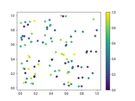
In the code above, we generate random data for x, y, and colors, create a scatter plot using plt.scatter, add a colorbar with plt.colorbar, and then set the limits of the colorbar to be between 0 and 1 using plt.clim.
Explicit Colorbar Limits
Sometimes, we may want to explicitly set the limits of the colorbar to specific values rather than relying on the data. This can be useful for ensuring consistency between multiple plots or emphasizing a particular range of values.
import matplotlib.pyplot as plt
import numpy as np

# Generate some random data
x = np.random.rand(100)
y = np.random.rand(100)
colors = np.random.rand(100)

# Create a scatter plot
plt.scatter(x, y, c=colors, cmap='plasma')
cbar = plt.colorbar()

# Set explicit limits for the colorbar
cbar.set_clim(0.2, 0.8)

plt.show()
In this example, we use cbar.set_clim to set the limits of the colorbar to be between 0.2 and 0.8, regardless of the range of values in the data.
Adjusting Colorbar Limits Dynamically
There may be cases where we want to adjust the limits of the colorbar dynamically based on the data. This can be done by calculating the minimum and maximum values of the data and updating the colorbar limits accordingly.
import matplotlib.pyplot as plt
import numpy as np

# Generate some random data
x = np.random.rand(100)
y = np.random.rand(100)
colors = np.random.rand(100)

# Create a scatter plot
plt.scatter(x, y, c=colors, cmap='magma')
cbar = plt.colorbar()

# Get the minimum and maximum values of the data
cmin = np.min(colors)
cmax = np.max(colors)

# Set the colorbar limits dynamically
cbar.set_clim(cmin, cmax)

plt.show()
In this example, we first calculate the minimum and maximum values of the colors array using np.min and np.max, then set the colorbar limits to those values using cbar.set_clim.
Customizing Colorbar Limits and Ticks
In addition to setting the limits of the colorbar, we can also customize the colorbar by changing the tick locations and labels. This allows us to provide more informative annotations or emphasize specific values in the plot.
import matplotlib.pyplot as plt
import numpy as np

# Generate some random data
x = np.random.rand(100)
y = np.random.rand(100)
colors = np.random.rand(100)

# Create a scatter plot
plt.scatter(x, y, c=colors, cmap='inferno')
cbar = plt.colorbar()

# Set the colorbar limits
cbar.set_clim(0.2, 0.8)

# Customize colorbar ticks and labels
cbar.set_ticks([0.2, 0.4, 0.6, 0.8])
cbar.set_ticklabels(['Low', 'Medium', 'High', 'Very High'])

plt.show()
In this example, we use cbar.set_ticks to specify the locations of the colorbar ticks and cbar.set_ticklabels to set the labels for each tick.
Manually Adding Colorbar to Plot
Sometimes, we may want to manually add a colorbar to a plot, rather than using the default colorbar created by matplotlib. This can give us more control over the appearance and placement of the colorbar in the plot.
import matplotlib.pyplot as plt
import numpy as np
import matplotlib.colorbar as colorbar

# Generate some random data
x = np.random.rand(100)
y = np.random.rand(100)
colors = np.random.rand(100)

# Create a scatter plot
plt.scatter(x, y, c=colors, cmap='viridis')

# Manually create a colorbar
cbar_ax = plt.gcf().add_axes([0.85, 0.1, 0.05, 0.8])
cbar = colorbar.ColorbarBase(cbar_ax, cmap='viridis', norm=plt.Normalize(0, 1))

# Set the colorbar limits
cbar.set_clim(0, 1)

plt.show()
In this example, we manually create a colorbar using colorbar.ColorbarBase and specify the position and size of the colorbar axes using plt.gcf().add_axes. We then set the limits of the colorbar using cbar.set_clim.
Colorbar Limits for Contour Plots
Colorbar limits can also be set for contour plots, where the colorbar represents the mapping between the contour levels and colors on the plot. Let’s see an example of setting colorbar limits for a contour plot.
import matplotlib.pyplot as plt
import numpy as np

# Generate some random data
x = np.linspace(-2, 2, 100)
y = np.linspace(-2, 2, 100)
X, Y = np.meshgrid(x, y)
Z = np.exp(-X**2 - Y**2)

# Create a contour plot
contour = plt.contourf(X, Y, Z, cmap='coolwarm')
cbar = plt.colorbar(contour)

# Set the colorbar limits
plt.clim(0, 1)

plt.show()
Output:

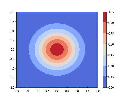
In this example, we generate a 2D Gaussian distribution using np.exp(-X2 - Y2) and create a contour plot of the distribution using plt.contourf. We then add a colorbar to the plot and set the limits of the colorbar to be between 0 and 1.
Colorbar Limits for Image Plots
Colorbar limits can also be set for image plots, where the colorbar represents the mapping between pixel values and colors in the image. Let’s see an example of setting colorbar limits for an image plot.
import matplotlib.pyplot as plt
import numpy as np

# Generate a random image
image = np.random.rand(100, 100)

# Create an image plot
plt.imshow(image, cmap='gray')
cbar = plt.colorbar()

# Set the colorbar limits
plt.clim(0, 1)

plt.show()
Output:

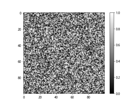
In this example, we generate a random 100×100 image using np.random.rand and create an image plot of the image using plt.imshow. We then add a colorbar to the plot and set the limits of the colorbar to be between 0 and 1.
Colorbar Limits for Surface Plots
Colorbar limits can also be set for surface plots, where the colorbar represents the mapping between surface heights and colors in the plot. Let’s see an example of setting colorbar limits for a surface plot.
import matplotlib.pyplot as plt
import numpy as np

# Generate some data for the surface plot
x = np.arange(-5, 5, 0.1)
y = np.arange(-5, 5, 0.1)
X, Y = np.meshgrid(x, y)
Z = np.sin(np.sqrt(X**2 + Y**2))

# Create a surface plot
fig = plt.figure()
ax = fig.add_subplot(111, projection='3d')
surf = ax.plot_surface(X, Y, Z, cmap='coolwarm')
fig.colorbar(surf)

# Set the colorbar limits
plt.clim(-1, 1)

plt.show()
In this example, we generate arandom surface using np.sin(np.sqrt(X2 + Y2)) and create a 3D surface plot of the data using ax.plot_surface. We then add a colorbar to the plot using fig.colorbar and set the limits of the colorbar to be between -1 and 1.
Colorbar Limits for Pcolor Plots
Colorbar limits can also be set for pcolor plots, which are similar to contour plots but represent the color mapping between grid cells rather than contour lines. Let’s see an example of setting colorbar limits for a pcolor plot.
import matplotlib.pyplot as plt
import numpy as np

# Generate some data for the pcolor plot
x = np.linspace(-2, 2, 101)
y = np.linspace(-2, 2, 101)
X, Y = np.meshgrid(x, y)
Z = np.exp(-X**2 - Y**2)

# Create a pcolor plot
pcolor = plt.pcolor(X, Y, Z, cmap='coolwarm')
cbar = plt.colorbar(pcolor)

# Set the colorbar limits
plt.clim(0, 1)

plt.show()
Output:

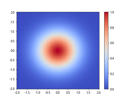
In this example, we generate a 2D Gaussian distribution using np.exp(-X2 - Y2) and create a pcolor plot of the distribution using plt.pcolor. We then add a colorbar to the plot and set the limits of the colorbar to be between 0 and 1.
Colorbar Limits Conclusion
In this article, we explored how to set the limits of colorbars in matplotlib. We covered basic colorbar limits, explicit colorbar limits, adjusting colorbar limits dynamically, customizing colorbar limits and ticks, manually adding colorbar to a plot, setting colorbar limits for contour plots, image plots, surface plots, and pcolor plots. By understanding how to set colorbar limits, you can enhance your data visualizations and better communicate your findings to others. Experiment with the examples provided to see how colorbar limits can improve the clarity and effectiveness of your plots.