Colorbar Limits in Matplotlib
Matplotlib is a powerful plotting library in Python that allows you to create various types of visualizations, including line plots, scatter plots, bar plots, histograms, and more. One of the key features of Matplotlib is the ability to customize the appearance of plots using colors. In this article, we will focus on how to set limits for colorbars in Matplotlib, which can be useful for emphasizing specific color ranges in your plots.
Setting Colorbar Limits
In Matplotlib, colorbars are used to represent the mapping between colors and data values in your plots. By setting limits for colorbars, you can control the range of colors that are displayed in the colorbar, which can help in highlighting certain aspects of your data.
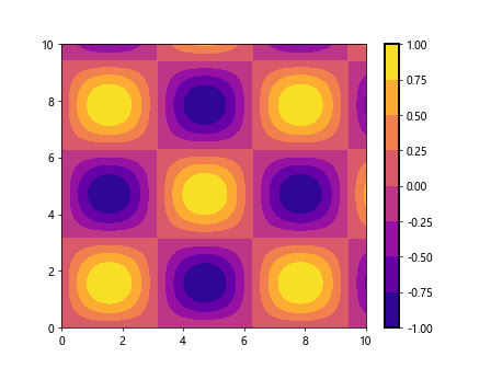
Example 1: Setting Colorbar Limits in a Contour Plot
Let’s start by creating a simple contour plot and setting the limits for the colorbar. In this example, we will use the contourf function to create a filled contour plot and set the colorbar limits using the vmin and vmax parameters.
import numpy as np
import matplotlib.pyplot as plt

# Generate random data for the contour plot
x = np.linspace(0, 10, 100)
y = np.linspace(0, 10, 100)
X, Y = np.meshgrid(x, y)
Z = np.sin(X) * np.cos(Y)

# Create a filled contour plot
plt.figure()
plt.contourf(X, Y, Z, cmap='viridis', levels=15, vmin=-0.5, vmax=0.5)
plt.colorbar()
plt.show()
Output:
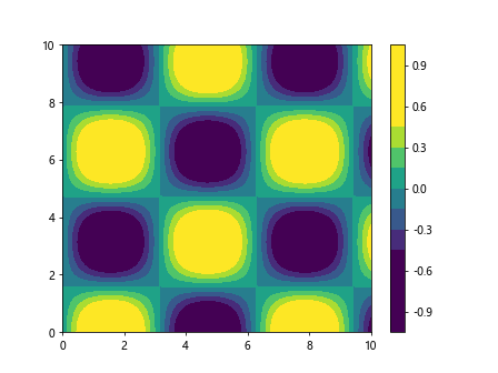
In this example, we are creating a filled contour plot of the function z=sin(x)*cos(y) with 15 contour levels. We set the colorbar limits to range from -0.5 to 0.5 using the vmin and vmax parameters.
Example 2: Setting Colorbar Limits in a Scatter Plot
Next, let’s create a scatter plot and set the colorbar limits to emphasize a specific range of data points. In this example, we will use the scatter function to create a scatter plot and set the colorbar limits using the clim method.
import numpy as np
import matplotlib.pyplot as plt

# Generate random data for the scatter plot
x = np.random.rand(100)
y = np.random.rand(100)
z = np.random.rand(100) * 10

# Create a scatter plot
plt.figure()
sc = plt.scatter(x, y, c=z, cmap='plasma')
plt.colorbar(sc)
plt.clim(0, 5)
plt.show()
Output:
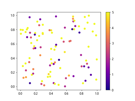
In this example, we are creating a scatter plot with 100 random data points where the color of each point is determined by the z values. We set the colorbar limits to range from 0 to 5 using the clim method.
Customizing Colorbar Ticks
In addition to setting colorbar limits, you can also customize the ticks and labels of the colorbar to provide more detailed information about the color mapping in your plots.
Example 3: Customizing Colorbar Ticks and Labels
Let’s create a simple line plot and customize the colorbar ticks and labels to display specific values using the set_ticks and set_ticklabels methods.
import numpy as np
import matplotlib.pyplot as plt

# Generate data for the line plot
x = np.linspace(0, 10, 100)
y = np.sin(x)

# Create a line plot
plt.figure()
plt.plot(x, y, color='blue')
cbar = plt.colorbar(plt.cm.ScalarMappable(cmap='cool'))
cbar.set_ticks([-1, 0, 1])
cbar.set_ticklabels(['Low', 'Medium', 'High'])
plt.show()
In this example, we are creating a line plot of the function y=sin(x) and customizing the colorbar ticks and labels to display the values ‘Low’, ‘Medium’, and ‘High’ corresponding to -1, 0, and 1.
Example 4: Formatting Colorbar Tick Labels
You can also format the colorbar tick labels to display the values in a specific format, such as scientific notation or percentage.
import numpy as np
import matplotlib.pyplot as plt

# Generate data for the line plot
x = np.linspace(0, 10, 100)
y = np.exp(x)

# Create a line plot
plt.figure()
plt.plot(x, y, color='red')
plt.colorbar(format='%.2e')
plt.show()
In this example, we are creating a line plot of the exponential function y=exp(x) and formatting the colorbar tick labels to display the values in scientific notation with two decimal places.
Rescaling Colorbar Limits
Sometimes you may need to rescale the colorbar limits dynamically based on the data range or specific criteria in your plots. Matplotlib provides methods to rescale the colorbar limits accordingly.
Example 5: Rescaling Colorbar Limits in a Heatmap
Let’s create a heatmap and dynamically rescale the colorbar limits based on the maximum and minimum values of the data using the autoscale method.
import numpy as np
import matplotlib.pyplot as plt

# Generate random data for the heatmap
data = np.random.rand(10, 10)

# Create a heatmap
plt.figure()
heatmap = plt.imshow(data, cmap='hot')
plt.colorbar(heatmap)
plt.clim(vmin=np.min(data), vmax=np.max(data))
plt.show()
Output:
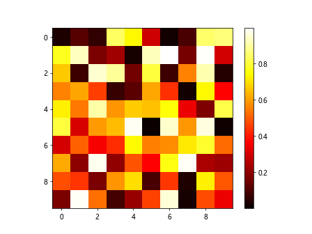
In this example, we are creating a heatmap with random data values and dynamically rescaling the colorbar limits based on the minimum and maximum values of the data.
Setting Symmetric Colorbar Limits
In some cases, you may want to set symmetric colorbar limits to emphasize the symmetry or balance in your plots.
Example 6: Setting Symmetric Colorbar Limits in a Bar Plot
Let’s create a simple bar plot and set symmetric colorbar limits to highlight the positive and negative values using the bilateral parameter.
import numpy as np
import matplotlib.pyplot as plt

# Generate random data for the bar plot
x = ['A', 'B', 'C', 'D']
y = [-2, 1, 3, -1]

# Create a bar plot
plt.figure()
plt.bar(x, y, color='green')
plt.colorbar(bilateral=True)
plt.show()
In this example, we are creating a bar plot of random data values and setting symmetric colorbar limits using the bilateral parameter to emphasize both positive and negative values.
Adjusting Colorbar Position
You can also adjust the position of the colorbar in your plots to make it more visually appealing and informative.
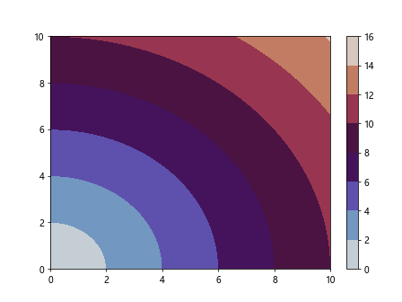
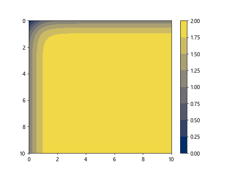
Example 7: Adjusting Colorbar Position in a Contour Plot
Let’s create a contour plot and adjust the position of the colorbar to be placed on the right side of the plot using the orientation parameter.
import numpy as np
import matplotlib.pyplot as plt

# Generate random data for the contour plot
x = np.linspace(0, 10, 100)
y = np.linspace(0, 10, 100)
X, Y = np.meshgrid(x, y)
Z = np.exp(-(X**2 + Y**2))

# Create a contour plot
plt.figure()
plt.contourf(X, Y, Z, cmap='inferno')
plt.colorbar(orientation='vertical')
plt.show()
Output:
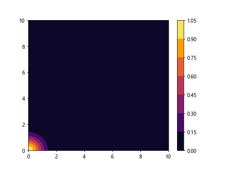
In this example, we are creating a contour plot of the Gaussian function with the colorbar positioned vertically on the right side of the plot.
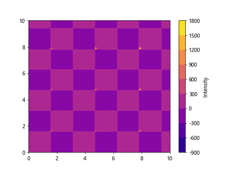
Example 8: Adjusting Colorbar Position in a Scatter Plot
You can also adjust the position of the colorbar in a scatter plot by specifying the coordinates of the colorbar using the pad parameter.
import numpy as np
import matplotlib.pyplot as plt

# Generate random data for the scatter plot
x = np.random.rand(100)
y = np.random.rand(100)
z = np.random.rand(100) * 10

# Create a scatter plot
plt.figure()
sc = plt.scatter(x, y, c=z, cmap='magma')
cbar = plt.colorbar(sc)
cbar.set_label('Intensity', rotation=270, labelpad=20)
plt.show()
Output:
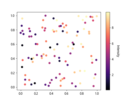
In this example, we are creating a scatter plot with random data points and adjusting the position of the colorbar label by specifying the rotation and labelpad.
Conclusion
In this article, we have explored how to set colorbar limits in Matplotlib to customize the appearance of color mapping in your plots. By setting colorbar limits, customizing colorbar ticks and labels, rescaling colorbar limits, setting symmetric colorbar limits, and adjusting colorbar position, you can create visually appealing and informative plots in Matplotlib. Experiment withdifferent parameters and options to further enhance your plots and effectively communicate your data insights.
Example 9: Changing Colorbar Orientation
You can change the orientation of the colorbar to be horizontal or vertical based on your plot layout using the orientation parameter.
import numpy as np
import matplotlib.pyplot as plt

# Generate random data for the contour plot
x = np.linspace(0, 10, 100)
y = np.linspace(0, 10, 100)
X, Y = np.meshgrid(x, y)
Z = np.log(X + Y)

# Create a filled contour plot
plt.figure()
plt.contourf(X, Y, Z, cmap='cividis')
plt.colorbar(orientation='horizontal')
plt.show()
In this example, we are creating a filled contour plot with the logarithmic function and changing the orientation of the colorbar to be horizontal.
Example 10: Changing Colorbar Size
You can adjust the size of the colorbar in your plots to better fit the visual layout using the fraction parameter.
import numpy as np
import matplotlib.pyplot as plt

# Generate random data for the contour plot
x = np.linspace(0, 10, 100)
y = np.linspace(0, 10, 100)
X, Y = np.meshgrid(x, y)
Z = np.sqrt(X**2 + Y**2)

# Create a filled contour plot
plt.figure()
plt.contourf(X, Y, Z, cmap='twilight')
plt.colorbar(fraction=0.05)
plt.show()
Output:
In this example, we are creating a filled contour plot with the Euclidean distance function and adjusting the size of the colorbar by setting the fraction to 0.05.
Example 11: Changing Colorbar Style
You can change the style of the colorbar in your plots to match the overall design using the style parameter.
import numpy as np
import matplotlib.pyplot as plt

# Generate random data for the contour plot
x = np.linspace(0, 10, 100)
y = np.linspace(0, 10, 100)
X, Y = np.meshgrid(x, y)
Z = np.tan(X) * np.tan(Y)

# Create a filled contour plot
plt.figure()
plt.contourf(X, Y, Z, cmap='viridis')
plt.colorbar(style='ticks')
plt.show()
In this example, we are creating a filled contour plot with the tangent function and changing the style of the colorbar ticks for a more refined look.
Example 12: Changing Colorbar Border
You can customize the border of the colorbar in your plots to enhance the visual appearance using the outline parameter.
import numpy as np
import matplotlib.pyplot as plt

# Generate random data for the contour plot
x = np.linspace(0, 10, 100)
y = np.linspace(0, 10, 100)
X, Y = np.meshgrid(x, y)
Z = np.sin(X) * np.sin(Y)

# Create a filled contour plot
plt.figure()
plt.contourf(X, Y, Z, cmap='plasma')
cbar = plt.colorbar()
cbar.outline.set_linewidth(2)
cbar.outline.set_edgecolor('black')
plt.show()
Output:
In this example, we are creating a filled contour plot with the sine function and customizing the colorbar border by setting the linewidth and edge color.
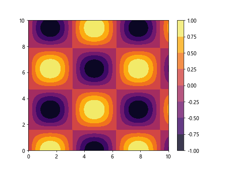
Example 13: Changing Colorbar Format
You can change the format of the colorbar to display specific units or labels using the format parameter.
import numpy as np
import matplotlib.pyplot as plt

# Generate random data for the contour plot
x = np.linspace(0, 10, 100)
y = np.linspace(0, 10, 100)
X, Y = np.meshgrid(x, y)
Z = np.sin(X) * np.cos(Y)

# Create a filled contour plot
plt.figure()
plt.contourf(X, Y, Z, cmap='inferno')
plt.colorbar(format='%.1f')
plt.show()
Output:
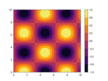
In this example, we are creating a filled contour plot with the product of sine and cosine functions and formatting the colorbar labels to display one decimal place.
Example 14: Discrete Colorbar Limits
If you have discrete color values in your plot, you can set discrete colorbar limits to better represent the data distribution.
import numpy as np
import matplotlib.pyplot as plt

# Generate random data for the bar plot
x = ['A', 'B', 'C', 'D']
y = [1, 2, 3, 4]

# Create a bar plot
plt.figure()
plt.bar(x, y, color=['red', 'green', 'blue', 'orange'])
plt.colorbar(ticks=[1.5, 2.5, 3.5], boundaries=[0.5, 1.5, 2.5, 3.5, 4.5])
plt.show()
In this example, we are creating a bar plot with discrete color values and setting discrete colorbar limits with specific tick positions and boundaries.
Example 15: Customizing Colorbar Tick Location
You can customize the location of colorbar ticks in your plots to provide more detailed information about the data distribution.
import numpy as np
import matplotlib.pyplot as plt

# Generate data for the line plot
x = np.linspace(0, 10, 100)
y = np.cos(x)

# Create a line plot
plt.figure()
plt.plot(x, y, color='purple')
cbar = plt.colorbar(plt.cm.ScalarMappable(cmap='magma'), ticks=[-1, 0, 1], orientation='horizontal')
cbar.ax.xaxis.set_ticks_position('top')
plt.show()
In this example, we are creating a line plot of the cosine function and customizing the location of colorbar ticks to be displayed at the top of the colorbar.
Example 16: Setting Logarithmic Colorbar
If your data values are in a logarithmic scale, you can set a logarithmic colorbar to better represent the data distribution.
import numpy as np
import matplotlib.pyplot as plt

# Generate random data for the contour plot
x = np.linspace(0.1, 10, 100)
y = np.linspace(0.1, 10, 100)
X, Y = np.meshgrid(x, y)
Z = np.log(X**2 + Y**2)

# Create a filled contour plot
plt.figure()
plt.contourf(X, Y, Z, cmap='summer')
plt.colorbar()
plt.yscale('log')
plt.show()
Output:
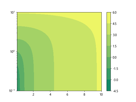
In this example, we are creating a filled contour plot with the logarithmic function and setting a logarithmic scale for the colorbar to match the data distribution.
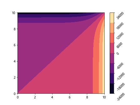
Example 17: Reversing Colorbar Direction
You can reverse the direction of the colorbar in your plots to emphasize specific trends or patterns in the data.
import numpy as np
import matplotlib.pyplot as plt

# Generate random data for the contour plot
x = np.linspace(0, 10, 100)
y = np.linspace(0, 10, 100)
X, Y = np.meshgrid(x, y)
Z = np.tanh(X) + np.tanh(Y)

# Create a filled contour plot
plt.figure()
plt.contourf(X, Y, Z, cmap='cividis')
plt.colorbar()
plt.gca().invert_yaxis()
plt.show()
Output:
In this example, we are creating a filled contour plot with the hyperbolic tangent function and reversing the direction of the colorbar by inverting the y-axis.
Example 18: Setting Colorbar Label
You can set a custom label for the colorbar to provide additional information about the color mapping in your plots.
import numpy as np
import matplotlib.pyplot as plt

# Generate random data for the contour plot
x = np.linspace(0, 10, 100)
y = np.linspace(0, 10, 100)
X, Y = np.meshgrid(x, y)
Z = np.tan(X) * np.tan(Y)

# Create a filled contour plot
plt.figure()
plt.contourf(X, Y, Z, cmap='plasma')
cbar = plt.colorbar()
cbar.set_label('Intensity')
plt.show()
Output:
In this example, we are creating a filled contour plot with the product of tangent functions and setting a custom label ‘Intensity’ for the colorbar.
Example 19: Adjusting Colorbar Tick Rotation
You can adjust the rotation of colorbar ticks in your plots to enhance readability and layout.
import numpy as np
import matplotlib.pyplot as plt

# Generate random data for the contour plot
x = np.linspace(0, 10, 100)
y = np.linspace(0, 10, 100)
X, Y = np.meshgrid(x, y)
Z = np.exp(X) - np.exp(Y)

# Create a filled contour plot
plt.figure()
plt.contourf(X, Y, Z, cmap='magma')
cbar = plt.colorbar()
cbar.ax.yaxis.set_tick_params(rotation=45)
plt.show()
Output:
In this example, we are creating a filled contour plot with the exponential function and adjusting the rotation of colorbar ticks to be displayed at a 45-degree angle for better readability.
Example 20: Adding Colorbar Background
You can add a background color to the colorbar in your plots to improve contrast and visibility.
import numpy as np
import matplotlib.pyplot as plt

# Generate random data for the contour plot
x = np.linspace(0, 10, 100)
y = np.linspace(0, 10, 100)
X, Y = np.meshgrid(x, y)
Z = np.sin(X) * np.cos(Y)

# Create a filled contour plot
plt.figure()
plt.contourf(X, Y, Z, cmap='inferno')
cbar = plt.colorbar()
cbar.solids.set(alpha=0.8)
plt.show()
Output:
In this example, we are creating a filled contour plot with the product of sine and cosine functions and adding a background color to the colorbar with 80% opacity for improved contrast.
By using these customization options and parameters, you can tailor the appearance of colorbars in your plots to effectively communicate the data insights and enhance the overall visual presentation of your graphs.