plt.colorbar limits
In Matplotlib, the plt.colorbar function is used to add a colorbar to a plot. By default, the colorbar will extend the full range of values in the data. However, there may be instances where you want to set specific limits for the colorbar to better visualize the data.
In this article, we will explore how to set the limits for the colorbar in Matplotlib using various examples.
Example 1: Basic Scatter Plot with Default Colorbar
Let’s start by creating a basic scatter plot with random data using the default colorbar settings:
import matplotlib.pyplot as plt
import numpy as np

# Generate some random data
x = np.random.rand(100)
y = np.random.rand(100)
colors = np.random.rand(100)

# Create a scatter plot
plt.scatter(x, y, c=colors, cmap='viridis')
plt.colorbar()

plt.show()
Output:
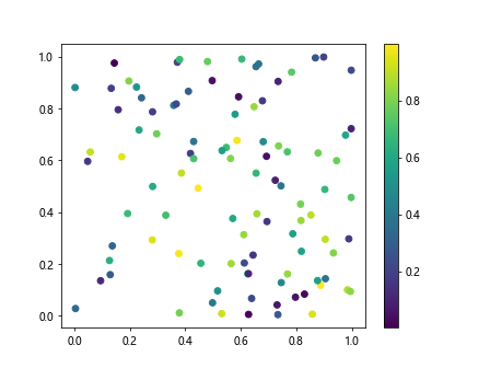
In this example, the colorbar extends from the minimum value to the maximum value in the data.
Example 2: Setting Colorbar Limits
To set specific limits for the colorbar, you can use the vmin and vmax arguments in the plt.colorbar function:
import matplotlib.pyplot as plt
import numpy as np

# Generate some random data
x = np.random.rand(100)
y = np.random.rand(100)
colors = np.random.rand(100)

# Create a scatter plot
plt.scatter(x, y, c=colors, cmap='viridis')
plt.colorbar().set_clim(0.2, 0.8)

plt.show()
In this example, we have set the colorbar limits to be between 0.2 and 0.8.
Example 3: Setting Colorbar Format
You can also customize the format of the colorbar using the format parameter:
import matplotlib.pyplot as plt
import numpy as np

# Generate some random data
x = np.random.rand(100)
y = np.random.rand(100)
colors = np.random.rand(100)

# Create a scatter plot
sc = plt.scatter(x, y, c=colors, cmap='viridis')
plt.colorbar(format='%.2f')

plt.show()
Output:
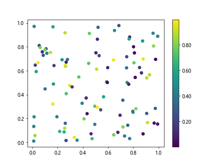
In this example, we have specified the format to display the colorbar values with two decimal places.
Example 4: Setting Colorbar Ticks
You can control the number and placement of colorbar ticks using the ticks parameter:
import matplotlib.pyplot as plt
import numpy as np

# Generate some random data
x = np.random.rand(100)
y = np.random.rand(100)
colors = np.random.rand(100)

# Create a scatter plot
sc = plt.scatter(x, y, c=colors, cmap='viridis')
cb = plt.colorbar()
cb.set_ticks([0.1, 0.3, 0.5, 0.7, 0.9])

plt.show()
Output:
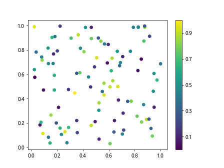
In this example, we have specified the colorbar ticks at specific values.
Example 5: Discrete Colorbar
If you want to create a colorbar with discrete colors, you can use the boundaries parameter:
import matplotlib.pyplot as plt
import numpy as np

# Generate some random data
x = np.random.rand(100)
y = np.random.rand(100)
colors = np.random.randint(0, 5, 100)  # Random integers for discrete colors

# Create a scatter plot
sc = plt.scatter(x, y, c=colors, cmap='viridis')
cb = plt.colorbar()
cb.set_ticks(np.arange(0, 5))
cb.set_ticklabels(['A', 'B', 'C', 'D', 'E'])

plt.show()
Output:
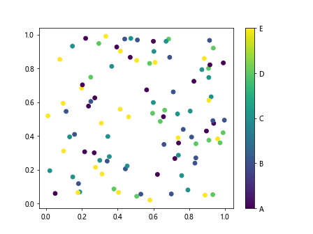
In this example, we have created a discrete colorbar with custom tick labels.
Example 6: Colorbar Orientation
You can also change the orientation of the colorbar using the orientation parameter:
import matplotlib.pyplot as plt
import numpy as np

# Generate some random data
x = np.random.rand(100)
y = np.random.rand(100)
colors = np.random.rand(100)

# Create a scatter plot
plt.scatter(x, y, c=colors, cmap='viridis')
plt.colorbar(orientation='horizontal')

plt.show()
Output:
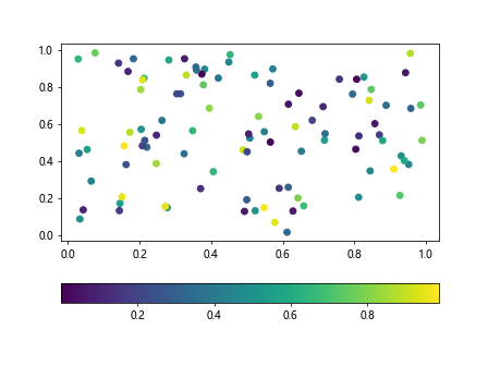
In this example, we have changed the orientation of the colorbar to be horizontal.
Example 7: Colorbar Spacing
To adjust the spacing of the colorbar from the plot, you can use the pad parameter:
import matplotlib.pyplot as plt
import numpy as np

# Generate some random data
x = np.random.rand(100)
y = np.random.rand(100)
colors = np.random.rand(100)

# Create a scatter plot
plt.scatter(x, y, c=colors, cmap='viridis')
plt.colorbar(pad=0.1)

plt.show()
Output:
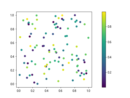
In this example, we have increased the spacing between the colorbar and the plot.
Example 8: Colorbar Title
You can add a title to the colorbar using the label parameter:
import matplotlib.pyplot as plt
import numpy as np

# Generate some random data
x = np.random.rand(100)
y = np.random.rand(100)
colors = np.random.rand(100)

# Create a scatter plot
plt.scatter(x, y, c=colors, cmap='viridis')
plt.colorbar(label='Colorbar Title')

plt.show()
Output:
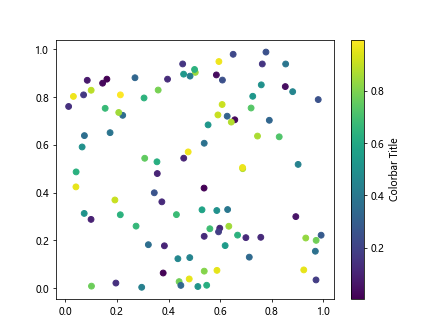
In this example, we have added a title to the colorbar.
Example 9: Colorbar Tick Labels
You can customize the tick labels of the colorbar using the ticklabels parameter:
import matplotlib.pyplot as plt
import numpy as np

# Generate some random data
x = np.random.rand(100)
y = np.random.rand(100)
colors = np.random.rand(100)

# Create a scatter plot
plt.scatter(x, y, c=colors, cmap='viridis')
plt.colorbar(ticks=[0.2, 0.4, 0.6, 0.8], ticklabels=['Low', 'Medium', 'High'])

plt.show()
In this example, we have set custom tick labels for the colorbar.
Example 10: Colorbar Transparency
You can adjust the transparency of the colorbar using the alpha parameter:
import matplotlib.pyplot as plt
import numpy as np

# Generate some random data
x = np.random.rand(100)
y = np.random.rand(100)
colors = np.random.rand(100)

# Create a scatter plot
plt.scatter(x, y, c=colors, cmap='viridis')
plt.colorbar(alpha=0.5)

plt.show()
Output:
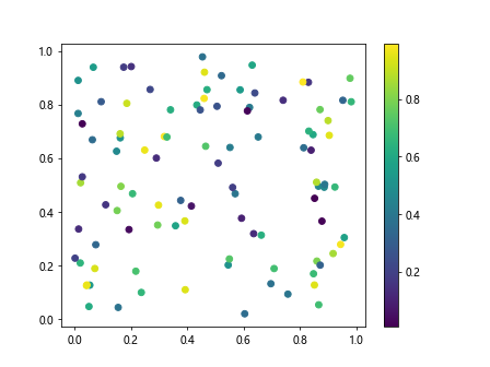
In this example, we have set the colorbar to be partially transparent.
plt.colorbar limits Conclusion
In this article, we have explored various ways to customize the colorbar in Matplotlib by setting limits, format, ticks, orientation, spacing, title, tick labels, and transparency. By understanding how to manipulate the colorbar, you can enhance the visual representation of your data in plots. Experiment with the examples provided to create custom colorbars that suit your specific needs.