plt.colorbar
In matplotlib, the plt.colorbar function is used to create a colorbar for a given plot. Colorbars are commonly used in visualizations to help viewers understand the relationship between the colors used in the plot and the data being represented.
Basic Usage
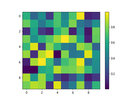
Let’s start by creating a simple plot and adding a colorbar to it. In this example, we will use the imshow function to display a 2D array as an image.
import matplotlib.pyplot as plt
import numpy as np

# Create a 2D array
data = np.random.rand(10, 10)

# Display the array as an image
plt.imshow(data)
plt.colorbar()
plt.show()
Output:
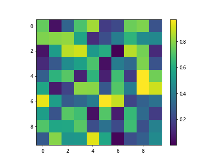
In this code snippet, we first generate a random 10×10 array using np.random.rand. Then, we use imshow to display this array as an image. Finally, we call plt.colorbar to add a colorbar to the plot.
Customizing Colorbars
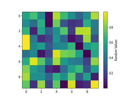
You can customize the appearance of the colorbar by passing additional arguments to the plt.colorbar function. For example, you can set the label for the colorbar using the label parameter:
import matplotlib.pyplot as plt
import numpy as np

# Create a 2D array
data = np.random.rand(10, 10)

plt.imshow(data)
plt.colorbar(label='Random Values')
plt.show()
Output:
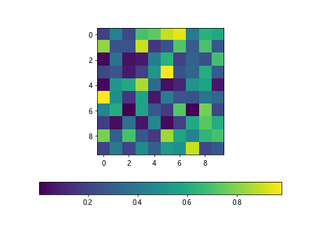
You can also change the orientation of the colorbar by setting the orientation parameter to ‘horizontal’:
import matplotlib.pyplot as plt
import numpy as np

# Create a 2D array
data = np.random.rand(10, 10)

plt.imshow(data)
plt.colorbar(orientation='horizontal')
plt.show()
Output:
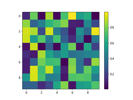
Additionally, you can change the location of the colorbar with the location parameter. Valid values for location are ‘left’, ‘right’, ‘top’, and ‘bottom’:
import matplotlib.pyplot as plt
import numpy as np

# Create a 2D array
data = np.random.rand(10, 10)

plt.imshow(data)
plt.colorbar(location='right')
plt.show()
Output:
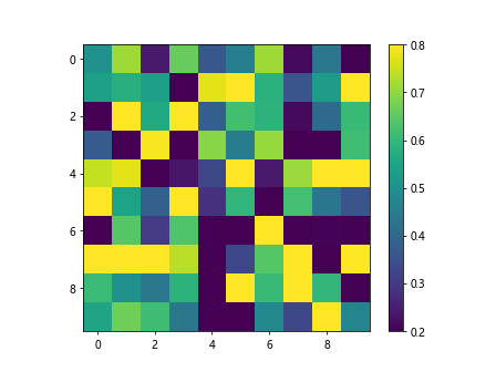
Controlling Colorbar Limits
You can control the range of values displayed in the colorbar by setting the vmin and vmax parameters. This can be useful when you want to focus on a specific range of values in your data:
import matplotlib.pyplot as plt
import numpy as np

# Create a 2D array
data = np.random.rand(10, 10)

plt.imshow(data, vmin=0.2, vmax=0.8)
plt.colorbar()
plt.show()
Output:
You can also set the ticks and tick labels for the colorbar using the ticks and ticklabels parameters. This can be especially useful when you want to display specific values on the colorbar:
import matplotlib.pyplot as plt
import numpy as np

# Create a 2D array
data = np.random.rand(10, 10)

plt.imshow(data)
plt.colorbar(ticks=[0, 0.5, 1], ticklabels=['low', 'medium', 'high'])
plt.show()
Changing Colorbar Colormap
Matplotlib provides a variety of colormaps that you can use to customize the appearance of your colorbar. You can set the colormap for the colorbar using the cmap parameter. Here’s an example using the ‘viridis’ colormap:
import matplotlib.pyplot as plt
import numpy as np

# Create a 2D array
data = np.random.rand(10, 10)

plt.imshow(data)
plt.colorbar(cmap='viridis')
plt.show()
Output:
You can also create a custom colormap and use it for the colorbar. In this example, we create a colormap that transitions from red to blue:
from matplotlib.colors import LinearSegmentedColormap
import matplotlib.pyplot as plt
import numpy as np

# Create a 2D array
data = np.random.rand(10, 10)

colors = [(1, 0, 0), (0, 0, 1)]
cmap = LinearSegmentedColormap.from_list('custom_cmap', colors, N=10)

plt.imshow(data)
plt.colorbar(cmap=cmap)
plt.show()
Output:
Handling Multiple Colorbars
If your plot contains multiple subplots, you can add a colorbar to each subplot individually. Here’s an example with two subplots, each with its own colorbar:
import matplotlib.pyplot as plt
import numpy as np

# Create a 2D array
data = np.random.rand(10, 10)

fig, axs = plt.subplots(1, 2)

axs[0].imshow(data)
cb1 = plt.colorbar(ax=axs[0])

axs[1].imshow(data.T)
cb2 = plt.colorbar(ax=axs[1])

plt.show()
In this code snippet, we create a figure with two subplots using plt.subplots. We then display an image on each subplot and add a colorbar to each subplot using the plt.colorbar function with the ax parameter.
Coloring Discrete Values
In some cases, you may want to map discrete values to specific colors in your plot. You can achieve this by using a ListedColormap along with BoundaryNorm. Here’s an example where we color values less than 0.5 as blue and values greater than 0.5 as red:
from matplotlib.colors import BoundaryNorm, ListedColormap
import matplotlib.pyplot as plt
import numpy as np

# Create a 2D array
data = np.random.rand(10, 10)

values = np.linspace(0, 1, 10)
colors = ['blue', 'red']
cmap = ListedColormap(colors)
norm = BoundaryNorm(values, cmap.N)

plt.imshow(data, cmap=cmap, norm=norm)
plt.colorbar()
plt.show()
Hiding Colorbar
If you want to hide the colorbar from the plot, you can use the plt.colorbar function with the mappable parameter set to None:
import matplotlib.pyplot as plt
import numpy as np

# Create a 2D array
data = np.random.rand(10, 10)

plt.imshow(data)
plt.colorbar(mappable=None)
plt.show()
Output:
Changing Colorbar Font Properties
You can customize the font properties of the colorbar labels using the set_label method and passing a dictionary of font properties:
import matplotlib.pyplot as plt
import numpy as np

# Create a 2D array
data = np.random.rand(10, 10)

cbar = plt.colorbar()
cbar.set_label('Label', fontdict={'fontsize': 14, 'fontweight': 'bold', 'color': 'green'})
plt.show()
plt.colorbar Conclusion
In this article, we explored various aspects of using plt.colorbar in matplotlib. We covered basic usage, customizing colorbars, controlling colorbar limits, changing colormaps, handling multiple colorbars, coloring discrete values, hiding the colorbar, and changing colorbar font properties. Colorbars are essential for visualizing data in plots and understanding the relationships between colors and data values. By utilizing the plt.colorbar function effectively, you can enhance the quality and interpretability of your plots.