Introduction to plt.errorbar
In data visualization, error bars are commonly used to represent uncertainty in the data being displayed. The plt.errorbar function in Matplotlib is a powerful tool for creating error bar plots in Python.
Basic Usage
The plt.errorbar function in Matplotlib can be used to plot data along with error bars. Here is a simple example of how to use plt.errorbar:
import matplotlib.pyplot as plt
import numpy as np

x = np.linspace(0, 10, 10)
y = np.sin(x)
error = 0.1

plt.errorbar(x, y, yerr=error, fmt='o', color='b')
plt.show()
Output:
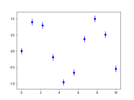
In this example, we create a simple sine curve with some added noise specified by the error variable. The yerr parameter is used to specify the size of the error bars and fmt is used to specify the style of the error bars. The color parameter sets the color of the error bars.
Customizing Error Bars
The plt.errorbar function allows for a high level of customization when it comes to error bars. You can customize the style, color, and size of the error bars to suit your needs. Here is an example that demonstrates some common customization options:
import matplotlib.pyplot as plt
import numpy as np

x = np.linspace(0, 10, 10)
y = np.cos(x)
errors = np.abs(np.random.randn(10))

plt.errorbar(x, y, yerr=errors, fmt='o', color='r', linestyle='--', linewidth=2, capsize=5)
plt.show()
Output:
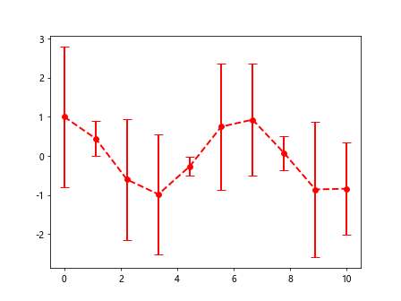
In this example, we add dashed lines to the error bars using linestyle='--', increase the width of the error bars using linewidth=2, and increase the size of the error bar caps using capsize=5.
Adding Horizontal Error Bars
In addition to vertical error bars, plt.errorbar also allows for the creation of horizontal error bars. Here is an example that demonstrates how to add horizontal error bars to a plot:
import matplotlib.pyplot as plt
import numpy as np

y = np.linspace(0, 10, 10)
x = np.sin(y)
errors = 0.2

plt.errorbar(x, y, xerr=errors, fmt='o', color='g')
plt.show()
Output:
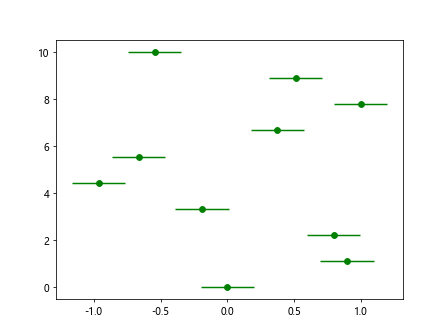
In this example, we use the xerr parameter to specify the horizontal error bars. The error bars are added to the x-axis of the plot.
Advanced Error Bar Plotting
plt.errorbar can also be used to create more advanced error bar plots, such as asymmetric error bars and varying error sizes. Here is an example that demonstrates how to create a plot with asymmetric error bars:
import matplotlib.pyplot as plt
import numpy as np

x = np.arange(10)
y = np.sqrt(x)
lower_errors = np.sqrt(x) / 2
upper_errors = np.sqrt(x) * 2

plt.errorbar(x, y, yerr=[lower_errors, upper_errors], fmt='o', color='m')
plt.show()
Output:
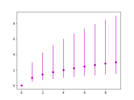
In this example, we use a list for the yerr parameter to specify different sizes for the lower and upper error bars. This results in asymmetric error bars on the plot.
Combining Multiple Data Sets
Sometimes it is necessary to plot multiple data sets on the same plot with error bars. Matplotlib makes it easy to do this using plt.errorbar. Here is an example that demonstrates how to plot multiple data sets with error bars:
import matplotlib.pyplot as plt
import numpy as np

x = np.linspace(0, 10, 10)
y1 = np.sin(x)
y2 = np.cos(x)
errors1 = 0.2
errors2 = 0.1

plt.errorbar(x, y1, yerr=errors1, fmt='o', color='b', label='sin(x)')
plt.errorbar(x, y2, yerr=errors2, fmt='x', color='r', label='cos(x)')
plt.legend()
plt.show()
Output:
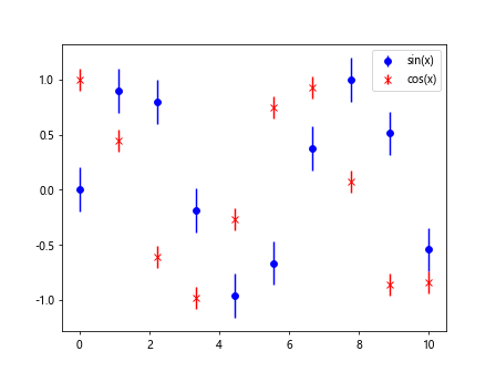
In this example, we plot two different data sets on the same plot and add a legend to differentiate between them.
Bar Plot with Error Bars
In addition to line plots, plt.errorbar can also be used to create bar plots with error bars. Here is an example that demonstrates how to create a bar plot with error bars:
import matplotlib.pyplot as plt
import numpy as np

x = np.arange(5)
y = np.random.rand(5)
errors = np.random.rand(5) / 2

plt.errorbar(x, y, yerr=errors, fmt='o', color='k', linestyle='-', capsize=5)
plt.xticks(x, ['A', 'B', 'C', 'D', 'E'])
plt.show()
Output:
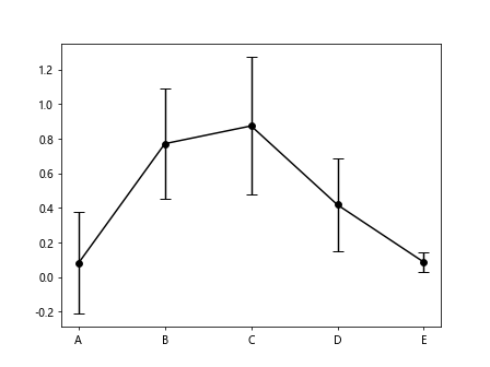
In this example, we create a bar plot with random data and add error bars to each bar using plt.errorbar. The xticks function is used to label the bars.
Grouped Bar Plot with Error Bars
Grouped bar plots are a common way of comparing multiple data sets. Matplotlib can be used to create grouped bar plots with error bars using the plt.errorbar function. Here is an example that demonstrates how to create a grouped bar plot with error bars:
import matplotlib.pyplot as plt
import numpy as np

x = np.arange(3)
y1 = [1, 2, 3]
y2 = [2, 3, 4]
errors1 = [0.1, 0.2, 0.3]
errors2 = [0.2, 0.3, 0.4]

plt.errorbar(x-0.1, y1, yerr=errors1, fmt='o', color='b', label='Group 1')
plt.errorbar(x+0.1, y2, yerr=errors2, fmt='x', color='r', label='Group 2')
plt.xticks(x, ['A', 'B', 'C'])
plt.legend()
plt.show()
Output:
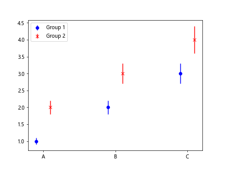
In this example, we create a grouped bar plot with two data sets and add error bars to each group. The bars are labeled using the xticks function and a legend is added to differentiate between the two groups.
Error Bar Styles
Matplotlib allows for the customization of error bar styles, such as changing the marker style or size. Here is an example that demonstrates how to change the marker style of the error bars:
import matplotlib.pyplot as plt
import numpy as np

x = np.linspace(0, 10, 10)
y = np.sin(x)
errors = 0.1

plt.errorbar(x, y, yerr=errors, fmt='o', color='b', marker='s', markersize=8)
plt.show()
In this example, we change the marker style of the error bars to squares using marker='s' and increase the size of the markers using markersize=8.
Log-Scale Error Bar Plot
In some cases, it may be necessary to plot data on a logarithmic scale. Matplotlib supports log-scale error bars using the plt.errorbar function. Here is an example that demonstrates how to create a log-scale error bar plot:
import matplotlib.pyplot as plt
import numpy as np

x = np.linspace(1, 10, 10)
y = np.log(x)
errors = 0.1

plt.errorbar(x, y, yerr=errors, fmt='o', color='b')
plt.yscale('log')
plt.show()
Output:
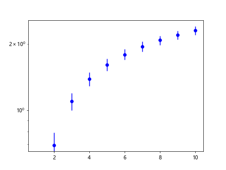
In this example, we plot data on a log-scale y-axis using the plt.yscale('log') function.
plt.errorbar Summary
In this article, we have explored the plt.errorbar function in Matplotlib and demonstrated how it can be used to create various types of error bar plots. From basic error bars to advanced customization options, plt.errorbar is a versatile tool for visualizing data with uncertainty. By combining error bars with line plots, bar plots, and grouped bar plots, you can effectively communicate the variability in your data to your audience. I hope this article has been helpful in understanding how to use plt.errorbar effectively in your data visualization projects.