How to Master Matplotlib Subplots Legend: A Comprehensive Guide
Matplotlib subplots legend is an essential feature for creating informative and visually appealing plots in Python. This comprehensive guide will explore various aspects of working with legends in Matplotlib subplots, providing detailed explanations and practical examples to help you master this powerful visualization tool.
Understanding Matplotlib Subplots Legend
Matplotlib subplots legend is a crucial component when creating multiple plots within a single figure. It allows you to add descriptive labels to different data series or plot elements, making your visualizations more informative and easier to interpret. By effectively using legends in subplots, you can enhance the clarity and readability of your data presentations.
Let’s start with a basic example of creating a subplot with a legend:
import matplotlib.pyplot as plt
import numpy as np

# Create sample data
x = np.linspace(0, 10, 100)
y1 = np.sin(x)
y2 = np.cos(x)

# Create subplot
fig, ax = plt.subplots()

# Plot data
ax.plot(x, y1, label='Sine')
ax.plot(x, y2, label='Cosine')

# Add legend
ax.legend()

# Set title
ax.set_title('Sine and Cosine Curves - how2matplotlib.com')

# Display the plot
plt.show()
Output:
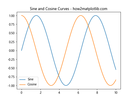
In this example, we create a simple subplot with two curves (sine and cosine) and add a legend to distinguish between them. The label parameter in the plot() function is used to specify the legend entries, and ax.legend() adds the legend to the subplot.
Customizing Legend Appearance
Matplotlib subplots legend offers various customization options to enhance the appearance of your legends. You can modify properties such as location, font size, background color, and more.
Here’s an example demonstrating some common customization options:
import matplotlib.pyplot as plt
import numpy as np

# Create sample data
x = np.linspace(0, 10, 100)
y1 = np.sin(x)
y2 = np.cos(x)

# Create subplot
fig, ax = plt.subplots()

# Plot data
ax.plot(x, y1, label='Sine')
ax.plot(x, y2, label='Cosine')

# Add customized legend
ax.legend(loc='upper right', fontsize=12, frameon=True, facecolor='lightgray', edgecolor='black')

# Set title
ax.set_title('Customized Legend - how2matplotlib.com')

# Display the plot
plt.show()
Output:
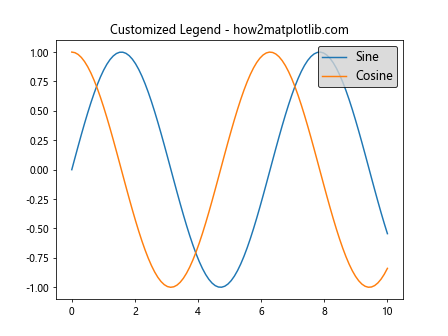
In this example, we customize the legend by specifying its location (loc), font size (fontsize), frame visibility (frameon), background color (facecolor), and edge color (edgecolor).
Placing Legends Outside the Plot Area
Sometimes, you may want to place the legend outside the plot area to maximize the space available for your data visualization. Matplotlib subplots legend provides options to achieve this.
Here’s an example of placing the legend outside the plot area:
import matplotlib.pyplot as plt
import numpy as np

# Create sample data
x = np.linspace(0, 10, 100)
y1 = np.sin(x)
y2 = np.cos(x)
y3 = np.tan(x)

# Create subplot
fig, ax = plt.subplots()

# Plot data
ax.plot(x, y1, label='Sine')
ax.plot(x, y2, label='Cosine')
ax.plot(x, y3, label='Tangent')

# Add legend outside the plot area
ax.legend(bbox_to_anchor=(1.05, 1), loc='upper left')

# Adjust layout to accommodate the legend
plt.tight_layout()

# Set title
ax.set_title('Legend Outside Plot Area - how2matplotlib.com')

# Display the plot
plt.show()
Output:
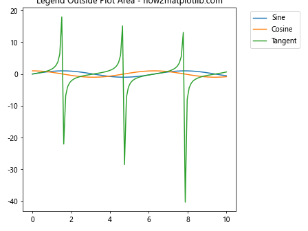
In this example, we use the bbox_to_anchor parameter to position the legend outside the plot area. The tight_layout() function is used to adjust the layout and prevent overlapping.
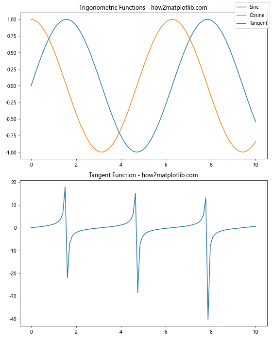
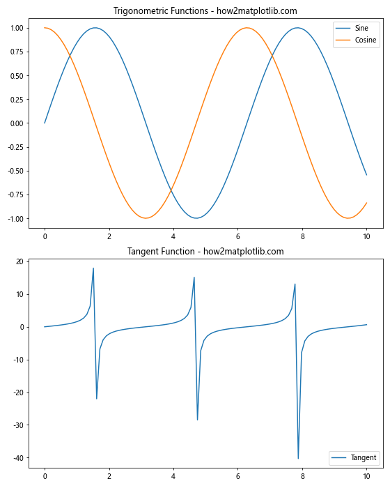
Creating Legends for Multiple Subplots
When working with multiple subplots, you may want to create separate legends for each subplot or a single legend for the entire figure. Matplotlib subplots legend provides flexibility in handling both scenarios.
Here’s an example of creating legends for multiple subplots:
import matplotlib.pyplot as plt
import numpy as np

# Create sample data
x = np.linspace(0, 10, 100)
y1 = np.sin(x)
y2 = np.cos(x)
y3 = np.tan(x)

# Create subplots
fig, (ax1, ax2) = plt.subplots(2, 1, figsize=(8, 10))

# Plot data on first subplot
ax1.plot(x, y1, label='Sine')
ax1.plot(x, y2, label='Cosine')
ax1.legend()
ax1.set_title('Trigonometric Functions - how2matplotlib.com')

# Plot data on second subplot
ax2.plot(x, y3, label='Tangent')
ax2.legend()
ax2.set_title('Tangent Function - how2matplotlib.com')

# Adjust layout
plt.tight_layout()

# Display the plot
plt.show()
Output:
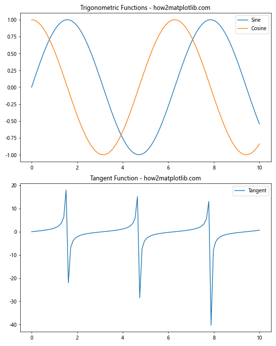
In this example, we create two subplots and add separate legends to each of them using ax1.legend() and ax2.legend().
Combining Legends from Multiple Subplots
In some cases, you may want to combine legends from multiple subplots into a single legend for the entire figure. Matplotlib subplots legend allows you to achieve this using the fig.legend() function.
Here’s an example of combining legends from multiple subplots:
import matplotlib.pyplot as plt
import numpy as np

# Create sample data
x = np.linspace(0, 10, 100)
y1 = np.sin(x)
y2 = np.cos(x)
y3 = np.tan(x)

# Create subplots
fig, (ax1, ax2) = plt.subplots(2, 1, figsize=(8, 10))

# Plot data on first subplot
ax1.plot(x, y1, label='Sine')
ax1.plot(x, y2, label='Cosine')
ax1.set_title('Trigonometric Functions - how2matplotlib.com')

# Plot data on second subplot
ax2.plot(x, y3, label='Tangent')
ax2.set_title('Tangent Function - how2matplotlib.com')

# Add combined legend for both subplots
fig.legend(loc='upper right')

# Adjust layout
plt.tight_layout()

# Display the plot
plt.show()
Output:
In this example, we use fig.legend() to create a single legend for both subplots, combining all the labels from both axes.
Customizing Legend Markers and Labels
Matplotlib subplots legend allows you to customize the markers and labels in your legends to make them more informative and visually appealing.
Here’s an example of customizing legend markers and labels:
import matplotlib.pyplot as plt
import numpy as np

# Create sample data
x = np.linspace(0, 10, 100)
y1 = np.sin(x)
y2 = np.cos(x)

# Create subplot
fig, ax = plt.subplots()

# Plot data
ax.plot(x, y1, 'r-', label='Sine')
ax.plot(x, y2, 'b--', label='Cosine')

# Customize legend markers and labels
custom_lines = [plt.Line2D([0], [0], color='red', lw=2),
                plt.Line2D([0], [0], color='blue', lw=2, linestyle='--')]
ax.legend(custom_lines, ['Custom Sine', 'Custom Cosine'])

# Set title
ax.set_title('Customized Legend Markers - how2matplotlib.com')

# Display the plot
plt.show()
Output:
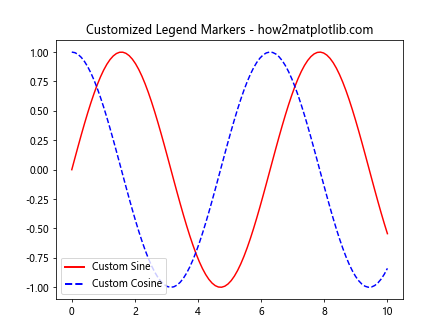
In this example, we create custom line objects using plt.Line2D() and use them to customize the legend markers and labels.
Adding a Legend to a Scatter Plot
Matplotlib subplots legend can also be used with scatter plots to differentiate between different data categories or groups.
Here’s an example of adding a legend to a scatter plot:
import matplotlib.pyplot as plt
import numpy as np

# Create sample data
np.random.seed(42)
x1 = np.random.rand(50)
y1 = np.random.rand(50)
x2 = np.random.rand(50)
y2 = np.random.rand(50)

# Create subplot
fig, ax = plt.subplots()

# Create scatter plot
ax.scatter(x1, y1, c='red', label='Group A')
ax.scatter(x2, y2, c='blue', label='Group B')

# Add legend
ax.legend()

# Set title
ax.set_title('Scatter Plot with Legend - how2matplotlib.com')

# Display the plot
plt.show()
Output:
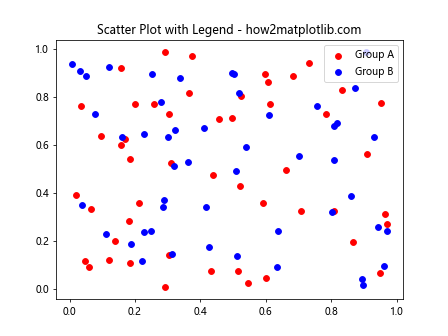
In this example, we create a scatter plot with two groups of data points and add a legend to distinguish between them.
Creating a Legend for Multiple Artists
When working with complex plots that involve multiple artists (e.g., lines, patches, collections), you may need to create a legend that includes all of these elements. Matplotlib subplots legend provides ways to handle such scenarios.
Here’s an example of creating a legend for multiple artists:
import matplotlib.pyplot as plt
import numpy as np

# Create sample data
x = np.linspace(0, 10, 100)
y1 = np.sin(x)
y2 = np.cos(x)

# Create subplot
fig, ax = plt.subplots()

# Plot data
line1, = ax.plot(x, y1, label='Sine')
line2, = ax.plot(x, y2, label='Cosine')
scatter = ax.scatter(x[::10], y1[::10], c='red', label='Scatter')
rect = ax.add_patch(plt.Rectangle((4, 0.5), 2, 0.5, fill=False, label='Rectangle'))

# Add legend for multiple artists
ax.legend(handles=[line1, line2, scatter, rect])

# Set title
ax.set_title('Legend for Multiple Artists - how2matplotlib.com')

# Display the plot
plt.show()
Output:
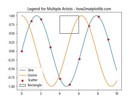
In this example, we create a plot with multiple artists (lines, scatter points, and a rectangle) and add a legend that includes all of these elements using the handles parameter in ax.legend().
Using Legend Proxies
Sometimes, you may want to create legend entries that don’t correspond directly to plotted data. Matplotlib subplots legend allows you to use legend proxies to achieve this.
Here’s an example of using legend proxies:
import matplotlib.pyplot as plt
import numpy as np

# Create sample data
x = np.linspace(0, 10, 100)
y = np.sin(x)

# Create subplot
fig, ax = plt.subplots()

# Plot data
ax.plot(x, y)

# Create legend proxies
from matplotlib.lines import Line2D
legend_elements = [Line2D([0], [0], color='b', lw=2, label='Sine Wave'),
                   Line2D([0], [0], color='r', lw=2, label='Cosine Wave (Not Shown)')]

# Add legend with proxies
ax.legend(handles=legend_elements)

# Set title
ax.set_title('Legend with Proxies - how2matplotlib.com')

# Display the plot
plt.show()
Output:
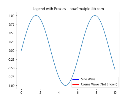
In this example, we create legend proxies using Line2D objects and add them to the legend using the handles parameter, even though one of the lines (Cosine Wave) is not actually plotted.
Controlling Legend Order
The order of items in a Matplotlib subplots legend can be important for clarity and readability. You can control the order of legend entries to suit your needs.
Here’s an example of controlling legend order:
import matplotlib.pyplot as plt
import numpy as np

# Create sample data
x = np.linspace(0, 10, 100)
y1 = np.sin(x)
y2 = np.cos(x)
y3 = np.tan(x)

# Create subplot
fig, ax = plt.subplots()

# Plot data
line1 = ax.plot(x, y1, label='Sine')[0]
line2 = ax.plot(x, y2, label='Cosine')[0]
line3 = ax.plot(x, y3, label='Tangent')[0]

# Add legend with custom order
ax.legend(handles=[line2, line3, line1])

# Set title
ax.set_title('Controlled Legend Order - how2matplotlib.com')

# Display the plot
plt.show()
Output:
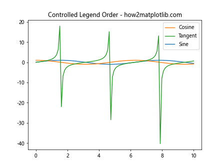
In this example, we control the order of legend entries by specifying the handles in the desired order when calling ax.legend().
Creating Multi-Column Legends
When dealing with many legend entries, a multi-column legend can help save space and improve readability. Matplotlib subplots legend provides options to create multi-column legends.
Here’s an example of creating a multi-column legend:
import matplotlib.pyplot as plt
import numpy as np

# Create sample data
x = np.linspace(0, 10, 100)
y1 = np.sin(x)
y2 = np.cos(x)
y3 = np.tan(x)
y4 = np.exp(x)
y5 = np.log(x)

# Create subplot
fig, ax = plt.subplots()

# Plot data
ax.plot(x, y1, label='Sine')
ax.plot(x, y2, label='Cosine')
ax.plot(x, y3, label='Tangent')
ax.plot(x, y4, label='Exponential')
ax.plot(x, y5, label='Logarithm')

# Add multi-column legend
ax.legend(ncol=3)

# Set title
ax.set_title('Multi-Column Legend - how2matplotlib.com')

# Display the plot
plt.show()
Output:
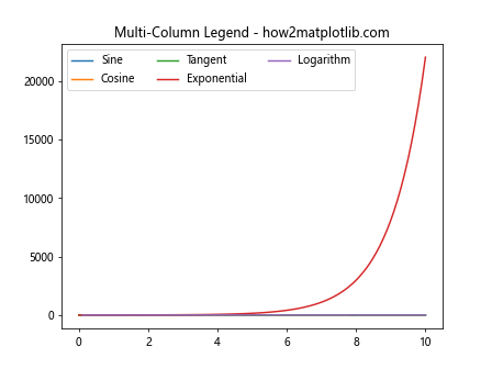
In this example, we use the ncol parameter in ax.legend() to specify the number of columns in the legend.
Adding a Legend to a Pie Chart
Matplotlib subplots legend can also be used with pie charts to provide labels for different segments.
Here’s an example of adding a legend to a pie chart:
import matplotlib.pyplot as plt

# Create sample data
sizes = [30, 20, 25, 15, 10]
labels = ['A', 'B', 'C', 'D', 'E']
colors = ['red', 'green', 'blue', 'yellow', 'orange']

# Create subplot
fig, ax = plt.subplots()

# Create pie chart
ax.pie(sizes, colors=colors, autopct='%1.1f%%', startangle=90)

# Add legend
ax.legend(labels, title="Categories", loc="center left", bbox_to_anchor=(1, 0, 0.5, 1))

# Set title
ax.set_title('Pie Chart with Legend - how2matplotlib.com')

# Ensure the pie chart is circular
ax.axis('equal')

# Display the plot
plt.show()
Output:
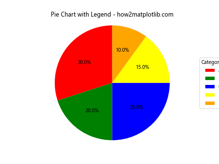
In this example, we create a pie chart and add a legend to label the different segments, positioning it outside the plot area.
Using Legend Handlers
Matplotlib subplots legend provides legend handlers that allow you to customize how legend entries are created and displayed. This is particularly useful for complex plot types or when you want to create custom legend representations.
Here’s an example of using legend handlers:
import matplotlib.pyplot as plt
import numpy as np

# Create sample data
x = np.linspace(0, 10, 100)
y1 = np.sin(x)
y2 = np.cos(x)

# Create subplot
fig, ax = plt.subplots()

# Plot data
line1, = ax.plot(x, y1, label='Sine')
line2, = ax.plot(x, y2, label='Cosine')

# Create custom legend handler
from matplotlib.legend_handler import HandlerLine2D

class MyHandler(HandlerLine2D):
    def create_artists(self, legend, orig_handle, xdescent, ydescent, width, height, fontsize, trans):
        line, = super().create_artists(legend, orig_handle, xdescent, ydescent,width, height, fontsize, trans)
        line.set_linestyle('--')
        return [line]

# Add legend with custom handler
ax.legend(handler_map={line1: MyHandler(), line2: MyHandler()})

# Set title
ax.set_title('Legend with Custom Handlers - how2matplotlib.com')

# Display the plot
plt.show()
Output:
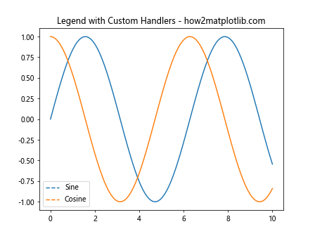
In this example, we create a custom legend handler that changes the line style of the legend entries to dashed lines. We then apply this custom handler to our legend using the handler_map parameter.
Creating a Legend for a 3D Plot
Matplotlib subplots legend can also be used with 3D plots to provide labels for different data series or surfaces.
Here’s an example of adding a legend to a 3D plot:
import matplotlib.pyplot as plt
import numpy as np
from mpl_toolkits.mplot3d import Axes3D

# Create sample data
x = np.linspace(-5, 5, 100)
y = np.linspace(-5, 5, 100)
X, Y = np.meshgrid(x, y)
Z1 = np.sin(np.sqrt(X**2 + Y**2))
Z2 = np.cos(np.sqrt(X**2 + Y**2))

# Create 3D subplot
fig = plt.figure()
ax = fig.add_subplot(111, projection='3d')

# Plot surfaces
surf1 = ax.plot_surface(X, Y, Z1, cmap='viridis', alpha=0.7, label='Sine')
surf2 = ax.plot_surface(X, Y, Z2, cmap='plasma', alpha=0.7, label='Cosine')

# Add legend
ax.legend()

# Set title
ax.set_title('3D Plot with Legend - how2matplotlib.com')

# Display the plot
plt.show()
Output:
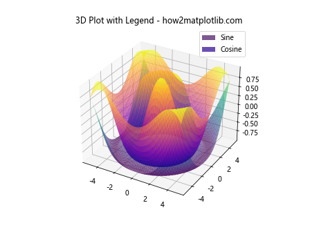
In this example, we create two 3D surfaces and add a legend to distinguish between them. Note that for 3D plots, you may need to use a proxy artist for the legend to work correctly with surfaces.
Customizing Legend Title
Matplotlib subplots legend allows you to add and customize a title for your legend, which can provide additional context or information about the plotted data.
Here’s an example of customizing the legend title:
import matplotlib.pyplot as plt
import numpy as np

# Create sample data
x = np.linspace(0, 10, 100)
y1 = np.sin(x)
y2 = np.cos(x)

# Create subplot
fig, ax = plt.subplots()

# Plot data
ax.plot(x, y1, label='Sine')
ax.plot(x, y2, label='Cosine')

# Add legend with custom title
legend = ax.legend(title='Trigonometric Functions')
legend.get_title().set_fontweight('bold')

# Set title
ax.set_title('Legend with Custom Title - how2matplotlib.com')

# Display the plot
plt.show()
Output:
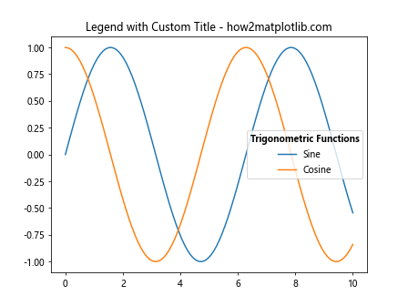
In this example, we add a title to the legend using the title parameter in ax.legend(). We then access the legend title object and customize its appearance by setting the font weight to bold.
Creating a Legend for Filled Areas
When working with filled areas in your plots, such as those created by fill_between() or bar(), you may want to create a legend that represents these areas accurately.
Here’s an example of creating a legend for filled areas:
import matplotlib.pyplot as plt
import numpy as np

# Create sample data
x = np.linspace(0, 10, 100)
y1 = np.sin(x)
y2 = np.cos(x)

# Create subplot
fig, ax = plt.subplots()

# Plot filled areas
ax.fill_between(x, 0, y1, alpha=0.3, label='Sine Area')
ax.fill_between(x, 0, y2, alpha=0.3, label='Cosine Area')

# Add legend
ax.legend()

# Set title
ax.set_title('Legend for Filled Areas - how2matplotlib.com')

# Display the plot
plt.show()
Output:
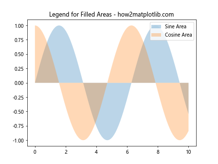
In this example, we use fill_between() to create filled areas and add a legend to distinguish between them. The legend automatically represents the filled areas with appropriate patches.
Handling Overlapping Legends
When working with multiple subplots or complex plots, legend overlap can become an issue. Matplotlib subplots legend provides options to handle overlapping legends and ensure they remain readable.
Here’s an example of handling overlapping legends:
import matplotlib.pyplot as plt
import numpy as np

# Create sample data
x = np.linspace(0, 10, 100)
y1 = np.sin(x)
y2 = np.cos(x)
y3 = np.tan(x)

# Create subplots
fig, (ax1, ax2) = plt.subplots(2, 1, figsize=(8, 10))

# Plot data on first subplot
ax1.plot(x, y1, label='Sine')
ax1.plot(x, y2, label='Cosine')
ax1.legend(loc='upper right')
ax1.set_title('Trigonometric Functions - how2matplotlib.com')

# Plot data on second subplot
ax2.plot(x, y3, label='Tangent')
ax2.legend(loc='lower right')
ax2.set_title('Tangent Function - how2matplotlib.com')

# Adjust layout to prevent legend overlap
plt.tight_layout()

# Display the plot
plt.show()
Output:
In this example, we position the legends in different locations for each subplot (upper right and lower right) to prevent overlap. We also use plt.tight_layout() to automatically adjust the spacing between subplots and prevent legend overlap.
Creating Interactive Legends
Matplotlib subplots legend can be made interactive, allowing users to toggle the visibility of plot elements by clicking on legend entries.
Here’s an example of creating an interactive legend:
import matplotlib.pyplot as plt
import numpy as np

# Create sample data
x = np.linspace(0, 10, 100)
y1 = np.sin(x)
y2 = np.cos(x)
y3 = np.tan(x)

# Create subplot
fig, ax = plt.subplots()

# Plot data
line1, = ax.plot(x, y1, label='Sine')
line2, = ax.plot(x, y2, label='Cosine')
line3, = ax.plot(x, y3, label='Tangent')

# Add interactive legend
leg = ax.legend()

# Enable picking on the legend
leg.set_picker(5)  # 5 points tolerance

# Define the pick event handler
def on_pick(event):
    if event.artist != leg:
        return

    # Get the legend line that was clicked
    legline = event.artist
    origline = legline.get_lines()[0]
    visible = not origline.get_visible()
    origline.set_visible(visible)

    # Change the alpha of the legend line
    legline.set_alpha(1.0 if visible else 0.2)
    fig.canvas.draw()

# Connect the pick event to the handler
fig.canvas.mpl_connect('pick_event', on_pick)

# Set title
ax.set_title('Interactive Legend - how2matplotlib.com')

# Display the plot
plt.show()
Output:
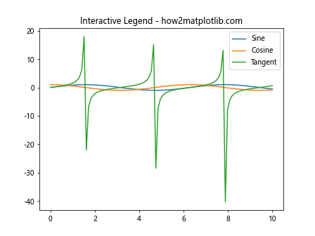
In this example, we create an interactive legend where clicking on a legend entry toggles the visibility of the corresponding plot element. The on_pick function handles the click events and updates the plot accordingly.
Matplotlib Subplots Legend Conclusion
Matplotlib subplots legend is a powerful tool for enhancing the clarity and informativeness of your data visualizations. By mastering the various techniques and customization options available, you can create professional-looking plots that effectively communicate your data insights.
Throughout this comprehensive guide, we’ve explored numerous aspects of working with Matplotlib subplots legend, including:
- Basic legend creation and customization
- Positioning legends inside and outside the plot area
- Handling legends for multiple subplots
- Customizing legend markers and labels
- Creating legends for different plot types (scatter plots, pie charts, 3D plots)
- Using legend proxies and handlers
- Controlling legend order and creating multi-column legends
- Adding and customizing legend titles
- Handling overlapping legends
- Creating interactive legends
By applying these techniques and experimenting with different options, you can create visually appealing and informative plots that effectively showcase your data. Remember to consider the specific requirements of your visualization and audience when designing your legends, and don’t hesitate to combine multiple techniques to achieve the desired result.
As you continue to work with Matplotlib subplots legend, you’ll discover even more ways to fine-tune your visualizations and create impactful data presentations. Keep practicing and exploring new possibilities to become a true master of Matplotlib subplots legend!