Matplotlib Set Colorbar Range
In data visualization, a colorbar is often used to represent the relationship between data values and colors. A colorbar typically includes a range of colors that correspond to the range of values in the data. By default, Matplotlib will automatically select the colorbar range based on the data values, but you can also manually set the colorbar range to better visualize your data.
In this article, we will explore how to set the colorbar range in Matplotlib with various examples. We will cover different ways to customize the colorbar range and create visually appealing colorbar representations for your data.
Example 1: Basic Colorbar Range Setting
import numpy as np
import matplotlib.pyplot as plt

# Generate some random data
data = np.random.random((10, 10))

# Create a plot and set the colorbar range
plt.imshow(data, cmap='viridis')
cbar = plt.colorbar()
cbar.set_clim(0, 1)

plt.show()
In this example, we generate random data and create a plot using the ‘viridis’ colormap. We then create a colorbar and use the set_clim method to set the colorbar range from 0 to 1.
Example 2: Using vmin and vmax Parameters
import numpy as np
import matplotlib.pyplot as plt

# Generate some random data
data = np.random.random((10, 10))

# Create a plot and set the colorbar range using vmin and vmax
plt.imshow(data, cmap='inferno', vmin=0.2, vmax=0.8)
cbar = plt.colorbar()

plt.show()
Output:
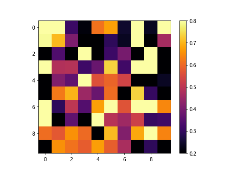
In this example, we set the colorbar range using the vmin and vmax parameters directly in the imshow function. This allows us to specify the minimum and maximum values for the colorbar range.
Example 3: Normalizing the Colorbar
import numpy as np
import matplotlib.pyplot as plt
import matplotlib.colors as mcolors

# Generate some random data
data = np.random.random((10, 10))

# Create a plot and normalize the data for the colorbar
plt.imshow(data, cmap='plasma', norm=mcolors.Normalize(vmin=0.3, vmax=0.7))
cbar = plt.colorbar()

plt.show()
Output:
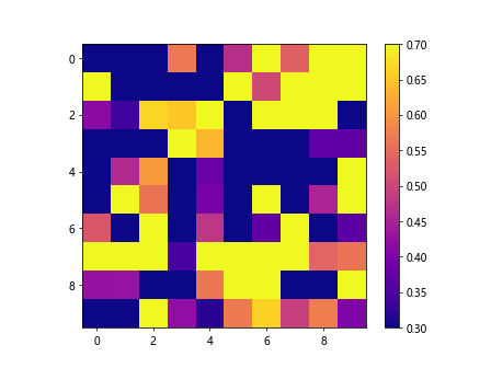
In this example, we use the Normalize class from matplotlib.colors to normalize the data values for the colorbar. This allows us to customize the colorbar range based on specific values in the data.
Example 4: Discrete Colorbar Range
import numpy as np
import matplotlib.pyplot as plt
import matplotlib.colors as mcolors

# Generate some random data
data = np.random.randint(1, 10, (10, 10))

# Create a plot with discrete color intervals
cmap = mcolors.ListedColormap(['red', 'green', 'blue', 'purple'])
bounds = [0, 3, 6, 9, 10]
norm = mcolors.BoundaryNorm(bounds, cmap.N)

plt.imshow(data, cmap=cmap, norm=norm)
cbar = plt.colorbar()

plt.show()
Output:
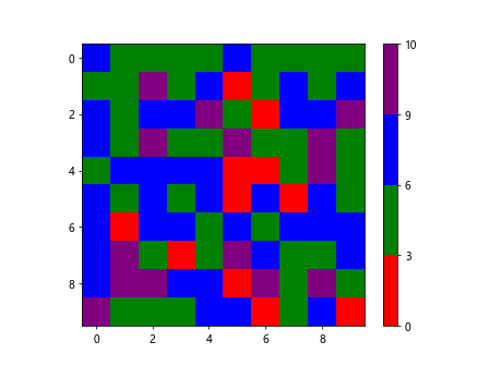
In this example, we create a plot with discrete color intervals using the ListedColormap and BoundaryNorm classes from matplotlib.colors. This allows us to define custom color intervals for the colorbar range.
Example 5: Custom Tick Labels
import numpy as np
import matplotlib.pyplot as plt

# Generate some random data
data = np.random.random((10, 10))

# Create a plot and customize the colorbar tick labels
plt.imshow(data, cmap='cool')
cbar = plt.colorbar()
cbar.set_ticks([0, 0.25, 0.5, 0.75, 1])
cbar.set_ticklabels(['Low', 'Medium', 'High', 'Very High', 'Max'])

plt.show()
Output:
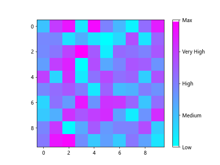
In this example, we customize the colorbar tick labels using the set_ticks and set_ticklabels methods. This allows us to provide labels for specific tick positions on the colorbar.
Example 6: Logarithmic Colorbar Range
import numpy as np
import matplotlib.pyplot as plt

# Generate some random data
data = np.random.randint(1, 100, (10, 10))

# Create a plot with a logarithmic colorbar range
plt.imshow(data, cmap='hot')
cbar = plt.colorbar()
cbar.set_norm(mcolors.LogNorm(vmin=1, vmax=100))
cbar.set_ticks([1, 10, 100])

plt.show()
In this example, we create a plot with a logarithmic colorbar range using the LogNorm class from matplotlib.colors. This allows us to visualize data with a wide range of values more effectively.
Example 7: Symmetric Colorbar Range
import numpy as np
import matplotlib.pyplot as plt

# Generate some random data
data = np.random.randn(10, 10)

# Create a plot with a symmetric colorbar range
plt.imshow(data, cmap='seismic')
cbar = plt.colorbar()
cbar.set_clim(-2, 2)

plt.show()
In this example, we create a plot with a symmetric colorbar range using the ‘seismic’ colormap. By setting the colorbar range from -2 to 2, we can visualize the data with a centered color scale.
Example 8: Combined Colorbar Ranges
import numpy as np
import matplotlib.pyplot as plt

# Generate some random data
data1 = np.random.random((10, 10))
data2 = np.random.random((10, 10))

# Create two plots with different colorbar ranges
fig, axs = plt.subplots(1, 2)

axs[0].imshow(data1, cmap='cividis')
cbar1 = axs[0].colorbar()
cbar1.set_clim(0, 0.5)

axs[1].imshow(data2, cmap='twilight')
cbar2 = axs[1].colorbar()
cbar2.set_clim(0.5, 1)

plt.show()
In this example, we create two plots with different colorbar ranges and customize each colorbar independently. This allows us to visualize multiple data sets with distinct color scales.
Example 9: Reversing Colorbar Range
import numpy as np
import matplotlib.pyplot as plt

# Generate some random data
data = np.random.random((10, 10))

# Create a plot with a reversed colorbar range
plt.imshow(data, cmap='viridis')
cbar = plt.colorbar()
cbar.set_clim(1, 0)

plt.show()
In this example, we create a plot with a reversed colorbar range by setting the colorbar range from 1 to 0. This reverses the color scale of the plot for a different visualization effect.
Example 10: Manually Setting Colorbar Range Based on Data
import numpy as np
import matplotlib.pyplot as plt

# Generate some random data
data = np.random.randint(1, 100, (10, 10))

# Create a plot and manually set the colorbar range based on data
plt.imshow(data, cmap='hot')
cbar = plt.colorbar()
cbar.set_clim(np.min(data), np.max(data))

plt.show()
In this example, we manually set the colorbar range based on the data by using the minimum and maximum values from the data array. This ensures that the colorbar range accurately reflects the data values.
Matplotlib Set Colorbar Range Conclusion
Setting the colorbar range in Matplotlib allows you to customize the visualization of your data and create more informative plots. By using the examples provided in this article, you can easily adjust the colorbar range to better represent your data and enhance the readability of your visualizations. Experiment with different methods of setting the colorbar range to find the most effective way to display your data.