Plot Horizontal Line in Matplotlib
In this tutorial, we will learn how to plot horizontal lines in Matplotlib, which is a popular Python library for creating static, animated, and interactive visualizations in Python. Specifically, we will look at different ways of plotting horizontal lines in Matplotlib, including using the axhline() function, hlines() function, and plot() function.
1. Using axhline() Function
The axhline() function in Matplotlib is used to draw a horizontal line across the plot. This function takes parameters like y, xmin, and xmax to customize the position and length of the horizontal line.
Here is an example code that demonstrates how to plot a horizontal line using the axhline() function:
import numpy as np
import matplotlib.pyplot as plt

x = np.arange(0, 10, 0.1)
y = np.sin(x)

plt.plot(x, y)
plt.axhline(y=0, color='r', linestyle='--')
plt.show()
Output:
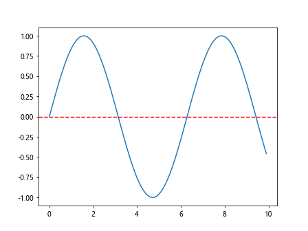
In this example, we first create a sine wave using numpy and plot it. Then, we use the axhline() function to draw a horizontal line at y=0 with a red dashed line.
2. Using hlines() Function
The hlines() function in Matplotlib is another way to draw horizontal lines in a plot. This function takes parameters like y, xmin, xmax, and colors to customize the position, length, and color of the horizontal line.
Here is an example code that demonstrates how to plot horizontal lines using the hlines() function:
import numpy as np
import matplotlib.pyplot as plt

x = np.arange(0, 10, 0.1)
y = np.cos(x)

plt.plot(x, y)
plt.hlines(y=0, xmin=0, xmax=10, colors='b', linestyles='solid')
plt.show()
Output:
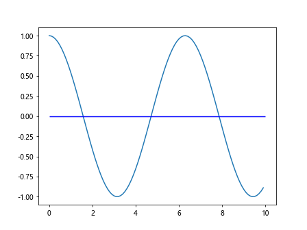
In this example, we create a cosine wave and plot it. Then, we use the hlines() function to draw a horizontal line at y=0 with a blue solid line.
3. Using plot() Function
The plot() function in Matplotlib can also be used to draw horizontal lines by plotting a horizontal line segment with two points.
Here is an example code that demonstrates how to plot horizontal lines using the plot() function:
import numpy as np
import matplotlib.pyplot as plt

x = np.arange(0, 10, 0.1)
y = np.tan(x)

plt.plot(x, y)
plt.plot([0, 10], [0, 0], color='g', linestyle='dotted')
plt.show()
Output:
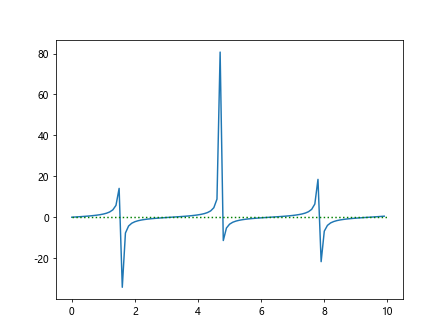
In this example, we create a tangent wave and plot it. Then, we use the plot() function to draw a horizontal line at y=0 with a green dotted line.
4. Plotting Multiple Horizontal Lines
You can also plot multiple horizontal lines in a single plot by calling the axhline() or hlines() functions multiple times with different parameters.
Here is an example code that demonstrates how to plot multiple horizontal lines using the axhline() function:
import numpy as np
import matplotlib.pyplot as plt

x = np.arange(0, 10, 0.1)
y = np.exp(x)

plt.plot(x, y)
plt.axhline(y=20, color='r', linestyle='--')
plt.axhline(y=40, color='b', linestyle='-.')
plt.axhline(y=60, color='g', linestyle=':')
plt.show()
Output:
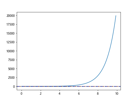
In this example, we create an exponential wave and plot it. Then, we use the axhline() function three times to draw horizontal lines at y=20, y=40, and y=60 with different colors and line styles.
5. Changing Line Properties
You can customize the properties of the horizontal lines, such as color, line style, and line width, to make them more visually appealing.
Here is an example code that demonstrates how to customize the properties of horizontal lines using the axhline() function:
import numpy as np
import matplotlib.pyplot as plt

x = np.arange(0, 10, 0.1)
y = np.log(x+1)

plt.plot(x, y)
plt.axhline(y=0, color='m', linestyle='-', linewidth=2)
plt.show()
Output:
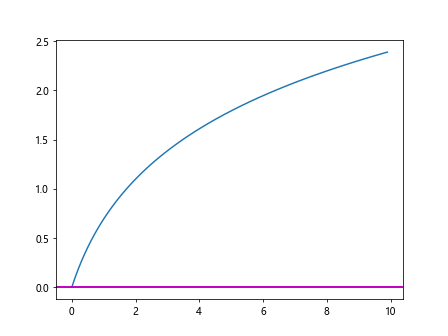
In this example, we create a logarithmic wave and plot it. Then, we use the axhline() function to draw a horizontal line at y=0 with a magenta solid line and a line width of 2.
6. Adding Annotations to Horizontal Lines
You can add annotations to horizontal lines to provide additional information or context to the plot. Annotations can include text, arrows, and other graphical elements.
Here is an example code that demonstrates how to add annotations to horizontal lines using the axhline() function:
import numpy as np
import matplotlib.pyplot as plt

x = np.arange(0, 10, 0.1)
y = np.sqrt(x)

plt.plot(x, y)
plt.axhline(y=2, color='y', linestyle='--')
plt.text(5, 2.1, 'Horizontal Line at y=2', color='k')
plt.show()
Output:
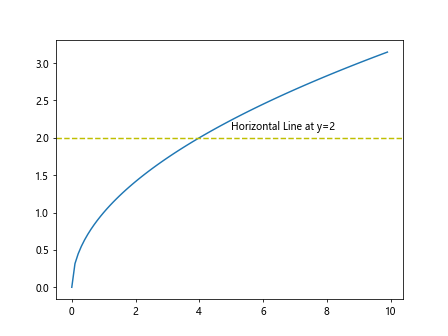
In this example, we create a square root wave and plot it. Then, we use the axhline() function to draw a horizontal line at y=2 with a yellow dashed line. We also add a text annotation above the line.
7. Creating Subplots with Horizontal Lines
You can create subplots in Matplotlib and draw horizontal lines in each subplot to compare different datasets or visualize multiple variables simultaneously.
Here is an example code that demonstrates how to create subplots with horizontal lines using the axhline() function:
import numpy as np
import matplotlib.pyplot as plt

x = np.arange(0, 10, 0.1)
y1 = np.sin(x)
y2 = np.cos(x)

fig, axs = plt.subplots(2)

axs[0].plot(x, y1)
axs[0].axhline(y=0, color='r', linestyle='--')
axs[0].set_title('Sin Wave')

axs[1].plot(x, y2)
axs[1].axhline(y=0, color='b', linestyle='-.')
axs[1].set_title('Cos Wave')

plt.tight_layout()
plt.show()
Output:
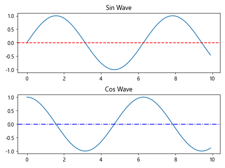
In this example, we create sine and cosine waves and plot them in two separate subplots. We use the axhline() function to draw horizontal lines at y=0 in each subplot with different colors and line styles.
8. Plotting Horizontal Lines with Different Slopes
In addition to plotting horizontal lines at specific y-values, you can also plot horizontal lines with different slopes by specifying xmin and xmax parameters.
Here is an example code that demonstrates how to plot horizontal lines with different slopes using the hlines() function:
import numpy as np
import matplotlib.pyplot as plt

x = np.arange(0, 10, 0.1)
y = np.log10(x+1)

plt.plot(x, y)
plt.hlines(y=[1, 2, 3], xmin=0, xmax=[2, 5, 8], colors=['r', 'g', 'b'], linestyles='solid')
plt.show()
Output:
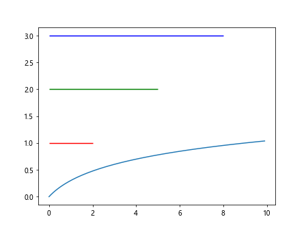
In this example, we create a base-10 logarithm wave and plot it. Then, we use the hlines() function to draw horizontal lines with slopes 1, 2, and 3 by specifying different xmin and xmax values.
9. Plotting Horizontal Lines with Dynamic Values
You can plot horizontal lines with dynamic values that change based on the data or conditions in your plot. This can be useful for highlighting specific thresholds or boundaries.
Here is an example code that demonstrates how to plot dynamic horizontal lines using the axhline() function:
import numpy as np
import matplotlib.pyplot as plt

x = np.arange(0, 10, 0.1)
y = np.exp(x)

threshold = np.mean(y) + 2*np.std(y)

plt.plot(x, y)
plt.axhline(y=threshold, color='r', linestyle='--')
plt.text(5, threshold+10, f'Threshold: {threshold:.2f}', color='k')
plt.show()
Output:
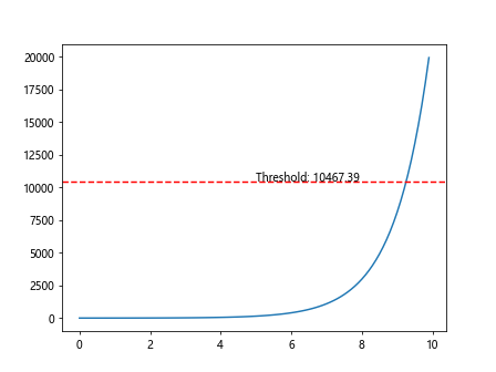
In this example, we create an exponential wave and plot it. We calculate a dynamic threshold based on the mean and standard deviation of the data. We use the axhline() function to draw a horizontal line at the threshold value with a red dashed line and add a text annotation above the line.
Plot Horizontal Line in Matplotlib Conclusion
In this tutorial, we have explored different ways to plot horizontal lines in Matplotlib using the axhline(), hlines(), and plot() functions. We have seen how to customize the properties of horizontal lines, add annotations, create subplots with horizontal lines, plot lines with different slopes, and plot dynamic lines based on data values.
By mastering the techniques presented in this tutorial, you can effectively incorporate horizontal lines into your plots to provide additional information, highlight specific values or thresholds, and improve the overall clarity and visual appeal of your visualizations.
Remember to experiment with different parameters, colors, line styles, and annotations to create visually compelling plots that effectively communicate your data and insights.