Intro to Matplotlib xlim
Matplotlib is a powerful plotting library for Python that provides a wide variety of customizable options to create visually appealing plots. One common customization that you may want to do when using Matplotlib is to set the limits of the x-axis. This can be done using the xlim() function. In this article, we will explore how to use the xlim() function in Matplotlib to set the limits of the x-axis in different scenarios.
Basic xlim Usage
To set the limits of the x-axis in Matplotlib, you can use the xlim() function. The xlim() function takes in two arguments, xmin and xmax, which specify the lower and upper limits of the x-axis, respectively.
Here’s a simple example that demonstrates how to use the xlim() function to set the limits of the x-axis between 0 and 10:
import matplotlib.pyplot as plt

x = [1, 2, 3, 4, 5]
y = [1, 4, 9, 16, 25]

plt.plot(x, y)
plt.xlim(0, 10)
plt.show()
Output:
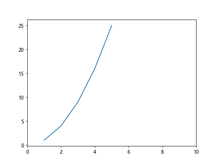
In this example, we first create a simple line plot with x and y values. We then use the xlim() function to set the limits of the x-axis between 0 and 10.
Adjusting x-axis Limits
You can also adjust the x-axis limits based on the data you have. For example, if you have data that extends beyond the default limits of the x-axis, you can use the xlim() function to zoom in on a specific part of the plot.
Here’s an example that demonstrates how to adjust the x-axis limits to focus on a specific range of data:
import matplotlib.pyplot as plt
import numpy as np

x = np.linspace(0, 10, 100)
y = np.sin(x)

plt.plot(x, y)
plt.xlim(2, 8)
plt.show()
Output:
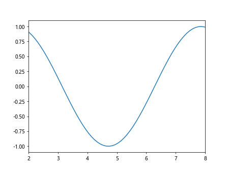
In this example, we generate data using NumPy’s linspace function and create a sine wave plot. We then use the xlim() function to zoom in on the part of the plot between x=2 and x=8.
Set x-axis Limits Automatically
In some cases, you may want Matplotlib to automatically adjust the x-axis limits based on the data being plotted. This can be done by passing auto as an argument to the xlim() function.
Here’s an example that demonstrates how to set the x-axis limits automatically:
import matplotlib.pyplot as plt
import numpy as np

x = np.linspace(0, 10, 100)
y = np.cos(x)

plt.plot(x, y)
plt.xlim('auto')
plt.show()
In this example, we create a cosine wave plot and use the xlim() function with the argument auto to let Matplotlib automatically adjust the x-axis limits based on the data.
Setting x-axis Limits with Scatter Plots
You can also use the xlim() function with scatter plots in Matplotlib. Scatter plots are useful for visualizing the relationship between two variables.
Here’s an example that demonstrates how to use the xlim() function with a scatter plot:
import matplotlib.pyplot as plt
import numpy as np

x = np.random.rand(100)
y = np.random.rand(100)

plt.scatter(x, y)
plt.xlim(0, 1)
plt.show()
Output:
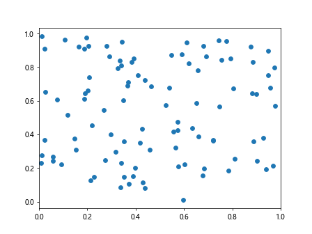
In this example, we create random data for x and y values and create a scatter plot. We then use the xlim() function to set the limits of the x-axis between 0 and 1.
Adding xlim to Multiple Subplots
If you have multiple subplots in a figure, you can set the x-axis limits for each subplot individually.
Here’s an example that demonstrates how to add xlim to multiple subplots:
import matplotlib.pyplot as plt
import numpy as np

x = np.linspace(0, 10, 100)
y1 = np.sin(x)
y2 = np.cos(x)

fig, axs = plt.subplots(2)
fig.suptitle('Multiple Subplots with Different x-axis Limits')

axs[0].plot(x, y1)
axs[0].set_xlim(0, 5)

axs[1].plot(x, y2)
axs[1].set_xlim(5, 10)

plt.show()
Output:
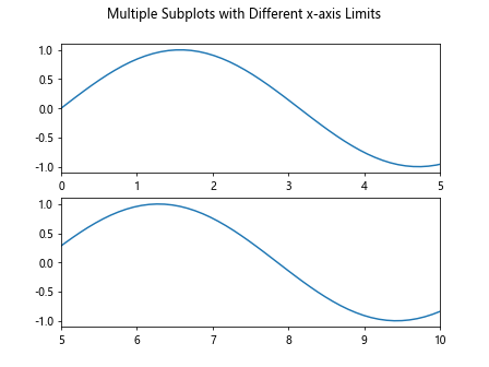
In this example, we create two subplots with sine and cosine wave plots. We set different x-axis limits for each subplot using the set_xlim() method.
Combining xlim with Annotations
You can combine xlim with annotations to highlight specific data points or regions on your plot.
Here’s an example that demonstrates how to combine xlim with annotations:
import matplotlib.pyplot as plt
import numpy as np

x = np.linspace(0, 10, 100)
y = np.sin(x)

plt.plot(x, y)
plt.xlim(2, 8)

plt.annotate('Peak', xy=(np.pi, 1), xytext=(3, 1.5),
             arrowprops=dict(facecolor='red', shrink=0.05))

plt.show()
Output:
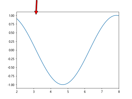
In this example, we create a sine wave plot and use the xlim() function to set the x-axis limits between 2 and 8. We then add an annotation to highlight the peak of the sine wave.
x-axis Limits with Subplots and Shared Axes
When working with subplots that share axes, you can set the x-axis limits for all subplots by using the sharex parameter.
Here’s an example that demonstrates how to set x-axis limits for subplots with shared x-axis:
import matplotlib.pyplot as plt
import numpy as np

x = np.linspace(0, 10, 100)
y1 = np.sin(x)
y2 = np.cos(x)

fig, axs = plt.subplots(2, sharex=True)
fig.suptitle('Subplots with Shared x-axis and Same x-axis Limits')

axs[0].plot(x, y1)
axs[1].plot(x, y2)

plt.xlim(2, 8)

plt.show()
Output:
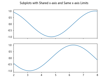
In this example, we create two subplots with shared x-axis and the same x-axis limits. We use the xlim() function to set the x-axis limits for both subplots.
Setting x-axis Limits with Bar Plots
In addition to line plots and scatter plots, you can also use the xlim() function with bar plots in Matplotlib. Bar plots are useful for comparing categorical data.
Here’s an example that demonstrates how to set the x-axis limits for a bar plot:
import matplotlib.pyplot as plt
import numpy as np

x = ['A', 'B', 'C', 'D', 'E']
y = [10, 20, 15, 25, 30]

plt.bar(x, y)
plt.xlim(-0.5, 4.5)
plt.show()
Output:
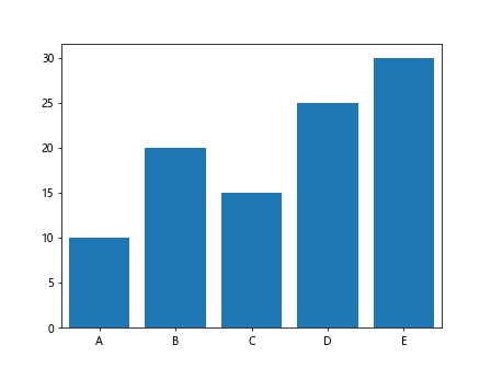
In this example, we create a bar plot to visualize categorical data. We use the xlim() function to set the x-axis limits between -0.5 and 4.5 to ensure the bars are fully displayed.
Setting x-axis Limits with Histograms
Histograms are another type of plot that you can create in Matplotlib. Histograms are used to display the distribution of a dataset.
Here’s an example that demonstrates how to set the x-axis limits for a histogram:
import matplotlib.pyplot as plt
import numpy as np

data = np.random.normal(0, 1, 1000)

plt.hist(data, bins=30)
plt.xlim(-3, 3)
plt.show()
Output:
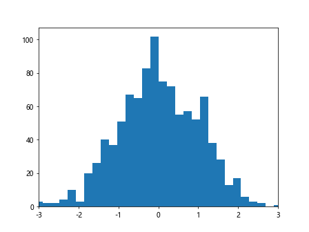
In this example, we generate random data from a normal distribution and create a histogram. We use the xlim() function to set the x-axis limits between -3 and 3 to focus on the distribution of the data.
matplotlib xlim Conclusion
In this article, we explored how to use the xlim() function in Matplotlib to set the limits of the x-axis in different scenarios. We covered basic usage, adjusting x-axis limits, setting limits automatically, using with scatter plots, adding to multiple subplots, combining with annotations, working with shared axes, and using with different types of plots such as bar plots and histograms.
By mastering the xlim() function in Matplotlib, you can have more control over your plots and customize them to better visualize your data. Experiment with different examples and scenarios to learn more about setting x-axis limits in Matplotlib.