Matplotlib Violin Plot
Matplotlib is a powerful Python library for creating visualizations, including violin plots. Violin plots are a combination of box plots and kernel density plots, providing a better understanding of the distribution of the data.
In this article, we will explore how to create violin plots using the matplotlib library in Python. We will cover various aspects of violin plots, including customizations, multiple plots, and subplots.
1. Basic Violin Plot
Let’s start with a basic example of creating a violin plot using random data.
import matplotlib.pyplot as plt
import numpy as np

# Generate random data
data = np.random.randn(100)

# Create a violin plot
plt.violinplot(data)

plt.title('Basic Violin Plot')
plt.show()
Output:
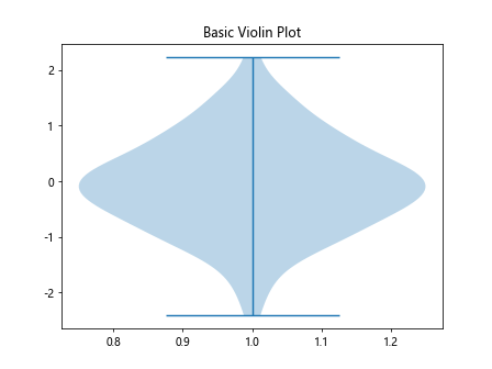
In this example, we generate random data using NumPy and create a violin plot using plt.violinplot(). The resulting plot will show the distribution of the data.
2. Customizing Violin Plot
You can customize the violin plot to suit your needs. Let’s explore some common customizations like changing the color and width of the plot.
import matplotlib.pyplot as plt
import numpy as np

# Generate random data
data = np.random.randn(100)

# Customizing the violin plot
plt.violinplot(data, fill_color='skyblue', linewidth=2)

plt.title('Customized Violin Plot')
plt.show()
By specifying fill_color and linewidth parameters, you can change the color and width of the violin plot.
3. Adding Multiple Violin Plots
You can also create multiple violin plots on the same figure to compare different datasets.
import matplotlib.pyplot as plt
import numpy as np

# Generate random data
data = np.random.randn(100)

# Generate more random data
data2 = np.random.randn(100)
data3 = np.random.randn(100)

# Create multiple violin plots
plt.violinplot([data, data2, data3])

plt.title('Multiple Violin Plots')
plt.show()
Output:
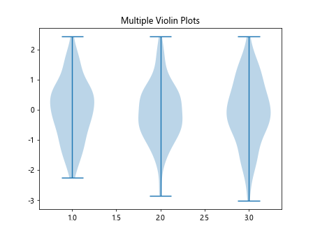
In this example, we create three violin plots for three different datasets on the same figure.
4. Horizontal Violin Plot
You can create horizontal violin plots by specifying the vert parameter as False.
import matplotlib.pyplot as plt
import numpy as np

# Generate random data
data = np.random.randn(100)

# Create a horizontal violin plot
plt.violinplot(data, vert=False)

plt.title('Horizontal Violin Plot')
plt.show()
Output:
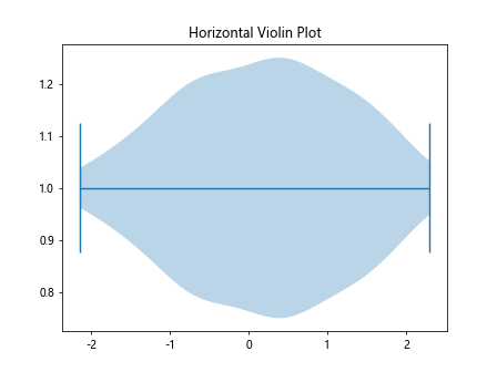
By setting vert to False, the violin plot will be displayed horizontally.
5. Grouped Violin Plots
Grouped violin plots can be created to compare different categories within the same dataset.
import matplotlib.pyplot as plt
import numpy as np

# Generate random data
data = np.random.randn(100)

# Generate more random data
data2 = np.random.randn(100)
data3 = np.random.randn(100)

# Create grouped violin plots
data_grouped = [data, data2]
plt.violinplot(data_grouped)

plt.title('Grouped Violin Plots')
plt.show()
Output:
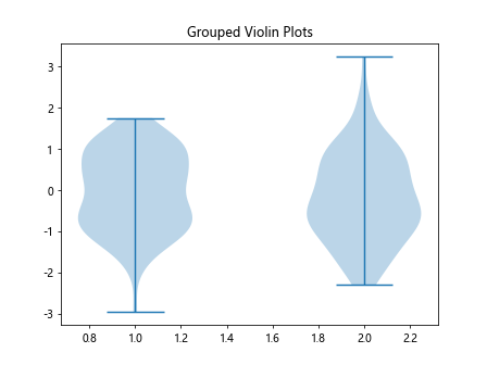
By providing a list of datasets, you can create grouped violin plots for easy comparison.
6. Adding Box Plots to Violin Plot
You can add box plots to violin plots by setting the showmeans parameter to True.
import matplotlib.pyplot as plt
import numpy as np

# Generate random data
data = np.random.randn(100)

# Generate more random data
data2 = np.random.randn(100)
data3 = np.random.randn(100)

# Add box plots to violin plot
plt.violinplot(data, showmeans=True)

plt.title('Violin Plot with Box Plot')
plt.show()
Output:
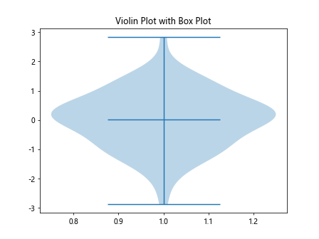
This will display box plots within the violin plot, providing additional summary statistics.
7. Overlaying Violin Plots with Scatter Plots
You can overlay violin plots with scatter plots to visualize individual data points along with the distribution.
import matplotlib.pyplot as plt
import numpy as np

# Generate random data
data = np.random.randn(100)

# Generate more random data
data2 = np.random.randn(100)
data3 = np.random.randn(100)

# Generate random x values
x = np.random.rand(100) * 4

# Overlay violin plot with scatter plot
plt.violinplot(data)
plt.scatter(x, data, color='red', alpha=0.5)

plt.title('Violin Plot with Scatter Plot')
plt.show()
Output:
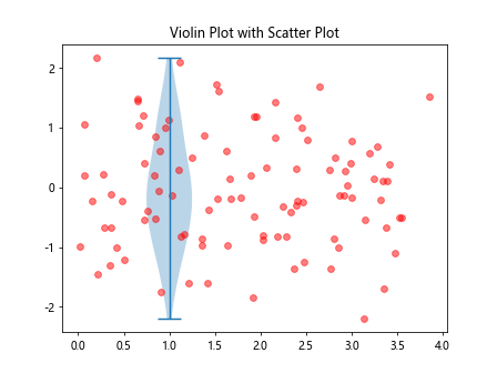
By plotting scatter points on top of the violin plot, you can see the distribution of the data points.
8. Customizing Violin Plot Elements
You can further customize violin plots by accessing and modifying specific elements.
import matplotlib.pyplot as plt
import numpy as np

# Generate random data
data = np.random.randn(100)

# Generate more random data
data2 = np.random.randn(100)
data3 = np.random.randn(100)

# Create violin plot
vp = plt.violinplot(data, showextrema=False)

# Customizing violin plot elements
for partname in ('cbars','cmins','cmaxes'):
    vp[partname].set_linewidth(2)

plt.title('Customized Violin Plot Elements')
plt.show()
In this example, we customize the width of specific elements of the violin plot.
9. Creating Subplots with Violin Plots
You can create multiple subplots with violin plots to compare different datasets side by side.
import matplotlib.pyplot as plt
import numpy as np

# Generate random data
data = np.random.randn(100)

# Generate more random data
data2 = np.random.randn(100)
data3 = np.random.randn(100)

# Create subplots with violin plots
fig, axs = plt.subplots(1, 2)
axs[0].violinplot(data)
axs[1].violinplot(data2)

plt.title('Subplots with Violin Plots')
plt.show()
Output:
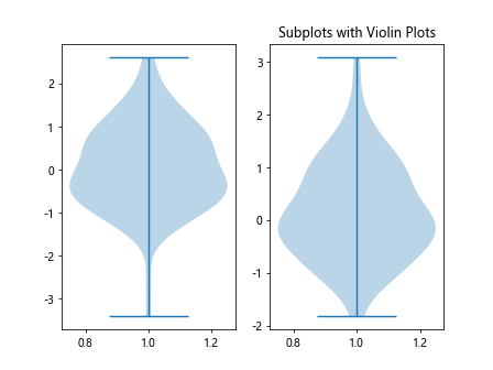
By using plt.subplots(), you can create subplots for visualizing multiple violin plots.
10. Annotated Violin Plot
You can add annotations to violin plots to provide additional information about the data.
import matplotlib.pyplot as plt
import numpy as np

# Generate random data
data = np.random.randn(100)

# Generate more random data
data2 = np.random.randn(100)
data3 = np.random.randn(100)

# Annotated violin plot
plt.violinplot(data)

plt.text(1, 0, 'Median', fontsize=10, ha='center')
plt.annotate('Outliers', xy=(1.5, 1.5), xytext=(2, 2),
             arrowprops=dict(facecolor='black', arrowstyle='->'))

plt.title('Annotated Violin Plot')
plt.show()
Output:
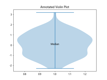
This example demonstrates how to add text annotations and annotations with arrows to a violin plot.
Matplotlib Violin Plot Conclusion
In this article, we have covered various aspects of creating violin plots using matplotlib in Python. From basic plots to advanced customizations and annotations, violin plots provide a powerful visualization tool for analyzing data distributions. By exploring the examples provided, you can create informative and visually appealing violin plots for your data analysis needs.