Matplotlib Scatter Plot in Python
Matplotlib is a powerful library for creating visualizations in Python. One of the common types of plots that can be created using Matplotlib is a scatter plot. Scatter plots are used to visualize the relationship between two variables by showing how they are related to each other. In this article, we will explore how to create scatter plots using Matplotlib in Python.
Basic Scatter Plot
Let’s start by creating a basic scatter plot using random data.
import matplotlib.pyplot as plt
import numpy as np

x = np.random.rand(50)
y = np.random.rand(50)

plt.scatter(x, y)
plt.show()
Output:
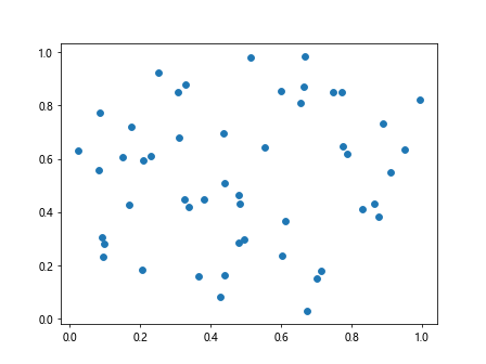
In this example, we generate random data for x and y, and then create a scatter plot using scatter() function from Matplotlib. The plot is displayed using show() function.
Scatter Plot with Size and Color
You can customize the scatter plot by changing the size and color of the points. Here is an example:
import matplotlib.pyplot as plt
import numpy as np

x = np.random.rand(50)
y = np.random.rand(50)

sizes = np.random.randint(10, 100, 50)
colors = np.random.rand(50)

plt.scatter(x, y, s=sizes, c=colors, alpha=0.5)
plt.show()
Output:
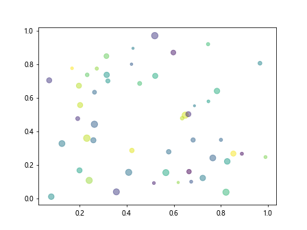
In this example, we set the size of the points using the s parameter, the color of the points using the c parameter, and the opacity of the points using the alpha parameter.
Scatter Plot with Labels
You can also add labels to the scatter plot to identify different groups or categories. Here is an example:
import matplotlib.pyplot as plt
import numpy as np

x = np.random.rand(50)
y = np.random.rand(50)

labels = np.random.randint(1, 5, 50)

for i in range(1, 5):
    plt.scatter(x[labels == i], y[labels == i], label=f'Group {i}')

plt.legend()
plt.show()
Output:
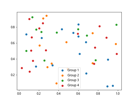
In this example, we generate random labels for each point and then create a scatter plot for each group identified by the labels. We add a legend to the plot using the legend() function.
Scatter Plot with Annotations
You can annotate specific points in the scatter plot to provide additional information. Here is an example:
import matplotlib.pyplot as plt
import numpy as np

x = np.random.rand(50)
y = np.random.rand(50)

plt.scatter(x, y)
plt.annotate('Point 1', (x[0], y[0]), textcoords='offset points', xytext=(5,5), ha='center')
plt.show()
Output:
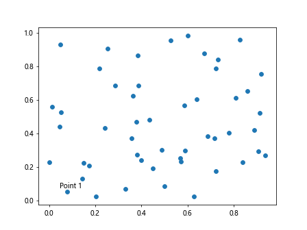
In this example, we annotate the first point in the scatter plot with the text ‘Point 1’ using the annotate() function. We specify the text position relative to the point using the xytext parameter.
Scatter Plot with Regression Line
You can add a regression line to the scatter plot to visualize the relationship between two variables. Here is an example:
from scipy import stats
import matplotlib.pyplot as plt
import numpy as np

x = np.random.rand(50)
y = np.random.rand(50)

slope, intercept, r_value, p_value, std_err = stats.linregress(x, y)
line = slope * x + intercept

plt.scatter(x, y)
plt.plot(x, line, color='red')
plt.show()
Output:
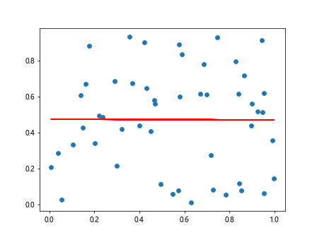
In this example, we calculate the regression line using the linregress() function from scipy.stats module and then plot the line on the scatter plot.
Scatter Plot with Different Markers
You can use different markers to represent different data points in the scatter plot. Here is an example:
import matplotlib.pyplot as plt
import numpy as np

x = np.random.rand(50)
y = np.random.rand(50)

markers = ['o', 's', '^', 'D']

for i in range(4):
    plt.scatter(x[labels == i+1], y[labels == i+1], label=f'Group {i+1}', marker=markers[i])

plt.legend()
plt.show()
In this example, we use different markers (circle, square, triangle, diamond) to represent different groups in the scatter plot.
Scatter Plot with Subplots
You can create multiple scatter plots in the same figure using subplots. Here is an example:
import matplotlib.pyplot as plt
import numpy as np

x = np.random.rand(50)
y = np.random.rand(50)

fig, axs = plt.subplots(2, 2)

for i in range(4):
    row = i // 2
    col = i % 2
    axs[row, col].scatter(x[labels == i+1], y[labels == i+1], label=f'Group {i+1}')
    axs[row, col].legend()

plt.show()
In this example, we create a 2×2 grid of subplots and plot each group in a separate subplot.
Scatter Plot with Different Colormaps
You can use different colormaps to represent the intensity or value of a third variable in the scatter plot. Here is an example:
import matplotlib.pyplot as plt
import numpy as np

x = np.random.rand(50)
y = np.random.rand(50)

third_variable = np.random.rand(50)

plt.scatter(x, y, c=third_variable, cmap='viridis')
plt.colorbar()
plt.show()
Output:
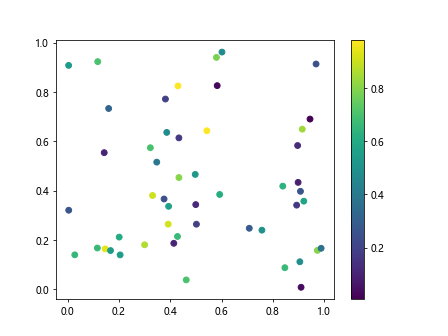
In this example, we use the c parameter to specify a third variable and the cmap parameter to specify the color map for the points. We add a color bar to show the mapping of values to colors.
Scatter Plot on Polar Axis
You can create scatter plots on polar axes to visualize data in a circular or radial format. Here is an example:
import matplotlib.pyplot as plt
import numpy as np

x = np.random.rand(50)
y = np.random.rand(50)

theta = 2 * np.pi * np.random.rand(50)
r = np.random.rand(50)

plt.subplot(111, polar=True)
plt.scatter(theta, r)
plt.show()
Output:
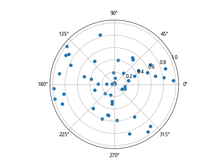
In this example, we create polar axes using the subplot() function with polar=True parameter and then plot the data in polar coordinates.
Scatter Plot with Marker Size and Color
You can combine marker size and color to create more informative scatter plots. Here is an example:
import matplotlib.pyplot as plt
import numpy as np

x = np.random.rand(50)
y = np.random.rand(50)

sizes = np.linspace(10, 100, 50)
colors = np.abs(x - y)

plt.scatter(x, y, s=sizes, c=colors, cmap='cool', alpha=0.5)
plt.colorbar()
plt.show()
Output:
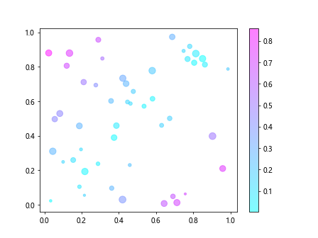
In this example, we use the s parameter to set marker size, the c parameter to set marker color, and a colormap to map values to colors.
Matplotlib Scatter Plot in Python Conclusion
In this article, we explored various ways to create scatter plots using Matplotlib in Python. We covered basic scatter plots, customizing marker size and color, adding labels and annotations, regression lines, different markers, subplots, colormaps, polar axes, and marker size and color combination. Scatter plots are versatile visualizations that can help in understanding relationships between variables in your data. Experiment with different parameters and customization options to create informative and visually appealing scatter plots in Python using Matplotlib.