Scatter Plot with Matplotlib
Scatter plots are used to visualize the relationship between two variables. Using Matplotlib, we can create scatter plots to analyze the correlation between different data points.
Basic Scatter Plot
The following example shows how to create a basic scatter plot using Matplotlib. We will use random data for this demonstration.
import matplotlib.pyplot as plt
import numpy as np

# Generating random data
x = np.random.rand(100)
y = np.random.rand(100)

# Creating scatter plot
plt.scatter(x, y)
plt.show()
Output:
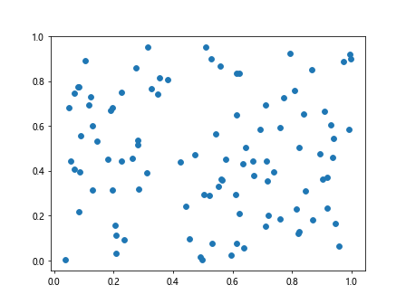
Running this code will display a scatter plot with random data points.
Customizing Scatter Plot
With Matplotlib, we can customize the scatter plot by changing the colors, sizes, and shapes of the data points. Here is an example:
import matplotlib.pyplot as plt
import numpy as np

# Generating random data
x = np.random.rand(100)
y = np.random.rand(100)

# Creating scatter plot with customizations
plt.scatter(x, y, c='red', s=50, marker='^', alpha=0.5)
plt.show()
Output:
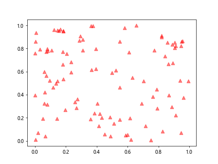
In this code snippet, we set the color to red, size of the data points to 50, marker shape to triangle (^), and transparency to 0.5.
Adding Labels and Title
It is important to add labels and title to a scatter plot to provide context. Below is an example of how to do this:
import matplotlib.pyplot as plt
import numpy as np

# Generating random data
x = np.random.rand(100)
y = np.random.rand(100)

# Adding labels and title to scatter plot
plt.scatter(x, y)
plt.xlabel('X-axis')
plt.ylabel('Y-axis')
plt.title('Scatter Plot Example')
plt.show()
Output:
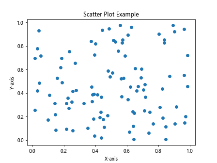
This code snippet adds labels to the x-axis and y-axis, as well as a title to the scatter plot.
Adding a Trend Line
We can add a trend line to a scatter plot to visualize the relationship between the data points. Here is an example:
import matplotlib.pyplot as plt
import numpy as np

# Generating random data
x = np.random.rand(100)
y = np.random.rand(100)

# Adding a trend line to scatter plot
plt.scatter(x, y)
plt.plot(np.unique(x), np.poly1d(np.polyfit(x, y, 1))(np.unique(x)), color='red')
plt.show()
Output:
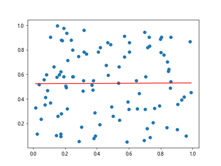
In this code, we used np.polyfit() and np.poly1d() to calculate and plot a trend line.
Multiple Scatter Plots
We can create multiple scatter plots in the same figure to compare different data sets. Here is an example:
import matplotlib.pyplot as plt
import numpy as np

# Generating random data
x = np.random.rand(100)
y = np.random.rand(100)

# Creating multiple scatter plots
x1 = np.random.rand(100)
y1 = np.random.rand(100)
x2 = np.random.rand(100)
y2 = np.random.rand(100)

plt.scatter(x1, y1, color='blue', label='Dataset 1')
plt.scatter(x2, y2, color='red', label='Dataset 2')
plt.legend()
plt.show()
Output:
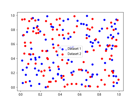
This code snippet creates two separate scatter plots in the same figure with different colors and labels.
Different Marker Styles
Matplotlib provides a variety of marker styles that can be used in scatter plots. Here is an example showcasing some of the available marker styles:
import matplotlib.pyplot as plt
import numpy as np

# Using different marker styles
x = np.random.rand(10)
y = np.random.rand(10)

markers = ['+', 'o', '*', 's', 'D', '^', 'v', '<', '>', 'p', 'h']

for i, marker in enumerate(markers):
    plt.scatter(x[i], y[i], marker=marker, label=marker)

plt.legend()
plt.show()
In this code, we loop through different marker styles and plot a data point for each style.
Highlighting Specific Data Points
We can highlight specific data points in a scatter plot by changing the color or size of those points. Here is an example:
import matplotlib.pyplot as plt
import numpy as np

# Highlighting specific data points
x = np.random.rand(10)
y = np.random.rand(10)

highlighted_point = 3

colors = ['blue' if i == highlighted_point else 'green' for i in range(10)]
sizes = [50 if i == highlighted_point else 20 for i in range(10)]

plt.scatter(x, y, c=colors, s=sizes)
plt.show()
Output:
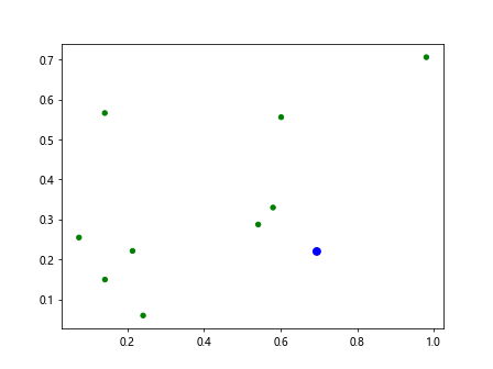
This code snippet highlights the data point with index 3 by changing its color to blue and size to 50.
Adding Annotations
Annotations can be added to a scatter plot to provide additional information about specific data points. Here is an example:
import matplotlib.pyplot as plt
import numpy as np

# Adding annotations to scatter plot
x = np.random.rand(10)
y = np.random.rand(10)
labels = ['A', 'B', 'C', 'D', 'E', 'F', 'G', 'H', 'I', 'J']

for i, label in enumerate(labels):
    plt.scatter(x[i], y[i])
    plt.annotate(label, (x[i], y[i]))

plt.show()
Output:
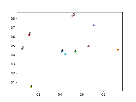
In this code snippet, we loop through the data points and annotate each point with a corresponding label.
Changing Axis Limits
We can change the axis limits of a scatter plot to focus on a specific range of data. Here is an example:
import matplotlib.pyplot as plt
import numpy as np

# Changing axis limits of scatter plot
x = np.random.rand(100)
y = np.random.rand(100)

plt.scatter(x, y)
plt.xlim(0, 0.5)
plt.ylim(0, 0.5)
plt.show()
Output:
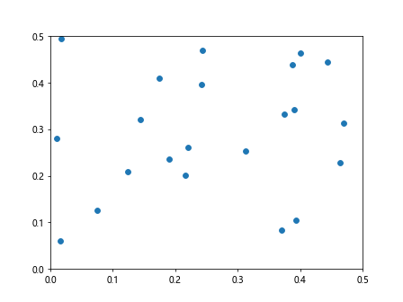
This code snippet sets the x-axis and y-axis limits to a range of 0 to 0.5.
Saving Scatter Plots
Scatter plots can be saved as image files for later use or sharing. Here is an example of how to save a scatter plot as a PNG file:
import matplotlib.pyplot as plt
import numpy as np

# Saving scatter plot as PNG
x = np.random.rand(100)
y = np.random.rand(100)

plt.scatter(x, y)
plt.savefig('scatter_plot.png')
Running this code will save the scatter plot as a PNG file named “scatter_plot.png”.
Scatter Plot with Matplotlib Conclusion
In this article, we have explored how to create scatter plots using Matplotlib. We covered basic scatter plots, customizations, adding labels and annotations, trend lines, multiple scatter plots, and more. With these examples, you should be able to create and customize scatter plots for your data analysis needs using Matplotlib.