Subplots in Matplotlib
In Matplotlib, subplots are multiple plots displayed within the same figure. This allows us to compare different data sets or visualize multiple aspects of a dataset in a single figure. This article will guide you through how to create subplots in Matplotlib and customize them to fit your needs.
Basic Subplots
To create basic subplots in Matplotlib, we use the subplots() function. This function returns a Figure object and an array of Axes objects, which represent the individual plots within the figure.
import matplotlib.pyplot as plt

fig, axs = plt.subplots(2, 2)
plt.show()
Output:
In this example, we create a 2×2 grid of subplots. The subplots() function takes the number of rows and columns as arguments. When we run this code, we’ll get a figure with four empty subplots.
Customizing Subplots
We can customize the appearance of subplots using various parameters in the subplots() function.
import matplotlib.pyplot as plt

fig, axs = plt.subplots(2, 2, figsize=(10, 6), sharex=True, sharey=True)
plt.show()
Output:
In this example, we set the figsize parameter to adjust the size of the figure, and the sharex and sharey parameters to share the x-axis and y-axis between subplots.
Plotting on Subplots
To plot data on specific subplots, we can use the Axes objects returned by the subplots() function.
import numpy as np
import matplotlib.pyplot as plt

x = np.linspace(0, 10, 100)
y1 = np.sin(x)
y2 = np.cos(x)

fig, axs = plt.subplots(2, 1)
axs[0].plot(x, y1)
axs[1].plot(x, y2)
plt.show()
Output:
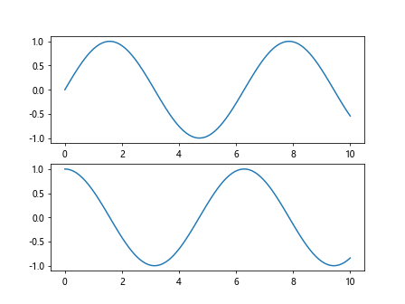
In this example, we plot the sine function on the first subplot and the cosine function on the second subplot.
Customizing Subplot Layout
We can adjust the layout of subplots within a figure by using the tight_layout() function.
import numpy as np
import matplotlib.pyplot as plt

x = np.linspace(0, 10, 100)
y1 = np.sin(x)
y2 = np.cos(x)

fig, axs = plt.subplots(2, 2)
plt.tight_layout()
plt.show()
Output:
The tight_layout() function automatically adjusts the spacing between subplots to prevent overlapping.
Subplots with Different Sizes
We can create subplots with different sizes by specifying the gridspec_kw parameter in the subplots() function.
import numpy as np
import matplotlib.pyplot as plt

x = np.linspace(0, 10, 100)
y1 = np.sin(x)
y2 = np.cos(x)

fig, axs = plt.subplots(2, 2, gridspec_kw={'width_ratios': [1, 2]})
plt.show()
Output:
In this example, the second subplot will be twice as wide as the first subplot.
Subplots with Colorbars
We can add colorbars to subplots using the colorbar() function.
import numpy as np
import matplotlib.pyplot as plt

x = np.linspace(0, 10, 100)
y1 = np.sin(x)
y2 = np.cos(x)

fig, axs = plt.subplots(1, 2)
im = axs[0].imshow(np.random.rand(10, 10))
fig.colorbar(im, ax=axs[0])
plt.show()
Output:
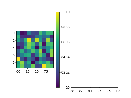
In this example, we add a colorbar to the first subplot that represents the intensity of random data.
Nested Subplots
We can create nested subplots by specifying the layout of subplots within subplots.
import numpy as np
import matplotlib.pyplot as plt

x = np.linspace(0, 10, 100)
y1 = np.sin(x)
y2 = np.cos(x)

fig, ((ax1, ax2), (ax3, ax4)) = plt.subplots(2, 2)
ax1.plot([1, 2, 3, 4])
ax4.plot([4, 3, 2, 1])
plt.show()
Output:
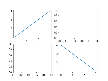
In this example, we create a figure with a 2×2 layout of subplots and nest two subplots inside one of the subplots.
Subplot Grids
We can create complex subplot grids using the GridSpec class.
import matplotlib.gridspec as gridspec
import numpy as np
import matplotlib.pyplot as plt

x = np.linspace(0, 10, 100)
y1 = np.sin(x)
y2 = np.cos(x)

fig = plt.figure()
gs = gridspec.GridSpec(3, 3)
ax1 = fig.add_subplot(gs[0, :])
ax2 = fig.add_subplot(gs[1, :-1])
ax3 = fig.add_subplot(gs[1:, -1])
ax4 = fig.add_subplot(gs[-1, 0])
ax5 = fig.add_subplot(gs[-1, -2])
plt.show()
In this example, we create a grid of subplots with different arrangements using the GridSpec class.
Fine-tuning Subplot Spacings
We can fine-tune the spacing between subplots using the subplots_adjust() function.
import numpy as np
import matplotlib.pyplot as plt

x = np.linspace(0, 10, 100)
y1 = np.sin(x)
y2 = np.cos(x)

fig, axs = plt.subplots(2, 2)
plt.subplots_adjust(hspace=0.5, wspace=0.5)
plt.show()
Output:
In this example, we set the horizontal and vertical spacing between subplots to 0.5.
Multiple Figures with Subplots
We can create multiple figures with subplots by creating new Figure objects.
import numpy as np
import matplotlib.pyplot as plt

x = np.linspace(0, 10, 100)
y1 = np.sin(x)
y2 = np.cos(x)

fig1, axs1 = plt.subplots(2, 2)
fig2, axs2 = plt.subplots(1, 2)
plt.show()
Output:
In this example, we create two separate figures, each with its own set of subplots.
Subplots with Titles and Labels
We can add titles and labels to subplots using the set_title() and set_xlabel()/set_ylabel() functions.
import numpy as np
import matplotlib.pyplot as plt

x = np.linspace(0, 10, 100)
y1 = np.sin(x)
y2 = np.cos(x)

fig, axs = plt.subplots(1, 2)
axs[0].plot(x, y1)
axs[0].set_title('Sine Function')
axs[0].set_xlabel('x')
axs[0].set_ylabel('y')
plt.show()
Output:
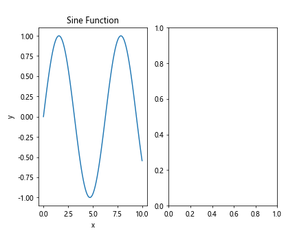
In this example, we add a title, x-axis label, and y-axis label to the first subplot.
Subplots with Legends
We can add legends to subplots using the legend() function.
import numpy as np
import matplotlib.pyplot as plt

x = np.linspace(0, 10, 100)
y1 = np.sin(x)
y2 = np.cos(x)

fig, axs = plt.subplots(1, 2)
axs[0].plot(x, y1, label='sin(x)')
axs[0].plot(x, y2, label='cos(x)')
axs[0].legend()
plt.show()
Output:
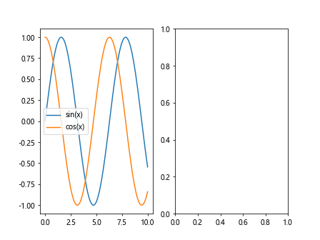
In this example, we add a legend to the first subplot that shows labels for each plot.
Subplots with Annotations
We can add annotations to subplots using the annotate() function.
import numpy as np
import matplotlib.pyplot as plt

x = np.linspace(0, 10, 100)
y1 = np.sin(x)
y2 = np.cos(x)

fig, axs = plt.subplots(1, 2)
axs[0].plot(x, y1)
axs[0].annotate('Maximum', xy=(np.pi/2, 1), xytext=(np.pi/2+1, 1.5),
             arrowprops=dict(facecolor='black', shrink=0.05))
plt.show()
Output:

In this example, we annotate the maximum point of the sine function on the first subplot.
Logarithmic Scales in Subplots
We can use logarithmic scales in subplots by setting the scale using the set_xscale() and set_yscale() functions.
import numpy as np
import matplotlib.pyplot as plt

x = np.linspace(0, 10, 100)
y1 = np.sin(x)
y2 = np.cos(x)

fig, axs = plt.subplots(1, 2)
axs[0].plot(x, y1)
axs[0].set_xscale('log')
axs[1].hist(np.random.normal(0, 1, 1000), bins=30)
axs[1].set_yscale('log')
plt.show()
Output:
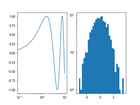
In this example, we set logarithmic scales for the x-axis and y-axis in different subplots.
Subplots with Different Markers
We can plot data with different markers on subplots using the marker parameter in the plot() function.
import numpy as np
import matplotlib.pyplot as plt

x = np.linspace(0, 10, 100)
y1 = np.sin(x)
y2 = np.cos(x)

fig, axs = plt.subplots(1, 2)
axs[0].plot(x, y1, marker='o')
axs[1].scatter(x, y2, marker='x')
plt.show()
Output:
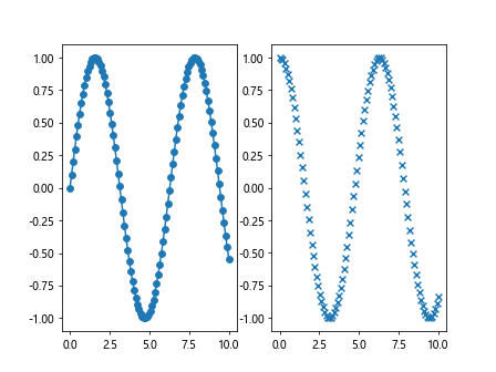
In this example, we plot the sine function with circular markers in the first subplot and the cosine function with cross markers in the second subplot.
Subplots with Different Colormaps
We can plot data with different colormaps on subplots by specifying the cmap parameter in functions that require a colormap.
import numpy as np
import matplotlib.pyplot as plt

x = np.linspace(0, 10, 100)
y1 = np.sin(x)
y2 = np.cos(x)

fig, axs = plt.subplots(1, 2)
im1 = axs[0].imshow(np.random.rand(10, 10), cmap='cool')
im2 = axs[1].imshow(np.random.rand(10, 10), cmap='hot')
fig.colorbar(im1, ax=axs[0])
fig.colorbar(im2, ax=axs[1])
plt.show()
Output:
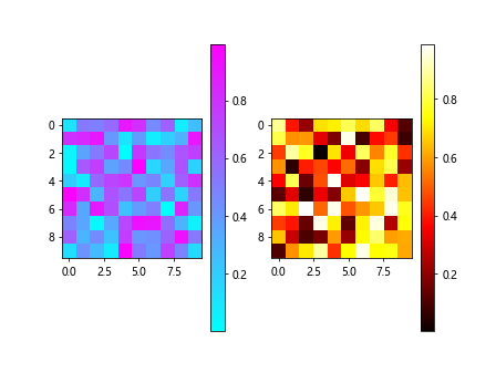
In this example, we plot random data with the ‘cool’ colormap in the first subplot and the ‘hot’ colormap in thesecond subplot.
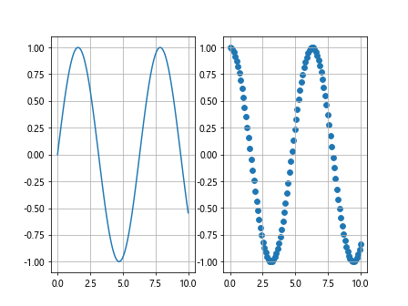
Subplots with Shared Axes
We can create subplots with shared axes by setting the sharex or sharey parameter in the subplots() function.
import numpy as np
import matplotlib.pyplot as plt

x = np.linspace(0, 10, 100)
y1 = np.sin(x)
y2 = np.cos(x)

fig, axs = plt.subplots(2, 2, sharex='all', sharey='all')
axs[0, 0].plot(x, y1)
axs[1, 0].plot(x, y2)
plt.show()
Output:
In this example, we create subplots with shared x-axis and y-axis across all subplots.
Subplots with Images
We can display images on subplots using the imshow() function.
import numpy as np
import matplotlib.pyplot as plt

x = np.linspace(0, 10, 100)
y1 = np.sin(x)
y2 = np.cos(x)

fig, axs = plt.subplots(1, 2)
img1 = np.random.rand(28, 28)
img2 = np.random.rand(28, 28)
axs[0].imshow(img1, cmap='gray')
axs[1].imshow(img2, cmap='viridis')
plt.show()
Output:
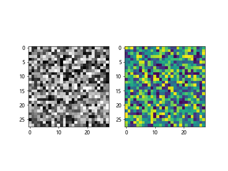
In this example, we display two random 28×28 images with different colormaps on separate subplots.
Subplots with Grid Lines
We can show grid lines on subplots by using the grid() function.
import numpy as np
import matplotlib.pyplot as plt

x = np.linspace(0, 10, 100)
y1 = np.sin(x)
y2 = np.cos(x)

fig, axs = plt.subplots(1, 2)
axs[0].plot(x, y1)
axs[0].grid(True)
axs[1].scatter(x, y2)
axs[1].grid(True)
plt.show()
Output:
In this example, we display grid lines on both the line plot and scatter plot in separate subplots.
Subplots with Different Line Styles
We can plot data with different line styles on subplots using the linestyle parameter in the plot() function.
import numpy as np
import matplotlib.pyplot as plt

x = np.linspace(0, 10, 100)
y1 = np.sin(x)
y2 = np.cos(x)

fig, axs = plt.subplots(1, 2)
axs[0].plot(x, y1, linestyle='--')
axs[1].plot(x, y2, linestyle='-.')
plt.show()
Output:
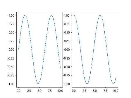
In this example, we plot the sine function with dashed lines in the first subplot and the cosine function with dash-dot lines in the second subplot.
Subplots with Error Bars
We can add error bars to plots on subplots using the errorbar() function.
import numpy as np
import matplotlib.pyplot as plt

x = np.linspace(0, 10, 100)
y1 = np.sin(x)
y2 = np.cos(x)

fig, axs = plt.subplots(1, 2)
axs[0].errorbar(x, y1, yerr=0.1)
axs[1].scatter(x, y2, yerr=0.2)
plt.show()
In this example, we add error bars to the line plot in the first subplot and the scatter plot in the second subplot.
Subplots with Annotations
We can annotate specific points on subplots using the annotate() function.
import numpy as np
import matplotlib.pyplot as plt

x = np.linspace(0, 10, 100)
y1 = np.sin(x)
y2 = np.cos(x)

fig, axs = plt.subplots(1, 2)
axs[0].plot(x, y1)
axs[0].annotate('Peak', xy=(np.pi/2, 1), xytext=(np.pi/2+1, 1.5),
             arrowprops=dict(facecolor='black', shrink=0.05))
plt.show()
Output:
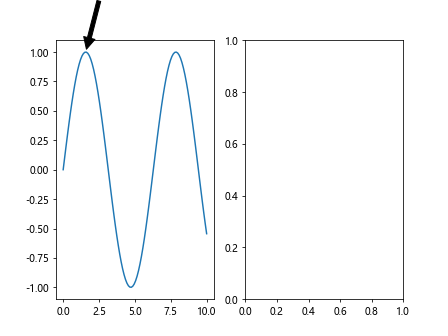
In this example, we annotate the peak of the sine function on the first subplot.
Subplots with Multiple Plots
We can create subplots with multiple plots on each subplot.
import numpy as np
import matplotlib.pyplot as plt

x = np.linspace(0, 10, 100)
y1 = np.sin(x)
y2 = np.cos(x)

fig, axs = plt.subplots(2, 2)
axs[0, 0].plot(x, y1)
axs[0, 1].scatter(x, y2)
axs[1, 0].hist(np.random.normal(0, 1, 1000), bins=30)
axs[1, 1].bar(['A', 'B', 'C', 'D'], [10, 20, 15, 30])
plt.show()
Output:
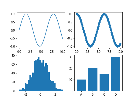
In this example, we plot the sine function, scatter plot, histogram, and bar chart on separate subplots.
These are just a few examples of how you can create and customize subplots in Matplotlib. With the flexibility and power of Matplotlib, the possibilities are endless in creating visually appealing and informative visualizations. Experiment with different parameters, settings, and plot types to find the best way to showcase your data in subplots.