Matplotlib Subplots
Matplotlib is a powerful Python library for creating static, animated, and interactive visualizations in Python. One common task in data visualization is comparing multiple plots side by side using subplots. In this article, we will explore how to create subplots in Matplotlib and customize them to create complex and informative visualizations.
Creating Subplots
To create subplots in Matplotlib, we can use the subplots() function. This function returns a figure object and an array of axes objects. We can then use these axes objects to plot different charts in the same figure. Let’s look at some examples:
Example 1: Creating a Simple 2×2 Subplot Grid
import matplotlib.pyplot as plt

fig, axs = plt.subplots(2, 2)
plt.show()
Output:
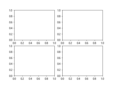
In this example, we create a 2×2 grid of subplots using the subplots() function. We get a figure object fig and an array of axes objects axs.
Example 2: Plotting Different Data on Subplots
import matplotlib.pyplot as plt
import numpy as np

x = np.linspace(0, 10, 100)
y1 = np.sin(x)
y2 = np.cos(x)

fig, axs = plt.subplots(1, 2)
axs[0].plot(x, y1)
axs[1].plot(x, y2)
plt.show()
Output:
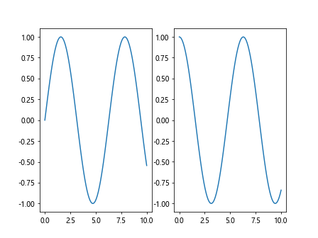
In this example, we plot sin(x) on the first subplot and cos(x) on the second subplot.
Customizing Subplots
We can customize subplots in Matplotlib by adjusting properties such as the size, title, labels, and colors. Let’s look at some examples:
Example 3: Customizing Subplot Size
import matplotlib.pyplot as plt

fig, axs = plt.subplots(1, 2, figsize=(12, 6))
plt.show()
Output:
In this example, we set the size of the figure to (12, 6) using the figsize parameter.
Example 4: Adding Titles and Labels to Subplots
import matplotlib.pyplot as plt
import numpy as np

x = np.linspace(0, 10, 100)
y = np.sin(x)

fig, axs = plt.subplots(1, 1)
axs.plot(x, y)
axs.set_title('Sine Curve')
axs.set_xlabel('X-axis')
axs.set_ylabel('Y-axis')
plt.show()
Output:
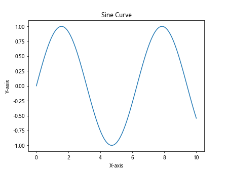
In this example, we add a title, x-axis label, and y-axis label to the subplot.
Example 5: Changing Subplot Colors
import matplotlib.pyplot as plt
import numpy as np

x = np.linspace(0, 10, 100)
y1 = np.sin(x)
y2 = np.cos(x)

fig, axs = plt.subplots(1, 2)
axs[0].plot(x, y1, color='red')
axs[1].plot(x, y2, color='blue')
plt.show()
Output:
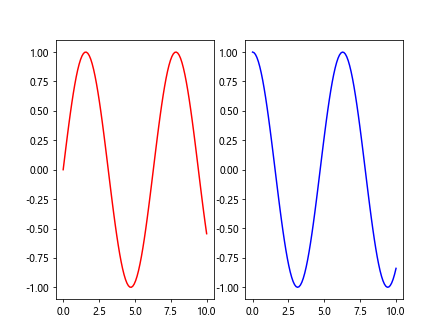
In this example, we change the color of the lines in the subplots to red and blue.
Plotting Different Types of Subplots
Matplotlib supports a variety of plot types that we can use in subplots. Let’s explore some examples:
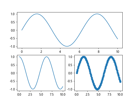
Example 6: Line Plot and Scatter Plot Subplots
import matplotlib.pyplot as plt
import numpy as np

x = np.linspace(0, 10, 100)
y = np.sin(x)

fig, axs = plt.subplots(1, 2)
axs[0].plot(x, y)
axs[1].scatter(x, y)
plt.show()
Output:
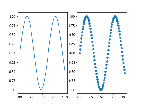
In this example, we plot a line plot on the first subplot and a scatter plot on the second subplot.
Example 7: Bar Plot and Histogram Subplots
import matplotlib.pyplot as plt
import numpy as np

data = np.random.rand(100)

fig, axs = plt.subplots(1, 2)
axs[0].bar(range(1, 6), data[:5])
axs[1].hist(data, bins=20)
plt.show()
Output:
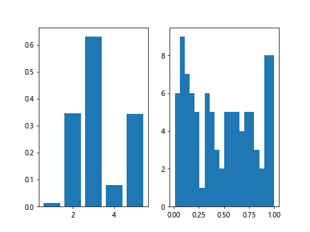
In this example, we plot a bar plot on the first subplot and a histogram on the second subplot.
Example 8: Box Plot and Violin Plot Subplots
import matplotlib.pyplot as plt
import numpy as np

data = [np.random.normal(0, std, 100) for std in range(1, 4)]

fig, axs = plt.subplots(1, 2)
axs[0].boxplot(data)
axs[1].violinplot(data)
plt.show()
Output:
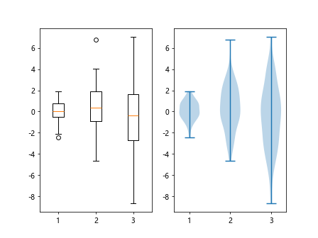
In this example, we plot a box plot on the first subplot and a violin plot on the second subplot.
Subplot Layouts
In addition to the standard grid layout, Matplotlib also supports custom subplot layouts such as gridspec and subplot2grid. Let’s explore some examples:
Example 9: Using GridSpec for Custom Subplot Layout
import matplotlib.pyplot as plt
import matplotlib.gridspec as gridspec
import numpy as np

x = np.linspace(0, 10, 100)
y1 = np.sin(x)
y2 = np.cos(x)

fig = plt.figure()
gs = gridspec.GridSpec(2, 2)
ax1 = plt.subplot(gs[0, :])
ax2 = plt.subplot(gs[1, 0])
ax3 = plt.subplot(gs[1, 1])

ax1.plot(x, y1)
ax2.plot(x, y2)
ax3.scatter(x, y1)
plt.show()
Output:
In this example, we use GridSpec to create a custom layout with different subplot sizes.
Example 10: Using Subplot2grid for Custom Subplot Positioning
import matplotlib.pyplot as plt
import numpy as np

x = np.linspace(0, 10, 100)
y1 = np.sin(x)
y2 = np.cos(x)

fig = plt.figure()
ax1 = plt.subplot2grid((3, 3), (0, 0), colspan=3)
ax2 = plt.subplot2grid((3, 3), (1, 0), colspan=2)
ax3 = plt.subplot2grid((3, 3), (1, 2), rowspan=2)
ax4 = plt.subplot2grid((3, 3), (2, 0), colspan=3)

ax1.plot(x, y1)
ax2.plot(x, y2)
ax3.scatter(x, y1)
ax4.hist(y1, bins=20)
plt.show()
Output:

In this example, we use subplot2grid to create a custom layout with different subplot positions and sizes.
Advanced Customization of Subplots
Example 11: Adding Legends to Subplots
import matplotlib.pyplot as plt
import numpy as np

x = np.linspace(0, 10, 100)
y1 = np.sin(x)
y2 = np.cos(x)

fig, axs = plt.subplots(1, 2)
axs[0].plot(x, y1, label='sin(x)')
axs[1].plot(x, y2, label='cos(x)')
axs[0].legend()
axs[1].legend()
plt.show()
Output:
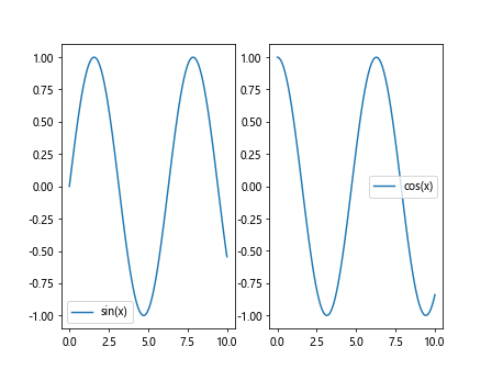
In this example, we add legends to the subplots to provide information about the plotted data.
Example 12: Adding Annotations to Subplots
import matplotlib.pyplot as plt
import numpy as np

x = np.linspace(0, 10, 100)
y = np.sin(x)

fig, ax = plt.subplots()
ax.plot(x, y)
ax.annotate('Max', xy=(np.pi/2, 1), xytext=(np.pi/2 + 1, 1.5),
             arrowprops=dict(facecolor='black', shrink=0.05))
plt.show()
Output:
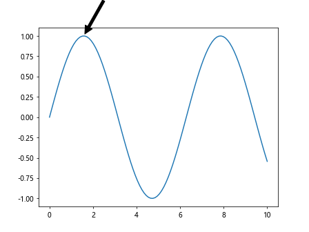
In this example, we add an annotation to the plot to highlight a specific data point.
Example 13: Adding Gridlines to Subplots
import matplotlib.pyplot as plt
import numpy as np

x = np.linspace(0, 10, 100)
y = np.sin(x)

fig, ax = plt.subplots()
ax.plot(x, y)
ax.grid(True)
plt.show()
Output:

In this example, we add gridlines to the plot for better visualization of data points.
Additional Functionalities with Subplots
Example 14: Nested Subplots
import matplotlib.pyplot as plt
import numpy as np

x = np.linspace(0, 10, 100)
y1 = np.sin(x)
y2 = np.cos(x)

fig, axs = plt.subplots(2, 1)
axs[0].plot(x, y1)
axs[1].plot(x, y2)

inner_ax = axs[0].inset_axes([0.5, 0.5, 0.4, 0.4])
inner_ax.plot(x, np.sin(x*2), color='red')
plt.show()
Output:
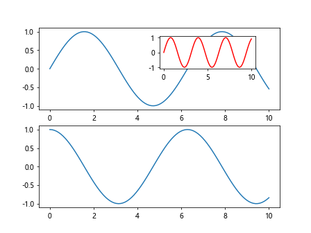
In this example, we create nested subplots with an inset subplot within the main subplot.
Example 15: Sharing Axes between Subplots
import matplotlib.pyplot as plt
import numpy as np

x = np.linspace(0, 10, 100)
y1 = np.sin(x)
y2 = np.cos(x)

fig, axs = plt.subplots(1, 2, sharey=True)
axs[0].plot(x, y1)
axs[1].plot(x, y2)
plt.show()
Output:
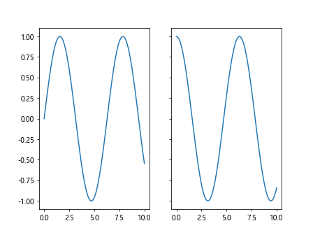
In this example, we share the y-axis between two subplots for better comparison.
Matplotlib Subplots Conclusion
In this article, we have covered various advanced customization techniques and additional functionalities offered by Matplotlib subplots. By incorporating these techniques into your data visualization workflow, you can create highly customized and interactive visualizations that effectively communicate insights from your data.
Matplotlib provides a wide range of tools and options for creating subplots, allowing you to tailor your visualizations to suit specific requirements. Experiment with different subplot configurations, customizations, and functionalities to create visually appealing and informative plots for your data analysis tasks. As you become more familiar with Matplotlib subplots, you will gain greater flexibility and control over your visualizations, enabling you to convey complex information in a clear and compelling manner.