Matplotlib Scatter Plot
Matplotlib is a powerful library for creating visualizations in Python. In this article, we will focus on creating scatter plots using Matplotlib. Scatter plots are used to display the relationship between two numerical variables by plotting points on a two-dimensional plane.
Basic Scatter Plot
Let’s start by creating a basic scatter plot using Matplotlib. In this example, we will generate random data points and plot them.
import matplotlib.pyplot as plt
import numpy as np

# Generate random data
x = np.random.rand(100)
y = np.random.rand(100)

# Create a scatter plot
plt.scatter(x, y)
plt.xlabel('X-axis')
plt.ylabel('Y-axis')
plt.title('Basic Scatter Plot')
plt.show()
Output:
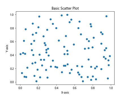
When you run the above code, you should see a simple scatter plot with random points on the X and Y axes.
Changing Marker Size and Color
You can customize the appearance of the data points in a scatter plot by changing the marker size and color. Let’s see an example of how to do this.
import matplotlib.pyplot as plt
import numpy as np

# Generate random data
x = np.random.rand(100)
y = np.random.rand(100)

# Create a scatter plot with custom markers
plt.scatter(x, y, s=50, c='red', alpha=0.5)
plt.xlabel('X-axis')
plt.ylabel('Y-axis')
plt.title('Scatter Plot with Custom Markers')
plt.show()
Output:
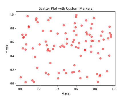
In this example, we set the marker size to 50, the color to red, and the transparency to 0.5. This will create a scatter plot with larger red points that are semi-transparent.
Adding a Colorbar
If you want to represent a third dimension in your scatter plot, you can do so by adding a colorbar. Let’s see how to create a scatter plot with a colorbar.
import matplotlib.pyplot as plt
import numpy as np

# Generate random data
x = np.random.rand(100)
y = np.random.rand(100)
colors = np.random.rand(100)

# Create a scatter plot with a colorbar
plt.scatter(x, y, c=colors, cmap='viridis')
plt.colorbar()
plt.xlabel('X-axis')
plt.ylabel('Y-axis')
plt.title('Scatter Plot with Colorbar')
plt.show()
Output:
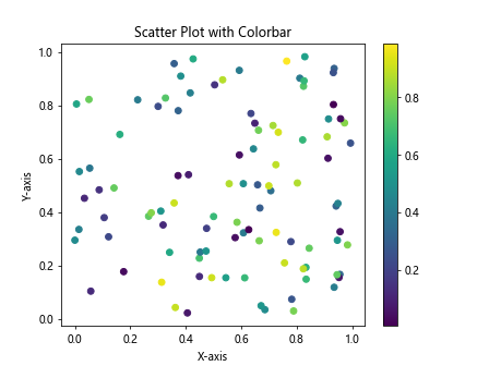
In this example, we use the cmap parameter to specify the colormap of the colorbar. The color of the points will be determined by the values in the colors array.
Customizing Marker Shape
Matplotlib allows you to customize the shape of the markers in a scatter plot. Let’s see an example of how to create a scatter plot with different marker shapes.
import matplotlib.pyplot as plt
import numpy as np

# Generate random data
x = np.random.rand(100)
y = np.random.rand(100)
sizes = np.random.randint(10, 100, size=100)

# Create a scatter plot with custom marker shapes
plt.scatter(x, y, s=sizes, marker='s')
plt.xlabel('X-axis')
plt.ylabel('Y-axis')
plt.title('Scatter Plot with Custom Marker Shapes')
plt.show()
Output:
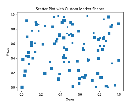
In this example, we use the marker parameter to specify the shape of the markers. The ‘s’ value represents a square marker.
Adding Annotations
You can add annotations to specific points in a scatter plot to provide additional information. Let’s see how to annotate points in a scatter plot.
import matplotlib.pyplot as plt
import numpy as np

# Generate random data
x = np.random.rand(100)
y = np.random.rand(100)

# Create a scatter plot with annotations
plt.scatter(x, y)
for i, txt in enumerate(['A', 'B', 'C', 'D', 'E']):
    plt.annotate(txt, (x[i], y[i]))
plt.xlabel('X-axis')
plt.ylabel('Y-axis')
plt.title('Scatter Plot with Annotations')
plt.show()
Output:
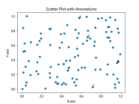
In this example, we use the annotate function to add text annotations to specific points in the scatter plot.
Highlighting Specific Points
You can highlight specific points in a scatter plot by changing their color or size. Let’s see an example of how to highlight specific points in a scatter plot.
import matplotlib.pyplot as plt
import numpy as np

# Generate random data
x = np.random.rand(100)
y = np.random.rand(100)

# Create a scatter plot with highlighted points
plt.scatter(x, y, c='blue')
plt.scatter(x[50], y[50], c='red', s=100, label='Highlighted Point')
plt.legend()
plt.xlabel('X-axis')
plt.ylabel('Y-axis')
plt.title('Scatter Plot with Highlighted Point')
plt.show()
Output:
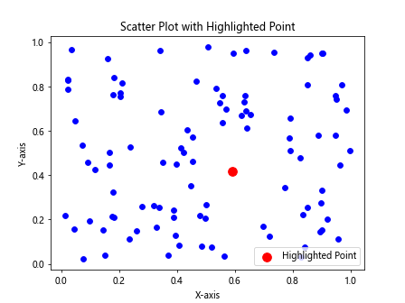
In this example, we use a separate scatter function to highlight a specific point in the scatter plot.
Subplots with Scatter Plots
You can create multiple scatter plots in a grid layout using subplots in Matplotlib. Let’s see an example of how to create subplots with scatter plots.
import matplotlib.pyplot as plt
import numpy as np

# Generate random data
x = np.random.rand(100)
y1 = np.random.rand(100)
y2 = np.random.rand(100) * 2

# Create subplots with scatter plots
fig, axs = plt.subplots(1, 2, figsize=(12, 6))
axs[0].scatter(x, y1, c='green')
axs[0].set_title('Subplot 1')

axs[1].scatter(x, y2, c='orange')
axs[1].set_title('Subplot 2')

plt.show()
Output:
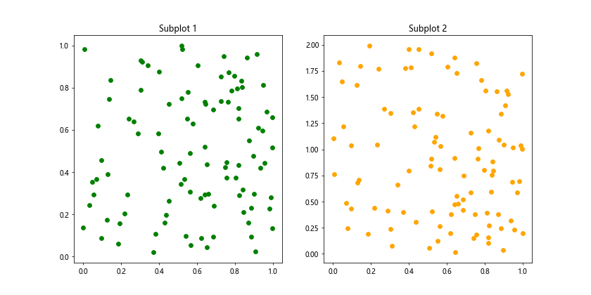
In this example, we use the subplots function to create a grid layout with two subplots, each containing a scatter plot.
Plotting Categorical Data
You can also create scatter plots with categorical data by assigning numerical values to the categories. Let’s see an example of how to plot categorical data in a scatter plot.
import matplotlib.pyplot as plt
import numpy as np

# Generate random data
categories = ['A', 'B', 'C', 'D', 'E']
x = [1, 2, 3, 4, 5]
y = np.random.rand(5)

# Create a scatter plot with categorical data
plt.scatter(x, y)
plt.xticks(x, categories)
plt.xlabel('Categories')
plt.ylabel('Values')
plt.title('Scatter Plot with Categorical Data')
plt.show()
Output:
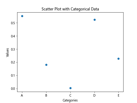
In this example, we use numerical values to represent categories in the scatter plot and then use xticks to label the categories on the X-axis.
Saving Scatter Plots
You can save your scatter plots as image files in various formats such as PNG, JPG, or PDF. Let’s see an example of how to save a scatter plot as a PNG file.
import matplotlib.pyplot as plt
import numpy as np

# Generate random data
x = np.random.rand(100)
y = np.random.rand(100)

# Create a scatter plot and save as PNG
plt.scatter(x, y)
plt.xlabel('X-axis')
plt.ylabel('Y-axis')
plt.title('Scatter Plot')
plt.savefig('scatter_plot.png')
In this example, the scatter plot will be saved as a PNG file named ‘scatter_plot.png’ in the current directory.
Matplotlib Scatter Plot Conclusion
In this article, we have explored various aspects of creating scatter plots using Matplotlib. Scatter plots are a versatile tool for visualizing relationships between numerical variables and can be customized in many ways to convey meaningful insights in your data. Experiment with different parameters and configurations to create beautiful and informative scatter plots for your data analysis projects.