Plotting with Matplotlib
Matplotlib is a popular Python library for creating visualizations. This article will cover various aspects of plotting with Matplotlib, including creating line plots, bar charts, histograms, scatter plots, and customizing plot styles.
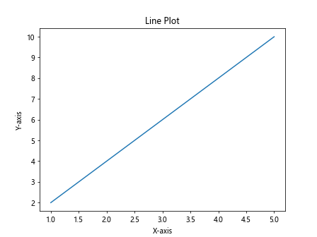
Line Plots
Line plots are one of the most common types of plots used in data visualization. To create a basic line plot with Matplotlib, you can use the plt.plot() function.
import matplotlib.pyplot as plt

x = [1, 2, 3, 4, 5]
y = [2, 4, 6, 8, 10]

plt.plot(x, y)
plt.xlabel('X-axis')
plt.ylabel('Y-axis')
plt.title('Line Plot')
plt.show()
Output:

This code snippet creates a simple line plot with x-axis values ranging from 1 to 5 and corresponding y-axis values of double the x values. When you run this code, you should see a plot showing a straight line.
Bar Charts
Bar charts are useful for comparing categories or groups of data. To create a bar chart using Matplotlib, you can use the plt.bar() function.
import matplotlib.pyplot as plt

categories = ['A', 'B', 'C', 'D']
values = [10, 20, 15, 25]

plt.bar(categories, values)
plt.xlabel('Categories')
plt.ylabel('Values')
plt.title('Bar Chart')
plt.show()
Output:
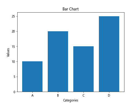
In this example, we have four categories labeled A, B, C, and D with corresponding values. When you run this code, you should see a bar chart showing the values for each category.
Histograms
Histograms are used to visualize the distribution of continuous data. To create a histogram with Matplotlib, you can use the plt.hist() function.
import matplotlib.pyplot as plt
import numpy as np

data = np.random.randn(1000)

plt.hist(data, bins=30)
plt.xlabel('Values')
plt.ylabel('Frequency')
plt.title('Histogram')
plt.show()
Output:
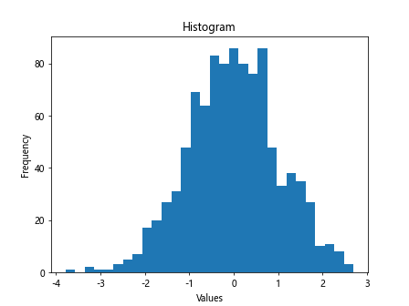
In this example, we generate random data using NumPy’s np.random.randn() function and create a histogram with 30 bins. Running this code will display a histogram of the data distribution.
Scatter Plots
Scatter plots are beneficial for visualizing relationships between two continuous variables. To create a scatter plot with Matplotlib, you can use the plt.scatter() function.
import matplotlib.pyplot as plt

x = [1, 2, 3, 4, 5]
y = [2, 4, 1, 3, 5]

plt.scatter(x, y)
plt.xlabel('X-axis')
plt.ylabel('Y-axis')
plt.title('Scatter Plot')
plt.show()
Output:
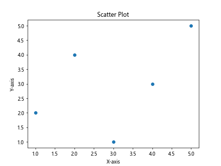
In this example, we have two sets of data points, and the code snippet creates a scatter plot showing the relationship between the x and y values.
Customizing Plot Styles
Matplotlib allows you to customize the appearance of your plots by changing colors, line styles, markers, and more. Let’s look at some examples of customizing plot styles.
Changing Line Colors
You can specify the color of a line plot using the color parameter in the plt.plot() function.
import matplotlib.pyplot as plt

x = [1, 2, 3, 4, 5]
y = [2, 4, 6, 8, 10]

plt.plot(x, y, color='red')
plt.xlabel('X-axis')
plt.ylabel('Y-axis')
plt.title('Line Plot with Red Line')
plt.show()
Output:
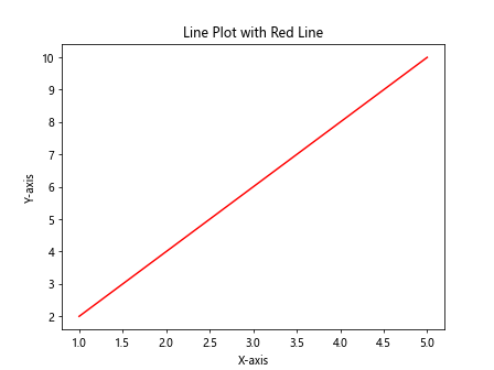
This code snippet creates a line plot with a red line. You can change the color to any valid color name or HTML color code.
Changing Line Styles
You can change the style of a line plot using the linestyle parameter in the plt.plot() function.
import matplotlib.pyplot as plt

x = [1, 2, 3, 4, 5]
y = [2, 4, 6, 8, 10]

plt.plot(x, y, linestyle='--')
plt.xlabel('X-axis')
plt.ylabel('Y-axis')
plt.title('Dashed Line Plot')
plt.show()
Output:
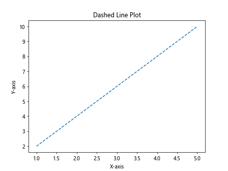
In this example, we create a line plot with a dashed line style. You can choose from various line styles such as ‘-‘, ‘–‘, ‘:’, etc.
Adding Markers
You can add markers to data points in a plot using the marker parameter in the plt.plot() function.
import matplotlib.pyplot as plt

x = [1, 2, 3, 4, 5]
y = [2, 4, 6, 8, 10]

plt.plot(x, y, marker='o')
plt.xlabel('X-axis')
plt.ylabel('Y-axis')
plt.title('Line Plot with Circle Markers')
plt.show()
Output:
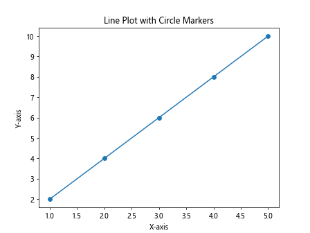
This code snippet adds circle markers to the data points in the line plot. You can choose from various marker styles such as ‘o’, ‘s’, ‘^’, etc.
Changing Plot Size
You can adjust the size of a plot using the figsize parameter in the plt.figure() function.
import matplotlib.pyplot as plt

plt.figure(figsize=(10, 6))
plt.plot([1, 2, 3, 4, 5], [2, 4, 6, 8, 10])
plt.xlabel('X-axis')
plt.ylabel('Y-axis')
plt.title('Line Plot with Custom Size')
plt.show()
Output:
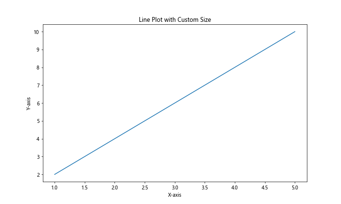
In this example, we create a line plot with a custom figure size of 10×6 inches. Adjust the figsize values to change the size of the plot.
Adding Gridlines
You can add gridlines to a plot using the plt.grid() function.
import matplotlib.pyplot as plt

x = [1, 2, 3, 4, 5]
y = [2, 4, 6, 8, 10]

plt.plot(x, y)
plt.xlabel('X-axis')
plt.ylabel('Y-axis')
plt.title('Line Plot with Gridlines')
plt.grid(True)
plt.show()
Output:
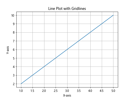
This code snippet creates a line plot with gridlines added to the plot. Set plt.grid(True) to display gridlines and plt.grid(False) to hide them.
Customizing Tick Labels
You can customize the appearance of tick labels on the axes using the plt.xticks() and plt.yticks() functions.
import matplotlib.pyplot as plt

x = [1, 2, 3, 4, 5]
y = [2, 4, 6, 8, 10]

plt.plot(x, y)
plt.xlabel('X-axis')
plt.ylabel('Y-axis')
plt.title('Line Plot with Custom Tick Labels')
plt.xticks([1, 2, 3, 4, 5], ['A', 'B', 'C', 'D', 'E'])
plt.show()
Output:
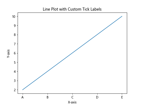
In this example, we customize the x-axis tick labels to display ‘A’ through ‘E’ instead of numerical values.
Adding Legends
You can add a legend to a plot by providing a label for each plot and calling the plt.legend() function.
import matplotlib.pyplot as plt

x = [1, 2, 3, 4, 5]
y1 = [2, 4, 6, 8, 10]
y2 = [1, 3, 5, 7, 9]

plt.plot(x, y1, label='Line 1')
plt.plot(x, y2, label='Line 2')
plt.xlabel('X-axis')
plt.ylabel('Y-axis')
plt.title('Line Plot with Legend')
plt.legend()
plt.show()
Output:
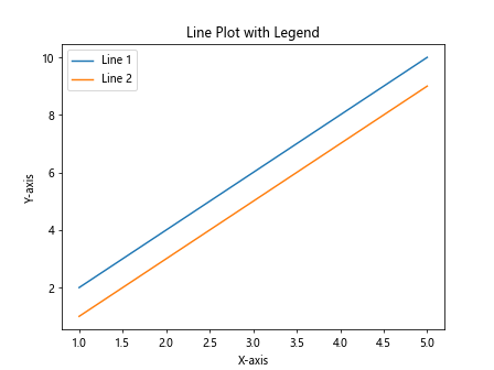
This code snippet creates a line plot with two lines, each labeled with a different label. The legend function adds a legend to the plot indicating which line represents each label.
Adding Text Annotations
You can add annotations to a plot using the plt.text() function.
import matplotlib.pyplot as plt

plt.plot([1, 2, 3, 4, 5], [2, 4, 6, 8, 10])
plt.xlabel('X-axis')
plt.ylabel('Y-axis')
plt.title('Line Plot with Text Annotation')
plt.text(3, 6, 'Max Value', fontsize=12)
plt.show()
Output:
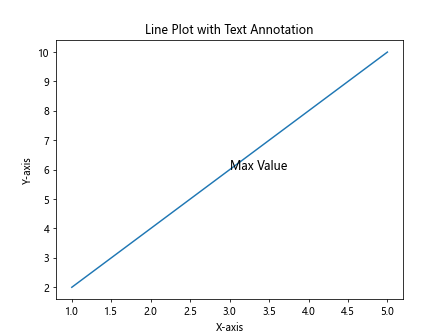
In this example, we add a text annotation ‘MaxValue’ to the plot at the coordinates (3, 6) with a font size of 12.
Subplots
Subplots allow you to create multiple plots within the same figure. You can use the plt.subplots() function to create subplots.
import matplotlib.pyplot as plt

fig, axs = plt.subplots(2, 2, figsize=(10, 8))

x = [1, 2, 3, 4, 5]
y1 = [2, 4, 6, 8, 10]
y2 = [1, 3, 5, 7, 9]

axs[0, 0].plot(x, y1)
axs[0, 0].set_title('Plot 1')

axs[0, 1].scatter(x, y2)
axs[0, 1].set_title('Plot 2')

axs[1, 0].bar(x, y1)
axs[1, 0].set_title('Plot 3')

axs[1, 1].hist(y2)
axs[1, 1].set_title('Plot 4')

plt.tight_layout()
plt.show()
Output:
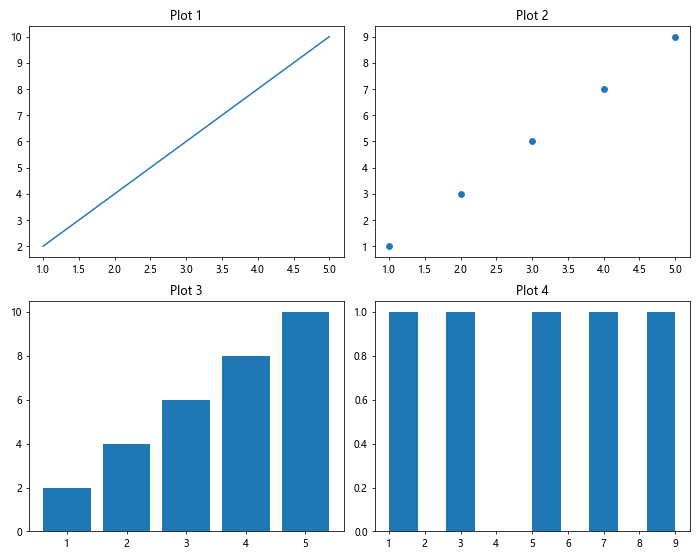
In this example, we create a 2×2 grid of subplots and plot different types of plots in each subplot.
Saving Plots
Matplotlib allows you to save plots in various formats such as PNG, JPG, PDF, and SVG. You can use the plt.savefig() function to save a plot.
import matplotlib.pyplot as plt

x = [1, 2, 3, 4, 5]
y = [2, 4, 6, 8, 10]

plt.plot(x, y)
plt.xlabel('X-axis')
plt.ylabel('Y-axis')
plt.title('Line Plot')

plt.savefig('line_plot.png', dpi=300)
plt.show()
Output:
This code snippet saves the line plot as a PNG file with a resolution of 300 dpi. You can change the file format and resolution as needed.
plot matplotlib Conclusion
In this article, we covered the basics of plotting with Matplotlib, including creating line plots, bar charts, histograms, scatter plots, and customizing plot styles. We also explored various customization options, subplots, saving plots, and more. Matplotlib is a versatile library with a wide range of functionality for creating stunning visualizations in Python.
Remember to experiment with different types of plots and customization options to create visually appealing and informative plots for your data analysis projects.