Plot Multiple Lines in Matplotlib
Matplotlib is a powerful library for creating visualizations in Python. One common use case is plotting multiple lines on the same graph. In this article, we will explore how to do this using Matplotlib.
Basic Line Plot
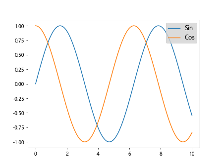
The first step is to import the necessary libraries and create some data to plot. Let’s start by plotting two simple lines.
import matplotlib.pyplot as plt
import numpy as np

x = np.linspace(0, 10, 100)
y1 = np.sin(x)
y2 = np.cos(x)

plt.plot(x, y1, label='Sin')
plt.plot(x, y2, label='Cos')
plt.legend()
plt.show()
Output:
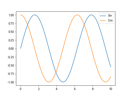
In this code snippet, we generate two arrays y1 and y2 using NumPy’s sin and cos functions. We then plot these arrays against x and add labels using the label parameter. Finally, we show the legend with plt.legend() and display the plot with plt.show().
Line Colors and Styles
We can customize the appearance of the lines by specifying colors and styles. Let’s plot two lines with different colors and styles.
import matplotlib.pyplot as plt
import numpy as np

x = np.linspace(0, 10, 100)
y1 = np.sin(x)
y2 = np.cos(x)

plt.plot(x, y1, color='blue', linestyle='dashed', label='Sin')
plt.plot(x, y2, color='red', linestyle='dashdot', label='Cos')
plt.legend()
plt.show()
Output:
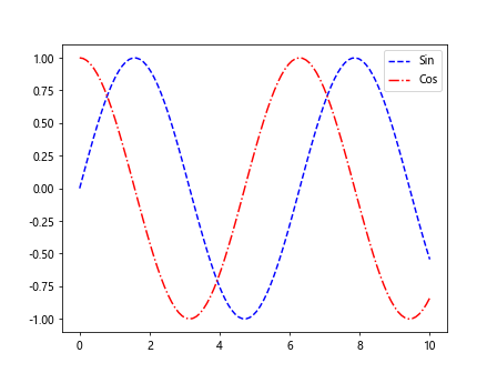
In this code snippet, we set the line color to blue and red using the color parameter, and the line style to dashed and dashdot using the linestyle parameter.
Line Width and Marker
We can also adjust the line width and add markers to the lines. Let’s plot two lines with different line widths and markers.
import matplotlib.pyplot as plt
import numpy as np

x = np.linspace(0, 10, 100)
y1 = np.sin(x)
y2 = np.cos(x)

plt.plot(x, y1, linewidth=2, marker='o', label='Sin')
plt.plot(x, y2, linewidth=1, marker='s', label='Cos')
plt.legend()
plt.show()
Output:
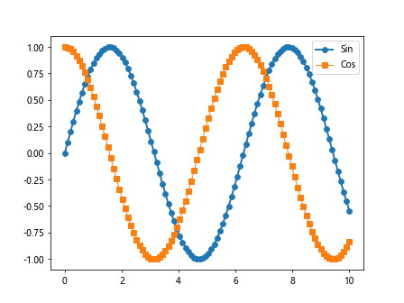
In this code snippet, we set the line width to 2 and 1 using the linewidth parameter, and add circular and square markers using the marker parameter.
Adding Annotations
Annotations can be useful to highlight specific points on the plot. Let’s add annotations to a line plot.
import matplotlib.pyplot as plt
import numpy as np

x = np.linspace(0, 10, 100)
y1 = np.sin(x)
y2 = np.cos(x)

plt.plot(x, y1, label='Sin')
plt.annotate('Peak', xy=(np.pi/2, 1), xytext=(np.pi/2+1, 1.5),
             arrowprops=dict(facecolor='black', shrink=0.05))
plt.plot(x, y2, label='Cos')
plt.legend()
plt.show()
Output:
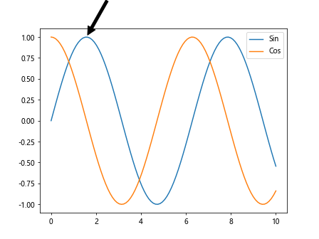
In this code snippet, we use the annotate function to add an annotation at the peak of the sine wave. We specify the text to display, the position of the text (xytext), and the position of the arrow (xy) using the arrowprops parameter.
Multiple Subplots
We can create multiple subplots in the same figure to compare different datasets. Let’s create two subplots with different lines.
import matplotlib.pyplot as plt
import numpy as np

x = np.linspace(0, 10, 100)
y1 = np.sin(x)
y2 = np.cos(x)
y3 = np.tan(x)

fig, axs = plt.subplots(2)

axs[0].plot(x, y1, label='Sin')
axs[1].plot(x, y2, label='Cos')
axs[1].plot(x, y3, label='Tan')
plt.show()
Output:
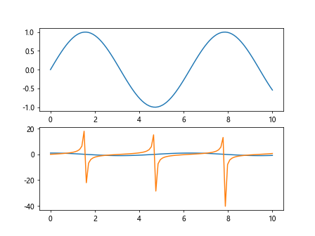
In this code snippet, we use plt.subplots to create a figure with two subplots. We then plot the sine wave in the first subplot and the cosine and tangent waves in the second subplot.
Customizing Axes
We can customize the axes of the plot to adjust the range, labels, and gridlines. Let’s plot two lines with customized axes.
import matplotlib.pyplot as plt
import numpy as np

x = np.linspace(0, 10, 100)
y1 = np.sin(x)
y2 = np.cos(x)

plt.plot(x, y1, label='Sin')
plt.plot(x, y2, label='Cos')
plt.xlim(0, 5)
plt.ylim(-1, 1)
plt.xlabel('X')
plt.ylabel('Y')
plt.grid(True)
plt.show()
Output:
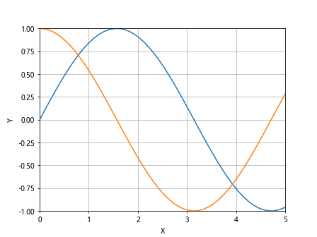
In this code snippet, we use plt.xlim and plt.ylim to adjust the range of the x and y axes, plt.xlabel and plt.ylabel to set the labels, and plt.grid to display gridlines.
Saving Plots
Matplotlib allows us to save plots in various formats such as PNG and PDF. Let’s save a plot with multiple lines as a PNG file.
import matplotlib.pyplot as plt
import numpy as np

x = np.linspace(0, 10, 100)
y1 = np.sin(x)
y2 = np.cos(x)

plt.plot(x, y1, label='Sin')
plt.plot(x, y2, label='Cos')
plt.legend()
plt.savefig('multiple_lines.png')
In this code snippet, we use plt.savefig to save the plot as a PNG file with the filename multiple_lines.png.
Customizing Legends
Legends can be customized to adjust the placement, font size, and background color. Let’s customize the legend of a plot with multiple lines.
import matplotlib.pyplot as plt
import numpy as np

x = np.linspace(0, 10, 100)
y1 = np.sin(x)
y2 = np.cos(x)

plt.plot(x, y1, label='Sin')
plt.plot(x, y2, label='Cos')
plt.legend(loc='upper right', fontsize='large', facecolor='lightgrey')
plt.show()
Output:
In this code snippet, we use the loc, fontsize, and facecolor parameters of plt.legend to set the location of the legend, the font size, and the background color.
Plotting Error Bars
Error bars can be added to the plot to show the uncertainty in the data. Let’s plot two lines with error bars.
import matplotlib.pyplot as plt
import numpy as np

x = np.linspace(0, 10, 10)
y1 = np.sin(x)
y2 = np.cos(x)
error = np.random.rand(2, 10)

plt.errorbar(x, y1, yerr=error, label='Sin')
plt.errorbar(x, y2, yerr=error, label='Cos')
plt.legend()
plt.show()
Output:
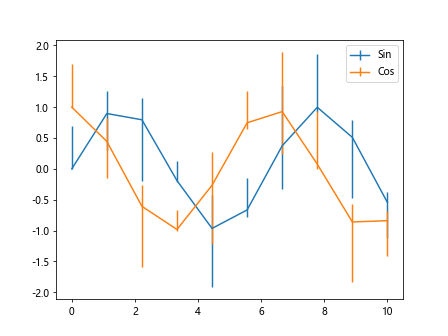
In this code snippet, we use plt.errorbar to plot the lines with error bars. We specify the yerr parameter to set the error bars.
Dual Y-Axis
Sometimes it’s useful to have a dual y-axis to compare datasets with different scales. Let’s plot two lines with dual y-axes.
import matplotlib.pyplot as plt
import numpy as np

fig, ax1 = plt.subplots()

x = np.arange(0, 10, 0.1)
y1 = np.sin(x)
y2 = np.exp(x)

ax1.plot(x, y1, 'b-')
ax1.set_xlabel('X')
ax1.set_ylabel('Sin', color='b')

ax2 = ax1.twinx()
ax2.plot(x, y2, 'r-')
ax2.set_ylabel('Exp', color='r')

plt.show()
Output:
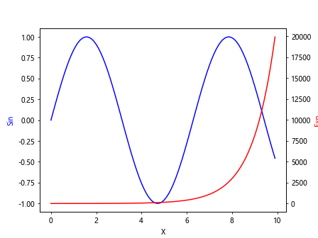
In this code snippet, we create a figure with two y-axes using plt.subplots and ax1.twinx(). We plot the sine wave on the left y-axis and the exponential function on the right y-axis.
3D Line Plot
Matplotlib also supports 3D plots, including 3D line plots. Let’s plot a 3D line with multiple lines.
from mpl_toolkits.mplot3d import Axes3D
import matplotlib.pyplot as plt
import numpy as np

fig = plt.figure()
ax = fig.add_subplot(111, projection='3d')

x = np.linspace(0, 10, 100)
y1 = np.sin(x)
y2 = np.cos(x)
z = np.arange(0, 100, 1)

ax.plot(x, y1, z, label='Sin')
ax.plot(x, y2, z, label='Cos')
plt.legend()
plt.show()
Output:
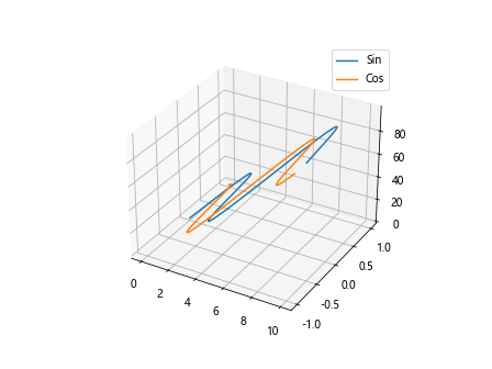
In this code snippet, weplot two lines in 3D space using mpl_toolkits.mplot3d.Axes3D. We define the x, y, and z coordinates for the two lines and plot them using ax.plot. The legend is added using plt.legend().
Transparent Lines
We can make the lines transparent to show underlying data in the plot. Let’s plot two transparent lines.
import matplotlib.pyplot as plt
import numpy as np

x = np.linspace(0, 10, 100)
y1 = np.sin(x)
y2 = np.cos(x)

plt.plot(x, y1, label='Sin', alpha=0.5)
plt.plot(x, y2, label='Cos', alpha=0.5)
plt.legend()
plt.show()
Output:
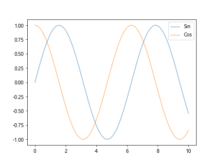
In this code snippet, we use the alpha parameter to set the transparency of the lines. A value of 0.5 makes the lines partially transparent.
Plot with Different Line Styles
Matplotlib provides a variety of line styles such as solid, dashed, and dotted. Let’s plot two lines with different line styles.
import matplotlib.pyplot as plt
import numpy as np

x = np.linspace(0, 10, 100)
y1 = np.sin(x)
y2 = np.cos(x)

plt.plot(x, y1, label='Sin', linestyle='solid')
plt.plot(x, y2, label='Cos', linestyle='dotted')
plt.legend()
plt.show()
Output:
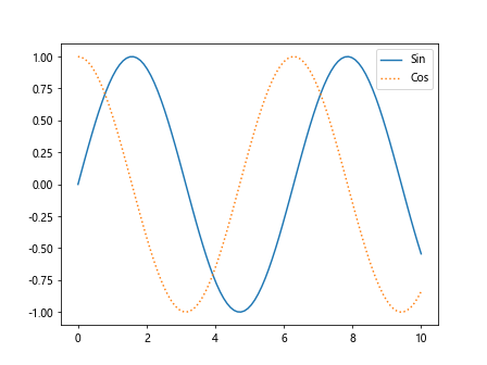
In this code snippet, we use the linestyle parameter to set the line styles of the two lines. solid creates a solid line, while dotted creates a line with dots.
Subplots with Shared Axis
We can create subplots with shared axes to compare datasets in different panels. Let’s create subplots with shared x-axis.
import matplotlib.pyplot as plt
import numpy as np

x = np.linspace(0, 10, 100)
y1 = np.sin(x)
y2 = np.cos(x)

fig, axs = plt.subplots(2, sharex=True)

axs[0].plot(x, y1, label='Sin')
axs[1].plot(x, y2, label='Cos')
plt.show()
Output:
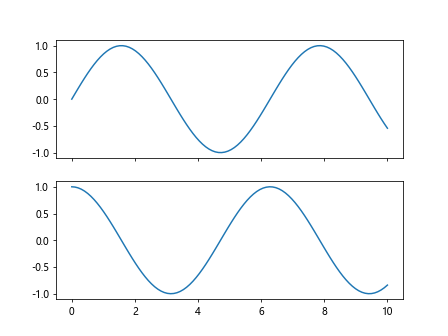
In this code snippet, we use plt.subplots with the sharex=True parameter to create subplots with a shared x-axis. We then plot the sine and cosine waves in separate subplots.
Plot with Shaded Regions
We can shade regions under the lines to highlight certain areas in the plot. Let’s plot two lines with shaded regions.
import matplotlib.pyplot as plt
import numpy as np

x = np.linspace(0, 10, 100)
y1 = np.sin(x)
y2 = np.cos(x)

plt.plot(x, y1, label='Sin')
plt.fill_between(x, y1, color='blue', alpha=0.3)
plt.plot(x, y2, label='Cos')
plt.fill_between(x, y2, color='red', alpha=0.3)
plt.legend()
plt.show()
Output:
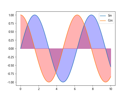
In this code snippet, we use plt.fill_between to shade the regions under the sine and cosine waves. We specify the colors and transparency using the color and alpha parameters.
Plot with Logarithmic Scale
Matplotlib supports plotting on logarithmic scales, which can be useful for data that covers a wide range of orders of magnitude. Let’s plot two lines on a logarithmic scale.
import matplotlib.pyplot as plt
import numpy as np

x = np.linspace(1, 10, 100)
y1 = np.exp(x)
y2 = np.power(x, 2)

plt.plot(x, y1, label='Exp')
plt.yscale('log')
plt.plot(x, y2, label='Pow')
plt.legend()
plt.show()
Output:
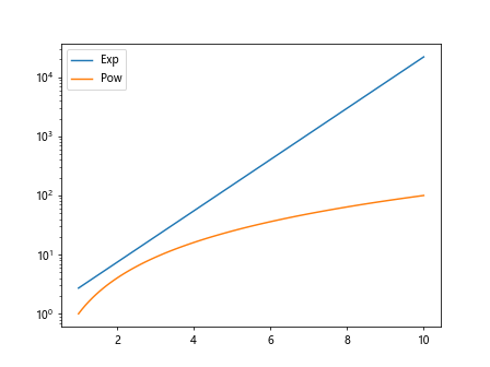
In this code snippet, we use plt.yscale('log') to set the y-axis to a logarithmic scale. We then plot the exponential and power functions on the log scale.
Plot with Error Bands
Error bands can be added to a plot to show the uncertainty in the data. Let’s plot two lines with error bands.
import matplotlib.pyplot as plt
import numpy as np

x = np.linspace(0, 10, 100)
y1 = np.sin(x)
y2 = np.cos(x)
error = 0.1

plt.plot(x, y1, label='Sin')
plt.fill_between(x, y1-error, y1+error, color='blue', alpha=0.3)
plt.plot(x, y2, label='Cos')
plt.fill_between(x, y2-error, y2+error, color='red', alpha=0.3)
plt.legend()
plt.show()
Output:
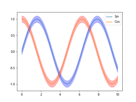
In this code snippet, we use plt.fill_between to add error bands to the sine and cosine waves. The error parameter specifies the width of the error band.
Plot with Gradient Color
Matplotlib allows us to plot lines with gradient colors. Let’s plot a line with a gradient color.
import matplotlib.pyplot as plt
import numpy as np

x = np.linspace(0, 10, 100)
y = np.sin(x)

plt.plot(x, y, color=plt.cm.cividis(np.linspace(0, 1, len(x))))
plt.show()
In this code snippet, we use plt.cm.cividis to get a colormap with varying colors. We then plot the sine wave with a gradient color based on the colormap.
These are just a few examples of how to plot multiple lines in Matplotlib. By using different customization options and features of Matplotlib, you can create complex and informative visualizations for your data.Experiment with these examples and explore the extensive documentation and tutorials available for Matplotlib to create stunning plots for your projects.