Matplotlib Examples
Matplotlib is a powerful Python visualization library that enables users to create a wide range of plots, graphs, and interactive visualizations. In this article, we will explore a variety of examples showcasing the capabilities of Matplotlib. From simple line plots to intricate 3D visualizations, we will cover a diverse set of visualizations using Matplotlib.
Basic Line Plot
The basic line plot is one of the most commonly used plots in data visualization. It is simple yet effective in displaying the trend or relationship between two variables. Let’s start with a simple example of plotting a line graph using Matplotlib.
import matplotlib.pyplot as plt

# Data
x = [1, 2, 3, 4, 5]
y = [2, 4, 6, 8, 10]

# Plot
plt.plot(x, y)
plt.xlabel('X-axis')
plt.ylabel('Y-axis')
plt.title('Basic Line Plot')
plt.show()
Output:
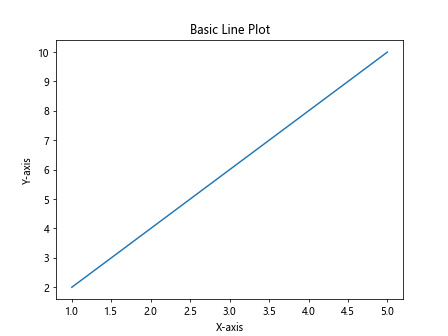
Running the above code will generate a basic line plot with the x-axis ranging from 1 to 5 and y-axis ranging from 2 to 10.
Scatter Plot
Scatter plots are used to visualize the relationship between two numerical variables. Each point represents an observation where the x-coordinate corresponds to one variable and the y-coordinate corresponds to another. Let’s create a scatter plot using Matplotlib.
import matplotlib.pyplot as plt

# Data
x = [1, 2, 3, 4, 5]
y = [2, 4, 6, 8, 10]

# Plot
plt.scatter(x, y)
plt.xlabel('X-axis')
plt.ylabel('Y-axis')
plt.title('Scatter Plot')
plt.show()
Output:
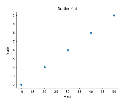
Running the code above will generate a scatter plot with points corresponding to the values in the x and y lists.
Bar Plot
Bar plots are useful for comparing different categories or groups. Each bar represents a category, and the height of the bar indicates the value of that category. Let’s create a bar plot using Matplotlib.
import matplotlib.pyplot as plt

# Data
categories = ['A', 'B', 'C', 'D']
values = [10, 20, 15, 30]

# Plot
plt.bar(categories, values)
plt.xlabel('Categories')
plt.ylabel('Values')
plt.title('Bar Plot')
plt.show()
Output:
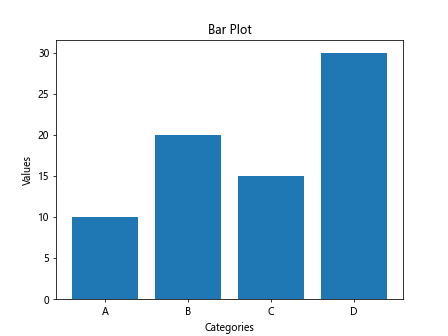
Running the code above will generate a bar plot with bars representing different categories and their corresponding values.
Histogram
Histograms are used to show the distribution of a continuous variable. The x-axis represents the variable’s range, while the y-axis represents the frequency or count of observations within each bin. Let’s create a histogram using Matplotlib.
import matplotlib.pyplot as plt
import numpy as np

# Data
data = np.random.randn(1000)

# Plot
plt.hist(data, bins=30)
plt.xlabel('Value')
plt.ylabel('Frequency')
plt.title('Histogram')
plt.show()
Output:
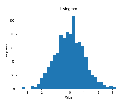
Running the code above will generate a histogram displaying the distribution of a random dataset.
Box Plot
Box plots are used to visualize the distribution of data and identify outliers. They display the median, quartiles, and possible outliers in a concise manner. Let’s create a box plot using Matplotlib.
import matplotlib.pyplot as plt
import numpy as np

# Data
data = np.random.randn(100)

# Plot
plt.boxplot(data)
plt.xlabel('Data')
plt.ylabel('Value')
plt.title('Box Plot')
plt.show()
Output:
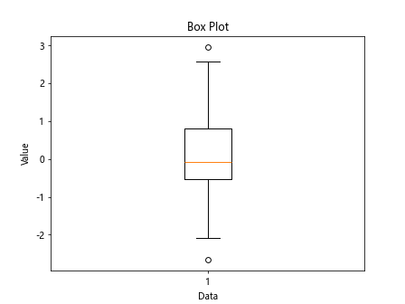
Running the code above will generate a box plot showing the distribution of a random dataset.
Pie Chart
Pie charts are useful for showing the proportional distribution of different categories as parts of a whole. Each wedge represents a category, and the size of the wedge corresponds to the proportion of that category. Let’s create a pie chart using Matplotlib.
import matplotlib.pyplot as plt

# Data
sizes = [30, 20, 25, 25]
labels = ['A', 'B', 'C', 'D']

# Plot
plt.pie(sizes, labels=labels, autopct='%1.1f%%')
plt.title('Pie Chart')
plt.show()
Output:
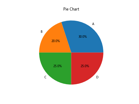
Running the code above will generate a pie chart displaying the distribution of different categories.
3D Plot
Matplotlib also supports 3D plotting, which is useful for visualizing complex datasets in three dimensions. Let’s create a 3D plot using Matplotlib.
import matplotlib.pyplot as plt
from mpl_toolkits.mplot3d import Axes3D
import numpy as np

# Data
x = np.linspace(-5, 5, 100)
y = np.linspace(-5, 5, 100)
X, Y = np.meshgrid(x, y)
Z = np.sin(np.sqrt(X**2 + Y**2))

# Plot
fig = plt.figure()
ax = fig.add_subplot(111, projection='3d')
ax.plot_surface(X, Y, Z)
ax.set_xlabel('X-axis')
ax.set_ylabel('Y-axis')
ax.set_zlabel('Z-axis')
plt.title('3D Plot')
plt.show()
Output:
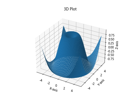
Running the code above will generate a 3D plot of a sine wave in three dimensions.
Subplots
Subplots allow you to create multiple plots within the same figure, making it easier to compare different visualizations. Let’s create subplots using Matplotlib.
import matplotlib.pyplot as plt

# Data
x = [1, 2, 3, 4, 5]
y1 = [2, 4, 6, 8, 10]
y2 = [1, 3, 5, 7, 9]

# Plot
fig, axs = plt.subplots(2)
fig.suptitle('Subplots Example')
axs[0].plot(x, y1)
axs[1].plot(x, y2)
plt.show()
Output:
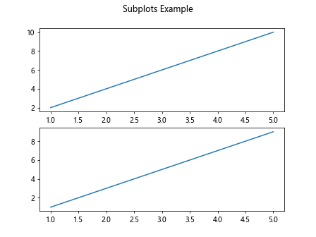
Running the code above will generate two subplots within the same figure, each displaying a line plot.
Annotations
Annotations are useful for adding explanatory text or labels to a plot to provide additional context. Let’s add annotations to a plot using Matplotlib.
import matplotlib.pyplot as plt

# Data
x = [1, 2, 3, 4, 5]
y = [2, 4, 6, 8, 10]

# Plot
plt.plot(x, y)
plt.xlabel('X-axis')
plt.ylabel('Y-axis')
plt.title('Annotations Example')
plt.annotate('Maximum', xy=(5, 10), xytext=(4, 10.5),
             arrowprops=dict(facecolor='black', shrink=0.05))
plt.show()
Output:
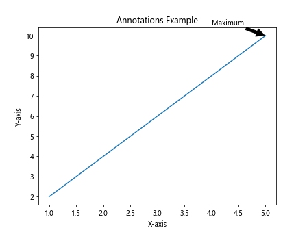
Running the code above will generate a line plot with an annotation indicating the maximum value.
Customizing Plot
Matplotlib provides a range of customization options to tailor the appearance of your plots to your preferences. Let’s customize a plot using Matplotlib.
import matplotlib.pyplot as plt
import numpy as np

# Data
x = np.linspace(0, 10, 100)
y = np.sin(x)

# Plot
plt.plot(x, y, color='red', linestyle='--', linewidth=2, marker='o', markersize=5)
plt.xlabel('X-axis')
plt.ylabel('Y-axis')
plt.title('Customizing Plot')
plt.show()
Output:
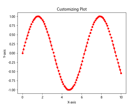
Running the code above will generate a customized line plot with a red dashed line, circular markers, and a thicker line width.
Saving Plot
Matplotlib allows you to save your plots to various image formats, such as PNG, JPEG, and PDF. Let’s save a plot to a PNG file using Matplotlib.
import matplotlib.pyplot as plt

# Data
x = [1, 2, 3, 4, 5]
y = [2, 4, 6, 8, 10]

# Plot
plt.plot(x, y)
plt.xlabel('X-axis')
plt.ylabel('Y-axis')
plt.title('Saving Plot Example')
plt.savefig('plot.png')
Running the code above will generate a line plot and save it as a PNG file named plot.png.