Mastering Matplotlib Subplots Padding: A Comprehensive Guide
Matplotlib subplots padding is a crucial aspect of creating visually appealing and well-organized plots in Python. This comprehensive guide will delve deep into the intricacies of Matplotlib subplots padding, providing you with the knowledge and tools to create professional-looking visualizations. We’ll explore various techniques, best practices, and examples to help you master the art of adjusting subplot padding in Matplotlib.
Understanding Matplotlib Subplots Padding
Matplotlib subplots padding refers to the space between subplots and the space between the subplots and the figure edges. Proper padding ensures that your plots are well-spaced and easy to read. Let’s start by examining the basics of Matplotlib subplots padding and how it affects your visualizations.
Basic Matplotlib Subplots Padding
To begin, let’s create a simple example that demonstrates the default padding in Matplotlib subplots:
import matplotlib.pyplot as plt

fig, (ax1, ax2) = plt.subplots(1, 2, figsize=(10, 4))

ax1.plot([1, 2, 3, 4], [1, 4, 2, 3])
ax2.plot([1, 2, 3, 4], [4, 3, 2, 1])

ax1.set_title("Plot 1 - how2matplotlib.com")
ax2.set_title("Plot 2 - how2matplotlib.com")

plt.show()
Output:
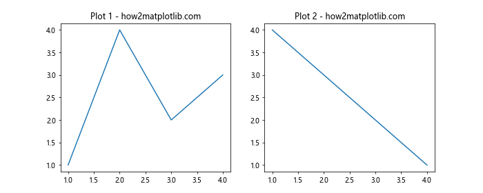
In this example, we create two subplots side by side using the plt.subplots() function. The default padding is applied automatically, but you may notice that the plots are quite close to each other and the figure edges.
Adjusting Matplotlib Subplots Padding
To improve the layout, we can adjust the padding using the plt.tight_layout() function:
import matplotlib.pyplot as plt

fig, (ax1, ax2) = plt.subplots(1, 2, figsize=(10, 4))

ax1.plot([1, 2, 3, 4], [1, 4, 2, 3])
ax2.plot([1, 2, 3, 4], [4, 3, 2, 1])

ax1.set_title("Plot 1 - how2matplotlib.com")
ax2.set_title("Plot 2 - how2matplotlib.com")

plt.tight_layout()
plt.show()
Output:
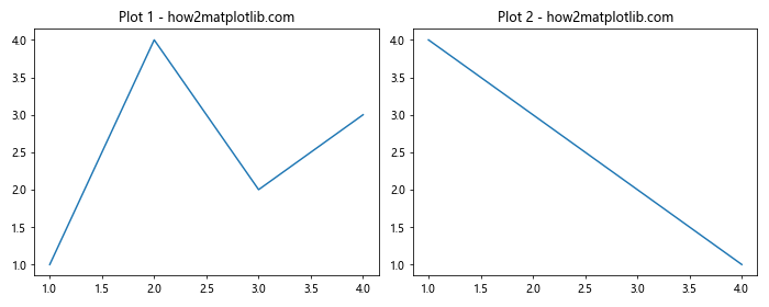
The plt.tight_layout() function automatically adjusts the padding between subplots and the figure edges, resulting in a more visually appealing layout.
Fine-tuning Matplotlib Subplots Padding
While plt.tight_layout() provides a good starting point, you may want more control over the padding. Matplotlib offers several ways to fine-tune subplot padding.
Using subplots_adjust() for Matplotlib Subplots Padding
The subplots_adjust() function allows you to manually set the padding values:
import matplotlib.pyplot as plt

fig, (ax1, ax2) = plt.subplots(1, 2, figsize=(10, 4))

ax1.plot([1, 2, 3, 4], [1, 4, 2, 3])
ax2.plot([1, 2, 3, 4], [4, 3, 2, 1])

ax1.set_title("Plot 1 - how2matplotlib.com")
ax2.set_title("Plot 2 - how2matplotlib.com")

plt.subplots_adjust(left=0.1, right=0.95, top=0.9, bottom=0.1, wspace=0.3, hspace=0.4)
plt.show()
Output:
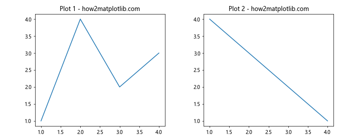
In this example, we use subplots_adjust() to set specific padding values:
left: The left side of the subplots of the figureright: The right side of the subplots of the figuretop: The top of the subplots of the figurebottom: The bottom of the subplots of the figurewspace: The width of the padding between subplots, as a fraction of the average axes widthhspace: The height of the padding between subplots, as a fraction of the average axes height
Matplotlib Subplots Padding with GridSpec
For more complex layouts, you can use GridSpec to create a grid of subplots with custom padding:
import matplotlib.pyplot as plt
from matplotlib.gridspec import GridSpec

fig = plt.figure(figsize=(12, 8))
gs = GridSpec(2, 2, width_ratios=[1, 1.5], height_ratios=[1, 1.5], wspace=0.3, hspace=0.3)

ax1 = fig.add_subplot(gs[0, 0])
ax2 = fig.add_subplot(gs[0, 1])
ax3 = fig.add_subplot(gs[1, :])

ax1.plot([1, 2, 3, 4], [1, 4, 2, 3])
ax2.plot([1, 2, 3, 4], [4, 3, 2, 1])
ax3.plot([1, 2, 3, 4], [2, 3, 4, 1])

ax1.set_title("Plot 1 - how2matplotlib.com")
ax2.set_title("Plot 2 - how2matplotlib.com")
ax3.set_title("Plot 3 - how2matplotlib.com")

plt.show()
Output:
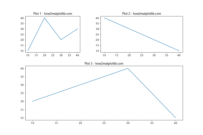
In this example, we use GridSpec to create a 2×2 grid with custom width and height ratios. We also set the wspace and hspace parameters to adjust the padding between subplots.
Advanced Matplotlib Subplots Padding Techniques
Now that we’ve covered the basics, let’s explore some advanced techniques for managing Matplotlib subplots padding.
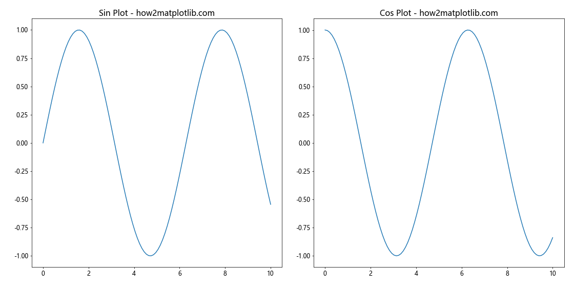
Dynamically Adjusting Matplotlib Subplots Padding
Sometimes, you may need to adjust the padding dynamically based on the content of your plots. Here’s an example that demonstrates how to do this:
import matplotlib.pyplot as plt
import numpy as np

def adjust_padding(fig, axes):
    fig.canvas.draw()
    bbox = fig.get_tightbbox(fig.canvas.get_renderer())
    tight_bbox_raw = bbox.transformed(fig.dpi_scale_trans.inverted())
    tight_bbox = tight_bbox_raw.expanded(1.02, 1.02)
    fig.set_size_inches(tight_bbox.width, tight_bbox.height)
    fig.tight_layout()

fig, (ax1, ax2) = plt.subplots(1, 2, figsize=(10, 4))

x = np.linspace(0, 10, 100)
ax1.plot(x, np.sin(x))
ax2.plot(x, np.cos(x))

ax1.set_title("Sin Plot - how2matplotlib.com")
ax2.set_title("Cos Plot - how2matplotlib.com")

adjust_padding(fig, [ax1, ax2])
plt.show()
In this example, we define a custom function adjust_padding() that calculates the tight bounding box of the figure and adjusts the figure size and layout accordingly. This approach ensures that the padding is optimized for the specific content of each subplot.
Matplotlib Subplots Padding for Different Subplot Sizes
When working with subplots of different sizes, you may need to adjust the padding individually. Here’s an example that demonstrates this:
import matplotlib.pyplot as plt
import numpy as np

fig = plt.figure(figsize=(12, 8))

gs = fig.add_gridspec(2, 2, width_ratios=[2, 1], height_ratios=[1, 2],
                      left=0.1, right=0.9, bottom=0.1, top=0.9,
                      wspace=0.3, hspace=0.3)

ax1 = fig.add_subplot(gs[0, 0])
ax2 = fig.add_subplot(gs[0, 1])
ax3 = fig.add_subplot(gs[1, :])

x = np.linspace(0, 10, 100)
ax1.plot(x, np.sin(x))
ax2.plot(x, np.cos(x))
ax3.plot(x, np.tan(x))

ax1.set_title("Sin Plot - how2matplotlib.com")
ax2.set_title("Cos Plot - how2matplotlib.com")
ax3.set_title("Tan Plot - how2matplotlib.com")

plt.show()
Output:
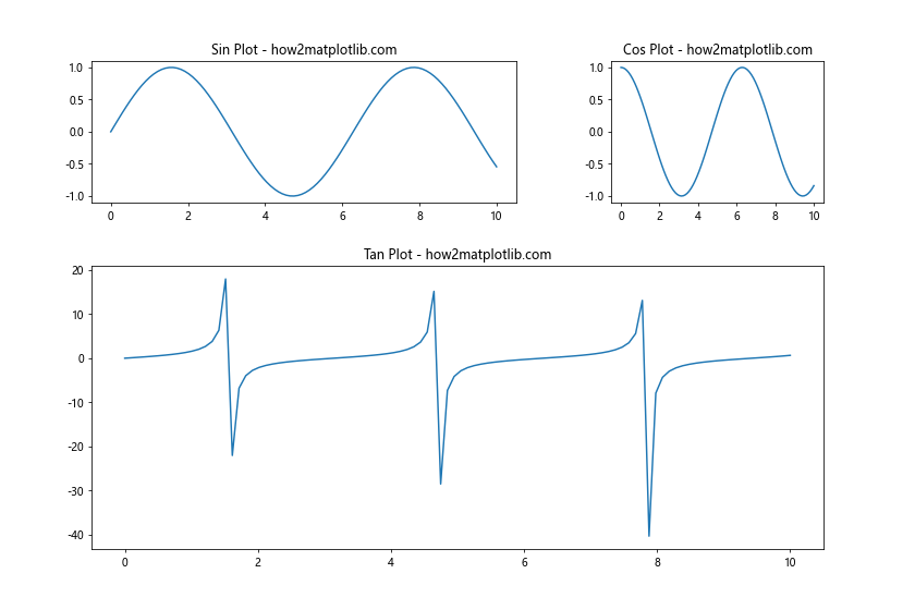
In this example, we use GridSpec to create subplots of different sizes and specify custom padding values for each subplot. This allows for fine-grained control over the layout and padding of your figure.
Matplotlib Subplots Padding for Different Plot Types
Different types of plots may require different padding settings. Let’s explore how to adjust padding for various plot types.
Matplotlib Subplots Padding for Bar Plots
Bar plots often require more horizontal space between subplots. Here’s an example of how to adjust padding for bar plots:
import matplotlib.pyplot as plt
import numpy as np

fig, (ax1, ax2) = plt.subplots(1, 2, figsize=(12, 5))

categories = ['A', 'B', 'C', 'D']
values1 = [4, 7, 2, 5]
values2 = [3, 6, 1, 8]

ax1.bar(categories, values1)
ax2.bar(categories, values2)

ax1.set_title("Bar Plot 1 - how2matplotlib.com")
ax2.set_title("Bar Plot 2 - how2matplotlib.com")

plt.tight_layout(w_pad=3)
plt.show()
Output:
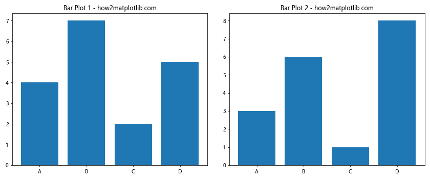
In this example, we use plt.tight_layout(w_pad=3) to increase the horizontal padding between the bar plots, ensuring that the bars don’t overlap or appear too close to each other.
Matplotlib Subplots Padding for Pie Charts
Pie charts often require more padding to accommodate labels and legends. Here’s an example:
import matplotlib.pyplot as plt

fig, (ax1, ax2) = plt.subplots(1, 2, figsize=(12, 6))

sizes1 = [15, 30, 45, 10]
labels1 = ['A', 'B', 'C', 'D']
sizes2 = [20, 35, 30, 15]
labels2 = ['W', 'X', 'Y', 'Z']

ax1.pie(sizes1, labels=labels1, autopct='%1.1f%%', startangle=90)
ax2.pie(sizes2, labels=labels2, autopct='%1.1f%%', startangle=90)

ax1.set_title("Pie Chart 1 - how2matplotlib.com")
ax2.set_title("Pie Chart 2 - how2matplotlib.com")

plt.tight_layout(pad=3)
plt.show()
Output:
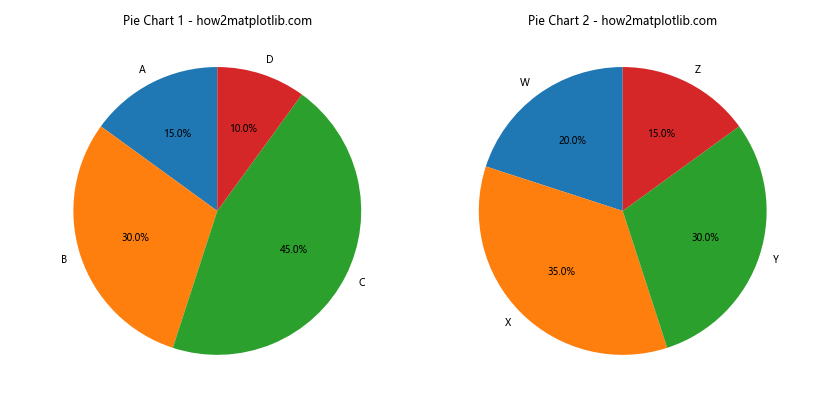
In this example, we use plt.tight_layout(pad=3) to increase the overall padding around the pie charts, ensuring that labels and percentages are clearly visible.
Matplotlib Subplots Padding for Complex Layouts
When working with complex layouts involving multiple subplots of different sizes and types, managing padding becomes even more critical. Let’s explore some techniques for handling Matplotlib subplots padding in these scenarios.
Nested Matplotlib Subplots Padding
Sometimes, you may need to create nested subplots with different padding requirements. Here’s an example of how to achieve this:
import matplotlib.pyplot as plt
import numpy as np

fig = plt.figure(figsize=(12, 8))

# Create outer grid
outer_grid = fig.add_gridspec(2, 2, wspace=0.3, hspace=0.3)

# Create nested subplots
ax1 = fig.add_subplot(outer_grid[0, 0])
ax2 = fig.add_subplot(outer_grid[0, 1])
inner_grid = outer_grid[1, :].subgridspec(1, 2, wspace=0.1)
ax3 = fig.add_subplot(inner_grid[0])
ax4 = fig.add_subplot(inner_grid[1])

# Plot data
x = np.linspace(0, 10, 100)
ax1.plot(x, np.sin(x))
ax2.plot(x, np.cos(x))
ax3.plot(x, np.tan(x))
ax4.plot(x, np.exp(x))

# Set titles
ax1.set_title("Sin Plot - how2matplotlib.com")
ax2.set_title("Cos Plot - how2matplotlib.com")
ax3.set_title("Tan Plot - how2matplotlib.com")
ax4.set_title("Exp Plot - how2matplotlib.com")

plt.tight_layout()
plt.show()
Output:
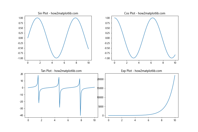
In this example, we create an outer grid with two rows and two columns, and then create a nested grid in the second row. We adjust the padding for both the outer and inner grids separately, allowing for fine-tuned control over the layout.
Matplotlib Subplots Padding with Mixed Plot Types
When combining different types of plots in a single figure, you may need to adjust padding individually for each subplot. Here’s an example:
import matplotlib.pyplot as plt
import numpy as np

fig = plt.figure(figsize=(12, 10))

gs = fig.add_gridspec(3, 2, width_ratios=[1.5, 1], height_ratios=[1, 1, 1.5],
                      left=0.1, right=0.9, bottom=0.1, top=0.9,
                      wspace=0.4, hspace=0.3)

ax1 = fig.add_subplot(gs[0, 0])
ax2 = fig.add_subplot(gs[0, 1])
ax3 = fig.add_subplot(gs[1, 0])
ax4 = fig.add_subplot(gs[1, 1])
ax5 = fig.add_subplot(gs[2, :])

# Line plot
x = np.linspace(0, 10, 100)
ax1.plot(x, np.sin(x))
ax1.set_title("Sin Plot - how2matplotlib.com")

# Bar plot
categories = ['A', 'B', 'C', 'D']
values = [4, 7, 2, 5]
ax2.bar(categories, values)
ax2.set_title("Bar Plot - how2matplotlib.com")

# Scatter plot
x = np.random.rand(50)
y = np.random.rand(50)
ax3.scatter(x, y)
ax3.set_title("Scatter Plot - how2matplotlib.com")

# Pie chart
sizes = [15, 30, 45, 10]
labels = ['A', 'B', 'C', 'D']
ax4.pie(sizes, labels=labels, autopct='%1.1f%%', startangle=90)
ax4.set_title("Pie Chart - how2matplotlib.com")

# Heatmap
data = np.random.rand(10, 10)
ax5.imshow(data, cmap='viridis')
ax5.set_title("Heatmap - how2matplotlib.com")

plt.tight_layout()
plt.show()
Output:
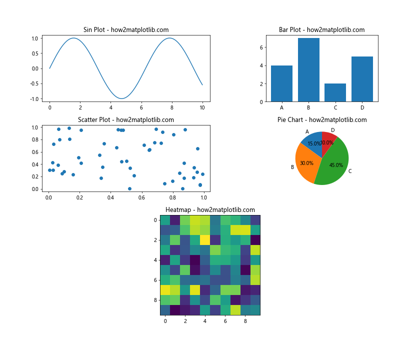
In this example, we create a complex layout with different types of plots, including a line plot, bar plot, scatter plot, pie chart, and heatmap. We use GridSpec to create a custom layout and adjust the padding for each subplot individually.
Matplotlib Subplots Padding for Annotations and Legends
When adding annotations and legends to your plots, you may need to adjust the padding to accommodate these additional elements. Let’s explore some techniques for managing Matplotlib subplots padding with annotations and legends.
Matplotlib Subplots Padding with Annotations
Here’s an example of how to adjust padding when adding annotations to your plots:
import matplotlib.pyplot as plt
import numpy as np

fig, (ax1, ax2) = plt.subplots(1, 2, figsize=(12, 5))

x = np.linspace(0, 10, 100)
y1 = np.sin(x)
y2 = np.cos(x)

ax1.plot(x, y1)
ax2.plot(x, y2)

ax1.set_title("Sin Plot - how2matplotlib.com")
ax2.set_title("Cos Plot - how2matplotlib.com")

# Add annotations
ax1.annotate('Peak', xy=(np.pi/2, 1), xytext=(np.pi/2, 1.2),
             arrowprops=dict(facecolor='black', shrink=0.05))
ax2.annotate('Trough', xy=(np.pi, -1), xytext=(np.pi, -1.2),
             arrowprops=dict(facecolor='black', shrink=0.05))

plt.tight_layout(pad=2)
plt.show()
Output:
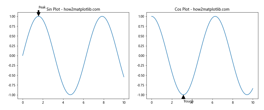
In this example, we add annotations to both subplots and use plt.tight_layout(pad=2) to increase the overall padding, ensuring that the annotations don’t overlap with the plot boundaries.
Matplotlib Subplots Padding with Legends
When adding legends to your plots, you may need to adjust the padding to accommodate them. Here’s an example:
import matplotlib.pyplot as plt
import numpy as np

fig, (ax1, ax2) = plt.subplots(1, 2, figsize=(12, 5))

x = np.linspace(0, 10, 100)
y1 = np.sin(x)
y2 = np.cos(x)
y3 = np.tan(x)

ax1.plot(x, y1, label='Sin')
ax1.plot(x, y2, label='Cos')
ax2.plot(x, y3, label='Tan')

ax1.set_title("Sin and Cos Plot - how2matplotlib.com")
ax2.set_title("Tan Plot - how2matplotlib.com")

ax1.legend(loc='upper right', bbox_to_anchor=(1.15, 1))
ax2.legend(loc='upper right', bbox_to_anchor=(1.15, 1))

plt.tight_layout(rect=[0, 0, 0.95, 1])
plt.show()
Output:
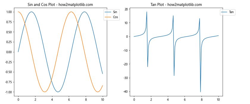
In this example, we add legends to both subplots and use bbox_to_anchor to position them outside the plot area. We then use plt.tight_layout(rect=[0, 0, 0.95, 1]) to adjust the overall layout, leaving space for the legends on the right side of the figure.
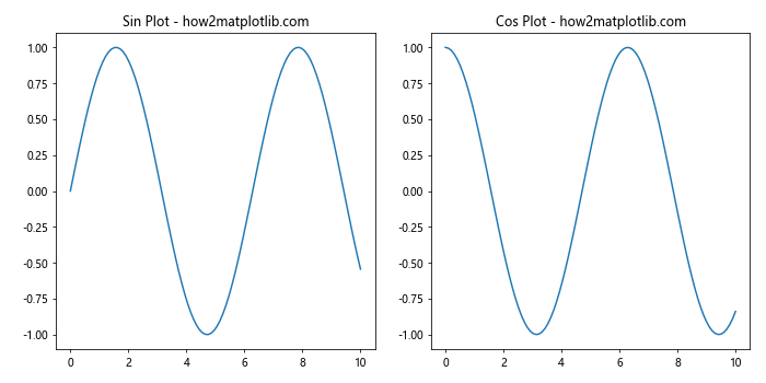
Matplotlib Subplots Padding for Different Figure Sizes
When creating plots for different purposes, such as presentations or publications, you may need to adjust the Matplotlib subplots padding based on the figure size. Let’s explore how to handle padding for different figure sizes.
Matplotlib Subplots Padding for Small Figures
When creating small figures, you may need to reduce padding to maximize the plot area. Here’s an example:
import matplotlib.pyplot as plt
import numpy as np

fig, (ax1, ax2) = plt.subplots(1, 2, figsize=(6, 3))

x = np.linspace(0, 10, 100)
y1 = np.sin(x)
y2 = np.cos(x)

ax1.plot(x, y1)
ax2.plot(x, y2)

ax1.set_title("Sin Plot - how2matplotlib.com", fontsize=8)
ax2.set_title("Cos Plot - how2matplotlib.com", fontsize=8)

ax1.tick_params(axis='both', which='major', labelsize=6)
ax2.tick_params(axis='both', which='major', labelsize=6)

plt.tight_layout(pad=0.5, w_pad=0.5, h_pad=0.5)
plt.show()
Output:
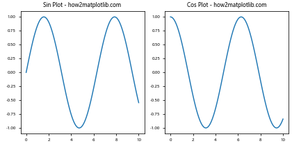
In this example, we create a small figure and reduce the padding using plt.tight_layout(pad=0.5, w_pad=0.5, h_pad=0.5). We also adjust the font sizes to fit the smaller plot area.
Matplotlib Subplots Padding for Large Figures
For large figures, you may want to increase padding to improve readability. Here’s an example:
import matplotlib.pyplot as plt
import numpy as np

fig, (ax1, ax2) = plt.subplots(1, 2, figsize=(16, 8))

x = np.linspace(0, 10, 100)
y1 = np.sin(x)
y2 = np.cos(x)

ax1.plot(x, y1)
ax2.plot(x, y2)

ax1.set_title("Sin Plot - how2matplotlib.com", fontsize=16)
ax2.set_title("Cos Plot - how2matplotlib.com", fontsize=16)

ax1.tick_params(axis='both', which='major', labelsize=12)
ax2.tick_params(axis='both', which='major', labelsize=12)

plt.tight_layout(pad=2, w_pad=2, h_pad=2)
plt.show()
Output:
In this example, we create a large figure and increase the padding using plt.tight_layout(pad=2, w_pad=2, h_pad=2). We also adjust the font sizes to match the larger plot area.
Matplotlib Subplots Padding for Different Output Formats
When saving your plots in different formats, you may need to adjust the Matplotlib subplots padding to ensure optimal display. Let’s explore how to handle padding for various output formats.
Matplotlib Subplots Padding for PNG Output
When saving plots as PNG files, you may want to adjust the padding to ensure that all elements are visible. Here’s an example:
import matplotlib.pyplot as plt
import numpy as np

fig, (ax1, ax2) = plt.subplots(1, 2, figsize=(10, 5))

x = np.linspace(0, 10, 100)
y1 = np.sin(x)
y2 = np.cos(x)

ax1.plot(x, y1)
ax2.plot(x, y2)

ax1.set_title("Sin Plot - how2matplotlib.com")
ax2.set_title("Cos Plot - how2matplotlib.com")

plt.tight_layout(pad=1.5)
plt.savefig('matplotlib_subplots_padding_example.png', dpi=300, bbox_inches='tight')
plt.show()
Output:
In this example, we use plt.tight_layout(pad=1.5) to adjust the padding and bbox_inches='tight' when saving the figure to ensure that all elements are included in the output PNG file.
Matplotlib Subplots Padding for PDF Output
When creating PDF outputs, you may need to adjust the padding to account for different page sizes. Here’s an example:
import matplotlib.pyplot as plt
import numpy as np

def create_plot(fig_size, padding):
    fig, (ax1, ax2) = plt.subplots(1, 2, figsize=fig_size)

    x = np.linspace(0, 10, 100)
    y1 = np.sin(x)
    y2 = np.cos(x)

    ax1.plot(x, y1)
    ax2.plot(x, y2)

    ax1.set_title("Sin Plot - how2matplotlib.com")
    ax2.set_title("Cos Plot - how2matplotlib.com")

    plt.tight_layout(pad=padding)
    return fig

# A4 size plot
a4_fig = create_plot((8.27, 11.69), 2)
a4_fig.savefig('matplotlib_subplots_padding_a4.pdf', bbox_inches='tight')

# Letter size plot
letter_fig = create_plot((8.5, 11), 1.5)
letter_fig.savefig('matplotlib_subplots_padding_letter.pdf', bbox_inches='tight')

plt.close('all')
In this example, we create a function to generate plots with different figure sizes and padding values. We then create two PDF outputs: one for A4 size and another for Letter size, adjusting the padding accordingly.
Matplotlib Subplots Padding for Interactive Plots
When creating interactive plots, you may need to adjust the Matplotlib subplots padding dynamically. Let’s explore how to handle padding in interactive scenarios.
Matplotlib Subplots Padding with Sliders
Here’s an example of how to adjust padding interactively using sliders:
import matplotlib.pyplot as plt
from matplotlib.widgets import Slider
import numpy as np

fig, (ax1, ax2) = plt.subplots(1, 2, figsize=(12, 6))

x = np.linspace(0, 10, 100)
y1 = np.sin(x)
y2 = np.cos(x)

line1, = ax1.plot(x, y1)
line2, = ax2.plot(x, y2)

ax1.set_title("Sin Plot - how2matplotlib.com")
ax2.set_title("Cos Plot - how2matplotlib.com")

plt.subplots_adjust(bottom=0.25)

ax_padding = plt.axes([0.2, 0.1, 0.6, 0.03])
slider_padding = Slider(ax_padding, 'Padding', 0.1, 1.0, valinit=0.5)

def update(val):
    padding = slider_padding.val
    plt.tight_layout(pad=padding)
    fig.canvas.draw_idle()

slider_padding.on_changed(update)

plt.show()
Output:
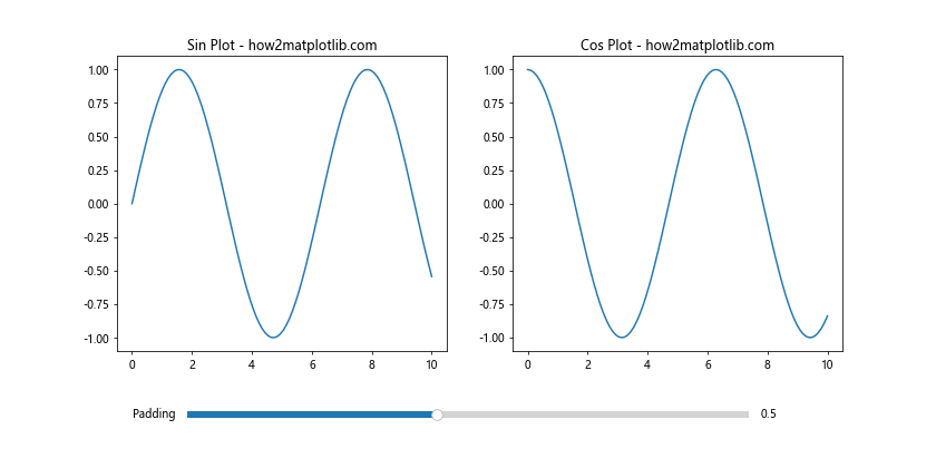
In this example, we create a slider that allows the user to interactively adjust the padding of the subplots. The update function is called whenever the slider value changes, adjusting the padding accordingly.
Matplotlib Subplots Padding Best Practices
To wrap up our comprehensive guide on Matplotlib subplots padding, let’s review some best practices to keep in mind when working with subplot layouts:
- Use
plt.tight_layout()as a starting point for automatic padding adjustment. - For more control, use
plt.subplots_adjust()orGridSpecto fine-tune padding values. - Consider the content of your plots when adjusting padding. Different plot types may require different padding settings.
- Pay attention to annotations, legends, and other additional elements that may require extra padding.
- Adjust padding based on the figure size and output format to ensure optimal display across different mediums.
- For complex layouts, consider using nested subplots and adjusting padding at different levels.
- When creating interactive plots, provide options for users to adjust padding dynamically.
- Always test your plots with different data and layout configurations to ensure that padding remains appropriate in various scenarios.
By following these best practices and utilizing the techniques we’ve covered in this guide, you’ll be well-equipped to create visually appealing and well-organized plots using Matplotlib subplots padding.
In conclusion, mastering Matplotlib subplots padding is essential for creating professional-looking visualizations. By understanding the various methods and techniques for adjusting padding, you can ensure that your plots are clear, readable, and visually appealing across different scenarios and output formats. Remember to experiment with different padding settings and always consider the specific requirements of your data and audience when creating your plots.