Mastering Matplotlib Subplots and Figsize: A Comprehensive Guide
Matplotlib subplots and figsize are essential components for creating effective data visualizations in Python. This comprehensive guide will explore the intricacies of using matplotlib subplots and figsize to create stunning and informative plots. We’ll cover everything from basic concepts to advanced techniques, providing you with the knowledge and skills to master these powerful tools.
Understanding Matplotlib Subplots and Figsize
Matplotlib subplots allow you to create multiple plots within a single figure, while figsize controls the overall dimensions of the figure. These features are crucial for organizing and presenting data effectively. Let’s start by exploring the basics of matplotlib subplots and figsize.
Basic Subplot Creation
To create a simple subplot, we use the plt.subplots() function. Here’s a basic example:
import matplotlib.pyplot as plt
import numpy as np

fig, ax = plt.subplots(figsize=(8, 6))
x = np.linspace(0, 10, 100)
ax.plot(x, np.sin(x), label='Sine Wave')
ax.set_title('How to use matplotlib subplots and figsize - how2matplotlib.com')
ax.legend()
plt.show()
Output:
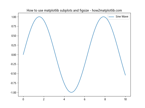
In this example, we create a single subplot with a figsize of 8 inches wide and 6 inches tall. The figsize parameter in plt.subplots() allows us to control the overall size of the figure.
Multiple Subplots
Matplotlib subplots really shine when creating multiple plots. Here’s an example with four subplots:
import matplotlib.pyplot as plt
import numpy as np

fig, axs = plt.subplots(2, 2, figsize=(12, 10))
x = np.linspace(0, 10, 100)

axs[0, 0].plot(x, np.sin(x))
axs[0, 0].set_title('Sine Wave')

axs[0, 1].plot(x, np.cos(x))
axs[0, 1].set_title('Cosine Wave')

axs[1, 0].plot(x, np.tan(x))
axs[1, 0].set_title('Tangent Wave')

axs[1, 1].plot(x, np.exp(x))
axs[1, 1].set_title('Exponential Function')

fig.suptitle('Multiple Subplots with Matplotlib - how2matplotlib.com', fontsize=16)
plt.tight_layout()
plt.show()
Output:
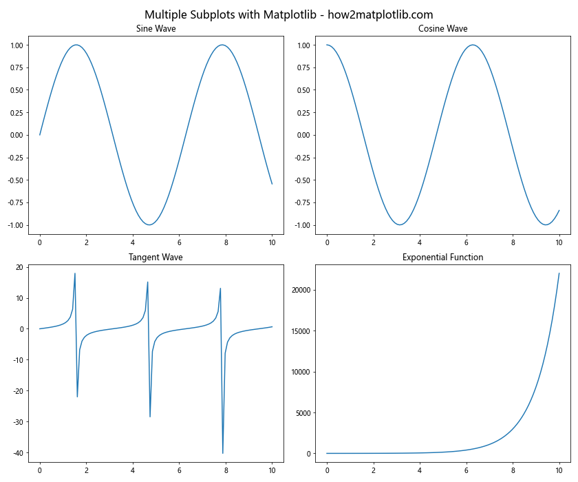
This example demonstrates how to create a 2×2 grid of subplots using matplotlib subplots. The figsize parameter is set to (12, 10) to accommodate the four plots comfortably.
Advanced Techniques with Matplotlib Subplots and Figsize
Now that we’ve covered the basics, let’s explore some more advanced techniques for working with matplotlib subplots and figsize.
Subplots with Different Sizes
Matplotlib subplots allow you to create plots of different sizes within the same figure. Here’s an example:
import matplotlib.pyplot as plt
import numpy as np

fig = plt.figure(figsize=(12, 8))
gs = fig.add_gridspec(3, 3)

ax1 = fig.add_subplot(gs[0, :])
ax2 = fig.add_subplot(gs[1, :-1])
ax3 = fig.add_subplot(gs[1:, -1])
ax4 = fig.add_subplot(gs[-1, 0])
ax5 = fig.add_subplot(gs[-1, -2])

x = np.linspace(0, 10, 100)
ax1.plot(x, np.sin(x))
ax2.plot(x, np.cos(x))
ax3.plot(x, np.tan(x))
ax4.plot(x, np.exp(x))
ax5.plot(x, np.log(x))

fig.suptitle('Subplots with Different Sizes - how2matplotlib.com', fontsize=16)
plt.tight_layout()
plt.show()
Output:
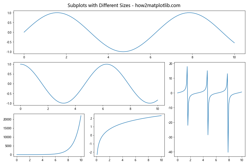
This example uses GridSpec to create subplots of different sizes within a single figure. The figsize parameter is set to (12, 8) to provide ample space for the various plots.
Adjusting Subplot Spacing
Controlling the spacing between subplots is crucial for creating visually appealing figures. Here’s how you can adjust subplot spacing:
import matplotlib.pyplot as plt
import numpy as np

fig, axs = plt.subplots(2, 2, figsize=(10, 8))
x = np.linspace(0, 10, 100)

for i in range(2):
    for j in range(2):
        axs[i, j].plot(x, np.sin(x + i + j))
        axs[i, j].set_title(f'Subplot {i+1},{j+1}')

fig.suptitle('Adjusting Subplot Spacing - how2matplotlib.com', fontsize=16)
plt.tight_layout()
plt.subplots_adjust(wspace=0.3, hspace=0.3)
plt.show()
Output:
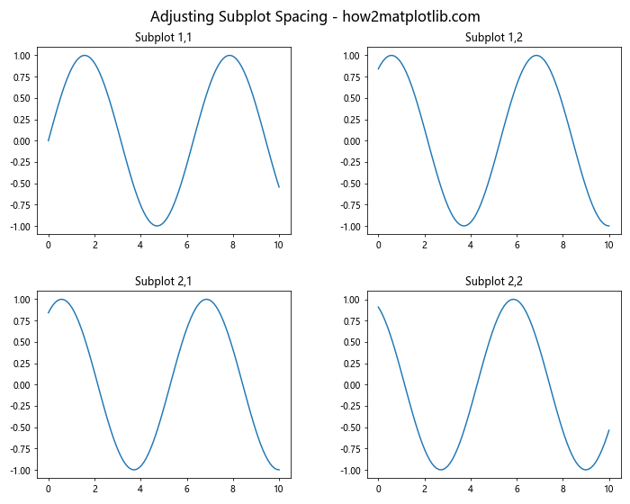
In this example, we use plt.subplots_adjust() to control the spacing between subplots. The wspace and hspace parameters adjust the horizontal and vertical spacing, respectively.
Customizing Matplotlib Subplots and Figsize
Customization is key to creating effective visualizations. Let’s explore some ways to customize matplotlib subplots and figsize.
Custom Subplot Layouts
Matplotlib subplots allow for flexible layout designs. Here’s an example of a custom layout:
import matplotlib.pyplot as plt
import numpy as np

fig = plt.figure(figsize=(12, 8))
gs = fig.add_gridspec(3, 3)

ax1 = fig.add_subplot(gs[0, :2])
ax2 = fig.add_subplot(gs[0, 2])
ax3 = fig.add_subplot(gs[1:, :2])
ax4 = fig.add_subplot(gs[1, 2])
ax5 = fig.add_subplot(gs[2, 2])

x = np.linspace(0, 10, 100)
ax1.plot(x, np.sin(x))
ax2.plot(x, np.cos(x))
ax3.plot(x, np.tan(x))
ax4.plot(x, np.exp(x))
ax5.plot(x, np.log(x))

fig.suptitle('Custom Subplot Layout - how2matplotlib.com', fontsize=16)
plt.tight_layout()
plt.show()
Output:
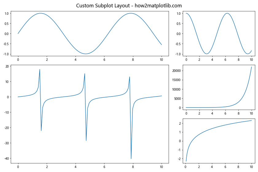
This example demonstrates how to create a custom layout using GridSpec. The figsize is set to (12, 8) to accommodate the unique arrangement of subplots.
Adjusting Figsize Dynamically
Sometimes, you may need to adjust the figsize dynamically based on the content. Here’s an example:
import matplotlib.pyplot as plt
import numpy as np

num_subplots = 5

fig_width = 4 * num_subplots
fig_height = 3 * ((num_subplots + 1) // 2)
fig, axs = plt.subplots(2, (num_subplots + 1) // 2, figsize=(fig_width, fig_height))
axs = axs.flatten()

x = np.linspace(0, 10, 100)
for i in range(num_subplots):
    axs[i].plot(x, np.sin(x + i))
    axs[i].set_title(f'Subplot {i+1}')

for i in range(num_subplots, len(axs)):
    fig.delaxes(axs[i])

fig.suptitle(f'Dynamic Figsize with {num_subplots} Subplots - how2matplotlib.com', fontsize=16)
plt.tight_layout()
plt.show()
Output:
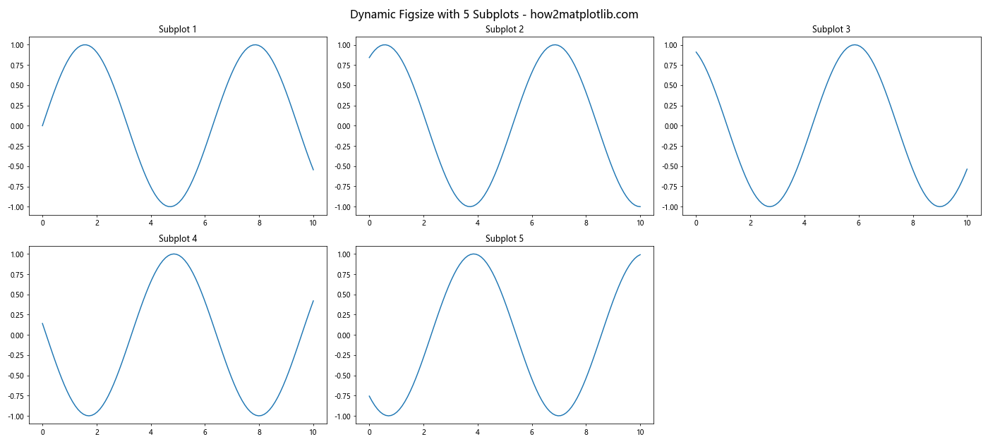
This example demonstrates how to adjust the figsize dynamically based on the number of subplots. The figsize is calculated to ensure each subplot has adequate space.
Advanced Visualization Techniques with Matplotlib Subplots and Figsize
Let’s explore some advanced visualization techniques using matplotlib subplots and figsize.
Combining Different Plot Types
Matplotlib subplots allow you to combine different types of plots within a single figure. Here’s an example:
import matplotlib.pyplot as plt
import numpy as np

fig, axs = plt.subplots(2, 2, figsize=(12, 10))

x = np.linspace(0, 10, 100)
y1 = np.sin(x)
y2 = np.exp(-x)

axs[0, 0].plot(x, y1)
axs[0, 0].set_title('Line Plot')

axs[0, 1].scatter(x, y2)
axs[0, 1].set_title('Scatter Plot')

axs[1, 0].bar(x[:10], y1[:10])
axs[1, 0].set_title('Bar Plot')

axs[1, 1].hist(y2, bins=20)
axs[1, 1].set_title('Histogram')

fig.suptitle('Combining Different Plot Types - how2matplotlib.com', fontsize=16)
plt.tight_layout()
plt.show()
Output:
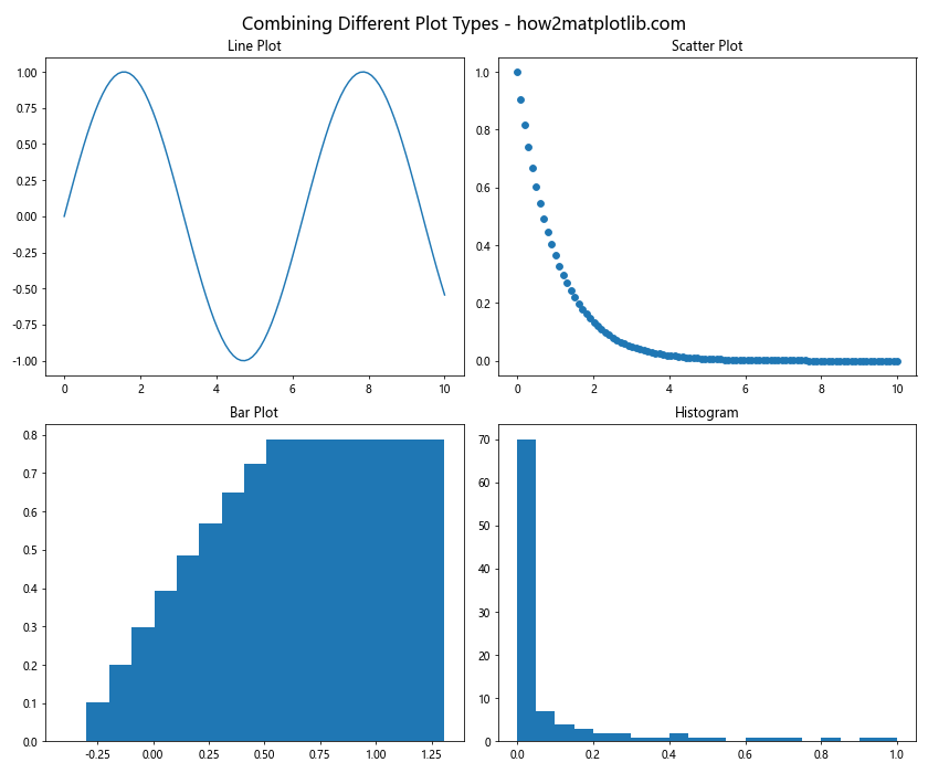
This example showcases how to create different types of plots (line, scatter, bar, and histogram) using matplotlib subplots within a single figure.
Creating Subplots with Shared Axes
Sharing axes between subplots can be useful for comparing data. Here’s how to do it:
import matplotlib.pyplot as plt
import numpy as np

fig, (ax1, ax2) = plt.subplots(2, 1, figsize=(10, 8), sharex=True)

x = np.linspace(0, 10, 100)
y1 = np.sin(x)
y2 = np.cos(x)

ax1.plot(x, y1)
ax1.set_title('Sine Wave')

ax2.plot(x, y2)
ax2.set_title('Cosine Wave')

fig.suptitle('Subplots with Shared X-Axis - how2matplotlib.com', fontsize=16)
plt.tight_layout()
plt.show()
Output:
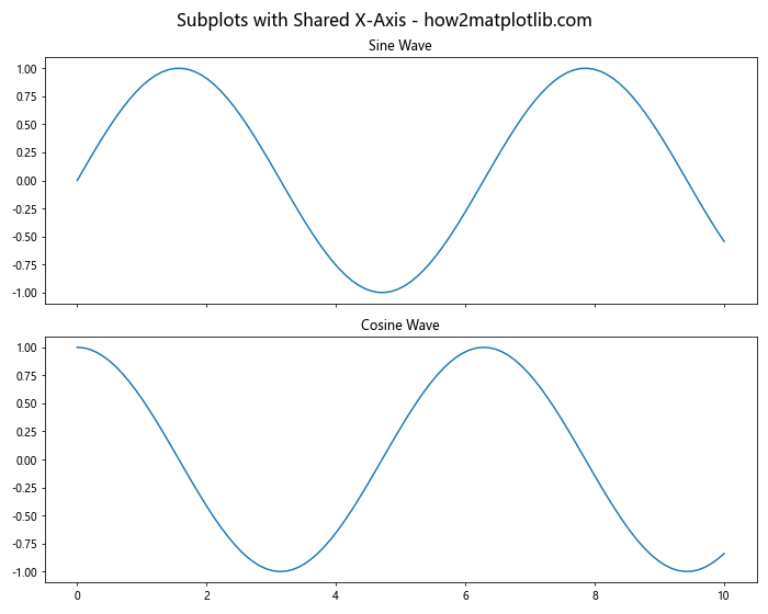
In this example, we create two subplots with a shared x-axis using the sharex=True parameter in plt.subplots().
Optimizing Matplotlib Subplots and Figsize for Different Display Sizes
Adapting your plots for different display sizes is crucial for creating versatile visualizations. Let’s explore some techniques for optimizing matplotlib subplots and figsize.
Responsive Figsize
Creating responsive figures that adapt to different screen sizes can be achieved by using relative units. Here’s an example:
import matplotlib.pyplot as plt
import numpy as np

width_inches = 8
height_inches = 6
fig, axs = plt.subplots(2, 2, figsize=(width_inches, height_inches))

x = np.linspace(0, 10, 100)
for i in range(2):
    for j in range(2):
        axs[i, j].plot(x, np.sin(x + i + j))
        axs[i, j].set_title(f'Subplot {i+1},{j+1}')

fig.suptitle(f'Responsive Plot ({width_inches}x{height_inches} inches) - how2matplotlib.com', fontsize=16)
plt.tight_layout()
plt.show()
Output:
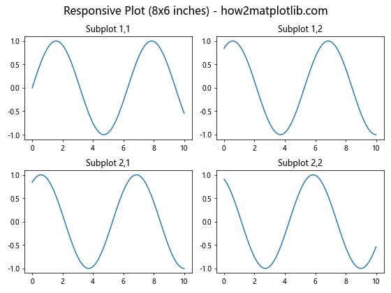
This example demonstrates how to create plots that adapt to different screen sizes by adjusting the figsize parameter.
Adjusting Font Sizes for Different Figure Sizes
When changing the figsize, it’s important to adjust font sizes accordingly. Here’s how you can do it:
import matplotlib.pyplot as plt
import numpy as np

figsize = (6, 4)

fig, ax = plt.subplots(figsize=figsize)

x = np.linspace(0, 10, 100)
y = np.sin(x)

ax.plot(x, y)

# Adjust font sizes based on figure size
base_size = min(figsize)
ax.set_title('Size-Adjusted Plot - how2matplotlib.com', fontsize=base_size*1.5)
ax.set_xlabel('X-axis', fontsize=base_size)
ax.set_ylabel('Y-axis', fontsize=base_size)
ax.tick_params(axis='both', which='major', labelsize=base_size*0.8)

plt.tight_layout()
plt.show()
Output:
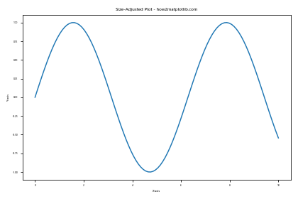
This example shows how to adjust font sizes dynamically based on the figure size, ensuring readability across different display sizes.
Advanced Customization of Matplotlib Subplots and Figsize
Let’s delve into some advanced customization techniques for matplotlib subplots and figsize.
Creating Inset Axes
Inset axes allow you to create smaller plots within a larger plot. Here’s how to do it:
import matplotlib.pyplot as plt
import numpy as np

fig, ax = plt.subplots(figsize=(10, 8))

x = np.linspace(0, 10, 100)
y = np.sin(x)

ax.plot(x, y)
ax.set_title('Main Plot with Inset - how2matplotlib.com')

# Create inset axes
axins = ax.inset_axes([0.6, 0.6, 0.3, 0.3])
axins.plot(x, y)
axins.set_xlim(4, 6)
axins.set_ylim(-1, 1)
axins.set_xticklabels([])
axins.set_yticklabels([])

ax.indicate_inset_zoom(axins)

plt.show()
Output:
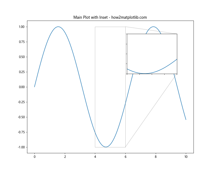
This example demonstrates how to create an inset plot within a larger plot using inset_axes().
Customizing Subplot Arrangements
Matplotlib subplots offer flexibility in arranging plots. Here’s an example of a custom arrangement:
import matplotlib.pyplot as plt
import numpy as np

fig = plt.figure(figsize=(12, 8))
gs = fig.add_gridspec(3, 3)

ax1 = fig.add_subplot(gs[0, :])
ax2 = fig.add_subplot(gs[1:, 0])
ax3 = fig.add_subplot(gs[1:, 1:])

x = np.linspace(0, 10, 100)
ax1.plot(x, np.sin(x))
ax1.set_title('Top Plot')

ax2.plot(x, np.cos(x))
ax2.set_title('Left Plot')

ax3.plot(x, np.tan(x))
ax3.set_title('Right Plot')

fig.suptitle('Custom Subplot Arrangement - how2matplotlib.com', fontsize=16)
plt.tight_layout()
plt.show()
Output:
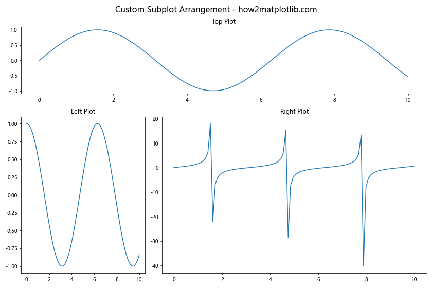
This example showcases a custom arrangement of subplots using GridSpec.
Optimizing Performance with Matplotlib Subplots and Figsize
When working with large datasets or creating complex visualizations, optimizing performance becomes crucial. Let’s explore some techniques to improve performance when using matplotlib subplots and figsize.
Using blitting for Animation
Blitting is a technique that can significantly improve the performance of animations. Here’s an example:
import matplotlib.pyplot as plt
import numpy as np
import matplotlib.animation as animation

fig, ax = plt.subplots(figsize=(10, 6))
x = np.linspace(0, 2*np.pi, 100)
line, = ax.plot(x, np.sin(x))

def animate(frame):
    line.set_ydata(np.sin(x + frame/10))
    return line,

ani = animation.FuncAnimation(fig, animate, frames=100, interval=50, blit=True)

ax.set_title('Optimized Animation with Blitting - how2matplotlib.com')
plt.show()
Output:
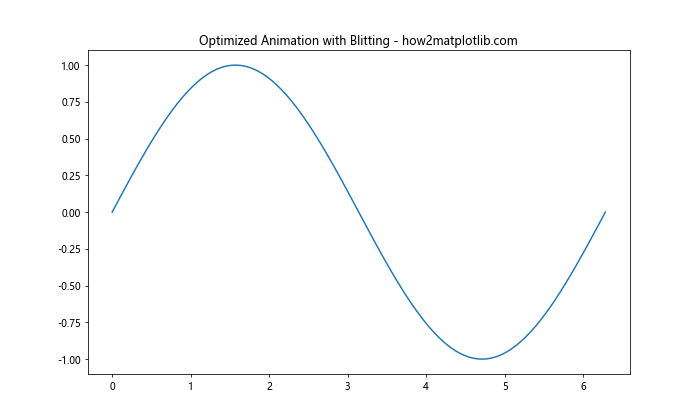
This example demonstrates how to use blitting in animations to improve performance. The blit=True parameter in FuncAnimation() enables blitting, which only redraws the parts of the plot that have changed.
Reducing the Number of Points
When dealing with large datasets, reducing the number of points plotted can significantly improve performance. Here’s an example:
import matplotlib.pyplot as plt
import numpy as np

num_points = 100

fig, ax = plt.subplots(figsize=(10, 6))

x = np.linspace(0, 10, num_points)
y = np.sin(x)

ax.plot(x, y)
ax.set_title(f'Plot with {num_points} points - how2matplotlib.com')
plt.show()
Output:
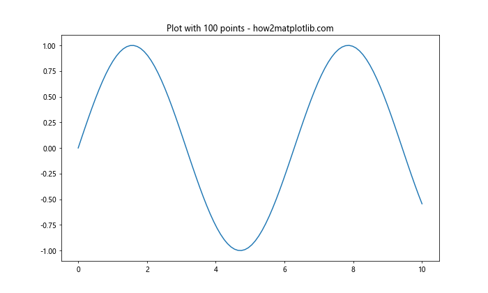
This example shows how reducing the number of points can improve performance while still maintaining the overall shape of the plot.
Advanced Applications of Matplotlib Subplots and Figsize
Let’s explore some advanced applications of matplotlib subplots and figsize in real-world scenarios.
Creating a Dashboard
Matplotlib subplots are excellent for creating dashboards. Here’s an example:
import matplotlib.pyplot as plt
import numpy as np

fig, axs = plt.subplots(2, 2, figsize=(12, 10))

# Line plot
x = np.linspace(0, 10, 100)
axs[0, 0].plot(x, np.sin(x))
axs[0, 0].set_title('Sales Trend')

# Bar plot
categories = ['A', 'B', 'C', 'D']
values = [3, 7, 2, 5]
axs[0, 1].bar(categories, values)
axs[0, 1].set_title('Product Categories')

# Scatter plot
x = np.random.rand(50)
y = np.random.rand(50)
axs[1, 0].scatter(x, y)
axs[1, 0].set_title('Customer Distribution')

# Pie chart
sizes = [15, 30, 45, 10]
axs[1, 1].pie(sizes, labels=categories, autopct='%1.1f%%')
axs[1, 1].set_title('Market Share')

fig.suptitle('Sales Dashboard - how2matplotlib.com', fontsize=16)
plt.tight_layout()
plt.show()
Output:
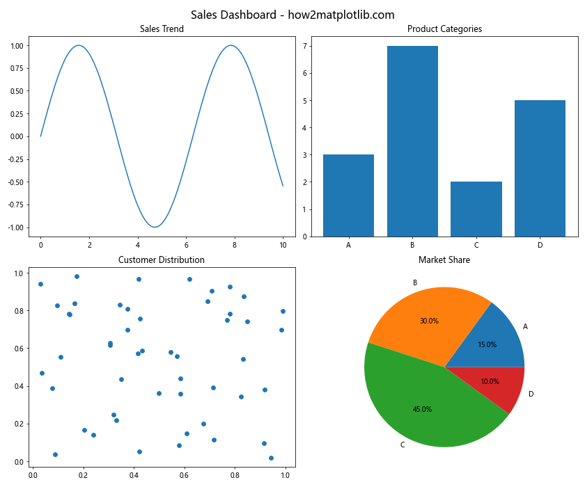
This example demonstrates how to create a simple dashboard using matplotlib subplots, combining different types of plots to present a comprehensive view of data.
Creating a Multi-Panel Scientific Figure
Scientific publications often require multi-panel figures. Here’s how you can create one:
import matplotlib.pyplot as plt
import numpy as np

fig = plt.figure(figsize=(12, 10))
gs = fig.add_gridspec(3, 3)

# Main plot
ax_main = fig.add_subplot(gs[1:, :2])
x = np.linspace(0, 10, 100)
ax_main.plot(x, np.sin(x), label='Sine')
ax_main.plot(x, np.cos(x), label='Cosine')
ax_main.set_title('Main Experiment Results')
ax_main.legend()

# Top-right plot
ax_tr = fig.add_subplot(gs[0, 2])
ax_tr.hist(np.random.normal(0, 1, 1000), bins=30)
ax_tr.set_title('Distribution')

# Middle-right plot
ax_mr = fig.add_subplot(gs[1, 2])
ax_mr.scatter(np.random.rand(50), np.random.rand(50))
ax_mr.set_title('Correlation')

# Bottom-right plot
ax_br = fig.add_subplot(gs[2, 2])
ax_br.bar(['A', 'B', 'C', 'D'], [3, 7, 2, 5])
ax_br.set_title('Categories')

fig.suptitle('Multi-Panel Scientific Figure - how2matplotlib.com', fontsize=16)
plt.tight_layout()
plt.show()
Output:
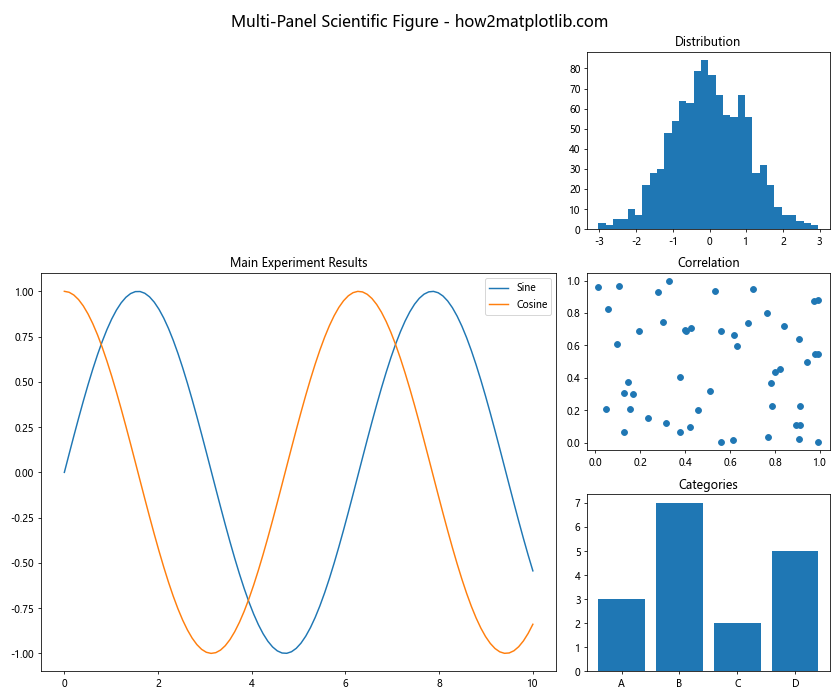
This example shows how to create a multi-panel scientific figure using matplotlib subplots and GridSpec, suitable for academic publications.
Best Practices for Using Matplotlib Subplots and Figsize
To make the most of matplotlib subplots and figsize, it’s important to follow some best practices. Let’s explore these in detail.
Consistent Styling
Maintaining consistent styling across subplots is crucial for creating professional-looking visualizations. Here’s an example:
import matplotlib.pyplot as plt
import numpy as np

fig, axs = plt.subplots(2, 2, figsize=(12, 10))

x = np.linspace(0, 10, 100)

for i in range(2):
    for j in range(2):
        axs[i, j].plot(x, np.sin(x + i + j))
        axs[i, j].set_title(f'Plot {i+1},{j+1}')
        axs[i, j].set_xlabel('X-axis')
        axs[i, j].set_ylabel('Y-axis')
        axs[i, j].grid(True, linestyle='--', alpha=0.7)

fig.suptitle('Consistent Styling Across Subplots - how2matplotlib.com', fontsize=16)
plt.tight_layout()
plt.show()
Output:
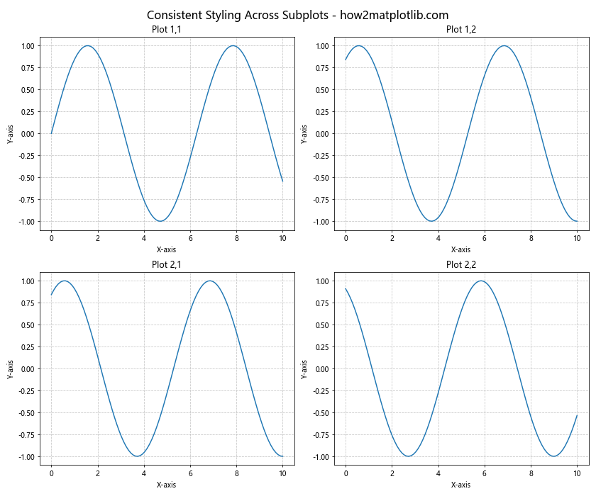
This example demonstrates how to maintain consistent styling across multiple subplots, including consistent labeling, gridlines, and overall appearance.
Appropriate Use of Color
Using color effectively can greatly enhance your visualizations. Here’s an example of using a color palette:
import matplotlib.pyplot as plt
import numpy as np
from matplotlib.colors import LinearSegmentedColormap

fig, axs = plt.subplots(2, 2, figsize=(12, 10))

x = np.linspace(0, 10, 100)
colors = ['#FF9999', '#66B2FF', '#99FF99', '#FFCC99']

for i in range(2):
    for j in range(2):
        axs[i, j].plot(x, np.sin(x + i + j), color=colors[i*2+j])
        axs[i, j].set_title(f'Plot {i+1},{j+1}')
        axs[i, j].set_facecolor('#F0F0F0')

fig.suptitle('Effective Use of Color Palette - how2matplotlib.com', fontsize=16)
plt.tight_layout()
plt.show()
Output:
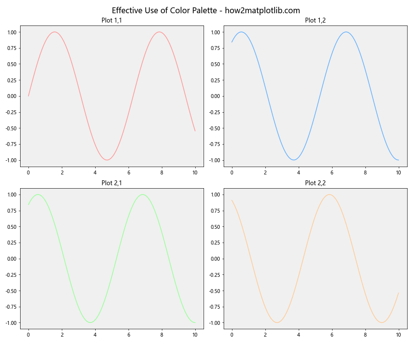
This example shows how to use a consistent color palette across subplots to create a visually appealing and cohesive figure.
Troubleshooting Common Issues with Matplotlib Subplots and Figsize
When working with matplotlib subplots and figsize, you may encounter some common issues. Let’s address these and provide solutions.
Overlapping Subplots
Sometimes, subplots may overlap, especially when using custom layouts. Here’s how to fix this:
import matplotlib.pyplot as plt
import numpy as np

fig, axs = plt.subplots(2, 2, figsize=(12, 10))

x = np.linspace(0, 10, 100)

for i in range(2):
    for j in range(2):
        axs[i, j].plot(x, np.sin(x + i + j))
        axs[i, j].set_title(f'Plot {i+1},{j+1}')

fig.suptitle('Fixing Overlapping Subplots - how2matplotlib.com', fontsize=16)
plt.tight_layout()  # This fixes overlapping
plt.show()
Output:
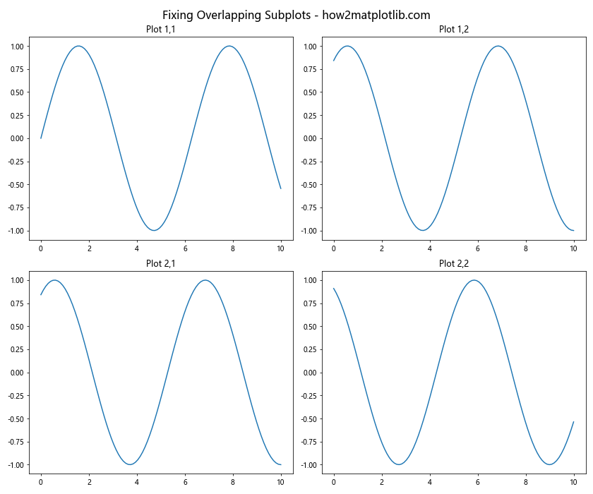
This example demonstrates how to use plt.tight_layout() to automatically adjust subplot parameters to give specified padding.
Inconsistent Subplot Sizes
When creating subplots of different sizes, you might end up with inconsistent layouts. Here’s how to address this:
import matplotlib.pyplot as plt
import numpy as np

fig = plt.figure(figsize=(12, 8))
gs = fig.add_gridspec(2, 3)

ax1 = fig.add_subplot(gs[0, :2])
ax2 = fig.add_subplot(gs[0, 2])
ax3 = fig.add_subplot(gs[1, :])

x = np.linspace(0, 10, 100)
ax1.plot(x, np.sin(x))
ax2.plot(x, np.cos(x))
ax3.plot(x, np.tan(x))

ax1.set_title('Wide Plot')
ax2.set_title('Narrow Plot')
ax3.set_title('Full Width Plot')

fig.suptitle('Consistent Subplot Sizes - how2matplotlib.com', fontsize=16)
plt.tight_layout()
plt.show()
Output:
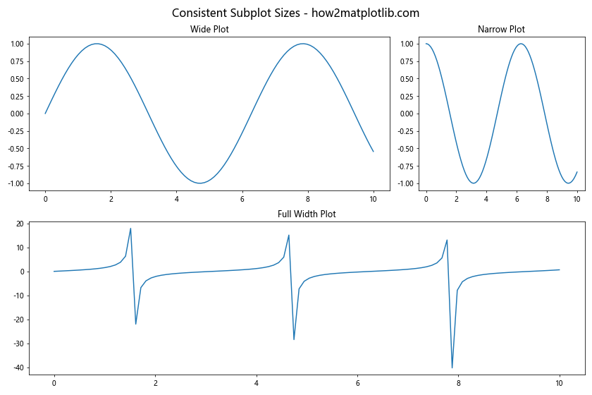
This example shows how to use GridSpec to create subplots of different sizes while maintaining a consistent overall layout.
Matplotlib Subplots and Figsize Conclusion
Mastering matplotlib subplots and figsize is essential for creating effective and professional data visualizations in Python. Throughout this comprehensive guide, we’ve explored various aspects of working with subplots and figsize, from basic concepts to advanced techniques.
We’ve covered topics such as creating basic and multiple subplots, customizing layouts, optimizing for different display sizes, and addressing common issues. By applying these techniques and best practices, you’ll be able to create stunning visualizations that effectively communicate your data.
Remember that practice is key to mastering these skills. Experiment with different subplot arrangements, figsize settings, and customization options to find what works best for your specific data and visualization needs. With matplotlib subplots and figsize, you have powerful tools at your disposal to create impactful and informative plots.
As you continue to work with matplotlib, don’t hesitate to explore the official documentation and community resources for even more advanced techniques and tips.