Change the Histogram Plot X Range in Python Matplotlib
Histograms are powerful tools for visualizing the distribution of data in statistics and data analysis. When working with histograms in Python using Matplotlib, you may often need to adjust the x-axis range to focus on specific parts of your data or to improve the overall presentation of your plot. This article will provide a comprehensive guide on how to change the histogram plot x range in Python Matplotlib, covering various methods and techniques with detailed examples.
Understanding Histograms in Matplotlib
Before diving into changing the x-axis range, let’s briefly review what histograms are and how they are created in Matplotlib. A histogram is a graphical representation of the distribution of numerical data. It estimates the probability distribution of a continuous variable by dividing the entire range of values into a series of intervals (bins) and then counting how many values fall into each interval.
In Matplotlib, histograms are typically created using the plt.hist() function or the ax.hist() method of an Axes object. The basic syntax for creating a histogram is as follows:
import matplotlib.pyplot as plt
import numpy as np

# Generate some random data
data = np.random.randn(1000)

# Create a histogram
plt.hist(data, bins=30)
plt.title('Histogram Example - how2matplotlib.com')
plt.xlabel('Value')
plt.ylabel('Frequency')
plt.show()
Output:
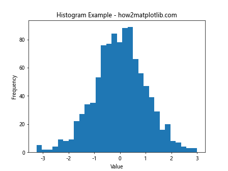
This code creates a simple histogram of normally distributed data with 30 bins. By default, Matplotlib automatically determines the x-axis range based on the minimum and maximum values in your data.
Changing the X-axis Range Using plt.xlim()
One of the simplest ways to change the x-axis range of a histogram is by using the plt.xlim() function. This function allows you to set the lower and upper limits of the x-axis explicitly.
Here’s an example of how to use plt.xlim() to change the x-axis range:
import matplotlib.pyplot as plt
import numpy as np

# Generate some random data
data = np.random.randn(1000)

# Create a histogram
plt.hist(data, bins=30)
plt.title('Histogram with Custom X Range - how2matplotlib.com')
plt.xlabel('Value')
plt.ylabel('Frequency')

# Set the x-axis range
plt.xlim(-3, 3)

plt.show()
Output:
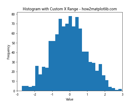
In this example, we set the x-axis range from -3 to 3 using plt.xlim(-3, 3). This focuses the view on the central part of the normal distribution, excluding the extreme tails.
Using ax.set_xlim() in Object-Oriented Interface
If you’re using Matplotlib’s object-oriented interface, you can use the set_xlim() method of the Axes object to change the x-axis range. This approach is particularly useful when working with subplots or more complex plot layouts.
Here’s an example:
import matplotlib.pyplot as plt
import numpy as np

# Generate some random data
data = np.random.randn(1000)

# Create a figure and axis object
fig, ax = plt.subplots()

# Create a histogram
ax.hist(data, bins=30)
ax.set_title('Histogram with Custom X Range (OO Interface) - how2matplotlib.com')
ax.set_xlabel('Value')
ax.set_ylabel('Frequency')

# Set the x-axis range
ax.set_xlim(-2.5, 2.5)

plt.show()
Output:
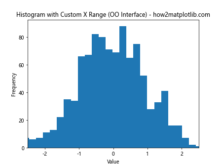
In this code, we create a Figure and Axes object explicitly, then use ax.set_xlim(-2.5, 2.5) to set the x-axis range from -2.5 to 2.5.
Adjusting X-axis Range Based on Data Statistics
Sometimes, you may want to set the x-axis range based on statistics of your data, such as mean and standard deviation. This can be particularly useful when dealing with datasets of different scales or when you want to focus on a specific number of standard deviations around the mean.
Here’s an example that sets the x-axis range to ±3 standard deviations from the mean:
import matplotlib.pyplot as plt
import numpy as np

# Generate some random data
data = np.random.randn(1000) * 2 + 1  # mean=1, std=2

# Calculate mean and standard deviation
mean = np.mean(data)
std = np.std(data)

# Create a histogram
plt.hist(data, bins=30)
plt.title('Histogram with X Range Based on Statistics - how2matplotlib.com')
plt.xlabel('Value')
plt.ylabel('Frequency')

# Set the x-axis range to ±3 standard deviations from the mean
plt.xlim(mean - 3*std, mean + 3*std)

plt.show()
Output:
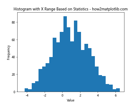
This code calculates the mean and standard deviation of the data, then uses these values to set the x-axis range to cover ±3 standard deviations from the mean.
Changing X-axis Range with Different Bin Sizes
When changing the x-axis range, you might also want to adjust the bin sizes to better represent the data within the new range. Here’s an example that demonstrates how to do this:
import matplotlib.pyplot as plt
import numpy as np

# Generate some random data
data = np.random.randn(1000)

# Define the x-axis range and number of bins
x_min, x_max = -2, 2
n_bins = 20

# Create a histogram with custom range and bins
plt.hist(data, bins=n_bins, range=(x_min, x_max))
plt.title('Histogram with Custom Range and Bins - how2matplotlib.com')
plt.xlabel('Value')
plt.ylabel('Frequency')

# Set the x-axis range (redundant in this case, but shown for completeness)
plt.xlim(x_min, x_max)

plt.show()
Output:
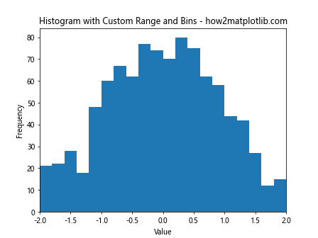
In this example, we explicitly set the range for the histogram using the range parameter in plt.hist(). This ensures that the bins are calculated only for the specified range, potentially giving a different view of the data distribution compared to using the full data range.
Using plt.axis() for Simultaneous X and Y Axis Control
If you need to adjust both the x-axis and y-axis ranges simultaneously, you can use the plt.axis() function. This can be particularly useful when you want to maintain a specific aspect ratio or focus on a particular region of the plot.
Here’s an example:
import matplotlib.pyplot as plt
import numpy as np

# Generate some random data
data = np.random.randn(1000)

# Create a histogram
plt.hist(data, bins=30)
plt.title('Histogram with Custom X and Y Range - how2matplotlib.com')
plt.xlabel('Value')
plt.ylabel('Frequency')

# Set both x and y axis ranges
plt.axis([-3, 3, 0, 100])

plt.show()
Output:
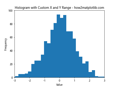
In this code, plt.axis([-3, 3, 0, 100]) sets the x-axis range from -3 to 3 and the y-axis range from 0 to 100. This can be useful for creating consistent views across multiple histograms or for focusing on specific regions of interest.
Changing X-axis Range for Multiple Histograms
When working with multiple histograms, you may want to set a consistent x-axis range across all plots. This is particularly useful for comparing distributions side by side. Here’s an example that creates multiple histograms with a consistent x-axis range:
import matplotlib.pyplot as plt
import numpy as np

# Generate multiple datasets
data1 = np.random.randn(1000)
data2 = np.random.randn(1000) * 1.5
data3 = np.random.randn(1000) + 2

# Create a figure with multiple subplots
fig, (ax1, ax2, ax3) = plt.subplots(3, 1, figsize=(8, 12))

# Plot histograms
ax1.hist(data1, bins=30)
ax2.hist(data2, bins=30)
ax3.hist(data3, bins=30)

# Set titles and labels
ax1.set_title('Histogram 1 - how2matplotlib.com')
ax2.set_title('Histogram 2 - how2matplotlib.com')
ax3.set_title('Histogram 3 - how2matplotlib.com')
ax3.set_xlabel('Value')

# Set consistent x-axis range for all subplots
for ax in (ax1, ax2, ax3):
    ax.set_xlim(-5, 5)
    ax.set_ylabel('Frequency')

plt.tight_layout()
plt.show()
Output:
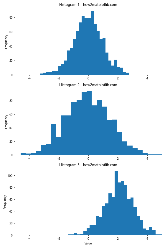
This example creates three histograms with different distributions and sets a consistent x-axis range of -5 to 5 for all of them using a loop over the Axes objects.
Changing X-axis Range with Logarithmic Scale
For datasets with a wide range of values, it can be useful to display the histogram with a logarithmic x-axis scale. Here’s an example of how to create a histogram with a logarithmic x-axis and set its range:
import matplotlib.pyplot as plt
import numpy as np

# Generate some random data with a wide range of values
data = np.random.lognormal(mean=0, sigma=1, size=1000)

# Create a histogram with logarithmic x-axis
plt.hist(data, bins=30)
plt.xscale('log')
plt.title('Histogram with Logarithmic X-axis - how2matplotlib.com')
plt.xlabel('Value (log scale)')
plt.ylabel('Frequency')

# Set the x-axis range in log scale
plt.xlim(1e-2, 1e2)

plt.show()
Output:
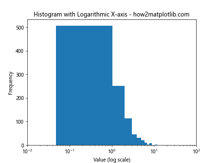
In this example, we use plt.xscale('log') to set the x-axis to a logarithmic scale, and then use plt.xlim(1e-2, 1e2) to set the range from 10^-2 to 10^2.
Using plt.hist() Range Parameter
The plt.hist() function itself provides a range parameter that allows you to specify the range of values to be included in the histogram. This can be an alternative or complementary approach to using plt.xlim(). Here’s an example:
import matplotlib.pyplot as plt
import numpy as np

# Generate some random data
data = np.random.randn(1000)

# Create a histogram with a specified range
plt.hist(data, bins=30, range=(-2, 2))
plt.title('Histogram with Range Parameter - how2matplotlib.com')
plt.xlabel('Value')
plt.ylabel('Frequency')

# The x-axis limits are automatically set by the range parameter,
# but you can still adjust them if needed
plt.xlim(-2.5, 2.5)

plt.show()
Output:
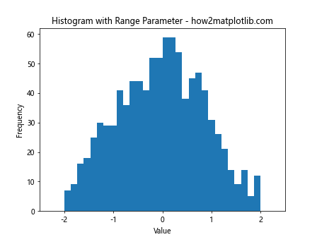
In this code, range=(-2, 2) in the plt.hist() function call specifies that only data between -2 and 2 should be included in the histogram. The x-axis limits are automatically set to match this range, but can still be adjusted using plt.xlim() if desired.
Changing X-axis Range with Cumulative Histograms
Cumulative histograms are useful for showing the cumulative distribution of data. When working with cumulative histograms, you might want to adjust the x-axis range to focus on specific percentiles. Here’s an example:
import matplotlib.pyplot as plt
import numpy as np

# Generate some random data
data = np.random.randn(1000)

# Create a cumulative histogram
plt.hist(data, bins=30, cumulative=True, density=True)
plt.title('Cumulative Histogram with Custom X Range - how2matplotlib.com')
plt.xlabel('Value')
plt.ylabel('Cumulative Frequency')

# Set the x-axis range to focus on the 10th to 90th percentiles
plt.xlim(np.percentile(data, 10), np.percentile(data, 90))

plt.show()
Output:
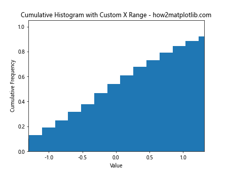
This example creates a cumulative histogram and sets the x-axis range to show only the values between the 10th and 90th percentiles of the data.
Adjusting X-axis Range for Stacked Histograms
Stacked histograms are used to show the composition of data across different categories. When working with stacked histograms, you might need to adjust the x-axis range to properly display all the stacked components. Here’s an example:
import matplotlib.pyplot as plt
import numpy as np

# Generate some random data for three categories
data1 = np.random.normal(0, 1, 1000)
data2 = np.random.normal(2, 1, 1000)
data3 = np.random.normal(4, 1, 1000)

# Create a stacked histogram
plt.hist([data1, data2, data3], bins=30, stacked=True, label=['Category 1', 'Category 2', 'Category 3'])
plt.title('Stacked Histogram with Custom X Range - how2matplotlib.com')
plt.xlabel('Value')
plt.ylabel('Frequency')
plt.legend()

# Set the x-axis range to encompass all data
plt.xlim(min(data1.min(), data2.min(), data3.min()), max(data1.max(), data2.max(), data3.max()))

plt.show()
Output:
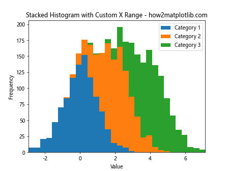
In this example, we create a stacked histogram of three different datasets and set the x-axis range to encompass the minimum and maximum values across all three datasets.
Using plt.setp() for Multiple Axes
When working with multiple subplots, you can use plt.setp() to set properties for multiple Axes objects at once, including the x-axis limits. Here’s an example:
import matplotlib.pyplot as plt
import numpy as np

# Generate some random data
data1 = np.random.randn(1000)
data2 = np.random.randn(1000) * 1.5

# Create a figure with two subplots
fig, (ax1, ax2) = plt.subplots(2, 1, figsize=(8, 10))

# Plot histograms
ax1.hist(data1, bins=30)
ax2.hist(data2, bins=30)

# Set titles and labels
ax1.set_title('Histogram 1 - how2matplotlib.com')
ax2.set_title('Histogram 2 - how2matplotlib.com')
ax2.set_xlabel('Value')

# Set consistent x-axis range for both subplots using plt.setp()
plt.setp((ax1, ax2), xlim=(-5, 5))

plt.tight_layout()
plt.show()
Output:
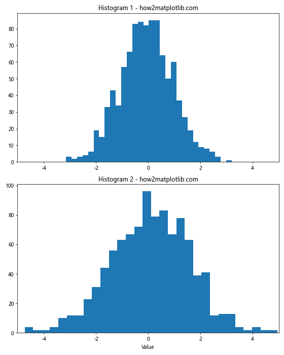
In this example, we use plt.setp((ax1, ax2), xlim=(-5, 5)) to set the x-axis limits for both subplots simultaneously.
Changing X-axis Range with Kernel Density Estimation
Kernel Density Estimation (KDE) is another way to visualize the distribution of data, often used alongside or instead of histograms. When using KDE, you might want to adjust the x-axis range to focus on the most relevant parts of the distribution. Here’s an example:
import matplotlib.pyplot as plt
import numpy as np
from scipy import stats

# Generate some random data
data = np.random.randn(1000)

# Calculate the KDE
kde = stats.gaussian_kde(data)
x = np.linspace(data.min(), data.max(), 100)
y = kde(x)

# Plot the KDE
plt.plot(x, y)
plt.fill_between(x, y, alpha=0.5)
plt.title('KDE Plot with Custom X Range - how2matplotlib.com')
plt.xlabel('Value')
plt.ylabel('Density')

# Set the x-axis range to focus on the central part of the distribution
plt.xlim(-3, 3)

plt.show()
Output:
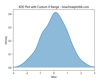
In this example, we create a Kernel Density Estimation plot and use plt.xlim(-3, 3) to focus on the central part of the distribution, which is typically the most informative for normally distributed data.
Adjusting X-axis Range with Histogram and KDE Overlay
Sometimes, it’s useful to overlay a KDE plot on a histogram to show both the raw data distribution and a smoothed estimate. When doing this, you might want to adjust the x-axis range to properly display both visualizations. Here’s an example:
import matplotlib.pyplot as plt
import numpy as np
from scipy import stats

# Generate some random data
data = np.random.randn(1000)

# Calculate the KDE
kde = stats.gaussian_kde(data)
x = np.linspace(data.min(), data.max(), 100)
y = kde(x)

# Create a figure and axis object
fig, ax = plt.subplots()

# Plot the histogram
ax.hist(data, bins=30, density=True, alpha=0.7, label='Histogram')

# Plot the KDE
ax.plot(x, y, label='KDE')

ax.set_title('Histogram and KDE with Custom X Range - how2matplotlib.com')
ax.set_xlabel('Value')
ax.set_ylabel('Density')
ax.legend()

# Set the x-axis range to show the full extent of both visualizations
ax.set_xlim(min(data.min(), x.min()), max(data.max(), x.max()))

plt.show()
Output:
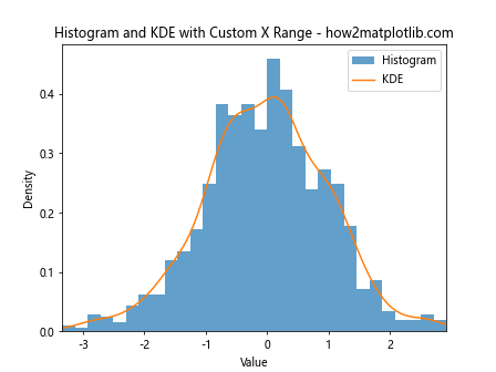
In this example, we plot both a histogram and a KDE on the same axes, then use ax.set_xlim() to set the x-axis range to encompass the full extent of both visualizations.
Changing X-axis Range for Normalized Histograms
When working with normalized histograms (where the y-axis represents probability density rather than frequency), you might want to adjust the x-axis range to focus on the most probable regions. Here’s an example:
import matplotlib.pyplot as plt
import numpy as np

# Generate some random data
data = np.random.randn(1000)

# Create a normalized histogram
plt.hist(data, bins=30, density=True)
plt.title('Normalized Histogram with Custom X Range - how2matplotlib.com')
plt.xlabel('Value')
plt.ylabel('Probability Density')

# Set the x-axis range to focus on the central 95% of the data
plt.xlim(np.percentile(data, 2.5), np.percentile(data, 97.5))

plt.show()
Output:
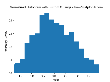
In this example, we create a normalized histogram using density=True in the plt.hist() function, then set the x-axis range to show only the central 95% of the data using percentiles.
Using plt.margins() to Adjust X-axis Range
The plt.margins() function provides another way to adjust the plot range, including the x-axis range of histograms. It allows you to add a margin to the automatic limits. Here’s an example:
import matplotlib.pyplot as plt
import numpy as np

# Generate some random data
data = np.random.randn(1000)

# Create a histogram
plt.hist(data, bins=30)
plt.title('Histogram with Margins - how2matplotlib.com')
plt.xlabel('Value')
plt.ylabel('Frequency')

# Add margins to the x-axis
plt.margins(x=0.1)

plt.show()
Output:
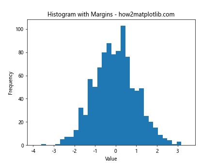
In this example, plt.margins(x=0.1) adds a 10% margin to both sides of the x-axis. This can be useful for ensuring that all data points are clearly visible, especially at the edges of the distribution.
Changing X-axis Range for Histograms with Custom Bin Edges
When creating histograms with custom bin edges, you might need to adjust the x-axis range to properly display all bins. Here’s an example:
import matplotlib.pyplot as plt
import numpy as np

# Generate some random data
data = np.random.exponential(scale=2, size=1000)

# Define custom bin edges
bin_edges = np.logspace(np.log10(0.1), np.log10(20), num=20)

# Create a histogram with custom bin edges
plt.hist(data, bins=bin_edges)
plt.xscale('log')
plt.title('Histogram with Custom Bins and X Range - how2matplotlib.com')
plt.xlabel('Value (log scale)')
plt.ylabel('Frequency')

# Set the x-axis range to match the bin edges
plt.xlim(bin_edges[0], bin_edges[-1])

plt.show()
Output:
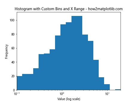
In this example, we create a histogram with logarithmically spaced bin edges for exponentially distributed data. We then use plt.xlim() to set the x-axis range to match the first and last bin edges.
Conclusion
Changing the x-axis range of histogram plots in Matplotlib is a versatile technique that can significantly enhance the presentation and interpretation of your data. Whether you’re focusing on specific regions of interest, comparing multiple distributions, or adjusting for different scales, the methods discussed in this article provide a comprehensive toolkit for customizing your histogram visualizations.
Key takeaways include:
- Use
plt.xlim()orax.set_xlim()for simple range adjustments. - Consider data statistics when setting ranges (e.g., mean ± standard deviations).
- Adjust bin sizes and ranges together for more meaningful representations.
- Use
plt.axis()for simultaneous control of x and y axes. - Apply consistent ranges across multiple subplots for easy comparison.
- Implement dynamic range adjustment based on user input or data characteristics.
- Consider logarithmic scales for data with wide value ranges.
- Use the
rangeparameter inplt.hist()for an alternative approach. - Adjust ranges for specialized histogram types like cumulative or stacked histograms.
- Combine histograms with other visualizations like KDE plots, adjusting ranges accordingly.
By mastering these techniques, you can create more informative and visually appealing histogram plots that effectively communicate your data’s distribution and key features. Remember to always consider your specific data and audience when choosing how to adjust your histogram’s x-axis range.