Line Color in Matplotlib
Matplotlib is a powerful data visualization library in Python that offers extensive customization options for creating high-quality plots and charts. One of the fundamental aspects of plot customization is controlling the color of lines in your graphs. This article will delve deep into the various ways you can manipulate line colors in Matplotlib, providing detailed explanations and numerous code examples to help you master this essential skill.
Understanding Color in Matplotlib
Before we dive into the specifics of line color manipulation, it’s crucial to understand how Matplotlib handles colors. Matplotlib supports a wide range of color specifications:
- Color names: Matplotlib recognizes a large set of named colors (e.g., ‘red’, ‘blue’, ‘green’).
- Hexadecimal strings: Colors can be specified using hex codes (e.g., ‘#FF0000’ for red).
- RGB or RGBA tuples: Colors can be defined as tuples of red, green, and blue values (and optionally alpha for transparency).
- Grayscale intensities: Single floats between 0 and 1 represent shades of gray.
Let’s start with a basic example of plotting a line with a specific color:
import matplotlib.pyplot as plt
import numpy as np

x = np.linspace(0, 10, 100)
y = np.sin(x)

plt.figure(figsize=(10, 6))
plt.plot(x, y, color='red', linewidth=2)
plt.title('Sine Wave - how2matplotlib.com')
plt.xlabel('X-axis')
plt.ylabel('Y-axis')
plt.grid(True)
plt.show()

print("The plot shows a red sine wave.")
Output:
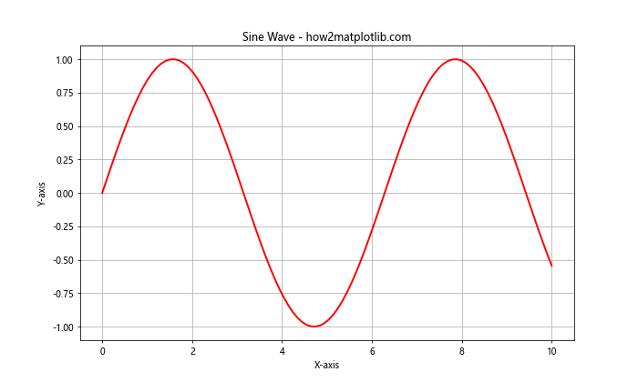
In this example, we’ve created a simple sine wave plot with a red line. The color parameter in the plt.plot() function is set to ‘red’, which is a named color in Matplotlib.
Using Named Colors
Matplotlib provides a wide array of named colors that you can use directly in your plots. These named colors are easy to remember and use, making them a popular choice for quick visualizations.
Here’s an example showcasing multiple lines with different named colors:
import matplotlib.pyplot as plt
import numpy as np

x = np.linspace(0, 10, 100)
y1 = np.sin(x)
y2 = np.cos(x)
y3 = np.tan(x)

plt.figure(figsize=(12, 8))
plt.plot(x, y1, color='blue', label='Sine')
plt.plot(x, y2, color='green', label='Cosine')
plt.plot(x, y3, color='red', label='Tangent')
plt.title('Trigonometric Functions - how2matplotlib.com')
plt.xlabel('X-axis')
plt.ylabel('Y-axis')
plt.legend()
plt.grid(True)
plt.ylim(-2, 2)  # Limit y-axis for better visibility
plt.show()

print("The plot shows three trigonometric functions with different colors.")
Output:
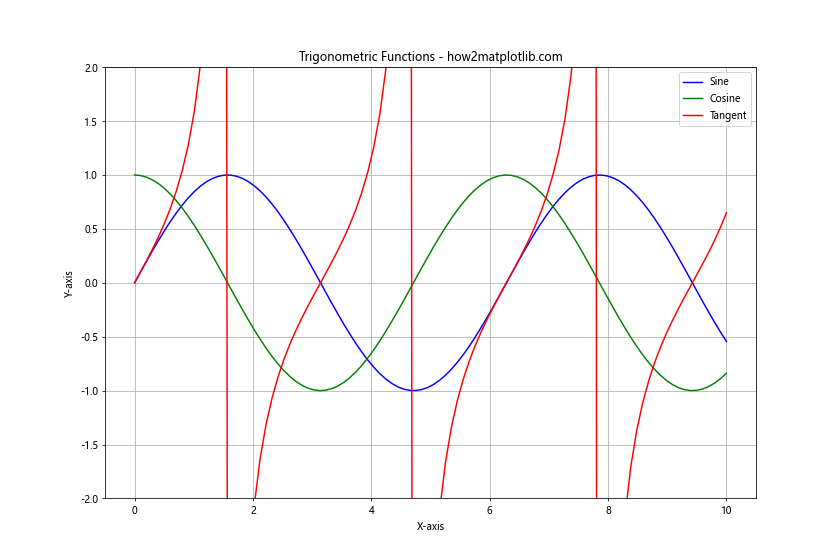
In this example, we’ve plotted three trigonometric functions using different named colors: blue for sine, green for cosine, and red for tangent. The label parameter is used to create a legend, which helps identify each line.
Using Hexadecimal Color Codes
Hexadecimal color codes offer more precise control over colors compared to named colors. They allow you to specify exact shades and hues using a six-digit code.
Here’s an example using hexadecimal color codes:
import matplotlib.pyplot as plt
import numpy as np

x = np.linspace(0, 10, 100)
y1 = x**2
y2 = x**2.5
y3 = x**3

plt.figure(figsize=(12, 8))
plt.plot(x, y1, color='#FF5733', label='x^2')
plt.plot(x, y2, color='#33FF57', label='x^2.5')
plt.plot(x, y3, color='#3357FF', label='x^3')
plt.title('Power Functions - how2matplotlib.com')
plt.xlabel('X-axis')
plt.ylabel('Y-axis')
plt.legend()
plt.grid(True)
plt.show()

print("The plot shows three power functions with custom hexadecimal colors.")
Output:
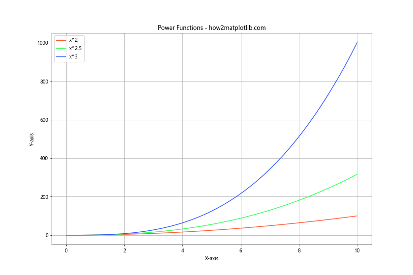
In this example, we’ve used hexadecimal color codes to specify custom colors for three different power functions. The codes ‘#FF5733’, ‘#33FF57’, and ‘#3357FF’ represent specific shades of red, green, and blue respectively.
Using Colormaps
Colormaps in Matplotlib are a powerful way to represent data using a range of colors. While they’re often used for 2D plots like heatmaps, they can also be applied to line colors, especially when you want to represent a third dimension in your data.
Here’s an example using a colormap to color lines based on a third variable:
import matplotlib.pyplot as plt
import numpy as np

t = np.linspace(0, 10, 100)
x = t * np.cos(t)
y = t * np.sin(t)
z = t

plt.figure(figsize=(12, 8))
plt.scatter(x, y, c=z, cmap='viridis', s=10)
for i in range(len(t)-1):
    plt.plot(x[i:i+2], y[i:i+2], color=plt.cm.viridis(i/len(t)))
plt.colorbar(label='Time')
plt.title('Spiral Plot with Colormap - how2matplotlib.com')
plt.xlabel('X-axis')
plt.ylabel('Y-axis')
plt.grid(True)
plt.show()

print("The plot shows a spiral with colors representing time progression.")
Output:
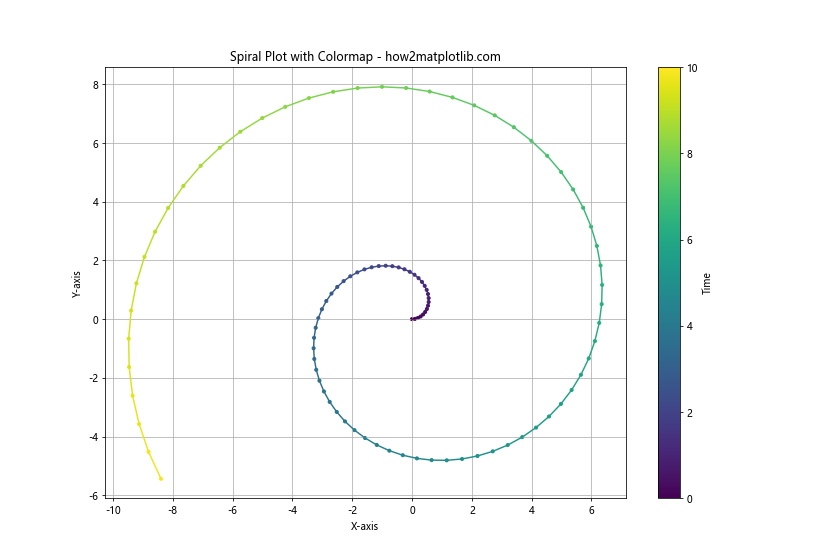
In this example, we’ve created a spiral plot where the color of the line changes based on the time variable. We use the ‘viridis’ colormap, which is a perceptually uniform colormap that ranges from blue to yellow. The plt.cm.viridis(i/len(t)) call returns a color from the colormap based on the normalized index of each point.
Changing Line Color Dynamically
Sometimes, you might want to change the color of a line dynamically based on certain conditions or data values. Here’s an example that changes line color based on the slope of the line:
import matplotlib.pyplot as plt
import numpy as np

x = np.linspace(0, 10, 1000)
y = np.sin(x) * np.exp(-0.1 * x)

plt.figure(figsize=(12, 8))
for i in range(len(x)-1):
    if (y[i+1] - y[i]) / (x[i+1] - x[i]) > 0:
        color = 'red'
    else:
        color = 'blue'
    plt.plot(x[i:i+2], y[i:i+2], color=color, linewidth=2)
plt.title('Damped Sine Wave with Dynamic Colors - how2matplotlib.com')
plt.xlabel('X-axis')
plt.ylabel('Y-axis')
plt.grid(True)
plt.show()

print("The plot shows a damped sine wave with red for positive slope and blue for negative slope.")
Output:
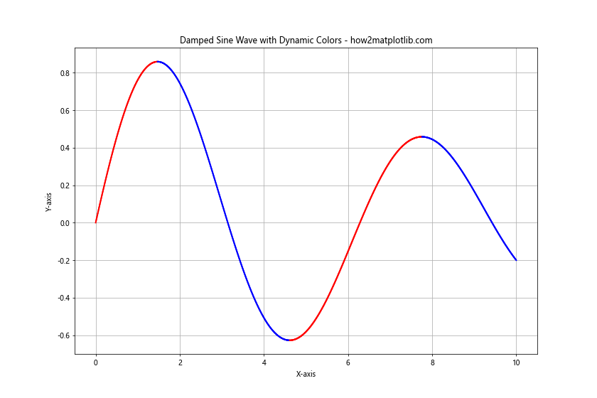
In this example, we’ve plotted a damped sine wave where the color of the line changes based on its slope. When the slope is positive, the line is red, and when it’s negative, the line is blue. This creates a visually striking representation of the function’s behavior.
Combining Multiple Color Techniques
You can combine various color techniques to create more complex and informative visualizations. Here’s an example that combines multiple color techniques:
import matplotlib.pyplot as plt
import numpy as np

x = np.linspace(0, 10, 100)
y1 = np.sin(x)
y2 = np.cos(x)
y3 = np.tan(x)

plt.figure(figsize=(12, 8))

# Solid line with named color
plt.plot(x, y1, color='blue', label='Sine', linewidth=2)

# Dashed line with hex color
plt.plot(x, y2, color='#FF5733', label='Cosine', linestyle='--', linewidth=2)

# Dotted line with RGB color
plt.plot(x, y3, color=(0.1, 0.8, 0.1), label='Tangent', linestyle=':', linewidth=2)

# Scatter plot with colormap
scatter = plt.scatter(x, y1+y2, c=y3, cmap='viridis', label='Sine + Cosine')
plt.colorbar(scatter, label='Tangent Value')

plt.title('Combined Color Techniques - how2matplotlib.com')
plt.xlabel('X-axis')
plt.ylabel('Y-axis')
plt.legend()
plt.grid(True)
plt.ylim(-3, 3)
plt.show()

print("The plot combines multiple color techniques: named colors, hex codes, RGB tuples, and a colormap.")
Output:
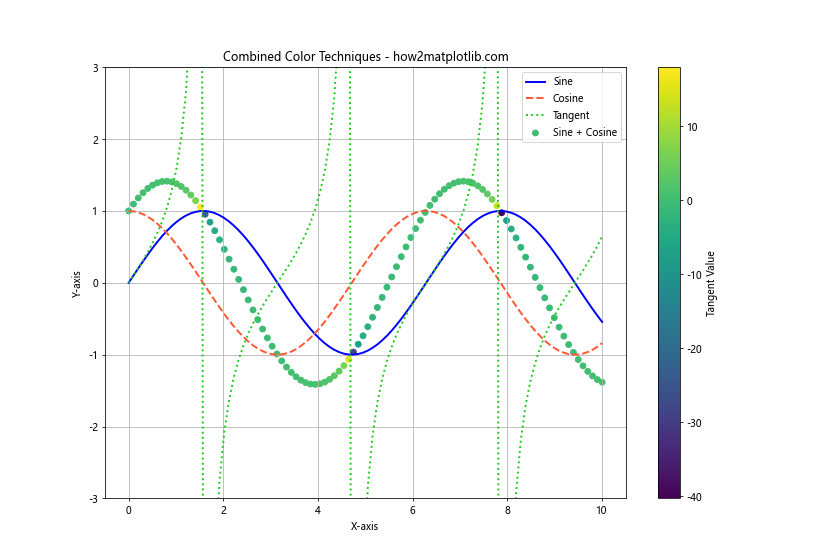
In this example, we’ve combined several color techniques:
- A solid blue line for the sine function using a named color.
- A dashed orange line for the cosine function using a hex color code.
- A dotted green line for the tangent function using an RGB tuple.
- A scatter plot of the sum of sine and cosine, colored using a colormap based on the tangent values.
This combination of techniques allows us to represent multiple layers of information in a single plot.
Using Alpha for Transparency
The alpha parameter allows you to control the transparency of lines, which can be useful when dealing with overlapping data or when you want to emphasize certain parts of your plot.
Here’s an example demonstrating the use of alpha:
import matplotlib.pyplot as plt
import numpy as np

x = np.linspace(0, 10, 100)
y1 = np.sin(x)
y2 = np.cos(x)
y3 = np.tan(x)

plt.figure(figsize=(12, 8))

plt.plot(x, y1, color='red', alpha=0.3, linewidth=5, label='Sine (α=0.3)')
plt.plot(x, y2, color='green', alpha=0.6, linewidth=5, label='Cosine (α=0.6)')
plt.plot(x, y3, color='blue', alpha=1.0, linewidth=5, label='Tangent (α=1.0)')

plt.title('Trigonometric Functions with Varying Transparency - how2matplotlib.com')
plt.xlabel('X-axis')
plt.ylabel('Y-axis')
plt.legend()
plt.grid(True)
plt.ylim(-2, 2)
plt.show()

print("The plot shows trigonometric functions with different levels of transparency.")
Output:
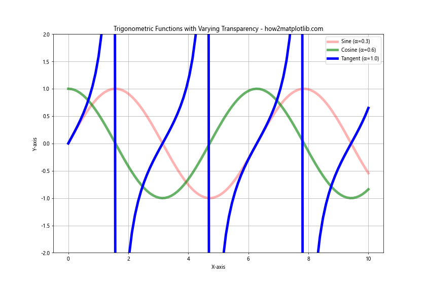
In this example, we’ve plotted three trigonometric functions with different levels of transparency. The sine function has an alpha of 0.3 (very transparent), the cosine function has an alpha of 0.6 (semi-transparent), and the tangent function has an alpha of 1.0 (fully opaque). This technique can be particularly useful when dealing with overlapping lines or when you want to emphasize certain parts of your plot.
Color Mapping Based on Data Values
You can map colors to specific data values, creating a continuous color gradient along your line. This is particularly useful when you want to represent an additional dimension of data in your 2D plot.
Here’s an example that maps colors to y-values:
import matplotlib.pyplot as plt
import numpy as np

x = np.linspace(0, 10, 1000)
y = np.sin(x) * np.exp(-0.1 * x)

plt.figure(figsize=(12, 8))

points = plt.scatter(x, y, c=y, cmap='coolwarm', s=5)
plt.colorbar(points, label='Y-value')

for i in range(len(x)-1):
    plt.plot(x[i:i+2], y[i:i+2], color=plt.cm.coolwarm((y[i] + 1) / 2))

plt.title('Damped Sine Wave with Color Mapping - how2matplotlib.com')
plt.xlabel('X-axis')
plt.ylabel('Y-axis')
plt.grid(True)
plt.show()

print("The plot shows a damped sine wave with colors mapped to y-values.")
Output:
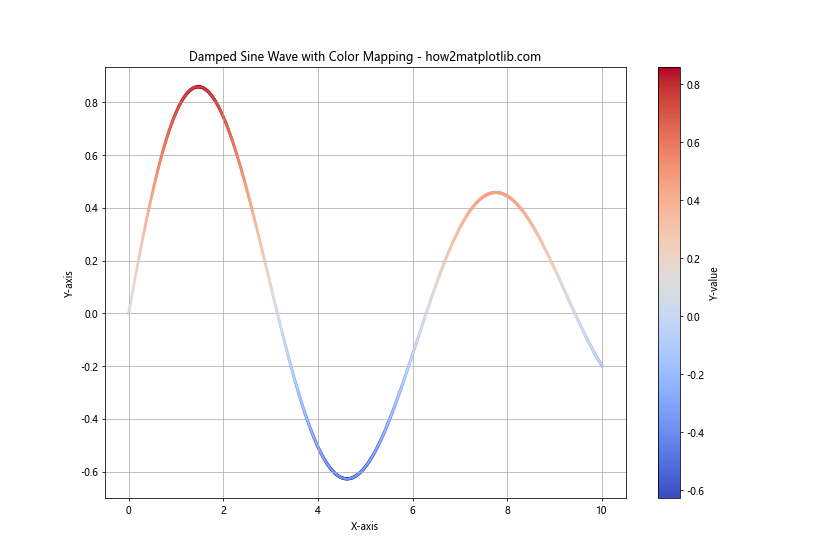
In this example, we’ve created a damped sine wave where the color of each segment of the line is determined by its y-value. We use the ‘coolwarm’ colormap, which transitions from cool colors (blues) for negative values to warm colors (reds) for positive values. The scatter plot and colorbar help to illustrate the color mapping.
Creating Custom Colormaps
While Matplotlib provides many built-in colormaps, you might sometimes need to create a custom colormap for your specific needs. Here’s an example of creating and using a custom colormap:
import matplotlib.pyplot as plt
import numpy as np
from matplotlib.colors import LinearSegmentedColormap

x = np.linspace(0, 10, 1000)
y = np.sin(x) * np.exp(-0.1 * x)

# Define custom colors
colors = ['darkblue', 'royalblue', 'skyblue', 'paleturquoise', 'lightyellow', 'gold', 'orange', 'red']
n_bins = 100
custom_cmap = LinearSegmentedColormap.from_list('custom', colors, N=n_bins)

plt.figure(figsize=(12, 8))

points = plt.scatter(x, y, c=y, cmap=custom_cmap, s=5)
plt.colorbar(points, label='Y-value')

for i in range(len(x)-1):
    plt.plot(x[i:i+2], y[i:i+2], color=custom_cmap((y[i] + 1) / 2))

plt.title('Damped Sine Wave with Custom Colormap - how2matplotlib.com')
plt.xlabel('X-axis')
plt.ylabel('Y-axis')
plt.grid(True)
plt.show()

print("The plot shows a damped sine wave with a custom colormap.")
Output:
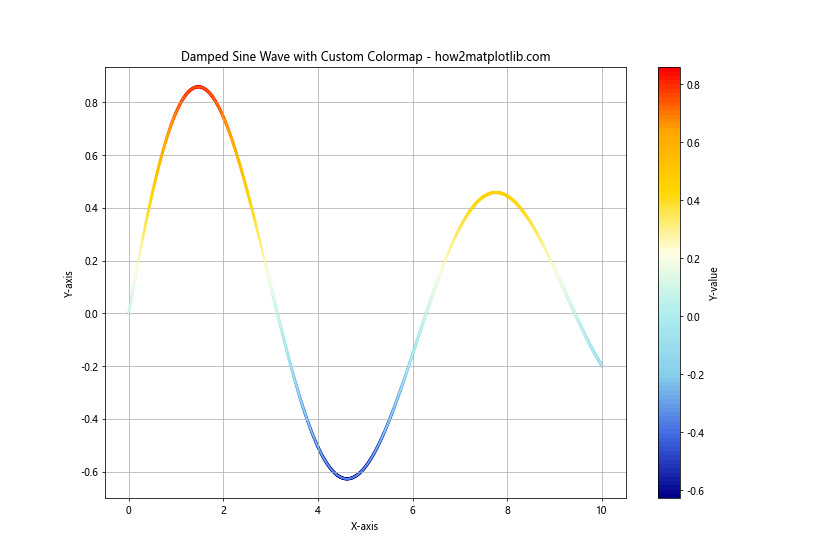
In this example, we’ve created a custom colormap that transitions through a series of colors from dark blue to red. We then use this custom colormap to color our damped sine wave based on its y-values.
Using Diverging Colormaps
Diverging colormaps are particularly useful when you want to emphasize a critical midpoint in your data, such as zero. These colormaps use different hues for values above and below the midpoint, with intensity increasing as values move away from the midpoint.
Here’s an example using a diverging colormap:
import matplotlib.pyplot as plt
import numpy as np

x = np.linspace(-5, 5, 1000)
y = x**3 - x

plt.figure(figsize=(12, 8))

points = plt.scatter(x, y, c=y, cmap='RdYlBu_r', s=5)
plt.colorbar(points, label='Y-value')

for i in range(len(x)-1):
    plt.plot(x[i:i+2], y[i:i+2], color=plt.cm.RdYlBu_r((y[i] - y.min()) / (y.max() - y.min())))

plt.title('Cubic Function with Diverging Colormap - how2matplotlib.com')
plt.xlabel('X-axis')
plt.ylabel('Y-axis')
plt.grid(True)
plt.axhline(y=0, color='k', linestyle='--')
plt.axvline(x=0, color='k', linestyle='--')
plt.show()

print("The plot shows a cubic function with a diverging colormap.")
Output:
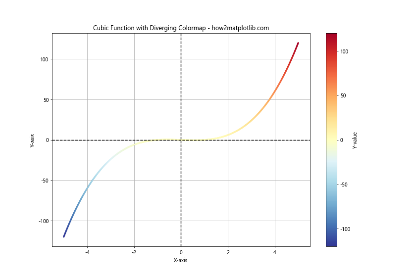
In this example, we’ve plotted a cubic function (y = x^3 – x) using the ‘RdYlBu_r’ diverging colormap. This colormap transitions from red (for negative values) through white (for values near zero) to blue (for positive values). The ‘_r’ at the end of the colormap name reverses the colormap, making red represent negative values and blue represent positive values, which is a common convention.
Combining Line Styles and Colors
Combining different line styles with colors can help distinguish between multiple lines in a plot, especially when you have many lines or when printing in black and white.
Here’s an example that combines line styles and colors:
import matplotlib.pyplot as plt
import numpy as np

x = np.linspace(0, 10, 100)
y1 = np.sin(x)
y2 = np.cos(x)
y3 = np.tan(x)
y4 = np.exp(-0.1 * x)

plt.figure(figsize=(12, 8))

plt.plot(x, y1, color='blue', linestyle='-', linewidth=2, label='Sine (Solid)')
plt.plot(x, y2, color='red', linestyle='--', linewidth=2, label='Cosine (Dashed)')
plt.plot(x, y3, color='green', linestyle=':', linewidth=2, label='Tangent (Dotted)')
plt.plot(x, y4, color='purple', linestyle='-.', linewidth=2, label='Exponential (Dash-dot)')

plt.title('Multiple Functions with Different Line Styles and Colors - how2matplotlib.com')
plt.xlabel('X-axis')
plt.ylabel('Y-axis')
plt.legend()
plt.grid(True)
plt.ylim(-2, 2)
plt.show()

print("The plot shows multiple functions with different line styles and colors.")
Output:
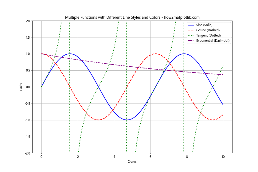
In this example, we’ve plotted four different functions, each with a unique combination of color and line style. This approach makes it easy to distinguish between the different lines, even if the plot were to be printed in grayscale.
Using Color to Represent Categorical Data
When dealing with categorical data, you can use different colors to represent different categories. This is particularly useful when you want to highlight the differences between groups in your data.
Here’s an example that uses color to represent different categories:
import matplotlib.pyplot as plt
import numpy as np

np.random.seed(42)
categories = ['A', 'B', 'C', 'D']
colors = ['#FF9999', '#66B2FF', '#99FF99', '#FFCC99']

plt.figure(figsize=(12, 8))

for i, category in enumerate(categories):
    x = np.random.rand(20)
    y = np.random.rand(20)
    plt.scatter(x, y, c=colors[i], label=f'Category {category}', s=100, alpha=0.7)

plt.title('Scatter Plot with Categorical Colors - how2matplotlib.com')
plt.xlabel('X-axis')
plt.ylabel('Y-axis')
plt.legend()
plt.grid(True)
plt.show()

print("The plot shows a scatter plot with colors representing different categories.")
Output:
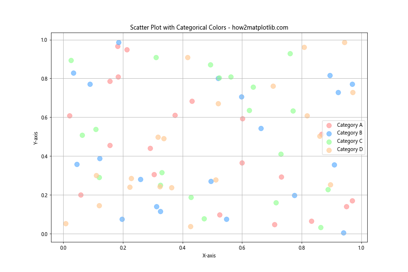
In this example, we’ve created a scatter plot where each point belongs to one of four categories. Each category is represented by a different color, making it easy to visually distinguish between the groups.
Animating Color Changes
You can create animations in Matplotlib where the color of lines changes over time. This can be useful for visualizing how data evolves or for creating eye-catching presentations.
Here’s an example of an animation where the color of a sine wave changes over time:
import matplotlib.pyplot as plt
import numpy as np
from matplotlib.animation import FuncAnimation

fig, ax = plt.subplots(figsize=(12, 8))
x = np.linspace(0, 2*np.pi, 100)
line, = ax.plot(x, np.sin(x), color='blue', linewidth=2)

def update(frame):
    line.set_color(plt.cm.viridis(frame / 100))
    return line,

ani = FuncAnimation(fig, update, frames=100, interval=50, blit=True)
plt.title('Animated Color Change - how2matplotlib.com')
plt.xlabel('X-axis')
plt.ylabel('Y-axis')
plt.show()

print("The animation shows a sine wave with changing colors.")
Output:
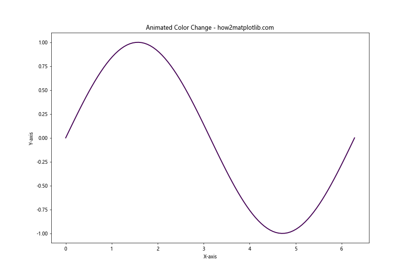
In this example, we’ve created an animation where the color of the sine wave changes gradually using the ‘viridis’ colormap. The FuncAnimation function is used to create the animation, with the update function changing the color of the line in each frame.
Line Color in Matplotlib Conclusion
Mastering line color in Matplotlib opens up a world of possibilities for creating informative and visually appealing plots. From simple solid colors to complex color mappings and animations, the techniques covered in this article provide a comprehensive toolkit for customizing your visualizations.
Remember that effective use of color can significantly enhance the readability and impact of your plots. However, it’s also important to consider color blindness and accessibility when choosing your color schemes. Matplotlib provides color-blind friendly colormaps (like ‘viridis’) that you can use to ensure your visualizations are accessible to a wide audience.
As you continue to work with Matplotlib, experiment with these different color techniques and combine them in creative ways. The more you practice, the more intuitive and powerful your data visualizations will become.