Matplotlib Example
Matplotlib is a powerful visualization library in Python that can be used to create a wide range of visualizations, such as line plots, scatter plots, bar plots, histograms, and more. In this article, we will explore various examples of how to use Matplotlib to create different types of plots.
Line Plot
A line plot is a type of plot that displays data points connected by straight line segments. It is commonly used to visualize the trend of data over time.
import matplotlib.pyplot as plt

x = [1, 2, 3, 4, 5]
y = [2, 4, 6, 8, 10]

plt.plot(x, y)
plt.xlabel('X-axis')
plt.ylabel('Y-axis')
plt.title('Line Plot Example')
plt.show()
Output:
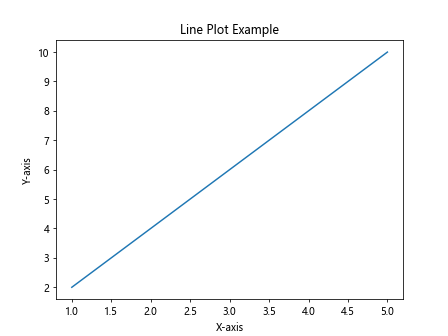
The above example creates a simple line plot with x-values [1, 2, 3, 4, 5] and y-values [2, 4, 6, 8, 10].
Scatter Plot
A scatter plot is a type of plot that displays data points as individual markers, which can be used to show relationships between two variables.
import matplotlib.pyplot as plt

x = [1, 2, 3, 4, 5]
y = [2, 4, 6, 8, 10]

plt.scatter(x, y)
plt.xlabel('X-axis')
plt.ylabel('Y-axis')
plt.title('Scatter Plot Example')
plt.show()
Output:
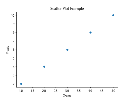
The above example creates a scatter plot with x-values [1, 2, 3, 4, 5] and y-values [2, 4, 6, 8, 10].
Bar Plot
A bar plot is a type of plot that displays data as rectangular bars, which can be used to compare different categories.
import matplotlib.pyplot as plt

labels = ['A', 'B', 'C', 'D', 'E']
values = [10, 20, 15, 30, 25]

plt.bar(labels, values)
plt.xlabel('Categories')
plt.ylabel('Values')
plt.title('Bar Plot Example')
plt.show()
Output:
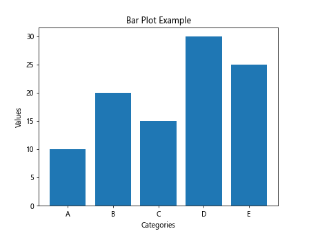
The above example creates a bar plot with categories ['A', 'B', 'C', 'D', 'E'] and values [10, 20, 15, 30, 25].
Histogram
A histogram is a type of plot that displays the distribution of a continuous variable by dividing the data into bins.
import matplotlib.pyplot as plt
import numpy as np

data = np.random.randn(1000)

plt.hist(data, bins=30)
plt.xlabel('Value')
plt.ylabel('Frequency')
plt.title('Histogram Example')
plt.show()
Output:
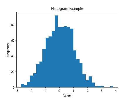
The above example creates a histogram plot with 1000 random data points divided into 30 bins.
Pie Chart
A pie chart is a type of plot that displays data as a circular chart divided into slices, which represent proportions of a whole.
import matplotlib.pyplot as plt

labels = ['A', 'B', 'C', 'D']
sizes = [30, 20, 25, 25]

plt.pie(sizes, labels=labels, autopct='%1.1f%%')
plt.title('Pie Chart Example')
plt.show()
Output:
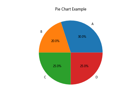
The above example creates a pie chart with labels ['A', 'B', 'C', 'D'] and sizes [30, 20, 25, 25].
Box Plot
A box plot is a type of plot that displays the distribution of a continuous variable through five summary statistics: minimum, lower quartile, median, upper quartile, and maximum.
import matplotlib.pyplot as plt
import numpy as np

data = np.random.randn(100)

plt.boxplot(data)
plt.title('Box Plot Example')
plt.show()
Output:
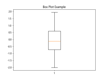
The above example creates a box plot of 100 random data points.
3D Plot
Matplotlib can also be used to create 3D plots, which can be useful for visualizing complex data in three dimensions.
import matplotlib.pyplot as plt
from mpl_toolkits.mplot3d import Axes3D
import numpy as np

fig = plt.figure()
ax = fig.add_subplot(111, projection='3d')

x = np.random.normal(size=100)
y = np.random.normal(size=100)
z = np.random.normal(size=100)

ax.scatter(x, y, z)
plt.title('3D Plot Example')
plt.show()
Output:
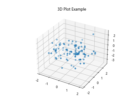
The above example creates a 3D scatter plot with 100 random data points in three dimensions.
Subplots
Matplotlib allows you to create multiple plots in the same figure using subplots.
import matplotlib.pyplot as plt

x = [1, 2, 3, 4, 5]
y1 = [2, 4, 6, 8, 10]
y2 = [5, 3, 7, 2, 8]

fig, axs = plt.subplots(2)

axs[0].plot(x, y1)
axs[0].set_title('Subplot 1')

axs[1].plot(x, y2)
axs[1].set_title('Subplot 2')

plt.show()
Output:
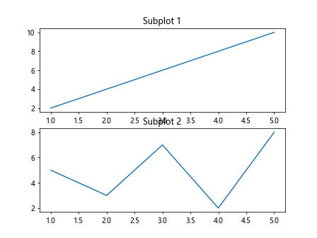
The above example creates two subplots, each with their own line plot.
Annotations
You can add annotations to your plots to provide additional information or context.
import matplotlib.pyplot as plt

x = [1, 2, 3, 4, 5]
y = [2, 4, 6, 8, 10]

plt.plot(x, y)
plt.annotate('Maximum', (5, 10), xytext=(4, 8),
             arrowprops=dict(facecolor='black', shrink=0.05))
plt.title('Annotation Example')
plt.show()
Output:
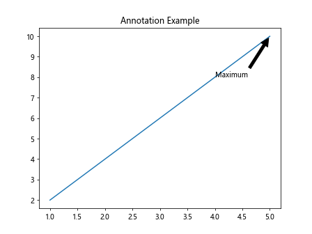
The above example adds an annotation to the maximum point in the line plot.
Customizing Plots
Matplotlib allows you to customize your plots by changing colors, labels, styles, and more.
import matplotlib.pyplot as plt

x = [1, 2, 3, 4, 5]
y = [2, 4, 6, 8, 10]

plt.plot(x, y, color='green', linestyle='--', marker='o', label='Line Plot')
plt.xlabel('X-axis')
plt.ylabel('Y-axis')
plt.title('Customizing Plots Example')
plt.legend()
plt.show()
Output:
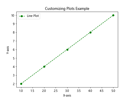
The above example customizes the line plot by changing the color, linestyle, and marker style.
Saving Plots
You can save your plots as image files using Matplotlib.
import matplotlib.pyplot as plt

x = [1, 2, 3, 4, 5]
y = [2, 4, 6, 8, 10]

plt.plot(x, y)
plt.xlabel('X-axis')
plt.ylabel('Y-axis')
plt.title('Line Plot Example')
plt.savefig('line_plot.png')
The above example saves the line plot as an image file named line_plot.png.
Working with Dates
Matplotlib also supports plotting date and time data.
import matplotlib.pyplot as plt
import pandas as pd

dates = pd.date_range('20220101', periods=5)
values = [10, 20, 15, 30, 25]

plt.plot(dates, values)
plt.xlabel('Date')
plt.ylabel('Value')
plt.title('Date Plot Example')
plt.show()
Output:
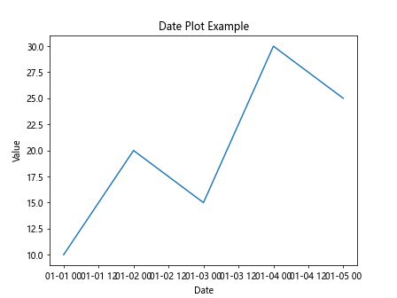
The above example creates a line plot with dates on the x-axis and values on the y-axis.
Working with Multiple Figures
You can create multiple figures to display different plots separately.
import matplotlib.pyplot as plt

x = [1, 2, 3, 4, 5]
y1 = [2, 4, 6, 8, 10]
y2 = [5, 3, 7, 2, 8]

plt.figure(1)
plt.plot(x, y1)
plt.title('Figure 1')

plt.figure(2)
plt.plot(x, y2)
plt.title('Figure 2')

plt.show()
Output:
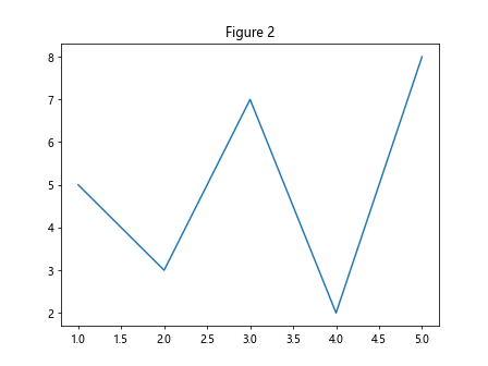
The above example creates two separate figures with different line plots.
Working with Logarithmic Scale
Matplotlib allows you to plot data on a logarithmic scale.
import matplotlib.pyplot as plt

x = [1, 2, 3, 4, 5]
y = [10, 100, 1000, 10000, 100000]

plt.plot(x, y)
plt.yscale('log')
plt.xlabel('X-axis')
plt.ylabel('Y-axis (log scale)')
plt.title('Logarithmic Scale Example')
plt.show()
Output:
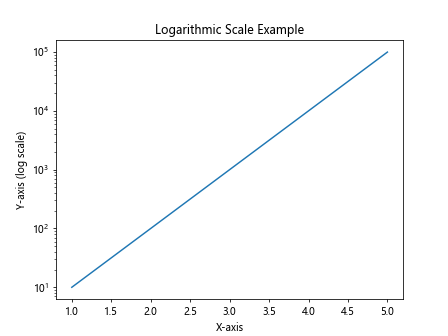
The above example plots the data on a logarithmic scale on the y-axis.
Adding Grid Lines
You can add grid lines to your plots to help with visualization.
import matplotlib.pyplot as plt

x = [1, 2, 3, 4, 5]
y = [2, 4, 6, 8, 10]

plt.plot(x, y)
plt.xlabel('X-axis')
plt.ylabel('Y-axis')
plt.title('Line Plot with Grid Lines')
plt.grid(True)
plt.show()
Output:
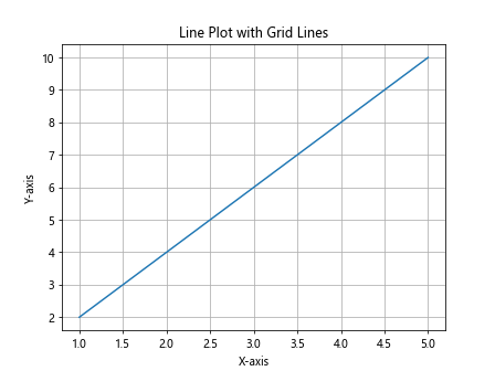
The above example adds grid lines to the line plot.
Adding Legends
You can add legends to your plots to provide information about the data being displayed.
import matplotlib.pyplot as plt

x = [1, 2, 3, 4, 5]
y1 = [2, 4, 6, 8, 10]
y2 = [5, 3, 7, 2, 8]

plt.plot(x, y1, label='Line 1')
plt.plot(x, y2, label='Line 2')
plt.xlabel('X-axis')
plt.ylabel('Y-axis')
plt.title('Line Plot with Legends')
plt.legend()
plt.show()
Output:
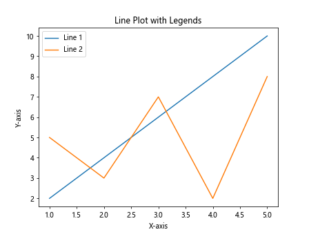
The above example adds legends to the line plot for better visualization.
Adding Titles and Labels
You can add titles and labels to your plots to provide context and information.
import matplotlib.pyplot as plt

x = [1, 2, 3, 4, 5]
y = [2, 4, 6, 8, 10]

plt.plot(x, y)
plt.xlabel('X-axis')
plt.ylabel('Y-axis')
plt.title('Line Plot with Title and Labels')
plt.show()
Output:
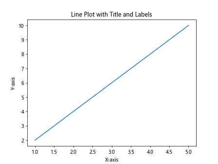
The above example adds a title, x-axis label, and y-axis label to the line plot.
Adding Annotations
You can add annotations to specific points on your plot to highlight important information.
import matplotlib.pyplot as plt

x = [1, 2, 3, 4, 5]
y = [2, 4, 6, 8, 10]

plt.plot(x, y)
plt.annotate('Maximum', (5, 10), xytext=(4, 8),
             arrowprops=dict(facecolor='black', shrink=0.05))
plt.xlabel('X-axis')
plt.ylabel('Y-axis')
plt.title('Line Plot with Annotation')
plt.show()
Output:
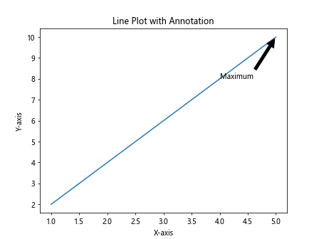
The above example adds an annotation to the maximum point on the line plot.
Matplotlib Example Conclusion
In this article, we explored various examples of how to use Matplotlib to create different types of plots, including line plots, scatter plots, bar plots, histograms, pie charts, box plots, 3D plots, subplots, annotations, customizing plots, saving plots, working with dates, multiple figures, logarithmic scale, grid lines, legends, titles, labels, and annotations. By mastering these examples, you will have a solid foundation in using Matplotlib for data visualization in Python.