Introduction to Matplotlib Colormap
Matplotlib is a popular data visualization library in Python that provides a wide range of customization options for creating stunning plots and graphs. One key feature of Matplotlib is its colormap functionality, which allows users to map data values to colors in a visually appealing way.
In this article, we will explore the basics of colormaps in Matplotlib, understand how to customize them, and learn how to apply them to various types of plots. We will also provide plenty of examples to demonstrate different aspects of colormap customization.
Overview of Colormaps in Matplotlib
Colormaps in Matplotlib are a way to map numerical values to colors in a visual representation. They are essential for representing data in a meaningful and visually appealing way. Matplotlib provides a variety of built-in colormaps that can be used to customize the colors of plots.
Let’s start by looking at a simple example of how to use a colormap in Matplotlib:
import numpy as np
import matplotlib.pyplot as plt
# Generate some data
x = np.linspace(0, 10, 100)
y = np.sin(x)
# Plot the data with a colormap
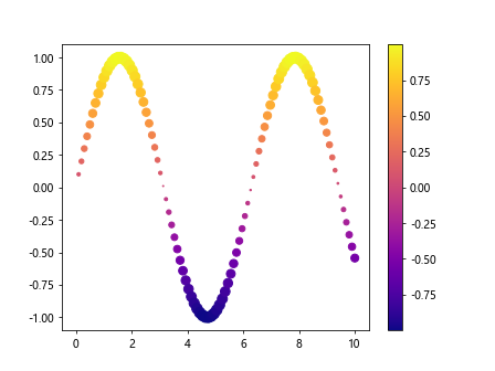
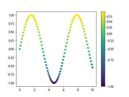
plt.scatter(x, y, c=y, cmap='viridis')
plt.colorbar()
plt.show()
Output:
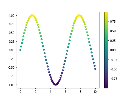
In this example, we are using the viridis colormap to color the points in a scatter plot based on the y values. The plt.colorbar() function adds a colorbar to the plot, which indicates the mapping of data values to colors.
Basic Colormap Customization
Matplotlib provides a wide range of built-in colormaps that can be used out of the box. However, users also have the option to customize colormaps to suit their specific needs. Let’s take a look at some basic customization options:
Changing the Colormap
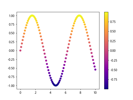
You can change the default colormap used in a plot by setting the cmap parameter to a different colormap name. Here is an example that uses the plasma colormap:
import numpy as np
import matplotlib.pyplot as plt

# Generate some data
x = np.linspace(0, 10, 100)
y = np.sin(x)

plt.scatter(x, y, c=y, cmap='plasma')
plt.colorbar()
plt.show()
Output:
Reversing the Colormap
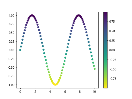
You can reverse the order of colors in a colormap by adding _r to the end of the colormap name. Here is an example that uses the viridis_r colormap:
import numpy as np
import matplotlib.pyplot as plt
# Generate some data
x = np.linspace(0, 10, 100)
y = np.sin(x)
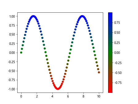
plt.scatter(x, y, c=y, cmap='viridis_r')
plt.colorbar()
plt.show()
Output:
Using a ListedColormap
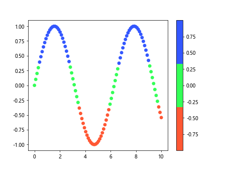
A ListedColormap allows you to specify a custom set of colors for a colormap. Here is an example that creates a ListedColormap with three specified colors:
import numpy as np
import matplotlib.pyplot as plt
from matplotlib.colors import ListedColormap

# Generate some data
x = np.linspace(0, 10, 100)
y = np.sin(x)

colors = ['#FF5733', '#33FF57', '#3357FF']
cmap = ListedColormap(colors)

plt.scatter(x, y, c=y, cmap=cmap)
plt.colorbar()
plt.show()
Output:
Applying Colormaps to Different Plot Types
Colormaps can be applied to various types of plots in Matplotlib, such as scatter plots, line plots, and contour plots. Let’s explore how colormaps can be used in different types of plots:
Scatter Plot
We have already seen an example of using a colormap in a scatter plot. Here is another example that demonstrates how to create a scatter plot with different sizes and colors:
import numpy as np
import matplotlib.pyplot as plt
from matplotlib.colors import ListedColormap

# Generate some data
x = np.linspace(0, 10, 100)
y = np.sin(x)

sizes = np.abs(y) * 100
plt.scatter(x, y, c=y, s=sizes, cmap='plasma')
plt.colorbar()
plt.show()
Output:
Line Plot
Colormaps can also be applied to line plots by changing the colors of the lines based on a colormap. Here is an example that shows how to create a line plot with a colormap:
import numpy as np
import matplotlib.pyplot as plt
from matplotlib.colors import ListedColormap

# Generate some data
x = np.linspace(0, 10, 100)
y = np.sin(x)

plt.plot(x, y, color='black', colormap='plasma')
plt.show()
Contour Plot
Colormaps can be used to colorize contour plots, which are useful for visualizing 3D surfaces on a 2D plot. Here is an example that demonstrates how to create a contour plot with a colormap:
import numpy as np
import matplotlib.pyplot as plt
from matplotlib.colors import ListedColormap

X, Y = np.meshgrid(x, y)
Z = np.sin(X) * np.cos(Y)

plt.contourf(X, Y, Z, cmap='viridis')
plt.colorbar()
plt.show()
Advanced Colormap Customization
In addition to basic colormap customization options, Matplotlib also provides advanced customization options for creating unique and visually appealing colormaps. Let’s explore some of these advanced customization options:
Creating a Custom LinearSegmentedColormap
You can create a custom colormap using the LinearSegmentedColormap class, which allows you to define a colormap using a set of colors and positions. Here is an example that demonstrates how to create a custom colormap:
import matplotlib.pyplot as plt
from matplotlib.colors import LinearSegmentedColormap
import numpy as np
from matplotlib.colors import ListedColormap

# Generate some data
x = np.linspace(0, 10, 100)
y = np.sin(x)

colors = [(0, 'red'), (0.5, 'green'), (1, 'blue')]
cmap = LinearSegmentedColormap.from_list('custom', colors)

plt.scatter(x, y, c=y, cmap=cmap)
plt.colorbar()
plt.show()
Output:
Using Colormap Transformations
Colormap transformations allow you to apply different transformations to the colormap for better color mapping. Here is an example that demonstrates how to use colormap transformations:
import matplotlib.pyplot as plt
import numpy as np
from matplotlib.colors import PowerNorm

# Generate some data
x = np.linspace(0, 10, 100)
y = np.sin(x)

plt.scatter(x, y, c=y, cmap='viridis', norm=PowerNorm(gamma=0.5))
plt.colorbar()
plt.show()
Output:
Setting Colormap Limits
You can set the upper and lower limit of a colormap by using the vmin and vmax parameters. Here is an example that shows how to set the limits of a colormap:
import matplotlib.pyplot as plt
import numpy as np
from matplotlib.colors import PowerNorm

# Generate some data
x = np.linspace(0, 10, 100)
y = np.sin(x)

plt.scatter(x, y, c=y, cmap='viridis', vmin=-1, vmax=1)
plt.colorbar()
plt.show()
Output:
