Mastering Matplotlib Fill Between: A Comprehensive Guide
Matplotlib Fill Between is a powerful feature in the Matplotlib library that allows you to fill the area between two curves or lines on a plot. This technique is particularly useful for visualizing data ranges, confidence intervals, and highlighting specific regions of interest in your plots. In this comprehensive guide, we’ll explore the various aspects of Matplotlib Fill Between, from basic usage to advanced applications, providing you with the knowledge and skills to create stunning and informative visualizations.
Introduction to Matplotlib Fill Between
Matplotlib Fill Between is a versatile tool that enables you to add color or shading to the area between two curves or lines on a plot. This feature is particularly useful when you want to emphasize certain regions of your data or illustrate the difference between two datasets. The fill_between() function in Matplotlib is the primary method for implementing this technique.
Let’s start with a simple example to demonstrate the basic usage of Matplotlib Fill Between:
import matplotlib.pyplot as plt
import numpy as np

x = np.linspace(0, 10, 100)
y1 = np.sin(x)
y2 = np.cos(x)

plt.figure(figsize=(10, 6))
plt.plot(x, y1, label='sin(x)')
plt.plot(x, y2, label='cos(x)')
plt.fill_between(x, y1, y2, alpha=0.3)
plt.title('Matplotlib Fill Between Example - how2matplotlib.com')
plt.xlabel('x')
plt.ylabel('y')
plt.legend()
plt.grid(True)
plt.show()
Output:
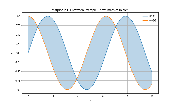
In this example, we create two curves using sine and cosine functions and then use Matplotlib Fill Between to shade the area between them. The alpha parameter controls the transparency of the filled area.
Basic Concepts of Matplotlib Fill Between
Before diving deeper into Matplotlib Fill Between, it’s essential to understand some basic concepts:
- x and y arrays: These are the data points that define the curves or lines between which you want to fill.
- where parameter: This optional parameter allows you to specify conditions for filling only certain regions.
- interpolate: When set to True, this parameter enables interpolation between points for smoother filling.
- alpha: This parameter controls the transparency of the filled area.
- color: You can specify the color of the filled area using various color formats.
Let’s explore these concepts with another example:
import matplotlib.pyplot as plt
import numpy as np

x = np.linspace(0, 10, 100)
y1 = 2 * np.sin(x) + 5
y2 = np.sin(x) + 3

plt.figure(figsize=(10, 6))
plt.plot(x, y1, label='Upper curve')
plt.plot(x, y2, label='Lower curve')
plt.fill_between(x, y1, y2, where=(y1 > y2), color='skyblue', alpha=0.5, interpolate=True)
plt.title('Matplotlib Fill Between with Conditions - how2matplotlib.com')
plt.xlabel('x')
plt.ylabel('y')
plt.legend()
plt.grid(True)
plt.show()
Output:
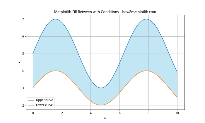
In this example, we use the where parameter to fill only the areas where the upper curve is greater than the lower curve. The interpolate=True argument ensures smooth filling between data points.
Advanced Techniques with Matplotlib Fill Between
Now that we’ve covered the basics, let’s explore some advanced techniques using Matplotlib Fill Between:
1. Multiple Fill Between Regions
You can create multiple fill between regions in a single plot to highlight different areas of interest:
import matplotlib.pyplot as plt
import numpy as np

x = np.linspace(0, 10, 100)
y1 = np.sin(x) + 2
y2 = np.sin(x)
y3 = np.sin(x) - 2

plt.figure(figsize=(10, 6))
plt.plot(x, y1, label='Upper')
plt.plot(x, y2, label='Middle')
plt.plot(x, y3, label='Lower')
plt.fill_between(x, y1, y2, color='lightgreen', alpha=0.5, label='Upper region')
plt.fill_between(x, y2, y3, color='lightblue', alpha=0.5, label='Lower region')
plt.title('Multiple Matplotlib Fill Between Regions - how2matplotlib.com')
plt.xlabel('x')
plt.ylabel('y')
plt.legend()
plt.grid(True)
plt.show()
Output:
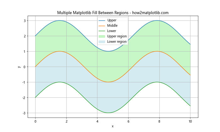
This example demonstrates how to create two distinct filled regions between three curves.
2. Filling Above and Below a Threshold
Matplotlib Fill Between can be used to highlight values above or below a certain threshold:
import matplotlib.pyplot as plt
import numpy as np

x = np.linspace(0, 10, 100)
y = np.sin(x)
threshold = 0.5

plt.figure(figsize=(10, 6))
plt.plot(x, y, label='sin(x)')
plt.axhline(y=threshold, color='r', linestyle='--', label='Threshold')
plt.fill_between(x, y, threshold, where=(y > threshold), color='green', alpha=0.3, label='Above threshold')
plt.fill_between(x, y, threshold, where=(y <= threshold), color='red', alpha=0.3, label='Below threshold')
plt.title('Matplotlib Fill Between with Threshold - how2matplotlib.com')
plt.xlabel('x')
plt.ylabel('y')
plt.legend()
plt.grid(True)
plt.show()
Output:
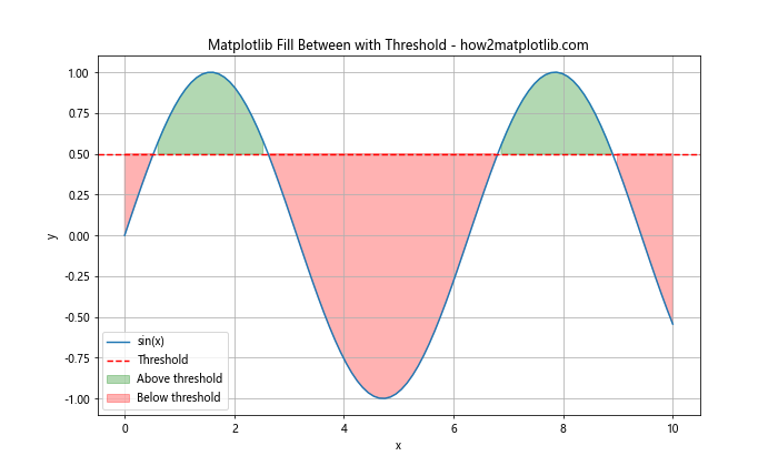
This example shows how to use Matplotlib Fill Between to highlight regions above and below a specified threshold value.
3. Creating Confidence Intervals
Matplotlib Fill Between is particularly useful for visualizing confidence intervals:
import matplotlib.pyplot as plt
import numpy as np

x = np.linspace(0, 10, 100)
y = np.sin(x)
y_err = 0.2 * np.random.random(len(x))

plt.figure(figsize=(10, 6))
plt.plot(x, y, label='Data')
plt.fill_between(x, y - y_err, y + y_err, alpha=0.3, label='Confidence interval')
plt.title('Confidence Interval using Matplotlib Fill Between - how2matplotlib.com')
plt.xlabel('x')
plt.ylabel('y')
plt.legend()
plt.grid(True)
plt.show()
Output:
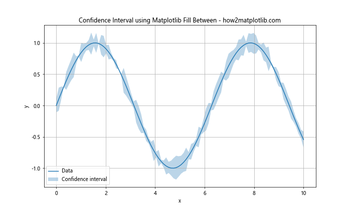
This example demonstrates how to create a simple confidence interval visualization using Matplotlib Fill Between.
Customizing Matplotlib Fill Between
Matplotlib Fill Between offers various customization options to enhance your visualizations:
1. Changing Fill Styles
You can modify the fill style using the hatch parameter:
import matplotlib.pyplot as plt
import numpy as np

x = np.linspace(0, 10, 100)
y1 = np.sin(x) + 2
y2 = np.sin(x)

plt.figure(figsize=(10, 6))
plt.plot(x, y1, label='Upper')
plt.plot(x, y2, label='Lower')
plt.fill_between(x, y1, y2, hatch='///', alpha=0.3, label='Filled region')
plt.title('Matplotlib Fill Between with Custom Fill Style - how2matplotlib.com')
plt.xlabel('x')
plt.ylabel('y')
plt.legend()
plt.grid(True)
plt.show()
Output:
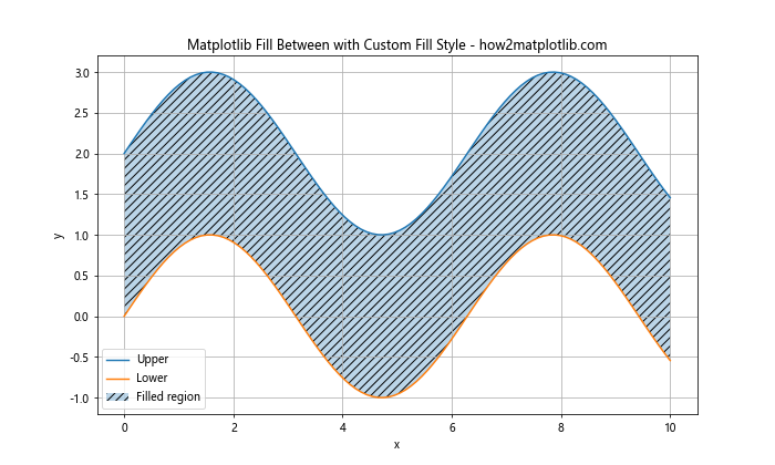
This example shows how to use a hatched fill style for the area between two curves.
2. Gradient Fill
You can create a gradient fill effect using Matplotlib Fill Between:
import matplotlib.pyplot as plt
import numpy as np
from matplotlib.colors import LinearSegmentedColormap

x = np.linspace(0, 10, 100)
y1 = np.sin(x) + 2
y2 = np.sin(x)

colors = ['#ff9999', '#66b3ff']
n_bins = 100
cmap = LinearSegmentedColormap.from_list('custom', colors, N=n_bins)

plt.figure(figsize=(10, 6))
plt.plot(x, y1, color='red', label='Upper')
plt.plot(x, y2, color='blue', label='Lower')

for i in range(n_bins):
    y = y2 + (y1 - y2) * i / n_bins
    plt.fill_between(x, y2, y, color=cmap(i / n_bins), alpha=0.1)

plt.title('Matplotlib Fill Between with Gradient Fill - how2matplotlib.com')
plt.xlabel('x')
plt.ylabel('y')
plt.legend()
plt.grid(True)
plt.show()
Output:
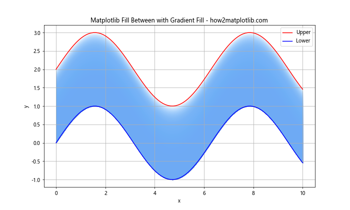
This example demonstrates how to create a gradient fill effect between two curves using Matplotlib Fill Between.
Combining Matplotlib Fill Between with Other Plot Types
Matplotlib Fill Between can be combined with other plot types to create more complex visualizations:
1. Fill Between with Scatter Plot
import matplotlib.pyplot as plt
import numpy as np

x = np.linspace(0, 10, 50)
y1 = 2 * np.sin(x) + np.random.random(50) * 0.5
y2 = np.sin(x) + np.random.random(50) * 0.5

plt.figure(figsize=(10, 6))
plt.fill_between(x, y1, y2, alpha=0.3, label='Filled region')
plt.scatter(x, y1, color='red', label='Upper points')
plt.scatter(x, y2, color='blue', label='Lower points')
plt.title('Matplotlib Fill Between with Scatter Plot - how2matplotlib.com')
plt.xlabel('x')
plt.ylabel('y')
plt.legend()
plt.grid(True)
plt.show()
Output:
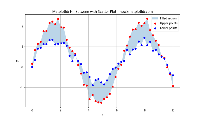
This example demonstrates how to combine Matplotlib Fill Between with a scatter plot to visualize data points and the region between them.
2. Fill Between with Bar Plot
import matplotlib.pyplot as plt
import numpy as np

categories = ['A', 'B', 'C', 'D', 'E']
values1 = [4, 7, 3, 8, 5]
values2 = [2, 5, 1, 6, 3]

x = np.arange(len(categories))
width = 0.35

fig, ax = plt.subplots(figsize=(10, 6))
rects1 = ax.bar(x - width/2, values1, width, label='Group 1')
rects2 = ax.bar(x + width/2, values2, width, label='Group 2')

ax.fill_between(x, values1, values2, alpha=0.3, label='Difference')

ax.set_ylabel('Values')
ax.set_title('Matplotlib Fill Between with Bar Plot - how2matplotlib.com')
ax.set_xticks(x)
ax.set_xticklabels(categories)
ax.legend()

plt.show()
Output:
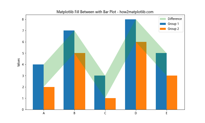
This example shows how to use Matplotlib Fill Between in combination with a bar plot to highlight the difference between two groups of data.
Handling Time Series Data with Matplotlib Fill Between
Matplotlib Fill Between is particularly useful for visualizing time series data:
import matplotlib.pyplot as plt
import pandas as pd
import numpy as np

# Generate sample time series data
dates = pd.date_range(start='2023-01-01', end='2023-12-31', freq='D')
values = np.cumsum(np.random.randn(len(dates))) + 10
df = pd.DataFrame({'Date': dates, 'Value': values})

# Calculate moving average
df['MA'] = df['Value'].rolling(window=30).mean()

plt.figure(figsize=(12, 6))
plt.plot(df['Date'], df['Value'], label='Daily value')
plt.plot(df['Date'], df['MA'], label='30-day Moving Average', color='red')
plt.fill_between(df['Date'], df['Value'], df['MA'], where=(df['Value'] > df['MA']),
                 color='green', alpha=0.3, label='Above MA')
plt.fill_between(df['Date'], df['Value'], df['MA'], where=(df['Value'] <= df['MA']),
                 color='red', alpha=0.3, label='Below MA')

plt.title('Time Series with Matplotlib Fill Between - how2matplotlib.com')
plt.xlabel('Date')
plt.ylabel('Value')
plt.legend()
plt.grid(True)
plt.show()
Output:
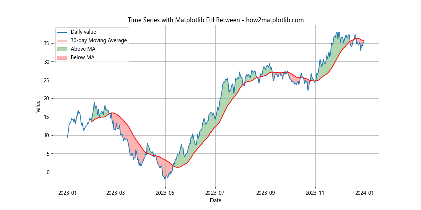
This example demonstrates how to use Matplotlib Fill Between to highlight regions where a time series is above or below its moving average.
Creating Stacked Area Charts with Matplotlib Fill Between
Matplotlib Fill Between can be used to create stacked area charts, which are useful for visualizing the composition of a whole over time:
import matplotlib.pyplot as plt
import numpy as np

x = np.linspace(0, 10, 100)
y1 = np.sin(x) + 1
y2 = np.sin(x + np.pi/4) + 2
y3 = np.sin(x + np.pi/2) + 3

plt.figure(figsize=(10, 6))
plt.fill_between(x, 0, y1, label='Area 1', alpha=0.5)
plt.fill_between(x, y1, y1+y2, label='Area 2', alpha=0.5)
plt.fill_between(x, y1+y2, y1+y2+y3, label='Area 3', alpha=0.5)

plt.title('Stacked Area Chart using Matplotlib Fill Between - how2matplotlib.com')
plt.xlabel('x')
plt.ylabel('y')
plt.legend()
plt.grid(True)
plt.show()
Output:
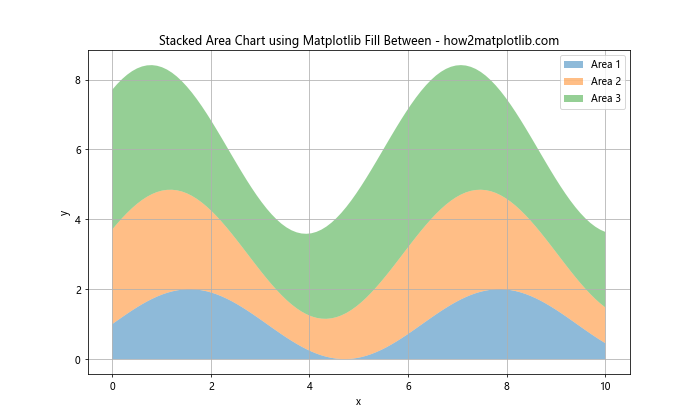
This example shows how to create a stacked area chart using Matplotlib Fill Between, which is useful for visualizing the contribution of different components to a total.
Matplotlib Fill Between for Data Comparison
Matplotlib Fill Between can be an effective tool for comparing different datasets or highlighting the differences between them:
import matplotlib.pyplot as plt
import numpy as np

x = np.linspace(0, 10, 100)
y1 = np.sin(x)
y2 = np.sin(x + 0.5)

plt.figure(figsize=(10, 6))
plt.plot(x, y1, label='Dataset 1')
plt.plot(x, y2, label='Dataset 2')
plt.fill_between(x, y1, y2, where=(y1 > y2), color='green', alpha=0.3, label='Dataset 1 > Dataset 2')
plt.fill_between(x, y1, y2, where=(y1 <= y2), color='red', alpha=0.3, label='Dataset 1 <= Dataset 2')

plt.title('Data Comparison using Matplotlib Fill Between - how2matplotlib.com')
plt.xlabel('x')
plt.ylabel('y')
plt.legend()
plt.grid(True)
plt.show()
Output:
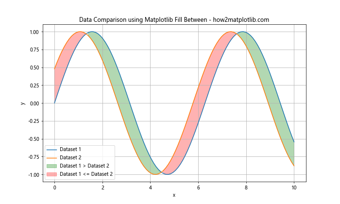
This example demonstrates how to use Matplotlib Fill Between to compare two datasets, highlighting the regions where one dataset is greater than the other.
Matplotlib Fill Between for Error Visualization
Matplotlib Fill Between is an excellent tool for visualizing error ranges or uncertainty in data:
import matplotlib.pyplot as plt
import numpy as np

x = np.linspace(0, 10, 50)
y = np.sin(x)
y_err = 0.1 + 0.1 * np.random.random(len(x))

plt.figure(figsize=(10, 6))
plt.plot(x, y, label='Data')
plt.fill_between(x, y - y_err, y + y_err, alpha=0.3, label='Error range')
plt.errorbar(x, y, yerr=y_err, fmt='o', color='red', alpha=0.5, label='Error bars')

plt.title('Error Visualization using Matplotlib Fill Between - how2matplotlib.com')
plt.xlabel('x')
plt.ylabel('y')
plt.legend()
plt.grid(True)
plt.show()
Output:
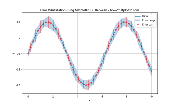
This example shows how to use Matplotlib Fill Between to create a shaded error range around a data series, combined with traditional error bars for comparison.
Matplotlib Fill Between for Highlighting Specific Regions
You can use Matplotlib Fill Between to highlight specific regions of interest in your plots:
import matplotlib.pyplot as plt
import numpy as np

x = np.linspace(0, 10, 100)
y = np.sin(x)

plt.figure(figsize=(10, 6))
plt.plot(x, y, label='sin(x)')

# Highlight specific regions
regions = [(1, 3), (5, 7), (8, 9)]
colors = ['yellow', 'lightgreen', 'lightblue']

for (start, end), color in zip(regions, colors):
    plt.axvspan(start, end, color=color, alpha=0.3)
    plt.fill_between(x, y, where=((x >= start) & (x <= end)), color=color, alpha=0.3)

plt.title('Highlighting Regions with Matplotlib Fill Between - how2matplotlib.com')
plt.xlabel('x')
plt.ylabel('y')
plt.legend()
plt.grid(True)
plt.show()
Output:
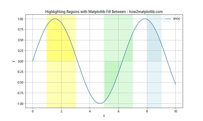
This example demonstrates how to use Matplotlib Fill Between to highlight specific regions of a plot, which can be useful for drawing attention to particular areas of interest.
Matplotlib Fill Between for Probability Distributions
Matplotlib Fill Between can be used to visualize probability distributions and their cumulative density functions:
import matplotlib.pyplot as plt
import numpy as np
from scipy.stats import norm

x = np.linspace(-4, 4, 100)
y = norm.pdf(x)
cdf = norm.cdf(x)

plt.figure(figsize=(10, 6))
plt.plot(x, y, label='PDF')
plt.plot(x, cdf, label='CDF')
plt.fill_between(x, y, alpha=0.3, label='PDF area')
plt.fill_between(x, 0, cdf, alpha=0.3, label='CDF area')

plt.title('Probability Distribution Visualization with Matplotlib Fill Between - how2matplotlib.com')
plt.xlabel('x')
plt.ylabel('Probability')
plt.legend()
plt.grid(True)
plt.show()
Output:
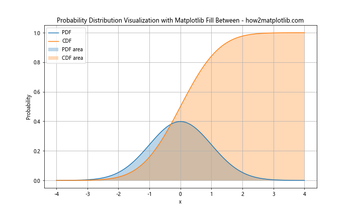
This example shows how to use Matplotlib Fill Between to visualize both the probability density function (PDF) and cumulative distribution function (CDF) of a normal distribution.
Matplotlib Fill Between for Financial Data Visualization
Matplotlib Fill Between can be particularly useful for visualizing financial data, such as stock prices and trading ranges:
import matplotlib.pyplot as plt
import numpy as np
import pandas as pd

# Generate sample stock data
dates = pd.date_range(start='2023-01-01', end='2023-12-31', freq='B')
prices = np.cumsum(np.random.randn(len(dates))) + 100
high = prices + np.random.rand(len(dates)) * 5
low = prices - np.random.rand(len(dates)) * 5

plt.figure(figsize=(12, 6))
plt.plot(dates, prices, label='Closing Price')
plt.fill_between(dates, low, high, alpha=0.3, label='Trading Range')

plt.title('Stock Price Visualization with Matplotlib Fill Between - how2matplotlib.com')
plt.xlabel('Date')
plt.ylabel('Price')
plt.legend()
plt.grid(True)
plt.show()
Output:
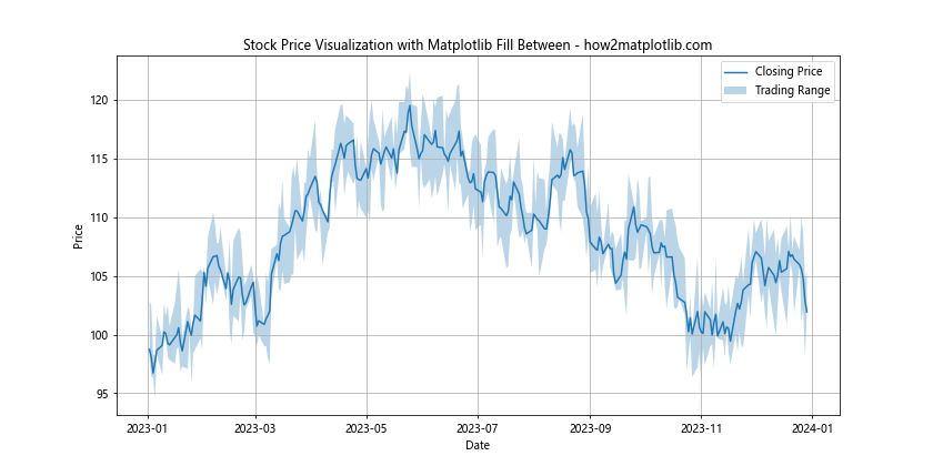
This example demonstrates how to use Matplotlib Fill Between to visualize the trading range of a stock, with the closing price shown as a line plot.
Advanced Matplotlib Fill Between Techniques
Let's explore some advanced techniques using Matplotlib Fill Between:
1. Stepped Fill Between
You can create a stepped fill between effect using the step function:
import matplotlib.pyplot as plt
import numpy as np

x = np.arange(0, 10, 1)
y1 = np.random.randint(1, 10, 10)
y2 = y1 + np.random.randint(1, 5, 10)

fig, ax = plt.subplots(figsize=(10, 6))
ax.step(x, y1, where='post', label='Lower')
ax.step(x, y2, where='post', label='Upper')
ax.fill_between(x, y1, y2, alpha=0.3, step='post', label='Filled Region')

plt.title('Stepped Fill Between using Matplotlib - how2matplotlib.com')
plt.xlabel('x')
plt.ylabel('y')
plt.legend()
plt.grid(True)
plt.show()
Output:
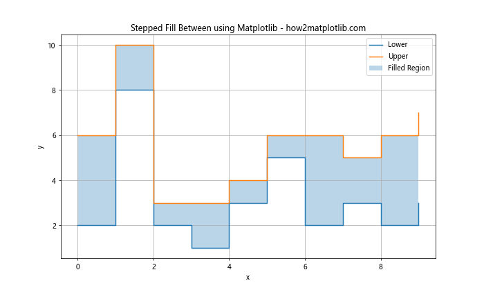
This example shows how to create a stepped fill between effect, which can be useful for visualizing discrete data or changes over time.
2. Polar Plot with Fill Between
Matplotlib Fill Between can also be used with polar plots:
import matplotlib.pyplot as plt
import numpy as np

theta = np.linspace(0, 2*np.pi, 100)
r1 = 2 + np.sin(5*theta)
r2 = 1 + np.sin(3*theta)

fig, ax = plt.subplots(figsize=(8, 8), subplot_kw=dict(projection='polar'))
ax.plot(theta, r1)
ax.plot(theta, r2)
ax.fill_between(theta, r1, r2, alpha=0.3)

plt.title('Polar Plot with Matplotlib Fill Between - how2matplotlib.com')
plt.show()
Output:
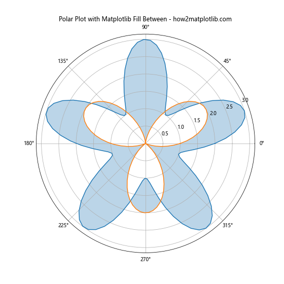
This example demonstrates how to use Matplotlib Fill Between in a polar plot, which can be useful for visualizing directional or cyclical data.
3. Animated Fill Between
You can create animated visualizations using Matplotlib Fill Between:
import matplotlib.pyplot as plt
import numpy as np
from matplotlib.animation import FuncAnimation

fig, ax = plt.subplots(figsize=(10, 6))
x = np.linspace(0, 2*np.pi, 200)
line, = ax.plot(x, np.sin(x))
fill = ax.fill_between(x, np.sin(x), alpha=0.3)

def update(frame):
    y = np.sin(x + frame/10)
    line.set_ydata(y)
    fill.remove()
    ax.fill_between(x, y, alpha=0.3)
    return line, fill

ani = FuncAnimation(fig, update, frames=np.linspace(0, 2*np.pi, 100),
                    blit=True, interval=50)

plt.title('Animated Matplotlib Fill Between - how2matplotlib.com')
plt.xlabel('x')
plt.ylabel('y')
plt.show()
Output:
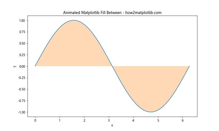
This example shows how to create an animated fill between effect, which can be useful for visualizing dynamic data or creating interactive visualizations.
Best Practices for Using Matplotlib Fill Between
When using Matplotlib Fill Between, consider the following best practices:
- Choose appropriate colors: Use colors that complement each other and don't overwhelm the viewer. Consider using alpha values to make the filled areas semi-transparent.
Label your plots: Always include clear labels for axes, titles, and legends to make your visualizations easy to understand.
Use consistent styles: If you're creating multiple plots, maintain a consistent style across all of them for a professional look.
Consider data density: For dense datasets, you may want to use interpolation or smoothing techniques to create cleaner fill between areas.
Combine with other plot types: Don't hesitate to combine fill between with other plot types like scatter plots, line plots, or bar charts to create more informative visualizations.
Use for appropriate data types: Fill between is particularly useful for continuous data, time series, and ranges. Make sure it's the right choice for your data type.
Be mindful of overlapping regions: When using multiple fill between areas, consider how they overlap and whether this affects the interpretation of your data.
Matplotlib Fill Between Conclusion
Matplotlib Fill Between is a versatile and powerful tool for data visualization. From basic area plots to complex, multi-layered visualizations, it offers a wide range of possibilities for highlighting and comparing data. By mastering the techniques and best practices outlined in this guide, you'll be well-equipped to create informative and visually appealing plots using Matplotlib Fill Between. Remember to experiment with different combinations of colors, styles, and plot types to find the most effective way to communicate your data. Whether you're working with financial data, scientific measurements, or any other type of continuous data, Matplotlib Fill Between can help you create compelling visualizations that effectively convey your message.