Matplotlib Hist
Matplotlib is a popular library in Python used for creating various types of plots. One of the most commonly used plots in Matplotlib is the histogram. A histogram is a graphical representation of the distribution of numerical data. It consists of a series of bars or bins, each representing a range of values, and the height of each bar corresponds to the frequency of occurrences within that range.
In this article, we will explore how to create histograms using Matplotlib. We will cover different customization options, such as setting the number of bins, colors, and styles. We will also demonstrate how to add labels, titles, and legends to the histogram plots.
Basic Histogram
Let’s start by creating a basic histogram using random data. We will generate 1000 random numbers and plot a histogram to visualize the distribution.
import matplotlib.pyplot as plt
import numpy as np

data = np.random.randn(1000)

plt.hist(data, bins=30, color='skyblue', edgecolor='black')
plt.title('Histogram of Random Data')
plt.xlabel('Value')
plt.ylabel('Frequency')
plt.show()
Output:
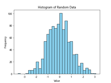
In the above code, we used np.random.randn() to generate 1000 random numbers from a standard normal distribution. We then used plt.hist() to create a histogram with 30 bins, set the color to ‘skyblue’, and the edgecolor to ‘black’. Finally, we added a title, xlabel, and ylabel to the plot.
Customizing Histogram
Number of Bins
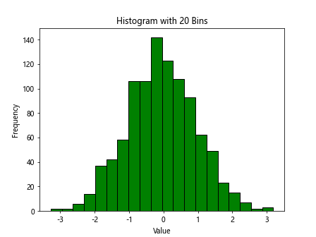
You can control the number of bins in the histogram by specifying the bins parameter in the plt.hist() function. Let’s create a histogram with 20 bins for the same random data.
import matplotlib.pyplot as plt
import numpy as np

data = np.random.randn(1000)

plt.hist(data, bins=20, color='green', edgecolor='black')
plt.title('Histogram with 20 Bins')
plt.xlabel('Value')
plt.ylabel('Frequency')
plt.show()
Output:
Colors and Styles
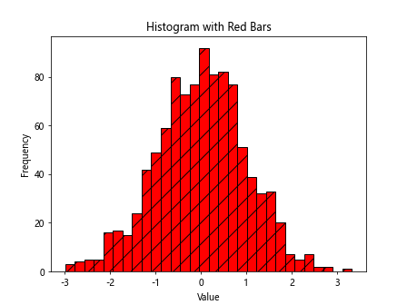
You can customize the colors and styles of the histogram bars. Here, we will create a histogram with red bars filled with a diagonal hatch pattern.
import matplotlib.pyplot as plt
import numpy as np

data = np.random.randn(1000)

plt.hist(data, bins=30, color='red', edgecolor='black', hatch='/', histtype='bar')
plt.title('Histogram with Red Bars')
plt.xlabel('Value')
plt.ylabel('Frequency')
plt.show()
Output:
Multiple Histograms
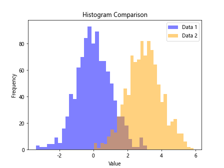
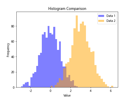
You can plot multiple histograms on the same figure to compare different datasets. Let’s create two histograms with different colors and overlay them on a single plot.
import matplotlib.pyplot as plt
import numpy as np

data = np.random.randn(1000)
data1 = np.random.randn(1000)
data2 = np.random.normal(loc=3, scale=1, size=1000)

plt.hist(data1, bins=30, color='blue', alpha=0.5, label='Data 1')
plt.hist(data2, bins=30, color='orange', alpha=0.5, label='Data 2')
plt.legend()
plt.title('Histogram Comparison')
plt.xlabel('Value')
plt.ylabel('Frequency')
plt.show()
Output:
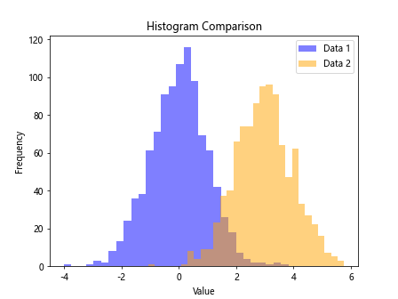
Adding Labels and Titles
Adding Title
You can add a title to the histogram plot using the plt.title() function. Let’s add a title to the previous histogram comparison plot.
import matplotlib.pyplot as plt
import numpy as np

data = np.random.randn(1000)
data1 = np.random.randn(1000)
data2 = np.random.normal(loc=3, scale=1, size=1000)

plt.hist(data1, bins=30, color='blue', alpha=0.5, label='Data 1')
plt.hist(data2, bins=30, color='orange', alpha=0.5, label='Data 2')
plt.legend()
plt.title('Histogram Comparison')
plt.xlabel('Value')
plt.ylabel('Frequency')
plt.show()
Output:
Adding Labels
You can add labels to the x-axis and y-axis using the plt.xlabel() and plt.ylabel() functions, respectively. Let’s add labels to the previous histogram comparison plot.
import matplotlib.pyplot as plt
import numpy as np

data = np.random.randn(1000)
data1 = np.random.randn(1000)
data2 = np.random.normal(loc=3, scale=1, size=1000)

plt.hist(data1, bins=30, color='blue', alpha=0.5, label='Data 1')
plt.hist(data2, bins=30, color='orange', alpha=0.5, label='Data 2')
plt.legend()
plt.title('Histogram Comparison')
plt.xlabel('Value')
plt.ylabel('Frequency')
plt.show()
Output:
Matplotlib Hist Conclusion
In this article, we have covered the basics of creating histograms using Matplotlib in Python. We explored different customization options such as setting the number of bins, colors, and styles. We also demonstrated how to add labels, titles, and legends to the histogram plots. By learning how to create and customize histograms, you can effectively visualize and analyze your data distribution in Python using Matplotlib.