Matplotlib Bar
Matplotlib is a popular open-source Python library for data visualization. One of the commonly used plot types in Matplotlib is the bar plot, which is used to display categorical data with rectangular bars. In this article, we will explore how to create bar plots using Matplotlib and discuss different customization options available.
Basic Bar Plot in Matplotlib
Let’s start by creating a basic bar plot using Matplotlib. We will use random data for demonstration.
import matplotlib.pyplot as plt
import numpy as np

# Data
categories = ['A', 'B', 'C', 'D', 'E']
values = [23, 45, 56, 78, 33]

# Create bar plot
plt.bar(categories, values)

# Add labels
plt.xlabel('Categories')
plt.ylabel('Values')
plt.title('Basic Bar Plot')
plt.show()
Output:
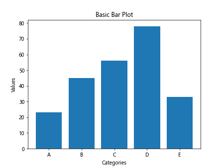
The above code will generate a simple bar plot with five categories (A, B, C, D, E) and their corresponding values.
Customizing Bar Plot
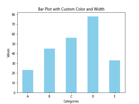
Customizing Color and Width
You can customize the color and width of the bars in a bar plot.
import matplotlib.pyplot as plt
import numpy as np

# Data
categories = ['A', 'B', 'C', 'D', 'E']
values = [23, 45, 56, 78, 33]

# Create bar plot with custom color and width
plt.bar(categories, values, color='skyblue', width=0.5)

# Add labels
plt.xlabel('Categories')
plt.ylabel('Values')
plt.title('Bar Plot with Custom Color and Width')
plt.show()
Output:
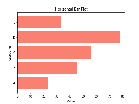
Horizontal Bar Plot
You can also create a horizontal bar plot by using the barh function in Matplotlib.
import matplotlib.pyplot as plt
import numpy as np

# Data
categories = ['A', 'B', 'C', 'D', 'E']
values = [23, 45, 56, 78, 33]

# Create horizontal bar plot
plt.barh(categories, values, color='salmon')

# Add labels
plt.xlabel('Values')
plt.ylabel('Categories')
plt.title('Horizontal Bar Plot')
plt.show()
Output:
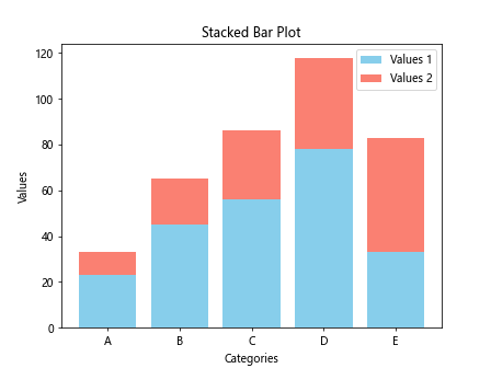
Stacked Bar Plot
You can create a stacked bar plot to display multiple datasets together.
import matplotlib.pyplot as plt
import numpy as np

# Data
categories = ['A', 'B', 'C', 'D', 'E']
values1 = [23, 45, 56, 78, 33]
values2 = [10, 20, 30, 40, 50]

# Create stacked bar plot
plt.bar(categories, values1, color='skyblue', label='Values 1')
plt.bar(categories, values2, color='salmon', label='Values 2', bottom=values1)

# Add labels
plt.xlabel('Categories')
plt.ylabel('Values')
plt.title('Stacked Bar Plot')
plt.legend()
plt.show()
Output:
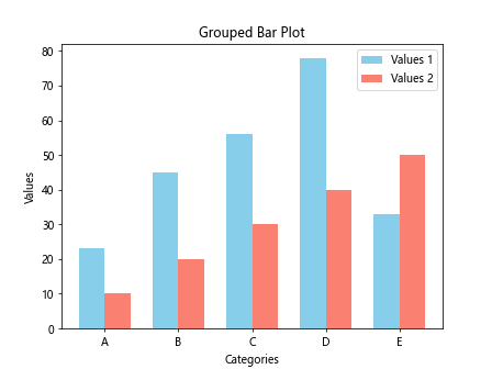
Grouped Bar Plot
You can create a grouped bar plot to display multiple datasets side by side.
import matplotlib.pyplot as plt
import numpy as np

# Data
categories = ['A', 'B', 'C', 'D', 'E']
values1 = [23, 45, 56, 78, 33]
values2 = [10, 20, 30, 40, 50]

# Create grouped bar plot
bar_width = 0.35
plt.bar(np.arange(len(categories)), values1, bar_width, color='skyblue', label='Values 1')
plt.bar(np.arange(len(categories)) + bar_width, values2, bar_width, color='salmon', label='Values 2')

# Add labels
plt.xlabel('Categories')
plt.ylabel('Values')
plt.title('Grouped Bar Plot')
plt.xticks(np.arange(len(categories)) + bar_width / 2, categories)
plt.legend()
plt.show()
Output:
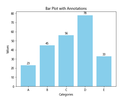
Adding Annotations
You can add annotations to a bar plot to provide additional information.
import matplotlib.pyplot as plt
import numpy as np

# Data
categories = ['A', 'B', 'C', 'D', 'E']
values = [23, 45, 56, 78, 33]

# Create bar plot
plt.bar(categories, values, color='skyblue')

# Add annotations
for i, v in enumerate(values):
    plt.text(i, v + 1, str(v), ha='center')

# Add labels
plt.xlabel('Categories')
plt.ylabel('Values')
plt.title('Bar Plot with Annotations')
plt.show()
Output:
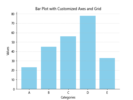
Customizing Axes and Grid
You can customize the appearance of axes and gridlines in a bar plot.
import matplotlib.pyplot as plt
import numpy as np

# Data
categories = ['A', 'B', 'C', 'D', 'E']
values = [23, 45, 56, 78, 33]

# Create bar plot
plt.bar(categories, values, color='skyblue')

# Customize axes and grid
plt.grid(axis='y', linestyle='--', alpha=0.5)
plt.gca().spines['top'].set_visible(False)
plt.gca().spines['right'].set_visible(False)

# Add labels
plt.xlabel('Categories')
plt.ylabel('Values')
plt.title('Bar Plot with Customized Axes and Grid')
plt.show()
Output:
Matplotlib Bar Conclusion
In this article, we have explored the basics of creating bar plots in Matplotlib. We have covered different customization options such as colors, widths, orientations, stacking, grouping, annotations, axes, and gridlines. By using these techniques, you can create visually appealing and informative bar plots for your data visualization needs.