Colormap in Matplotlib

Colormap in Matplotlib

Colormap is an important component in data visualization using Matplotlib. It represents the mapping between values and colors in a plot, helping to highlight patterns and trends in the data. In this article, we will explore various aspects of colormaps in Matplotlib and how to use them effectively in different types of plots.

Introduction to Colormaps

Colormaps are used to assign colors to different values in a plot, creating a visual representation of the data. Matplotlib provides a wide range of built-in colormaps that can be easily applied to various types of plots. Let’s start by looking at some basic colormaps and how to use them in a simple plot.

Example 1: Using the viridis Colormap

import matplotlib.pyplot as plt
import numpy as np

x = np.linspace(0, 10, 100)
y = np.sin(x)

plt.figure()
plt.scatter(x, y, c=y, cmap='viridis')
plt.colorbar()
plt.show()

Output:

Colormap in Matplotlib

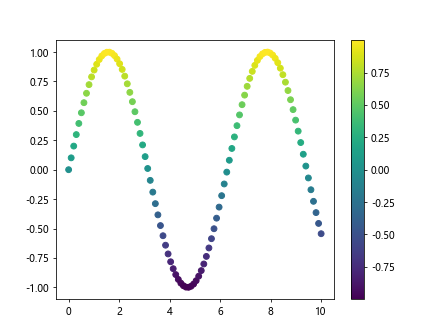
In this example, we create a scatter plot of y values using the viridis colormap. The c parameter specifies the colors based on the y values, and cmap='viridis' sets the colormap to viridis. The plt.colorbar() function adds a color bar to the plot, indicating the mapping between colors and values.

Example 2: Changing Colormap with set_cmap

import matplotlib.pyplot as plt
import numpy as np

x = np.linspace(0, 10, 100)
y = np.sin(x)

plt.figure()
plt.scatter(x, y, c=y, cmap='plasma')
plt.colorbar()
plt.set_cmap('plasma_r')
plt.show()

Output:

Colormap in Matplotlib

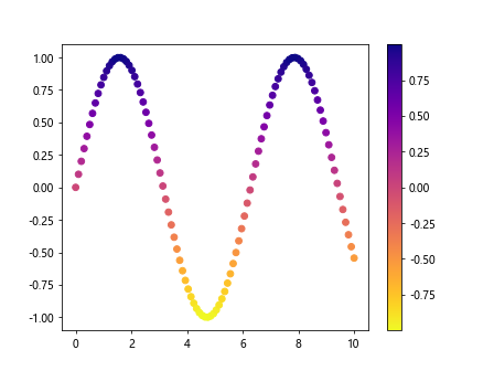
In this example, we first create a scatter plot with the plasma colormap. Then, we change the colormap to plasma_r using the set_cmap function. This function allows us to dynamically change the colormap of a plot after it has been created.

List of Built-In Colormaps

Matplotlib provides a variety of built-in colormaps that can be used for different purposes. Here are some popular colormaps and their visual representations:

  1. Viridis

  2. Plasma

  3. Inferno

  4. Magma

  5. Cividis

Example 3: Using the inferno Colormap

import matplotlib.pyplot as plt
import numpy as np

x = np.linspace(0, 10, 100)
y = np.sin(x)

plt.figure()
plt.plot(x, y, color='blue', cmap='inferno')
plt.show()

In this example, we create a line plot with the inferno colormap, which provides a visually appealing color scheme for the plot.

Setting Colormap Limits

In some cases, you may want to adjust the range of values mapped to colors in a plot. Matplotlib allows you to set the limits of the colormap using the vmin and vmax parameters. Let’s see how to do this with an example.

Example 4: Setting Colormap Limits

import matplotlib.pyplot as plt
import numpy as np

x = np.linspace(0, 10, 100)
y = np.sin(x)

plt.figure()
plt.scatter(x, y, c=y, cmap='viridis', vmin=-1, vmax=1)
plt.colorbar()
plt.show()

Output:

Colormap in Matplotlib

In this example, we set the colormap limits to -1 and 1 using the vmin and vmax parameters. This ensures that the colors in the plot are mapped to values within the specified range.

Creating Custom Colormaps

In addition to using built-in colormaps, you can also create custom colormaps in Matplotlib. Custom colormaps allow you to define specific color schemes tailored to your data visualization needs. Let’s create a custom colormap using the LinearSegmentedColormap class.

Example 5: Creating a Custom Colormap

import matplotlib.colors as mcolors
import matplotlib.pyplot as plt
import numpy as np

x = np.linspace(0, 10, 100)
y = np.sin(x)

colors = ['#FF0000', '#00FF00', '#0000FF']  # Red, Green, Blue
cmap_custom = mcolors.LinearSegmentedColormap.from_list('custom', colors)

plt.figure()
plt.scatter(x, y, c=y, cmap=cmap_custom)
plt.colorbar()
plt.show()

Output:

Colormap in Matplotlib

In this example, we define a custom colormap with the colors red, green, and blue. We then create a scatter plot using this custom colormap, providing a unique color scheme for the plot.

Using Colormaps in Different Types of Plots

Colormaps can be applied to various types of plots in Matplotlib, such as scatter plots, line plots, contour plots, and more. Let’s explore how to use colormaps in different types of plots with examples.

Example 6: Using Colormaps in a Contour Plot

import matplotlib.pyplot as plt
import numpy as np

x = np.linspace(0, 10, 100)
y = np.sin(x)

X, Y = np.meshgrid(np.linspace(-5, 5, 100), np.linspace(-5, 5, 100))
Z = np.sin(np.sqrt(X**2 + Y**2))

plt.figure()
plt.contourf(X, Y, Z, cmap='coolwarm')
plt.colorbar()
plt.show()

Output:

Colormap in Matplotlib

In this example, we create a contour plot of the sin function using the coolwarm colormap. The contourf function is used to fill the contours with colors based on the colormap.

Example 7: Using Colormaps in a 3D Plot

import matplotlib.pyplot as plt
import numpy as np
from mpl_toolkits.mplot3d import Axes3D

X, Y = np.meshgrid(np.linspace(-5, 5, 100), np.linspace(-5, 5, 100))

fig = plt.figure()
ax = fig.add_subplot(111, projection='3d')

ax.plot_surface(X, Y, Z, cmap='bone')
plt.colorbar()
plt.show()

In this example, we create a 3D surface plot using the bone colormap. The plot_surface function is used to plot the surface with colors based on the colormap.

Example 8: Using Colormaps in a Histogram

import matplotlib.pyplot as plt
import numpy as np

data = np.random.randn(1000)

plt.figure()
plt.hist(data, bins=30, color='blue', cmap='viridis')
plt.colorbar()
plt.show()

In this example, we create a histogram of random data using the viridis colormap. The hist function is used to plot the histogram with colors based on the colormap.

Colormap in Matplotlib Conclusion

In this article, we have explored the concept of colormaps in Matplotlib and how to effectively use them in different types of plots. We have covered basic colormaps, setting colormap limits, creating custom colormaps, and using colormaps in various plots. By understanding colormaps and their applications, you can enhance the visual representation of your data and gain valuable insights from your plots. Experiment with different colormaps and techniques to find the best visualizations for your data analysis projects.

Like(0)