Understanding Colormaps in Matplotlib
In Matplotlib, colormaps (cmaps) are used to map scalar data values to colors. Colormaps play an important role in data visualization as they can help convey information effectively through color coding. In this article, we will explore the different types of colormaps available in Matplotlib and how to use them in your plots.
Basic Usage of Colormaps
Let’s start by creating a simple scatter plot using a colormap to represent the values of the data points. In this example, we will use the ‘viridis’ colormap, which is one of the perceptually uniform colormaps in Matplotlib.
import numpy as np
import matplotlib.pyplot as plt

# Create random data
x = np.random.rand(100)
y = np.random.rand(100)
colors = np.random.rand(100)

# Plot data with colormap
plt.scatter(x, y, c=colors, cmap='viridis')
plt.colorbar()
plt.show()
Output:
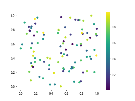
In the above code, we generate random data points and assign random colors to them. By using the ‘viridis’ colormap, the scatter plot conveys the data values through colors. The plt.colorbar() function adds a colorbar to the plot, which provides a reference for the mapping of data values to colors.
Available Colormaps in Matplotlib
Matplotlib provides a wide range of colormaps that cater to different visualization needs. Here are some commonly used colormaps:
- ‘viridis’: A perceptually uniform colormap designed for better readability.
- ‘plasma’: Another perceptually uniform colormap with different color transitions.
- ‘inferno’: A colormap with a dark background, suitable for highlighting data points.
- ‘magma’: A colormap optimized for black and white printing with distinct colors.
- ‘cividis’: A colorblind-friendly colormap designed to be easily distinguishable.
Let’s visualize these colormaps in a subplot to compare their color transitions.
import matplotlib.pyplot as plt

cmaps = ['viridis', 'plasma', 'inferno', 'magma', 'cividis']

fig, axs = plt.subplots(1, len(cmaps), figsize=(15, 3))

for i, cmap in enumerate(cmaps):
    ax = axs[i]
    im = ax.imshow([[i, i + 1]], cmap=cmap)
    ax.set_title(cmap)
    fig.colorbar(im, ax=ax)

plt.show()
Output:
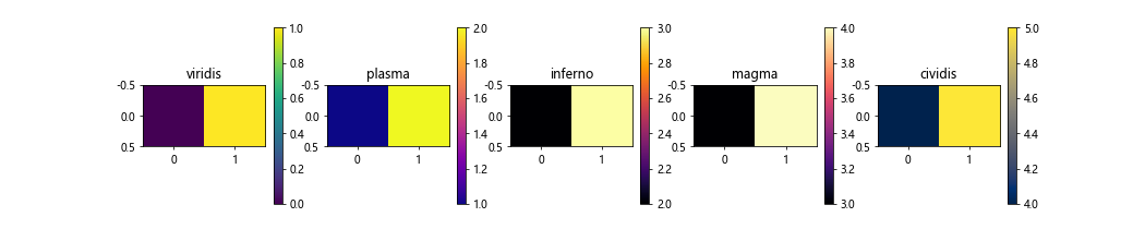
The above code creates subplots for each colormap, allowing us to see the distinct color transitions and styles of each. This comparison can help in choosing the most suitable colormap for your data visualization.
Customizing Colormaps
Matplotlib also allows you to create custom colormaps by specifying the colors and their positions in the colormap. Let’s create a custom colormap using a list of colors.
import matplotlib.pyplot as plt
from matplotlib.colors import LinearSegmentedColormap

colors = [(0, 'red'), (0.5, 'green'), (1, 'blue')]  # Red to green to blue gradient
cmap = LinearSegmentedColormap.from_list('custom_cmap', colors)

data = [[1, 2], [3, 4]]

plt.imshow(data, cmap=cmap)
plt.colorbar()
plt.show()
Output:
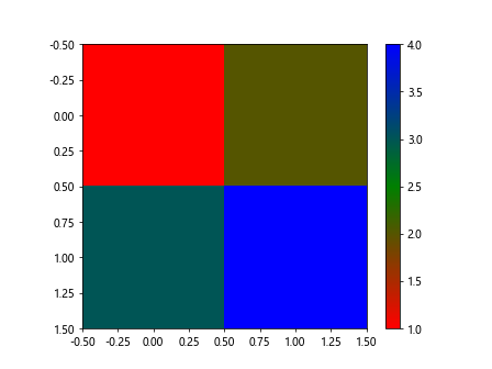
In the above code, we define a custom colormap with a red-green-blue gradient. By using the LinearSegmentedColormap, we specify the color transitions and their positions in the colormap. This custom colormap can be used in plots to represent data values using the defined color scheme.
Using Colormaps with Different Plot Types
Colormaps can be applied to various plot types in Matplotlib, such as line plots, bar plots, and contour plots. Let’s explore how colormaps can enhance different types of plots.
Line Plot with Colormap
In this example, we will create a line plot with a colormap to represent the z-values along the line.
import numpy as np
import matplotlib.pyplot as plt

x = np.linspace(0, 1, 100)
y = np.sin(2 * np.pi * x)
z = np.cos(2 * np.pi * x)

plt.plot(x, y, c=z, cmap='cool')
plt.colorbar()
plt.show()
The z values are mapped to colors using the ‘cool’ colormap in the line plot. The color transitions in the plot help visualize the variations in the z values along the line.
Bar Plot with Colormap
Colormaps can also be applied to bar plots to represent data values with different colors. Let’s create a bar plot with a colormap.
import numpy as np
import matplotlib.pyplot as plt

data = np.random.rand(10)
colors = np.random.rand(10)

plt.bar(range(10), data, color=plt.cm.viridis(colors))
plt.colorbar()
plt.show()
In this example, the colors of the bars in the plot are determined by the colors array using the ‘viridis’ colormap. Each bar is colored based on its data value, providing a visual representation of the data distribution.
Contour Plot with Colormap
Colormaps are commonly used in contour plots to visualize three-dimensional data on a two-dimensional surface. Let’s plot a contour map using a colormap.
import numpy as np
import matplotlib.pyplot as plt

x = np.linspace(-2, 2, 100)
y = np.linspace(-2, 2, 100)
X, Y = np.meshgrid(x, y)
Z = np.sin(X**2 + Y**2)

plt.contourf(X, Y, Z, cmap='spring')
plt.colorbar()
plt.show()
Output:
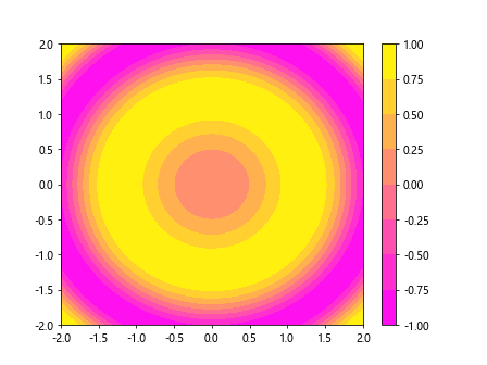
In the contour plot, the Z values are represented by colors using the ‘spring’ colormap. The color transitions in the plot visualize the variations in the Z values across the two-dimensional surface.
cmap matplotlib Conclusion
Colormaps play a crucial role in data visualization by mapping scalar values to colors, making it easier to interpret and analyze the data. In this article, we have explored the basic usage of colormaps in Matplotlib, the different types of available colormaps, and how to customize them according to your visualization needs. By incorporating colormaps in various plot types, you can enhance the visual representation of your data and improve the readability of your plots. Experiment with different colormaps to find the one that best suits your data visualization requirements.