Bar Graphs with Matplotlib
In data visualization, a bar graph is a common way to represent categorical data using rectangular bars of different heights or lengths. Matplotlib is a popular Python library for creating static, animated, and interactive visualizations in Python.
In this article, we will explore how to create bar graphs using Matplotlib. We will cover various aspects of creating bar graphs, including basic bar graphs, grouped bar graphs, stacked bar graphs, customizing bar colors and styles, and adding labels and annotations to bar graphs.
Basic Bar Graph in Matplotlib
To create a basic bar graph using Matplotlib, we can use the bar function. In this example, we will create a simple bar graph showing the count of different fruits.
import matplotlib.pyplot as plt

fruits = ['Apple', 'Banana', 'Orange', 'Grape', 'Watermelon']
counts = [10, 15, 8, 12, 20]

plt.bar(fruits, counts)
plt.xlabel('Fruits')
plt.ylabel('Count')
plt.title('Fruit Counts')

plt.show()
Output:
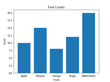
When we run this code, it will produce a bar graph showing the count of different fruits.
Grouped Bar Graph in Matplotlib
To create a grouped bar graph in Matplotlib, we can use the bar function multiple times. In this example, we will create a grouped bar graph showing the sales of different fruits in two different stores.
import matplotlib.pyplot as plt
import numpy as np

fruits = ['Apple', 'Banana', 'Orange', 'Grape', 'Watermelon']
store1_sales = [10, 15, 8, 12, 20]
store2_sales = [12, 10, 6, 15, 18]

bar_width = 0.35
indices = np.arange(len(fruits))

plt.bar(indices - bar_width/2, store1_sales, bar_width, label='Store 1')
plt.bar(indices + bar_width/2, store2_sales, bar_width, label='Store 2')

plt.xlabel('Fruits')
plt.ylabel('Sales')
plt.title('Fruit Sales by Store')
plt.xticks(indices, fruits)
plt.legend()

plt.show()
Output:
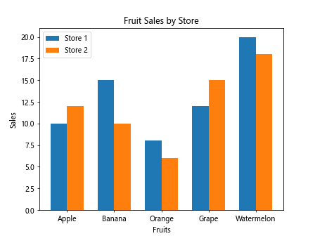
When we run this code, it will produce a grouped bar graph showing the sales of different fruits in two different stores.
Stacked Bar Graph in Matplotlib
To create a stacked bar graph in Matplotlib, we can use the bar function with the bottom parameter. In this example, we will create a stacked bar graph showing the revenue and expenses of a company over different quarters.
import matplotlib.pyplot as plt
import numpy as np

quarters = ['Q1', 'Q2', 'Q3', 'Q4']
revenue = [100, 120, 110, 130]
expenses = [80, 90, 95, 85]

plt.bar(quarters, revenue, label='Revenue')
plt.bar(quarters, expenses, bottom=revenue, label='Expenses')

plt.xlabel('Quarters')
plt.ylabel('Amount ($)')
plt.title('Company Revenue and Expenses by Quarter')
plt.legend()

plt.show()
Output:
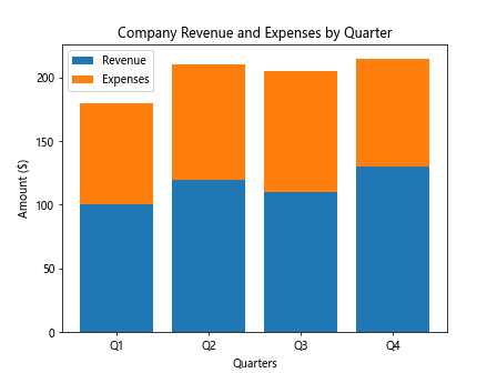
When we run this code, it will produce a stacked bar graph showing the revenue and expenses of a company over different quarters.
Customizing Bar Colors and Styles in Matplotlib
We can customize the colors and styles of bars in a bar graph using Matplotlib. In this example, we will create a bar graph with bars of different colors and styles.
import matplotlib.pyplot as plt
import numpy as np

fruits = ['Apple', 'Banana', 'Orange', 'Grape', 'Watermelon']
counts = [10, 15, 8, 12, 20]

bar_colors = ['blue', 'orange', 'green', 'red', 'purple']
bar_styles = ['solid', 'dashed', 'dotted', 'dashdot', 'solid']

for i in range(len(fruits)):
    plt.bar(fruits[i], counts[i], color=bar_colors[i], hatch=bar_styles[i])

plt.xlabel('Fruits')
plt.ylabel('Count')
plt.title('Fruit Counts')

plt.show()
When we run this code, it will produce a bar graph with bars of different colors and styles.
Adding Labels and Annotations
We can add labels and annotations to a bar graph to provide additional information to the viewers. In this example, we will add labels and annotations to a bar graph showing the count of different fruits.
import matplotlib.pyplot as plt
import numpy as np

fruits = ['Apple', 'Banana', 'Orange', 'Grape', 'Watermelon']
counts = [10, 15, 8, 12, 20]

plt.bar(fruits, counts)

for i in range(len(fruits)):
    plt.text(fruits[i], counts[i] + 0.5, str(counts[i]), ha='center')

plt.xlabel('Fruits')
plt.ylabel('Count')
plt.title('Fruit Counts')

plt.show()
Output:

When we run this code, it will produce a bar graph showing the count of different fruits with labels on top of each bar.
Bar Graphs with Matplotlib Conclusion
In this article, we have explored how to create bar graphs using Matplotlib. We have covered various aspects of creating bar graphs, including basic bar graphs, grouped bar graphs, stacked bar graphs, customizing bar colors and styles, and adding labels and annotations to bar graphs. By following these examples and exploring more options provided by Matplotlib, you can create visually appealing and informative bar graphs for your data visualization needs.