Histogram Matplotlib
Histograms are a type of plot that provide a visual representation of the distribution of a dataset. Matplotlib is a popular Python library for data visualization, and it offers a wide range of tools for creating histograms. In this article, we will explore how to use Matplotlib to create histograms, customize their appearance, and interpret the results.
Basic Histogram
Let’s start by creating a basic histogram using Matplotlib. We will generate some random data and plot a histogram to visualize its distribution.
import matplotlib.pyplot as plt
import numpy as np

data = np.random.normal(0, 1, 1000)
plt.hist(data, bins=30, color='skyblue')
plt.xlabel('Value')
plt.ylabel('Frequency')
plt.title('Random Data Histogram')
plt.show()
Output:
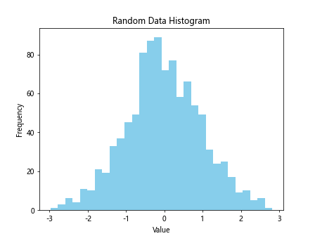
In this example, we use np.random.normal to generate random data with a mean of 0 and standard deviation of 1. We then plot a histogram with 30 bins using plt.hist and customize the color, xlabel, ylabel, and title of the plot.
Customizing Histogram
Matplotlib allows us to customize the appearance of the histogram by adjusting parameters such as color, transparency, and bin size. Let’s create a histogram with customized settings.
import matplotlib.pyplot as plt
import numpy as np

data1 = np.random.normal(0, 1, 1000)
data2 = np.random.normal(3, 1.5, 1000)

plt.hist(data1, bins=30, color='b', alpha=0.5, label='Data 1')
plt.hist(data2, bins=30, color='r', alpha=0.5, label='Data 2')
plt.legend()
plt.xlabel('Value')
plt.ylabel('Frequency')
plt.title('Customized Histogram')
plt.show()
Output:
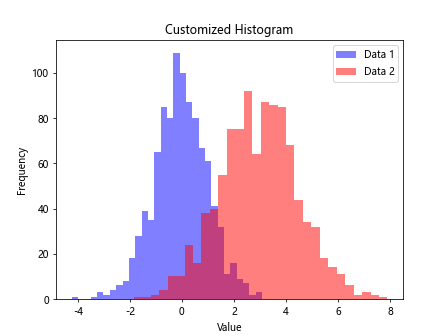
In this example, we plot two sets of random data with different means and standard deviations. We customize the color, transparency, and label of each dataset using the color, alpha, and label parameters in the plt.hist function. We then include a legend to differentiate between the two datasets.
Multiple Histograms
We can also plot multiple histograms on the same figure to compare different distributions. Let’s create a histogram with three sets of data and adjust the bin size and spacing.
import matplotlib.pyplot as plt
import numpy as np

data1 = np.random.normal(0, 1, 1000)
data2 = np.random.normal(2, 1, 1000)
data3 = np.random.normal(-2, 0.5, 1000)

plt.hist(data1, bins=30, color='b', alpha=0.5, label='Data 1')
plt.hist(data2, bins=30, color='r', alpha=0.5, label='Data 2')
plt.hist(data3, bins=30, color='g', alpha=0.5, label='Data 3')
plt.legend()
plt.xlabel('Value')
plt.ylabel('Frequency')
plt.title('Multiple Histograms')
plt.show()
Output:
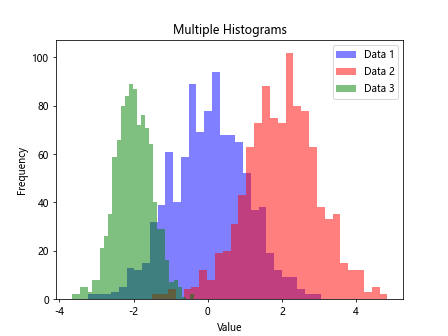
In this example, we plot three sets of random data with different means and adjust the bin size using the bins parameter in the plt.hist function. By setting alpha to 0.5, we make the histograms semi-transparent, allowing us to see overlapping areas more clearly.
Stacked Histogram
Matplotlib also allows us to stack histograms on top of each other to show the cumulative distribution of data. Let’s create a stacked histogram with two sets of data.
import matplotlib.pyplot as plt
import numpy as np

data1 = np.random.normal(0, 1, 1000)
data2 = np.random.normal(2, 1, 1000)

plt.hist([data1, data2], bins=30, color=['b', 'r'], alpha=0.7, stacked=True, label=['Data 1', 'Data 2'])
plt.legend()
plt.xlabel('Value')
plt.ylabel('Frequency')
plt.title('Stacked Histogram')
plt.show()
Output:
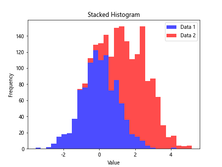
In this example, we plot two sets of random data and stack the histograms by setting stacked to True in the plt.hist function. We use the color parameter to assign different colors to each dataset and include a legend to distinguish between them.
Histogram with Density
We can also plot histograms in terms of density rather than frequency by normalizing the data. Let’s create a density histogram with customized appearance.
import matplotlib.pyplot as plt
import numpy as np

data = np.random.normal(0, 1, 1000)
plt.hist(data, bins=30, color='skyblue', density=True)
plt.xlabel('Value')
plt.ylabel('Density')
plt.title('Density Histogram')
plt.show()
Output:
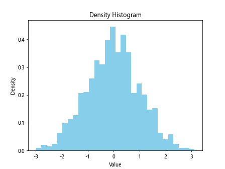
In this example, we generate random data and plot a density histogram by setting density to True in the plt.hist function. This normalization allows us to compare the distribution shapes of datasets with different sample sizes.
Cumulative Histogram
A cumulative histogram displays the cumulative distribution of data, showing how many values fall below a certain threshold. Let’s create a cumulative histogram with two sets of data.
import matplotlib.pyplot as plt
import numpy as np

data1 = np.random.normal(0, 1, 1000)
data2 = np.random.normal(2, 1, 1000)

plt.hist(data1, bins=30, color='b', alpha=0.5, cumulative=True, label='Data 1')
plt.hist(data2, bins=30, color='r', alpha=0.5, cumulative=True, label='Data 2')
plt.legend()
plt.xlabel('Value')
plt.ylabel('Cumulative Frequency')
plt.title('Cumulative Histogram')
plt.show()
Output:
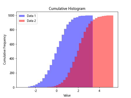
In this example, we plot two sets of random data and create a cumulative histogram by setting cumulative to True in the plt.hist function. This visualization helps us understand the overall distribution of data and the number of values below specific thresholds.
Grouped Histogram
A grouped histogram displays multiple datasets in separate bars next to each other, making it easier to compare their distributions. Let’s create a grouped histogram with three sets of data.
import matplotlib.pyplot as plt
import numpy as np

data1 = np.random.normal(0, 1, 1000)
data2 = np.random.normal(2, 1, 1000)
data3 = np.random.normal(-2, 0.5, 1000)
bins = np.linspace(-5, 5, 30)

plt.hist([data1, data2, data3], bins, color=['b', 'r', 'g'], alpha=0.7, label=['Data 1', 'Data 2', 'Data 3'])
plt.legend()
plt.xlabel('Value')
plt.ylabel('Frequency')
plt.title('Grouped Histogram')
plt.show()
Output:
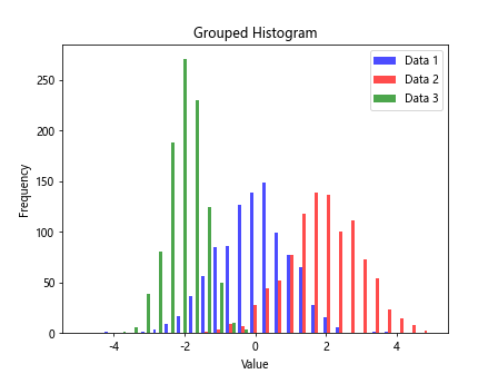
In this example, we plot three sets of random data and create a grouped histogram by providing a list of datasets to the plt.hist function. We specify different colors for each dataset and include a legend to identify them.
Horizontal Histogram
Matplotlib allows us to create horizontal histograms by changing the orientation of the bars. Let’s generate random data and plot a horizontal histogram.
import matplotlib.pyplot as plt
import numpy as np

data = np.random.normal(0, 1, 1000)
plt.hist(data, bins=30, color='skyblue', orientation='horizontal')
plt.ylabel('Value')
plt.xlabel('Frequency')
plt.title('Horizontal Histogram')
plt.show()
Output:
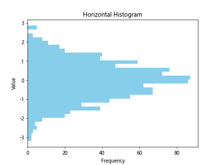
In this example, we plot a horizontal histogram by setting orientation to ‘horizontal’ in the plt.hist function. This orientation can be useful for displaying data with long labels or when comparing multiple datasets on a horizontal axis.
Custom Bin Size
We can customize the bin size of a histogram to display data with different levels of granularity. Let’s create a histogram with varying bin sizes to compare the distribution of two datasets.
import matplotlib.pyplot as plt
import numpy as np

data1 = np.random.normal(0, 1, 1000)
data2 = np.random.normal(0, 1, 1000)

plt.hist(data1, bins=10, color='b', alpha=0.5, label='Data 1')
plt.hist(data2, bins=50, color='r', alpha=0.5, label='Data 2')
plt.legend()
plt.xlabel('Value')
plt.ylabel('Frequency')
plt.title('Custom Bin Size Histogram')
plt.show()
Output:
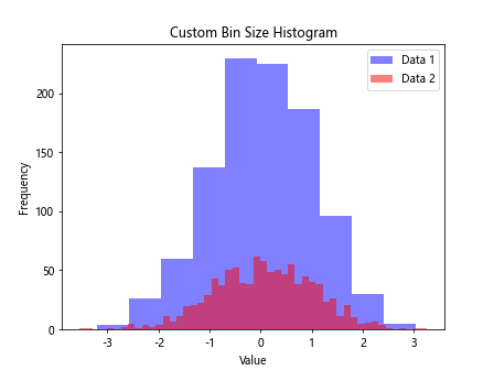
In this example, we plot two sets of data with different bin sizes using the bins parameter in the plt.hist function. By adjusting the bin size, we can analyze the distribution of data at different levels of detail.
Histogram with Log Scale
Matplotlib allows us to plot histograms with a logarithmic scale on the x-axis or y-axis to visualize data with a wide range of values. Let’s create a histogram with a log scale on the y-axis.
import matplotlib.pyplot as plt
import numpy as np

data = np.random.exponential(1, 1000)
plt.hist(data, bins=30, color='purple')
plt.yscale('log')
plt.xlabel('Value')
plt.ylabel('Frequency (Log Scale)')
plt.title('Log Scale Histogram')
plt.show()
Output:
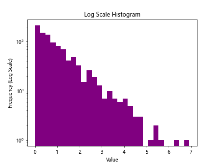
In this example, we generate exponential random data and plot a histogram with a logarithmic scale on the y-axis using plt.yscale('log'). This scale transformation allows us to observe the distribution of data with extreme values more clearly.
Weighted Histogram
Matplotlib supports weighted histograms, where each data point is associated with a weight that determines its contribution to the plot. Let’s create a weighted histogram with custom weights for each data point.
import matplotlib.pyplot as plt
import numpy as np

data = np.random.exponential(1, 1000)
weights = np.random.uniform(0, 2, 1000)
plt.hist(data, bins=30, weights=weights, color='orange')
plt.xlabel('Value')
plt.ylabel('Weighted Frequency')
plt.title('Weighted Histogram')
plt.show()
Output:
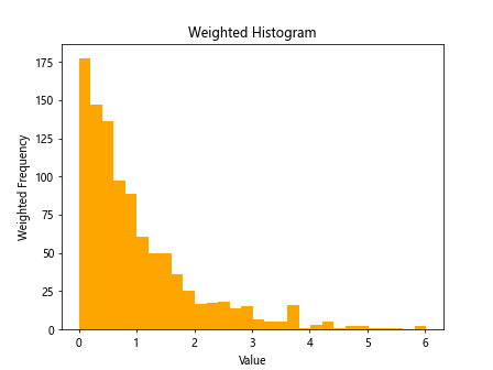
In this example, we generate exponential random data and assign custom weights using the weights parameter in the plt.hist function. This weighted histogram illustrates the influence of each data point on the overall distribution.
Overlay Histogram
Matplotlib allows us to overlay histograms on top of each other to visualize the intersection of different datasets. Let’s create an overlay histogram with two sets of data.
import matplotlib.pyplot as plt
import numpy as np

data1 = np.random.normal(0, 1, 1000)
data2 = np.random.normal(0.5, 1, 1000)

plt.hist(data1, bins=30, color='b', alpha=0.5, label='Data 1', density=True, histtype='step')
plt.hist(data2, bins=30, color='r', alpha=0.5, label='Data 2', density=True, histtype='step')
plt.legend()
plt.xlabel('Value')
plt.ylabel('Density')
plt.title('Overlay Histogram')
plt.show()
Output:
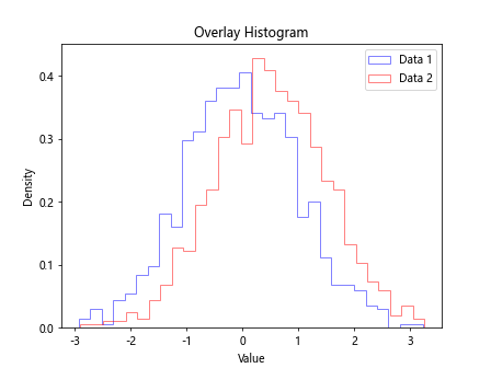
In this example, we plot two sets of data with the histtype parameter set to ‘step’ to create overlaid histograms. This visualization allows us to compare the distribution shapes of the datasets and identify overlapping regions.
Equalized Histogram
We can equalize histograms to adjust the intensity distribution of pixel values in images for better visualization. Let’s equalize a grayscale image histogram using Matplotlib.
import cv2
import matplotlib.pyplot as plt
import numpy as np

image = cv2.imread('image.jpg', cv2.IMREAD_GRAYSCALE)
equalized_image = cv2.equalizeHist(image)

plt.hist(image.flatten(), bins=256, color='b', alpha=0.5, label='Original Image')
plt.hist(equalized_image.flatten(), bins=256, color='r', alpha=0.5, label='Equalized Image')
plt.legend()
plt.xlabel('Pixel Value')
plt.ylabel('Frequency')
plt.title('Histogram Equalization')
plt.show()
In this example, we read a grayscale image using OpenCV and apply histogram equalization to improve its contrast. We plot the histograms of the original and equalized images to illustrate the transformation.
These examples demonstrate the versatility of Matplotlib for creating various types of histograms and customizing their appearance to analyze and visualize data effectively. With its extensive capabilities, Matplotlib is a powerful tool for data scientists and researchers in exploring and interpreting datasets.