Bar Plot with Matplotlib
Bar plots are a useful visualization tool to display and compare categorical data. In this article, we will explore how to create bar plots using the matplotlib library in Python.
Installation
Before we get started, make sure you have matplotlib installed. You can install it using pip:
pip install matplotlib
Basic Bar Plot in Matplotlib
Let’s start by creating a basic bar plot with some sample data.
import matplotlib.pyplot as plt

# Sample data
x = ['A', 'B', 'C', 'D', 'E']
y = [20, 35, 30, 25, 40]

plt.bar(x, y)
plt.xlabel('Categories')
plt.ylabel('Values')
plt.title('Basic Bar Plot')
plt.show()
Output:
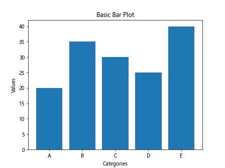
Running this code will generate a simple bar plot with the categories ‘A’, ‘B’, ‘C’, ‘D’, ‘E’ on the x-axis and corresponding values on the y-axis.
Customizing Bar Plot in Matplotlib
You can customize the appearance of the bar plot by changing the color, width, and orientation of the bars.
import matplotlib.pyplot as plt
import numpy as np

# Sample data
x = ['A', 'B', 'C', 'D', 'E']
y = [20, 35, 30, 25, 40]

plt.bar(x, y, color='skyblue', width=0.5, align='center', alpha=0.8)
plt.xlabel('Categories')
plt.ylabel('Values')
plt.title('Customized Bar Plot')
plt.show()
Output:
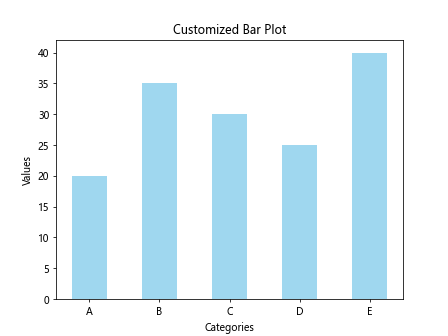
In this example, we have changed the color of the bars to ‘skyblue’, set the width of the bars to 0.5, aligned them to the center, and adjusted the transparency level using the alpha parameter.
Stacked Bar Plot in Matplotlib
You can create a stacked bar plot to show the composition of different categories within a single bar.
import matplotlib.pyplot as plt

# Sample data
x = ['A', 'B', 'C', 'D', 'E']
y1 = [10, 20, 15, 25, 30]
y2 = [15, 15, 20, 10, 25]

plt.bar(x, y1, label='Group 1')
plt.bar(x, y2, bottom=y1, label='Group 2')

plt.xlabel('Categories')
plt.ylabel('Values')
plt.title('Stacked Bar Plot')
plt.legend()
plt.show()
Output:
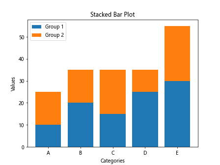
By specifying the bottom parameter in the second call to plt.bar(), we can stack the bars on top of each other.
Horizontal Bar Plot in Matplotlib
You can also create horizontal bar plots by using the barh function instead of bar.
import matplotlib.pyplot as plt

# Sample data
y = ['A', 'B', 'C', 'D', 'E']
x = [20, 35, 30, 25, 40]

plt.barh(y, x, color='salmon')
plt.ylabel('Categories')
plt.xlabel('Values')
plt.title('Horizontal Bar Plot')
plt.show()
Output:
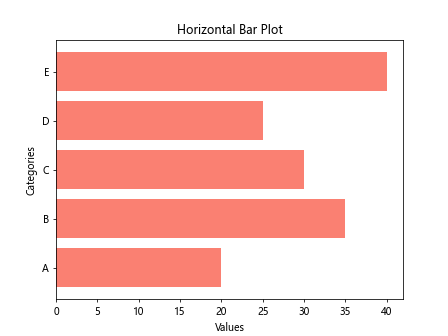
This code will generate a horizontal bar plot with categories on the y-axis and values on the x-axis.
Grouped Bar Plot in Matplotlib
To compare multiple groups with each category, you can create grouped bar plots.
import matplotlib.pyplot as plt

# Sample data
x = ['A', 'B', 'C', 'D', 'E']
y1 = [10, 20, 15, 25, 30]
y2 = [15, 15, 20, 10, 25]

fig, ax = plt.subplots()
width = 0.35

ax.bar(x, y1, width, label='Group 1')
ax.bar([i + width for i in range(len(x))], y2, width, label='Group 2')

ax.set_xlabel('Categories')
ax.set_ylabel('Values')
ax.set_title('Grouped Bar Plot')
ax.set_xticks([i + width/2 for i in range(len(x))])
ax.set_xticklabels(x)
ax.legend()

plt.show()
Output:
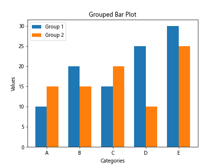
By adjusting the width of the bars and the x-coordinates, you can create a grouped bar plot to compare two groups within each category.
Bar Plot with Error Bars in Matplotlib
You can add error bars to the bar plot to visually represent the uncertainty in data.
import matplotlib.pyplot as plt

# Sample data
x = ['A', 'B', 'C', 'D', 'E']
y = [20, 35, 30, 25, 40]
error = [2, 3, 4, 2, 3]

plt.bar(x, y, yerr=error, capsize=5, color='orange')

plt.xlabel('Categories')
plt.ylabel('Values')
plt.title('Bar Plot with Error Bars')
plt.show()
Output:
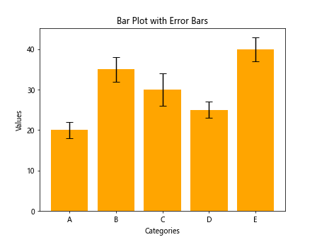
In this example, the yerr parameter is used to specify the error values for each bar, and capsize controls the size of the error bar caps.
Bar Plot with Annotations in Matplotlib
You can add annotations to the bar plot to display additional information on the plot.
import matplotlib.pyplot as plt

# Sample data
x = ['A', 'B', 'C', 'D', 'E']
y = [20, 35, 30, 25, 40]

plt.bar(x, y, color='pink')

for i, v in enumerate(y):
    plt.text(i, v + 1, str(v), ha='center')

plt.xlabel('Categories')
plt.ylabel('Values')
plt.title('Bar Plot with Annotations')
plt.show()
Output:
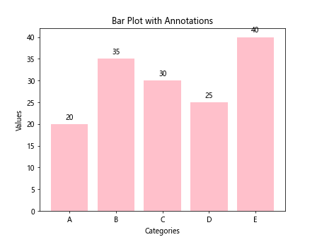
In this code snippet, we use plt.text() to add text labels above each bar showing the exact value of the bar.
Bar Plot with Different Bar Widths in Matplotlib
You can create a bar plot with varying bar widths using the width parameter.
import matplotlib.pyplot as plt

# Sample data
x = ['A', 'B', 'C', 'D', 'E']
y = [20, 35, 30, 25, 40]
bar_widths = [0.1, 0.3, 0.5, 0.7, 0.9]

plt.bar(x, y, width=bar_widths, color='purple')

plt.xlabel('Categories')
plt.ylabel('Values')
plt.title('Bar Plot with Different Bar Widths')
plt.show()
Output:
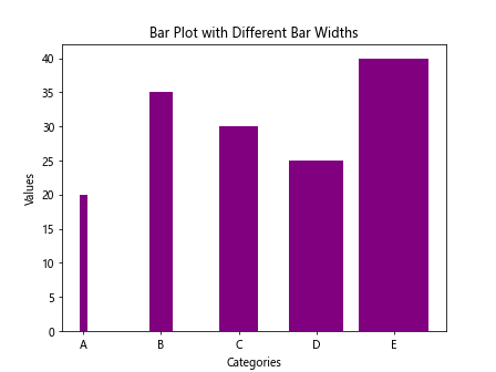
By specifying an array of widths, you can create a bar plot with bars of different widths.
Bar Plot with Log Scale in Matplotlib
You can plot the bars on a logarithmic scale by setting the scale of the y-axis to logarithmic.
import matplotlib.pyplot as plt

# Sample data
x = ['A', 'B', 'C', 'D', 'E']
y = [20, 35, 30, 25, 40]

plt.bar(x, y, color='teal')

plt.xlabel('Categories')
plt.ylabel('Values')
plt.title('Bar Plot with Log Scale')
plt.yscale('log')
plt.show()
Output:
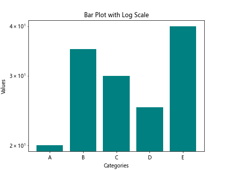
In this example, we use plt.yscale('log') to set the y-axis to a logarithmic scale.
Bar Plot with Title and Legend
You can add a title and legend to the bar plot for better clarity and explanation.
import matplotlib.pyplot as plt

# Sample data
x = ['A', 'B', 'C', 'D', 'E']
y = [20, 35, 30, 25, 40]

plt.bar(x, y, color='brown')

plt.xlabel('Categories')
plt.ylabel('Values')
plt.title('Bar Plot with Title and Legend')
plt.legend(['Group 1'])
plt.show()
Output:
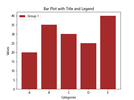
By using plt.legend() with appropriate labels, you can add a legend to the plot to explain the groups.
Bar Plot with Grid Lines
You can add grid lines to the bar plot for better visibility and reference.
import matplotlib.pyplot as plt

# Sample data
x = ['A', 'B', 'C', 'D', 'E']
y = [20, 35, 30, 25, 40]

plt.bar(x, y, color='gray')

plt.xlabel('Categories')
plt.ylabel('Values')
plt.title('Bar Plot with Grid Lines')
plt.grid(True, linestyle='--', linewidth=0.5)
plt.show()
Output:
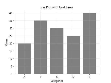
By setting plt.grid(True) with custom linestyle and linewidth, you can add grid lines to the plot.
Multiple Bar Plots
You can create multiple bar plots in the same figure by using subplots.
import matplotlib.pyplot as plt

# Sample data
x = ['A', 'B', 'C', 'D', 'E']
y1 = [10, 20, 15, 25, 30]
y2 = [15, 15, 20, 10, 25]

fig, axs = plt.subplots(2)
fig.suptitle('Multiple Bar Plots')

axs[0].bar(x, y1, color='green')
axs[0].set_title('Group 1')

axs[1].bar(x, y2, color='blue')
axs[1].set_title('Group 2')

plt.show()
Output:
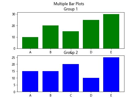
This code snippet demonstrates how to create two separate bar plots in a single figure using subplots.
Bar Plot with Different Bar Colors
You can customize the colors of individual bars in the plot for better distinction.
import matplotlib.pyplot as plt
import random

# Sample data
x = ['A', 'B', 'C', 'D', 'E']
y = [20, 35, 30, 25, 40]
colors = ['red', 'green', 'blue', 'orange', 'purple']

plt.bar(x, y, color=colors)

plt.xlabel('Categories')
plt.ylabel('Values')
plt.title('Bar Plot with Different Bar Colors')
plt.show()
Output:
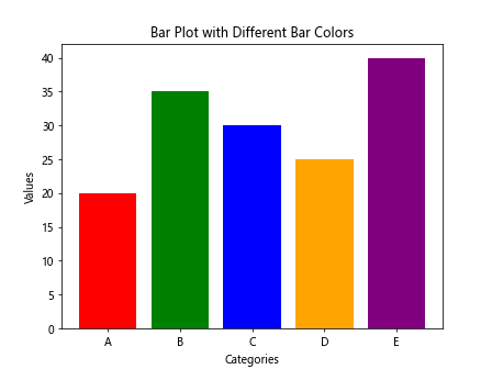
By providing an array of color values, you can assign different colors to each bar in the plot.
Histogram with Matplotlib
Histograms are a type of bar plot that represent the distribution of continuous data.
import matplotlib.pyplot as plt

# Sample data
data = [10, 20, 30, 15, 25, 35, 20, 15, 25, 30]

plt.hist(data, bins=5, color='skyblue', edgecolor='black')

plt.xlabel('Values')
plt.ylabel('Frequency')
plt.title('Histogram with Matplotlib')
plt.show()
Output:
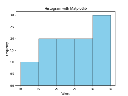
This code snippet demonstrates how to create a histogram using plt.hist() with specified bins, color, and edge color.
Bar Plot with Different Hatch Patterns
You can add different hatch patterns to the bars in the plot for visual distinction.
import matplotlib.pyplot as plt

# Sample data
x = ['A', 'B', 'C', 'D', 'E']
y = [20, 35, 30, 25, 40]
patterns = ['/ ', 'x', '*', 'o', '|']

bars = plt.bar(x, y, color='yellow')

for bar, pattern in zip(bars, patterns):
    bar.set_hatch(pattern)

plt.xlabel('Categories')
plt.ylabel('Values')
plt.title('Bar Plot with Hatch Patterns')
plt.show()
By setting different hatch patterns for each bar in the plot, you can create visually distinct bars.
Bar Plot with Horizontal Lines
You can add horizontal lines to the bar plot to represent a reference or critical value.
import matplotlib.pyplot as plt

# Sample data
x = ['A', 'B', 'C', 'D', 'E']
y = [20, 35, 30, 25, 40]
critical_value = 30

plt.bar(x, y, color='pink')

plt.axhline(critical_value, color='red', linestyle='--', linewidth=2)

plt.xlabel('Categories')
plt.ylabel('Values')
plt.title('Bar Plot with Horizontal Line')
plt.show()
Output:
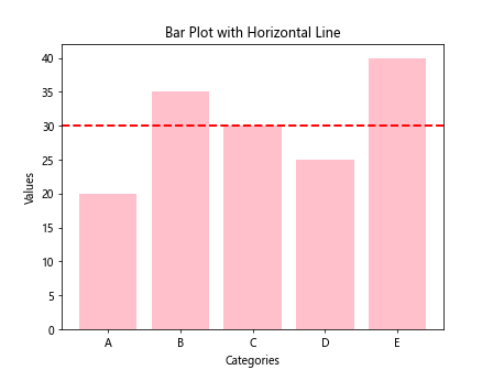
In this example, we use plt.axhline() to draw a horizontal line at the specified y-value on the plot.
Bar Plot with Text Annotation
You can add text annotations to the bar plot to provide additional information.
import matplotlib.pyplot as plt

# Sample data
x = ['A', 'B', 'C', 'D', 'E']
y = [20, 35, 30, 25, 40]

plt.bar(x, y, color='orange')

for i, v in enumerate(y):
    plt.text(i, v + 1, str(v), ha='center', va='bottom')

plt.xlabel('Categories')
plt.ylabel('Values')
plt.title('Bar Plot with Text Annotation')
plt.show()
Output:
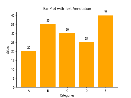
By using plt.text() with custom horizontal and vertical alignment, you can add text annotations above each bar in the plot.
Bar Plot with Matplotlib Conclusion
In this article, we have explored various aspects of creating bar plots using the matplotlib library in Python. We covered basic bar plots, customized bar plots, stacked bar plots, grouped bar plots, horizontal bar plots, and more. By following the examples provided and experimenting with different parameters, you can create informative and visually appealing bar plots to visualize your data effectively.