Legend in Matplotlib
Legend in Matplotlib is a feature that explains the elements of a plot. It is a crucial component when creating visualizations to help the viewers understand the data and the meaning of different elements in the plot. In this article, we will delve into the usage of legends in Matplotlib and how to customize it to make your plots more informative and visually appealing.
Basic Legend
The basic legend in Matplotlib can be added to a plot using the legend() function. Let’s create a simple line plot and add a legend to it.
import matplotlib.pyplot as plt
import numpy as np

x = np.linspace(0, 10, 100)
y1 = np.sin(x)
y2 = np.cos(x)

plt.plot(x, y1, label='Sin(x)')
plt.plot(x, y2, label='Cos(x)')
plt.legend()
plt.show()
Output:
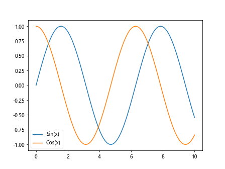
In this code snippet, we first create two arrays y1 and y2 representing the sine and cosine values of x respectively. We then plot y1 and y2 against x, adding labels to each line using the label parameter. Finally, we call the legend() function to display the legend on the plot.
Customizing Legend Location
Matplotlib allows you to customize the location of the legend on the plot. You can specify the location using the loc parameter in the legend() function. The loc parameter takes a string or a tuple of coordinates to place the legend at the desired location. Let’s see an example of customizing the legend location.
import matplotlib.pyplot as plt
import numpy as np

x = np.linspace(0, 10, 100)
y1 = np.sin(x)
y2 = np.cos(x)

plt.plot(x, y1, label='Sin(x)')
plt.plot(x, y2, label='Cos(x)')
plt.legend(loc='upper right')
plt.show()
Output:
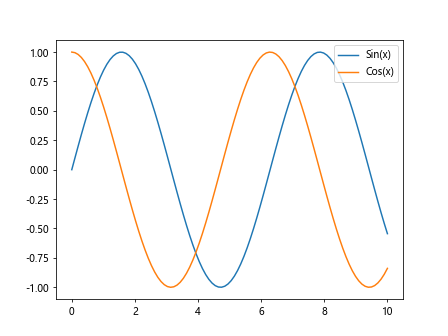
In this code snippet, we have set the location of the legend to the upper right corner of the plot.
Customizing Legend Appearance
You can customize the appearance of the legend in Matplotlib by changing various attributes such as font size, font style, background color, border, etc. Let’s see an example of customizing the legend appearance.
import matplotlib.pyplot as plt
import numpy as np

x = np.linspace(0, 10, 100)
y1 = np.sin(x)
y2 = np.cos(x)

plt.plot(x, y1, label='Sin(x)')
plt.plot(x, y2, label='Cos(x)')
plt.legend(fontsize='large', title='Trigonometric Functions', title_fontsize='x-large',
           frameon=True, shadow=True, fancybox=True, borderpad=1)
plt.show()
Output:
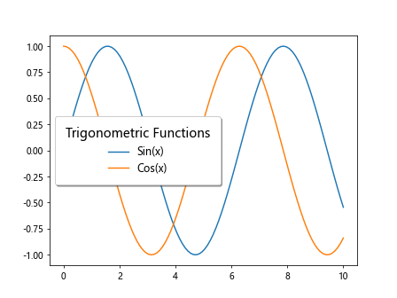
In this code snippet, we have customized the font size, title, frame, shadow, and border of the legend.
Customizing Legend Labels
You can also customize the labels of the legend in Matplotlib by changing the text, color, font, etc. Let’s see an example of customizing legend labels.
import matplotlib.pyplot as plt
import numpy as np

x = np.linspace(0, 10, 100)
y1 = np.sin(x)
y2 = np.cos(x)

# Creating custom legend labels
legend_labels = ['Sine Wave', 'Cosine Wave']

plt.plot(x, y1, label=legend_labels[0])
plt.plot(x, y2, label=legend_labels[1])
plt.legend()
plt.show()
Output:
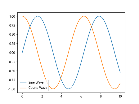
In this code snippet, we have used custom legend labels instead of directly specifying the labels in the plot function.
Multiple Legends
Sometimes you may need to have multiple legends in a single plot in Matplotlib. This can be achieved by adding multiple legends and specifying the labels for each legend separately. Let’s see an example of multiple legends in a plot.
import matplotlib.pyplot as plt
import numpy as np

x = np.linspace(0, 10, 100)
y1 = np.sin(x)
y2 = np.cos(x)
# Creating a second set of sine and cosine waves
y3 = np.sin(x + np.pi/2)
y4 = np.cos(x + np.pi/2)

plt.plot(x, y1, label='Sin(x)')
plt.plot(x, y2, label='Cos(x)')
plt.plot(x, y3, linestyle='--', label='Sin(x + π/2)')
plt.plot(x, y4, linestyle='--', label='Cos(x + π/2)')

plt.legend(['Trigonometric Functions', 'Phase Shifted Functions'])
plt.legend()
plt.show()
Output:
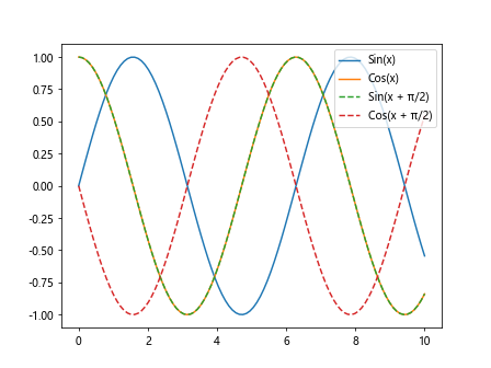
In this code snippet, we have added two separate legends to the plot for the trigonometric functions and phase-shifted functions.
Legend with Enhanced Formatting
You can enhance the formatting of the legend in Matplotlib by using LaTeX syntax for mathematical expressions, adding symbols, line styles, etc. Let’s see an example of a legend with enhanced formatting.
import matplotlib.pyplot as plt
import numpy as np

x = np.linspace(0, 10, 100)
y1 = np.sin(x)
y2 = np.cos(x)

plt.plot(x, y1, label='$\sin(x)$', linestyle='-', color='blue')
plt.plot(x, y2, label='$\cos(x)$', linestyle='-', color='red')
plt.legend()
plt.show()
In this code snippet, we have used LaTeX syntax for the legend labels to display the sine and cosine functions in a more visually appealing format.
Legend with Marker
You can add markers to the legend labels in Matplotlib to represent the data points on the plot. Let’s see an example of adding markers to the legend labels.
import matplotlib.pyplot as plt
import numpy as np

x = np.linspace(0, 10, 100)
y1 = np.sin(x)
y2 = np.cos(x)

plt.plot(x, y1, label='Sin(x)', marker='o', color='green')
plt.plot(x, y2, label='Cos(x)', marker='s', color='purple')
plt.legend()
plt.show()
Output:
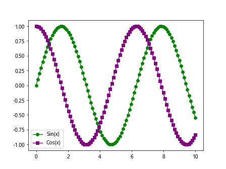
In this code snippet, we have added circular and square markers to the legend labels for the sine and cosine functions.
Legend Outside Plot
If you want to place the legend outside the plot area in Matplotlib, you can specify the bbox_to_anchor parameter in the legend() function. This parameter takes a tuple of coordinates to position the legend outside the plot. Let’s see an example of placing the legend outside the plot.
import matplotlib.pyplot as plt
import numpy as np

x = np.linspace(0, 10, 100)
y1 = np.sin(x)
y2 = np.cos(x)

plt.plot(x, y1, label='Sin(x)', linestyle='-', color='blue')
plt.plot(x, y2, label='Cos(x)', linestyle='-', color='red')
plt.legend(loc='center left', bbox_to_anchor=(1, 0.5))
plt.show()
Output:
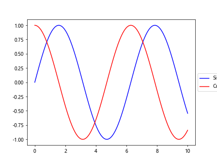
In this code snippet, we have positioned the legend to the right of the plot by specifying the bbox_to_anchor parameter.
Grouped Legend
You can group the legend labels together in Matplotlib by using the get_legend_handles_labels() function to retrieve the legend handles and labels and then creating a combined legend. Let’s see an example of creating a grouped legend.
import matplotlib.pyplot as plt
import numpy as np

x = np.linspace(0, 10, 100)
y1 = np.sin(x)
y2 = np.cos(x)

lines = plt.plot(x, y1, x, y2)
plt.legend(lines, ['Sine Wave', 'Cosine Wave'], loc='upper right')
plt.show()
Output:
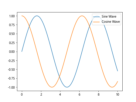
In this code snippet, we have grouped the legend labels for the sine and cosine waves using the get_legend_handles_labels() function.
Legend Title
You can add a title to the legend in Matplotlib to provide additional information about the data elements. Let’s see an example of adding a title to the legend.
import matplotlib.pyplot as plt
import numpy as np

x = np.linspace(0, 10, 100)
y1 = np.sin(x)
y2 = np.cos(x)

plt.plot(x, y1, label='Sin(x)', linestyle='-', color='blue')
plt.plot(x, y2, label='Cos(x)', linestyle='-', color='red')
plt.legend(title='Trigonometric Functions')
plt.show()
Output:
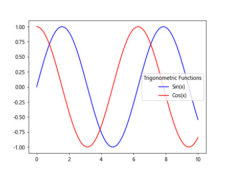
In this code snippet, we have added a title ‘Trigonometric Functions’ to the legend.
Legend without Frame
You can remove the frame around the legend in Matplotlib by setting the frameon parameter to False in the legend() function. Let’s see an example of a legend without a frame.
plt.plot(x, y1, label='Sin(x)', linestyle='-', color='blue')
plt.plot(x, y2, label='Cos(x)', linestyle='-', color='red')
plt.legend(frameon=False)
plt.show()
In this code snippet, we have removed the frame around the legend to make it more visually appealing.
Legend with Shadow
You can add a shadow effect to the legend in Matplotlib by setting the shadow parameter to True in the legend() function. Let’s see an example of a legend with a shadow effect.
import matplotlib.pyplot as plt
import numpy as np

x = np.linspace(0, 10, 100)
y1 = np.sin(x)
y2 = np.cos(x)

plt.plot(x, y1, label='Sin(x)', linestyle='-', color='blue')
plt.plot(x, y2, label='Cos(x)', linestyle='-', color='red')
plt.legend(shadow=True)
plt.show()
Output:
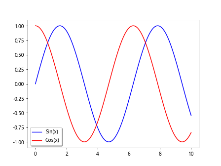
In this code snippet, we have added a shadow effect to the legend to make it stand out from the plot.
Legend with Fancybox
You can use a fancybox style for the legend in Matplotlib by setting the fancybox parameter to True in the legend() function. Let’s see an example of a legend with a fancybox.
import matplotlib.pyplot as plt
import numpy as np

x = np.linspace(0, 10, 100)
y1 = np.sin(x)
y2 = np.cos(x)

plt.plot(x, y1, label='Sin(x)', linestyle='-', color='blue')
plt.plot(x, y2, label='Cos(x)', linestyle='-', color='red')
plt.legend(fancybox=True)
plt.show()
Output:
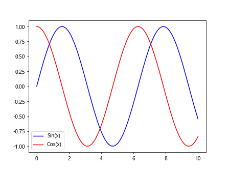
In this code snippet, we have used a fancybox style for the legend to give it a more stylish appearance.
Legend Border Padding
You can adjust the padding of the legend border in Matplotlib by setting the borderpad parameter in the legend() function. Let’s see an example of adjusting the border padding of the legend.
import matplotlib.pyplot as plt
import numpy as np

x = np.linspace(0, 10, 100)
y1 = np.sin(x)
y2 = np.cos(x)

plt.plot(x, y1, label='Sin(x)', linestyle='-', color='blue')
plt.plot(x, y2, label='Cos(x)', linestyle='-', color='red')
plt.legend(borderpad=2)
plt.show()
Output:
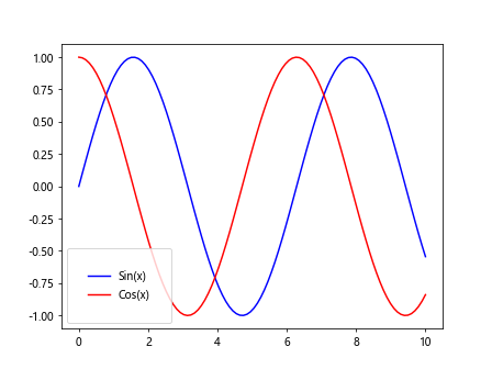
In this code snippet, we have increased the border padding of the legend to make it more visually pleasing.
Legend with Multiple Columns
If you have a long list of legend labels and want to display them in multiple columns in Matplotlib, you can use the ncol parameter in the legend() function. Let’s see an example of a legend with multiple columns.
import matplotlib.pyplot as plt
import numpy as np

x = np.linspace(0, 10, 100)
y1 = np.sin(x)
y2 = np.cos(x)

plt.plot(x, y1, label='Sin(x)', linestyle='-', color='blue')
plt.plot(x, y2, label='Cos(x)', linestyle='-', color='red')
plt.plot(x, y3, label='Tan(x)', linestyle='-', color='green')
plt.plot(x, y4, label='Cot(x)', linestyle='-', color='purple')
plt.legend(ncol=2)
plt.show()
In this code snippet, we have arranged the legend labels in two columns using the ncol parameter.
Legend Outside the Axes
You can place the legend outside the axes in Matplotlib by using the bbox_to_anchor parameter along with loc to position the legend relative to the figure size. Let’s see an example of placing the legend outside the axes.
import matplotlib.pyplot as plt
import numpy as np

x = np.linspace(0, 10, 100)
y1 = np.sin(x)
y2 = np.cos(x)

plt.plot(x, y1, label='Sin(x)', linestyle='-', color='blue')
plt.plot(x, y2, label='Cos(x)', linestyle='-', color='red')
plt.legend(loc='center', bbox_to_anchor=(0.5, -0.15), shadow=True, fancybox=True)
plt.show()
Output:
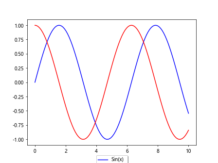
In this code snippet, we have positioned the legend in the center below the plot by specifying the bbox_to_anchor parameter.
Legend in Matplotlib Conclusion
Legends play a crucial role in Matplotlib visualizations by helping the viewers understand the data elements and their meaning in the plot. In this article, we have explored various aspects of legends in Matplotlib, including basic legends, customizing legend appearance, multiple legends, enhanced formatting, marker legends, grouped legends, and more. By mastering the usage and customization of legends, you can create more informative and visually appealing plots in Matplotlib.