Introduction to Matplotlib Bar Graph
Matplotlib is a versatile library for creating visualizations in Python. One common type of visualization is a bar graph, which is used to show comparisons between different categories of data. In this article, we will explore how to create bar graphs using Matplotlib.
Basic Bar Graph
The simplest form of a bar graph can be created using the bar function in Matplotlib. Below is an example of creating a basic bar graph with some sample data.
import matplotlib.pyplot as plt

# Sample data
categories = ['A', 'B', 'C', 'D', 'E']
values = [10, 20, 15, 25, 30]

# Creating the bar graph
plt.bar(categories, values)
plt.show()
Output:

In this code snippet, we first define the categories and corresponding values. We then use the bar function to create the bar graph. Running this code will result in a simple bar graph showing the values for each category.
Customizing Bar Graphs
Bar graphs can be customized in various ways to enhance readability and visual appeal. Some common customizations include changing the color, width, and alignment of the bars. Let’s see an example of customizing a bar graph.
import matplotlib.pyplot as plt

# Sample data
categories = ['A', 'B', 'C', 'D', 'E']
values = [10, 20, 15, 25, 30]

# Customizing the bar graph
plt.bar(categories, values, color='skyblue', width=0.5, align='center')
plt.xlabel('Categories')
plt.ylabel('Values')
plt.title('Customized Bar Graph')
plt.show()
Output:
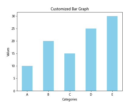
In this code snippet, we have customized the bar graph by changing the color to ‘skyblue’, setting the width of the bars to 0.5, and aligning the bars at the center. We have also added labels to the x-axis, y-axis, and a title to the graph. Running this code will display a customized bar graph.
Grouped Bar Graphs
Grouped bar graphs are useful when comparing multiple sets of data within each category. Each group of bars represents a different dataset, allowing for easy comparison. Let’s create an example of a grouped bar graph.
import matplotlib.pyplot as plt
import numpy as np

# Sample data
categories = ['A', 'B', 'C', 'D', 'E']
values1 = [10, 20, 15, 25, 30]
values2 = [15, 25, 20, 30, 35]

# Creating grouped bar graph
bar_width = 0.35
index = np.arange(len(categories))
plt.bar(index, values1, bar_width, label='Group 1')
plt.bar(index + bar_width, values2, bar_width, label='Group 2')
plt.xlabel('Categories')
plt.ylabel('Values')
plt.title('Grouped Bar Graph')
plt.xticks(index + bar_width / 2, categories)
plt.legend()
plt.show()
Output:
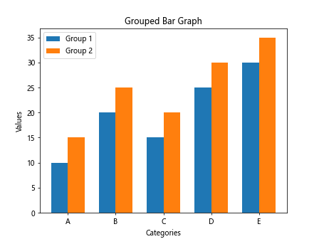
In this code snippet, we have used NumPy to generate evenly spaced indices for the categories. By adjusting the bar_width and the position of the bars, we can create grouped bar graphs. Running this code will display a grouped bar graph with two groups of bars representing different datasets.
Stacked Bar Graphs
Stacked bar graphs are useful for showing the cumulative totals of multiple datasets for each category. Each bar is divided into segments representing different datasets, stacked on top of each other. Let’s create an example of a stacked bar graph.
import matplotlib.pyplot as plt

# Sample data
categories = ['A', 'B', 'C', 'D', 'E']
values1 = [10, 20, 15, 25, 30]
values2 = [15, 25, 20, 30, 35]

# Creating stacked bar graph
plt.bar(categories, values1, label='Group 1')
plt.bar(categories, values2, bottom=values1, label='Group 2')
plt.xlabel('Categories')
plt.ylabel('Values')
plt.title('Stacked Bar Graph')
plt.legend()
plt.show()
Output:
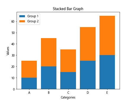
In this code snippet, we have used the bottom parameter in the bar function to stack the second set of bars on top of the first set. Running this code will display a stacked bar graph with two datasets for each category.
Horizontal Bar Graphs
While vertical bar graphs are more common, Matplotlib also allows creating horizontal bar graphs, which can be useful for displaying long category names or when comparing data horizontally. Let’s create an example of a horizontal bar graph.
import matplotlib.pyplot as plt

# Sample data
categories = ['Category A', 'Category B', 'Category C', 'Category D', 'Category E']
values = [10, 20, 15, 25, 30]

# Creating horizontal bar graph
plt.barh(categories, values)
plt.xlabel('Values')
plt.ylabel('Categories')
plt.title('Horizontal Bar Graph')
plt.show()
Output:
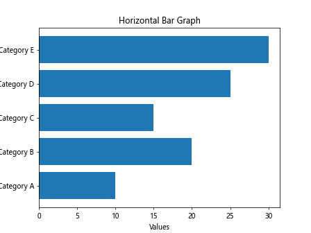
In this code snippet, we have used the barh function instead of bar to create a horizontal bar graph. Running this code will display a horizontal bar graph with the categories displayed on the y-axis and the values on the x-axis.
Bar Graph with Error Bars
Error bars are often used in bar graphs to show the variability or uncertainty in the data. Matplotlib allows adding error bars to bar graphs using the errorbar function. Let’s create an example of a bar graph with error bars.
import matplotlib.pyplot as plt

# Sample data
categories = ['A', 'B', 'C', 'D', 'E']
values = [10, 20, 15, 25, 30]
errors = [1, 2, 1.5, 2.5, 3]

# Creating bar graph with error bars
plt.bar(categories, values, yerr=errors, capsize=5)
plt.xlabel('Categories')
plt.ylabel('Values')
plt.title('Bar Graph with Error Bars')
plt.show()
Output:
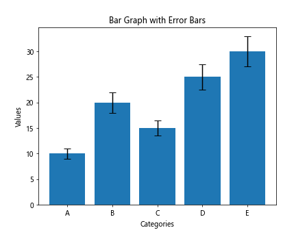
In this code snippet, we have added an errors list containing the error values for each category. We use the yerr parameter in the bar function to include error bars, and capsize to customize the error bar caps. Running this code will display a bar graph with error bars representing the variability in the data.
Grouped Bar Graph with Error Bars
Combining grouped bar graphs with error bars can provide a comprehensive visualization of multiple datasets with their associated uncertainties. Let’s create an example of a grouped bar graph with error bars.
import matplotlib.pyplot as plt
import numpy as np

# Sample data
categories = ['A', 'B', 'C', 'D', 'E']
values1 = [10, 20, 15, 25, 30]
errors1 = [1, 2, 1.5, 2.5, 3]
values2 = [15, 25, 20, 30, 35]
errors2 = [2, 1.5, 2, 2, 3]

# Creating grouped bar graph with error bars
bar_width = 0.35
index = np.arange(len(categories))
plt.bar(index, values1, bar_width, yerr=errors1, label='Group 1')
plt.bar(index + bar_width, values2, bar_width, yerr=errors2, label='Group 2')
plt.xlabel('Categories')
plt.ylabel('Values')
plt.title('Grouped Bar Graph with Error Bars')
plt.xticks(index + bar_width / 2, categories)
plt.legend()
plt.show()
Output:
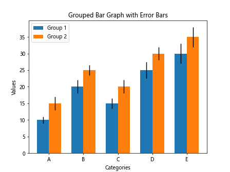
In this code snippet, we have added error values for each dataset and utilized the yerr parameter in the bar function to include error bars. Running this code will display a grouped bar graph with error bars representing the uncertainties in the data.
Customizing Bar Labels
Bar graphs can be further enhanced by customizing the labels displayed on the bars. Labels can convey additional information or provide context to the data. Let’s create an example of customizing bar labels in a bar graph.
import matplotlib.pyplot as plt

# Sample data
categories = ['A', 'B', 'C', 'D', 'E']
values = [10, 20, 15, 25, 30]

# Customizing bar labels
plt.bar(categories, values)
for i, value in enumerate(values):
    plt.text(i, value + 1, str(value), ha='center', va='bottom')
plt.xlabel('Categories')
plt.ylabel('Values')
plt.title('Bar Graph with Customized Labels')
plt.show()
Output:
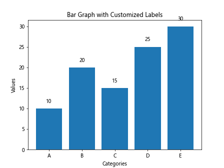
In this code snippet, we have added custom labels to each bar in the bar graph using the text function. The labels display the corresponding values on top of the bars. Running this code will display a bar graph with customized labels.
Adding Grid Lines to Bar Graphs
Grid lines can help align and compare values in bar graphs by providing a visual reference. Matplotlib allows adding grid lines to plots using the grid function. Let’s create an example of adding grid lines to a bar graph.
import matplotlib.pyplot as plt

# Sample data
categories = ['A', 'B', 'C', 'D', 'E']
values = [10, 20, 15, 25, 30]

# Creating bar graph with grid lines
plt.bar(categories, values)
plt.grid(axis='y', linestyle='dashed', color='gray', alpha=0.5)
plt.xlabel('Categories')
plt.ylabel('Values')
plt.title('Bar Graph with Grid Lines')
plt.show()
Output:

In this code snippet, we have used the grid function to add grid lines on the y-axis with a dashed style, gray color, and 50% transparency. Running this code will display a bar graph with grid lines for better alignment of values.
Horizontal Stacked Bar Graph
Matplotlib also allows creating horizontal stacked bar graphs, where the bars are stacked horizontally instead of vertically. This orientation can be useful for certain types of data visualization. Let’s create an example of a horizontal stacked bar graph.
import matplotlib.pyplot as plt

# Sample data
categories = ['A', 'B', 'C', 'D', 'E']
values1 = [10, 20, 15, 25, 30]
values2 = [15, 25, 20, 30, 35]

# Creating horizontal stacked bar graph
plt.barh(categories, values1, label='Group 1')
plt.barh(categories, values2, left=values1, label='Group 2')
plt.xlabel('Values')
plt.ylabel('Categories')
plt.title('Horizontal Stacked Bar Graph')
plt.legend()
plt.show()
Output:
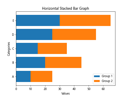
In this code snippet, we have used the barh function to create a horizontal stacked bar graph. By specifying the left parameter in the second barh function, we stack the bars horizontally. Running this code will display a horizontal stacked bar graph with two datasets for each category.
Colored Bar Graph with Gradient
Adding colors and gradients to bar graphs can make them more visually appealing and help highlight specific data points. Matplotlib allows customizing colors and gradients in bar graphs. Let’s create an example of a colored bar graph with a gradient.
import matplotlib.pyplot as plt
import numpy as np

# Sample data
categories = ['A', 'B', 'C', 'D', 'E']
values = [10, 20, 15, 25, 30]

# Creating colored bar graph with gradient
colors = plt.cm.viridis(np.linspace(0, 1, len(categories)))
plt.bar(categories, values, color=colors)
plt.xlabel('Categories')
plt.ylabel('Values')
plt.title('Colored Bar Graph with Gradient')
plt.show()
Output:
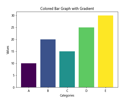
In this code snippet, we have used the plt.cm.viridis colormap to generate a range of colors for the bars. By specifying the color parameter in the bar function, we assign different colors to each bar based on the gradient. Running this code will display a colored bar graph with a gradient effect.
Bar Graph with Annotations
Annotations can provide additional context or highlight specific data points in a bar graph. Matplotlib allows adding annotations to bars using the annotate function. Let’s create an example of a bar graph with annotations.
import matplotlib.pyplot as plt

# Sample data
categories = ['A', 'B', 'C', 'D', 'E']
values = [10, 20, 15, 25, 30]

# Creating bar graph with annotations
plt.bar(categories, values)
for i, value in enumerate(values):
    plt.annotate(str(value), xy=(i, value), ha='center', va='bottom')
plt.xlabel('Categories')
plt.ylabel('Values')
plt.title('Bar Graph with Annotations')
plt.show()
Output:

In this code snippet, we have used the annotate function to add annotations to each bar in the bar graph. The annotations display the corresponding values at the top of each bar. Running this code will display a bar graph with annotations highlighting the values.
Bar Graph with Different Bar Widths
Bar graphs can have varying bar widths to emphasize certain data points or to create visual interest. Matplotlib allows customizing the width of individual bars in a bar graph. Let’s create an example of a bar graph with different bar widths.
import matplotlib.pyplot as plt

# Sample data
categories = ['A', 'B', 'C', 'D', 'E']
values = [10, 20, 15, 25, 30]

# Creating bar graph with different bar widths
bar_widths = [0.3, 0.6, 0.9, 1.2, 0.6]
for i in range(len(categories)):
    plt.bar(categories[i], values[i], width=bar_widths[i])
plt.xlabel('Categories')
plt.ylabel('Values')
plt.title('Bar Graph with Different Bar Widths')
plt.show()
Output:
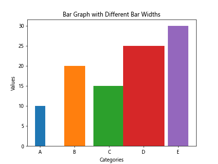
In this code snippet, we have defined a list of custom bar widths and applied them to each bar in the graph. By specifying the width parameter in the bar function, we can create a bar graph with different bar widths. Running this code will display a bar graph with bars of varying widths.
Bar Graph with Legend
Legends can provide key information about the data represented in a bar graph, such as the different datasets or categories. Matplotlib allows adding legends to plots to help explain the visualizations. Let’s create an example of a bar graph with a legend.
import matplotlib.pyplot as plt

# Sample data
categories = ['A', 'B', 'C', 'D', 'E']
values = [10, 20, 15, 25, 30]

# Creating bar graph with legend
plt.bar(categories, values, label='Values')
plt.xlabel('Categories')
plt.ylabel('Values')
plt.title('Bar Graph with Legend')
plt.legend()
plt.show()
Output:

In this code snippet, we have added a legend by specifying the label parameter in the bar function. The legend will automatically display the label assigned to each set of bars. Running this code will display a bar graph with a legend indicating the values represented.
Matplotlib Bar Graph Conclusion
In this article, we have explored various aspects of creating bar graphs using Matplotlib in Python. From basic bar graphs to customized and advanced visualizations, we have covered a range of techniques to create informative and visually appealing bar graphs. By utilizing the flexibility and customization options in Matplotlib, you can create dynamic and meaningful bar graphs to effectively communicate your data insights. Experiment with the provided examples and explore further customization options to enhance your data visualizations with bar graphs using Matplotlib.