Matplotlib Bar Plot
Matplotlib is a popular data visualization library in Python that allows you to create various types of plots, including bar plots. Bar plots are used to visualize the distribution or comparison of categorical data.
In this article, we will explore how to create different types of bar plots using Matplotlib. We will cover the basic bar plot, stacked bar plot, grouped bar plot, horizontal bar plot, and more.
Basic Bar Plot
The basic bar plot is used to display the distribution of a single categorical variable. You can create a simple bar plot using the bar function in Matplotlib.
import matplotlib.pyplot as plt

# Data
x = ['A', 'B', 'C', 'D']
y = [10, 20, 15, 25]

# Create a basic bar plot
plt.bar(x, y)

# Add labels and title
plt.xlabel('Category')
plt.ylabel('Value')
plt.title('Basic Bar Plot')

# Display the plot
plt.show()
Output:

The output of the above code will show a basic bar plot with the values ‘A’, ‘B’, ‘C’, ‘D’ on the x-axis and their corresponding heights on the y-axis.
Stacked Bar Plot
A stacked bar plot is used to show the contribution of each category to the total. You can create a stacked bar plot by using the bar function with the bottom parameter.
import matplotlib.pyplot as plt

# Data
x = ['A', 'B', 'C', 'D']
y1 = [10, 20, 15, 25]
y2 = [5, 10, 8, 15]

# Create a stacked bar plot
plt.bar(x, y1, label='Group 1')
plt.bar(x, y2, bottom=y1, label='Group 2')

# Add labels and title
plt.xlabel('Category')
plt.ylabel('Value')
plt.title('Stacked Bar Plot')
plt.legend()

# Display the plot
plt.show()
Output:
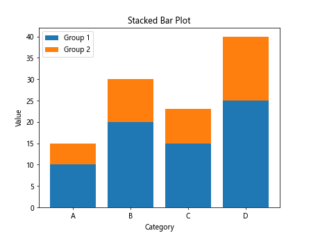
In the above code, the y2 values are being stacked on top of the y1 values for each category ‘A’, ‘B’, ‘C’, ‘D’.
Grouped Bar Plot
A grouped bar plot is used to compare the values of multiple categories side by side. You can create a grouped bar plot by adjusting the width and position of the bars.
import numpy as np
import matplotlib.pyplot as plt

# Data
x = ['A', 'B', 'C', 'D']
y1 = [10, 20, 15, 25]
y2 = [5, 10, 8, 15]

# Adjust the position of the bars
x_pos = np.arange(len(x))
width = 0.35

# Create a grouped bar plot
plt.bar(x_pos - width/2, y1, width=width, label='Group 1')
plt.bar(x_pos + width/2, y2, width=width, label='Group 2')

# Add labels and title
plt.xlabel('Category')
plt.ylabel('Value')
plt.title('Grouped Bar Plot')
plt.xticks(x_pos, x)
plt.legend()

# Display the plot
plt.show()
Output:
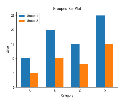
In the above code, the bars for ‘Group 1’ and ‘Group 2’ are positioned side by side for each category ‘A’, ‘B’, ‘C’, ‘D’.
Horizontal Bar Plot
A horizontal bar plot is used to display the distribution or comparison of categorical data in a horizontal orientation. You can create a horizontal bar plot by using the barh function in Matplotlib.
import matplotlib.pyplot as plt

# Data
x = ['A', 'B', 'C', 'D']
y = [10, 20, 15, 25]

# Create a horizontal bar plot
plt.barh(x, y)

# Add labels and title
plt.xlabel('Value')
plt.ylabel('Category')
plt.title('Horizontal Bar Plot')

# Display the plot
plt.show()
Output:
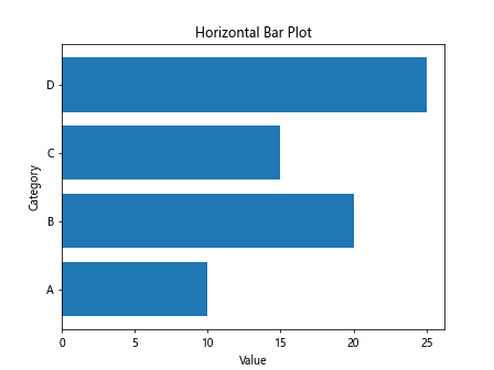
The output of the above code will show a horizontal bar plot with the values ‘A’, ‘B’, ‘C’, ‘D’ on the y-axis and their corresponding heights on the x-axis.
Bar Plot with Error Bars
You can enhance a bar plot by adding error bars to indicate the uncertainty in your data. You can create a bar plot with error bars using the errorbar function in Matplotlib.
import matplotlib.pyplot as plt

# Data
x = ['A', 'B', 'C', 'D']
y = [10, 20, 15, 25]
error = [1, 2, 1.5, 2.5]

# Create a bar plot with error bars
plt.bar(x, y, yerr=error, capsize=5)

# Add labels and title
plt.xlabel('Category')
plt.ylabel('Value')
plt.title('Bar Plot with Error Bars')

# Display the plot
plt.show()
Output:
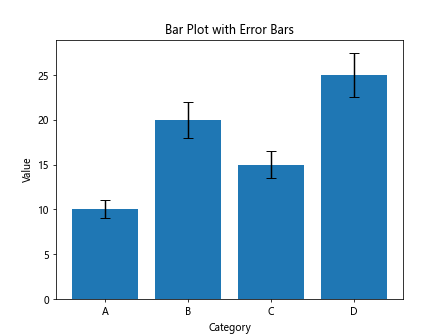
In the above code, error bars are added to each bar to show the uncertainty in the corresponding values.
Customizing Bar Plot Colors
You can customize the colors of the bars in a bar plot using the color parameter. You can specify a single color for all bars or a list of colors for individual bars.
import matplotlib.pyplot as plt

# Data
x = ['A', 'B', 'C', 'D']
y = [10, 20, 15, 25]

# Custom colors for each bar
colors = ['r', 'g', 'b', 'y']

# Create a bar plot with custom colors
plt.bar(x, y, color=colors)

# Add labels and title
plt.xlabel('Category')
plt.ylabel('Value')
plt.title('Bar Plot with Custom Colors')

# Display the plot
plt.show()
Output:
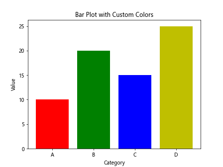
In the above code, different colors (‘r’, ‘g’, ‘b’, ‘y’) are assigned to each bar in the plot.
Bar Plot with Labels
You can add labels to the bars in a bar plot to display the values of each bar. You can create a bar plot with labels using the text function in Matplotlib.
import matplotlib.pyplot as plt

# Data
x = ['A', 'B', 'C', 'D']
y = [10, 20, 15, 25]

# Create a bar plot
plt.bar(x, y)

# Add labels to the bars
for i, v in enumerate(y):
    plt.text(i, v + 1, str(v), ha='center')

# Add labels and title
plt.xlabel('Category')
plt.ylabel('Value')
plt.title('Bar Plot with Labels')

# Display the plot
plt.show()
Output:

In the above code, labels are added on top of each bar to display the corresponding values.
Grouped Horizontal Bar Plot
You can create a grouped horizontal bar plot by adjusting the width and position of the bars in a horizontal orientation.
import numpy as np
import matplotlib.pyplot as plt

# Data
x = ['A', 'B', 'C', 'D']
y1 = [10, 20, 15, 25]
y2 = [5, 10, 8, 15]

# Adjust the position of the bars
y_pos = np.arange(len(x))
width = 0.35

# Create a grouped horizontal bar plot
plt.barh(y_pos - width/2, y1, height=width, label='Group 1')
plt.barh(y_pos + width/2, y2, height=width, label='Group 2')

# Add labels and title
plt.xlabel('Value')
plt.ylabel('Category')
plt.title('Grouped Horizontal Bar Plot')
plt.yticks(y_pos, x)
plt.legend()

# Display the plot
plt.show()
Output:
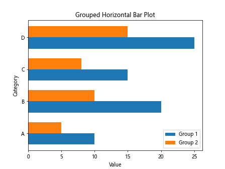
In the above code, the bars for ‘Group 1’ and ‘Group 2’ are positioned side by side in a horizontal orientation for each category ‘A’, ‘B’, ‘C’, ‘D’.
Bar Plot with Annotations
You can add annotations to the bars in a bar plot to provide additional information or context. You can create a bar plot with annotations using the annotate function in Matplotlib.
import matplotlib.pyplot as plt

# Data
x = ['A', 'B', 'C', 'D']
y = [10, 20, 15, 25]

# Create a bar plot
plt.bar(x, y)

# Add annotations to the bars
for i, v in enumerate(y):
    plt.annotate(str(v), (i, v), textcoords="offset points", xytext=(0,5), ha='center')

# Add labels and title
plt.xlabel('Category')
plt.ylabel('Value')
plt.title('Bar Plot with Annotations')

# Display the plot
plt.show()
Output:

In the above code, annotations are added on top of each bar to provide additional information about the values.
Grouped Bar Plot with Legends
You can create a grouped bar plot with legends to distinguish between different groups of bars. You can add a legend to the plot to identify each group.
import numpy as np
import matplotlib.pyplot as plt

# Data
x = ['A', 'B', 'C', 'D']
y1 = [10, 20, 15, 25]
y2 = [5, 10, 8, 15]

# Adjust the position of the bars
x_pos = np.arange(len(x))
width = 0.35

# Create a grouped bar plot with legends
plt.bar(x_pos - width/2, y1, width=width, label='Group 1')
plt.bar(x_pos + width/2, y2, width=width, label='Group 2')

# Add labels and title
plt.xlabel('Category')
plt.ylabel('Value')
plt.title('Grouped Bar Plot with Legends')
plt.xticks(x_pos, x)
plt.legend()

# Display the plot
plt.show()
Output:
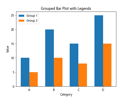
In the above code, legends are added to the plot to distinguish between ‘Group 1’ and ‘Group 2’.
Bar Plot with Custom Tick Labels
You can customize the tick labels on the x-axis or y-axis in a bar plot to provide more descriptive information. You can create a bar plot with custom tick labels using the xticks or yticks function in Matplotlib.
import matplotlib.pyplot as plt

# Data
x = ['A', 'B', 'C', 'D']
y = [10, 20, 15, 25]

# Create a bar plot
plt.bar(range(len(x)), y)

# Custom tick labels
plt.xticks(range(len(x)), ['Category A', 'Category B', 'Category C', 'Category D'])

# Add labels and title
plt.xlabel('Category')
plt.ylabel('Value')
plt.title('Bar Plot with Custom Tick Labels')

# Display the plot
plt.show()
Output:

In the above code, custom tick labels are used to replace the default labels on the x-axis.
Bar Plot with Grid Lines
You can add grid lines to a bar plot to guide the viewer’s eyes and improve the readability of the plot. You can create a bar plot with grid lines using the grid function in Matplotlib.
import matplotlib.pyplot as plt

# Data
x = ['A', 'B', 'C', 'D']
y = [10, 20, 15, 25]

# Create a bar plot with grid lines
plt.bar(x, y)
plt.grid(axis='y', linestyle='--')

# Add labels and title
plt.xlabel('Category')
plt.ylabel('Value')
plt.title('Bar Plot with Grid Lines')

# Display the plot
plt.show()
Output:

In the above code, grid lines are added along the y-axis to guide the viewer’s eyes.
Bar Plot with Title and Legend
You can add a title to the plot and a legend to provide additional context or information about the data. You can create a bar plot with a title and legend using the title and legend functions in Matplotlib.
import matplotlib.pyplot as plt

# Data
x = ['A', 'B', 'C', 'D']
y = [10, 20, 15, 25]

# Create a bar plot with title and legend
plt.bar(x, y, label='Values')

# Add labels and title
plt.xlabel('Category')
plt.ylabel('Value')
plt.title('Bar Plot with Title and Legend')
plt.legend()

# Display the plot
plt.show()
Output:
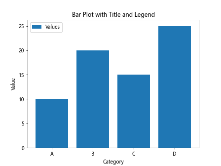
In the above code, a title ‘Bar Plot with Title and Legend’ is added to the plot, and a legend ‘Values’ is included to provide additional context.
Box Plot
A box plot is a type of plot that displays the distribution of numerical data using quartiles. You can create a box plot using the boxplot function in Matplotlib.
import matplotlib.pyplot as plt
import numpy as np

# Data
np.random.seed(10)
data = np.random.normal(0, 1, 100)

# Create a box plot
plt.boxplot(data)

# Add labels and title
plt.ylabel('Value')
plt.title('Box Plot')

# Display the plot
plt.show()
Output:
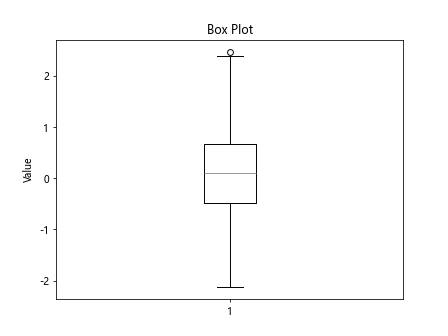
In the above code, a box plot is created to display the distribution of the ‘data’ values.
In this article, we have explored various techniques for creating different types of bar plots using Matplotlib. We have covered basic bar plots, stacked bar plots, grouped bar plots, horizontal bar plots, bar plots with error bars, custom colors, labels, annotations, legends, tick labels, grid lines, title, and box plots.
I hope this article has been helpful in understanding how to create and customize bar plots in Matplotlib. Experiment with the code examples provided to create your own unique visualizations.