Viridis Colormap
Viridis is a perceptually uniform colormap introduced in 2015. It has gained popularity due to its good visibility in both print and on screens, making it a great choice for data visualization. In this article, we will explore the Viridis colormap in more detail and learn how to use it in Matplotlib.
Introduction to Viridis Colormap
The Viridis colormap is a colormap designed to be perceptually uniform, meaning that the change in color is perceived consistently across the colormap. This is important for data visualization as it helps viewers accurately interpret the data being presented.
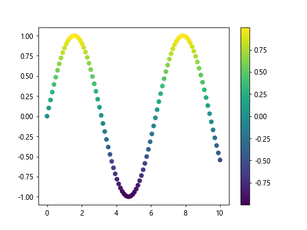
Let’s take a look at how to create a simple plot using the Viridis colormap in Matplotlib:
import numpy as np
import matplotlib.pyplot as plt

# Create some sample data
x = np.linspace(0, 10, 100)
y = np.sin(x)

plt.scatter(x, y, c=y, cmap='viridis')
plt.colorbar()
plt.show()
Output:

Using Viridis in Heatmaps
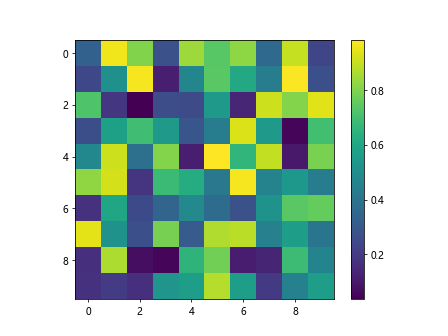
One common use case for colormaps is in heatmaps, where colors represent different values in a matrix. Let’s create a heatmap using the Viridis colormap:
import numpy as np
import matplotlib.pyplot as plt

data = np.random.rand(10, 10)
plt.imshow(data, cmap='viridis')
plt.colorbar()
plt.show()
Output:

Customizing Viridis Colormap
You can also customize the Viridis colormap to suit your needs. For example, you can reverse the colormap or adjust the brightness. Let’s see how to do this:
from matplotlib.colors import ListedColormap
import numpy as np
import matplotlib.pyplot as plt

data = np.random.rand(10, 10)

viridis_r = ListedColormap(viridis.colors[::-1])
plt.imshow(data, cmap=viridis_r)
plt.colorbar()
plt.show()
Using Viridis with Seaborn
Seaborn is a popular data visualization library built on top of Matplotlib. It provides a high-level interface for creating attractive and informative plots. Let’s use the Viridis colormap with Seaborn:
import seaborn as sns
from matplotlib.colors import ListedColormap
import numpy as np
import matplotlib.pyplot as plt

data = np.random.rand(10, 10)

sns.heatmap(data, cmap='viridis')
plt.show()
Comparing Viridis with Other Colormaps
Let’s compare the Viridis colormap with other commonly used colormaps like Jet and Gray:
from matplotlib.colors import ListedColormap
import numpy as np
import matplotlib.pyplot as plt

data = np.random.rand(10, 10)

plt.subplot(131)
plt.imshow(data, cmap='viridis')
plt.title('Viridis')

plt.subplot(132)
plt.imshow(data, cmap='jet')
plt.title('Jet')

plt.subplot(133)
plt.imshow(data, cmap='gray')
plt.title('Gray')

plt.show()
Conclusion
In this article, we have explored the Viridis colormap and learned how to use it in Matplotlib for data visualization. The Viridis colormap offers great visibility and consistency, making it a popular choice for a wide range of plotting tasks. Experiment with the examples provided to see the benefits of using the Viridis colormap in your own visualizations.